
Table of Contents: |
The US history of posters is intimately connected with advertisement for commerce, politics, and war. Early settlers in the American colonies produced most of what they consumed at home, but a few precious goods were bought in stores. Newspapers were scarce — the first in America were published around 1700 — and the ads they carried were few, often reappearing from issue to issue, and tended to carry messages in the form "Just Imported — A Variety of Goods." These ads contained few illustrations and seldom mentioned price. Brands were still unknown.
Benjamin Franklin was an early figure in the pre-independence America who was engaged in commercial and political advertisement. Throughout his life, and long after he was active in the printing business, Franklin thought of himself as "B. Franklin, Printer" . He had a lifelong fascination with the relation between printing, writing, and revision. The epitaph he wrote for himself imagines his resurrected body as a revised edition, and he sees his Autobiography as an opportunity to correct the “errata” of his youth. As publisher of The Philadelphia Gazette and Poor Richard's Almanac, he understood the importance of Typography, and image. In 1742 Franklin printed the first American magazine ad, and helped convince the public to buy his ideas as well as products in his magazine publications. He borrowed from the practice of including an image to decorate the first letter of a paragraph, and included simple woodcut illustrations in his advertisements to create aesthetically attractive layouts.
 |
| Ben Franklin, The Danger of An Unconverted Ministry, 1740. A fine example of Franklin's use of the aesthetics of typography. |
 |
| The New-England Courant 1721–1726, Published by James and Benjamin Franklin (Boston: Massachusetts Historical Society, 1924–1925). Facsimile. Franklin’s earliest surviving writing was a series of satirical essays published while he was still an apprentice in his older brother’s newspaper, The New England Courant, under the pseudonym “Silence Dogood.” Franklin’s own file of the paper is now in the British Library; in it he wrote the authors’ initials beside anonymous articles. His own initials, “B.F.,” here mark the third “Silence Dogood” essay. |
 |
| This ad in May 10, 1764 issue of Pennsylvania Gazette, to promote Benjamin Jackson Mustard and Chocolate is an example of Benjamin Franklin’s use of image for advertisement that revolutionized advertising. |
 |
| Franklin’s Join, or Die, a famous political banner first published in his Pennsylvania Gazette on May 9, 1754, had all the attribute of a poster. The original, the earliest known pictorial representation of colonial union, is a woodcut showing a snake severed into eighths, with each segment labeled with the initial of a British American colony or region. The banner appeared along with Franklin's editorial about the "disunited state" of the colonies, and helped make his point about the importance of colonial unity. |
The war propaganda posters started with the American Civil War. As that war lengthened, recruiting troops became a great challenge, and in 1863 Congress passed the Enrollment Act of Conscription, which President Lincoln signed into law. Several appeals for volunteers appeared in newspapers in the months before the draft went into effect. Civil War recruiting posters were created that enticed men with patriotic appeals, enlistment bonuses, and promises of well supplied units with experienced officers. Patriotic imagery contributed to the plea, and might feature eagles with wings spread, cavalry officers with raised swords, battle scenes, or pictures of George Washington and other national figures. Most posters were intended for a broad-based audience but some targeted specific segments of the population, such as posters written in German or French or decorated with harps and shamrocks to appeal to Irish- Americans.
 |
| A Recruitment Poster During the American Civil War |


Because of its unique political structure, American political posters have played an important role in the political theater, and in the process have developed a distinctive style. Before the age of television it was posters that created a particular negative or positive image for a candidate. For instance in 1812 Andrew Jackson’s reputation as a national hero, and his military glory at the Battle of New Orleans were put under a question mark when a Philadelphia printer named John Binns published the notorious “coffin handbill,” a poster showing six black coffins and claiming the militiamen Jackson had ordered executed had essentially been murdered.
 |
| Zachary Taylor, "rough & ready". Color campaign poster for Democratic nominee Zachary Taylor for the presidential election of 1848. woodcut ca. 1848 |
 |
| McKinley, the governor of Ohio, was largely in favor of retaining the gold standard. In addition, he was the author of the McKinley Tariff Act of 1890, which was largely protectionist. His campaign manager, Mark Hanna, a wealthy businessperson who applied the principles of business of that period to political campaigns, raised millions of dollars, outspending the Democrats by anywhere from seven to thirty-two times. Hanna packaged his candidate, creating the image of him as a leader who had a simple and clear message (encapsulated in the slogan on the poster, "Prosperity at Home, Prestige Abroad"). Overall, the Republican campaign theme in 1896 was that a McKinley administration could pull the country out of a depression and return it to prosperity, which did actually happen by 1900. |
 |
| Grand National Democratic banner, 1844 |
 |
| Grand National Democratic banner, 1852 |
 |
Zachary Taylor. Color campaign banner for Whig Party candidates in the national election of 1848. The banner, promoting Zachary Taylor and his vice presidential running mate Millard Fillmore. color lithograph ca. 1848 |
 |
| James A. Garfield and Chester A. Arthur, 1880 |
 |
| James G. Blaine and John A. Logan, 1884 |
The American Posters have been a reflection of their time. When at the turn-of-the-century art nouveau beacme the most popular style in Europe, many American artists began to follow the arts and crafts movement and there was a growing interest in Japanese prints. The American posters were meant to appeal to a broad consumer audience, so that they will be convinced that they need to buy the new consumer products, that the new advanced production technology mass produced. The artistic criteria for posters have been summed up by Hamilton King, one of the pioneers of poster design in America, who had studied in France. According to him posters must
''seize a moment — exploit a situation with one daring sweep of the pencil or brush. The poster is not a portrait, nor a study — it is an impression — a flash of line, a sweep of color ... all that can be told of a tale in the passing of an instant. It is dramatic and imaginative, yet it is saliently sincere."
 |
| Hamilton King — Theatre Magazine — June 1920 —Marion Davies |
 |
| Hamilton King,Ravinia Festival poster, 1917 |
With their vivid colors, and energetic designs posters caught the eyes of hurried pedestrians, making them ideal tools for street-side advertising. A vast army of talented artists, illustrators and printers were soon employed producing posters to promote products, amusements and publications. By the beginning of the 1890s publishers of American magazines, books and newspapers began to commission artistic advertising posters to market their products. With the arrival of the modern illustrated poster in America, artistic works by Louis Rhead and Edward Penfield, whose works were published in the Harper's Magazine, and Will Bradley who worked alongside Frank Hazenplug as a staff artist for the Chicago publisher, Stone & Kimball were executed in a very stylized art nouveau, inspired by the elegant and expressive illustrations of the English artist Aubrey Beardsley (1872-1898). But while Beardsley often restricted himself to working in black and white, the American artists reveled in the play of vibrant colors and bold graphics.

Louis John Rhead was from a family of well-known English artists. He was sent to Paris at the age of thirteen to study under Boulanger, and returned to England several years later. Rhead continued his studies under Edward Pointer and Alphonse Legros.By the time he arrived in America in 1888, he was one of the main leaders in the Art Nouveau movement along with Will Bradley and Edward Penfield. He created posters for Scribner's and Century magazines. In the 1890s Rhead designed nearly one hundred posters. His first posters were done in England for Cassell's Magazine and the Weekly Dispatch, and also for Phitesi boots. In the United States he created posters for a variety of magazines, including The Century, St. Nicholas, Harper's, The Bookman, and Scribner's. He also produced large one- and two-sheet posters for the New York Sun and the New York Journal. As well, Rhead produced commercial posters for the printing firm Louis Prang and Company, as well as for products such as Lundborg perfumes, Pearline washing powders, and Packer's soap.

Woman With Peacocks , 1896.
In 1895 Rhead won a Gold Medal for ''Best American Poster Design'' at the first International Poster Show in Boston. By the late 1890s, the popularity of poster art declined and Rhead turned his skills to book illustration. Between 1902 and his death in 1926, Rhead illustrated numerous children books published by Harpers and others. Rhead is noted as a great graphic designer. His pallet of colors were startlingly rich and vibrant, and his compositions were sophisticated and well balanced. He created art work that in his time looked modern and vanguard.


Edward Penfield was born in Brooklyn NY in 1866. He has been called the “originator of the poster in America. He was born 2 June 1866 in Brooklyn, New York to Ellen Lock Moore and Josiah B. Penfield. Although he is mostly known for his advertising ‘placards’ for Harper's New Monthly Magazine, it should be noted that his Harpers years constitute less than a third of his thirty-four year career. When he was in his early twenties Edward enrolled at the Art Students’ League in New York City. During the fall of 1889, Edward Penfield attended the costume class, from which several of his pen and ink studies still survive. He also studied painting under the impressionist George de Forest Brush around 1890. An associate art editor at Harper and Brothers who had seen Penfield's work suggested to the head of the art department to hire him as a staff illustrator.Penfield’s first published work appeared in Harper’s Weekly in 1891. In his early works, Penfield executed ink and watercolor wash illustrations in a similar style to the older generation of graphic artists, such as W.T. Smedley, W.A. Rogers, Thor de Thulstrep, Rufus Zogbaum and E.A. Abbey.

Remembering the Family Farm, Harpers March, 1899
Penfield traveled to Europe to further his study in Paris with George de Forest Brush however, soon he was called back by the Harpers to head up their art department. His trademark linework and use of broad tonal areas developed gradually after his return from Europe. It is believed that what made his work compelling was his well-thought design as well as illustration. These and other stylistic trademarks emanated from a number of influences, including the compositional precepts and casual poses found in Japanese prints, the hand-craftsmanship of the Arts and Crafts movement , the impressionistic approach of Parisian poster-making, and British poise and directness. The graphic art of Penfield demonstrates a keen sense of design and composition. The Art Center Bulletin of April 1925 remembered his contribution to illustrative art this way: To everything he produced Penfield brought his great gifts of design and draftsmanship, a wonderful sincerity that never faltered, and a beautiful humbleness of spirit.

World War I, YWCA propaganda poster
Penfield had a keen sense of design and composition. He is also credited with bringing abstraction to commercial art through his boldly simplified shapes. When he retired from Harper's, he began to travel and recorded his experiences in two sketch books published by Scribner's, Holland Sketches (1907) and Spanish Sketches (1911).

William H. Bradley is considered as one of the leading American poster artists of the turn of the century. Bradley was given the nickname "The American B," referring to Aubrey Beardsley the English graphic artist. However, it should be noted that Bradley was already an established artist by the time Beardsley’s designs became popular in England in 1894. He was born in Boston, Massachusetts, and at the age of 14 he obtained a job as a printer for a weekly newspaper, in 1880. He continued his journalistic pursuits until 1887 when he decided to move to Chicago to work for the prestigious painters, Knight and Leonard. Bradley established his own studio in and produced theater posters as well as commercial advertisements. He moved back in Boston in 1895 and set up the Wayside Press, where he published "Bradley, His Book: A Monthly Magazine Devoted to Art, Literature, and Printing". It was the rise of the poster movement that established his reputation. His poster The Twins (1894), created for the periodical The Chap-Book, was considered to be the first American Art Nouveau poster. He was awarded a gold medal by the American Institute of Graphic Arts in 1954.


Bradley's artistic style adhered to the Art Nouveau principles, and he was particularly influenced by the Arts and Crafts Movement and Japanese block printing.Bradley is credited with popularizing the two-dimensional poster style in the United States. His typographic and illustrative work pushed the boundaries of these fields into new directions. In addition, his re-introduction and use of Caslon type brought it back into popularity. Will Bradley was active, throughout his life, in a wide range of graphical arts including poster, magazine and book design; cartoon, illustration, decoration, and architecture. He designed well over fifty covers for books, many of which were reused or copied for other titles. They ranged from plain cloth covers with simple paper labels to lavish designs with gold stamping or several colors.

Frank Hazenplug (1873-1931) worked alongside Will Bradley as a staff artist for the Chicago publisher, Stone & Kimball. It was founded by two Harvard undergrads in 1893, and printed beautiful limited edition books by some of America's best authors. With Will Bradley as their designer, they quickly became famous for their in-house magazine, The Chap-Book. He took over for Bradley when the latter moved to Springfield in 1896. Hazenplug designed around ten posters for the company. In the early decades of the 20th century he turned his talents to the art of the book, as both an illustrator and designer.


Technological progress in bookbinding at the end of the 19th century allowed all of the major binding operations such as folding, gathering, sewing, rounding and backing and casing to be accomplished by machines. These developments encouraged the graphic designers to redirect their art to book cover design. A case-smoothing machine was introduced by George H. Sanborn & Sons of New York in 1891, and soon after competitors' models were available. In 1901 a cloth-cutting machine was invented by the Smyth Company and two years later the company introduced the first casing-in machine. Over the same period, the Sheridan Company improved earlier patents to make an automatic gathering machine. As a result, graphic designers were able to produce highly professional layouts and stylized pictorial representations, which solidified the foundation of the book cover design. Publishers, in particular, were promoting this art since they had long realized that artistically designed book covers were the most effective advertising. The book cover designs of the early 20th century demonstrate a stunning array of creativity through a wide range of styles, influenced by the Arts and Crafts movement, Art Nouveau, Japanese prints and the so-called poster style of design.


Joseph Binder (1898-1972) is widely regarded as one of the "Most Influential Modern Graphic Designers". He was born in Vienna. As a young man he apprenticed to become a lithographer and when he was twenty four entered at the Vienna School of Arts and Crafts. His artistic talent, and his mastery of lithography helped him to win many awards during his student years. In particular, he won a competition for poster designs for the American Red Cross, which paved the way for his employment at that institution when he immigrated to the US in 1936.

Music Theatre Festival, Vienna, 1924
In 1924 he founded, Vienna Graphics. Inspired by Cubist and DeStijl movements, he designed elegant compositions and geometric patterns which helped to build up his reputation as an innovative advertising and graphic designer. Binder reduced the subjects of his design into their simple of geometric forms, using color contrasts to stress their features. He believed in psychological impact of colors.

WWII Labor Propaganda Poster, 1946

Austria Ski Vacation, C 1930.

International Advertising Art , 1931

Advertisement for AP Iced Coffee, 1950s
In 1927, Binder and a number of other graphic designers founded Design Austria, the national Austrian designers association. Over the1933-35 he became a visiting lecturer both at the Chicago Art Institute and the Minneapolis School of Art. His clear, reductive compositional style gave rise to his international status and his posters were exhibited in New York and Tokyo. He won first prizes in competitions organized by the Art Directors Club New York and the Museum of Modern Art. When he immigrated into the US, his clients included American Railroads, American Airlines, A&P Iced Coffee, Fortune and Graphics. He was appointed as the art director and designer of the U.S. Navy in 1948.
New York World's Fair 1939

Seymour Chwast regarded as one of the most influential artists of the twentieth century , is founder of the world famous Push Pin Studios whose distinct style has had a worldwide influence on contemporary visual communications. He was born in 1931 in The Bronx, New York. He began to draw when he was just seven years old, but it was at Abraham Lincoln High School in the Coney Island, that his talent was discovered. He was accepted as a member of the "Art Squad." A group of young graphic designers who were studying under the celebrated teacher Leon Friend. At sixteen, and encouraged by Friend, Chwast's first illustration was published in Seventeen magazine. In 1948, he entered The Cooper Union for the Advancement of Science and Art, known simply as Cooper Union, in neighborhood of Manhattan, New York City, where he studied illustration and graphic design.

The Push Pin Graphic Poster
At Cooper Union , he and two of his fellow students, Milton Glaser and Reynold Ruffins, founded a studio called Design Plus in their second school year, but they went out of business after completing only two projects. In 1951 he graduated and worked as a junior designer in the advertising department of the New York Times, then for House and Garden and Glamour magazines. In 1954, in partnership with Milton Glaser and Edward Sorel, he founded the celebrated Push Pin Studios. In 1985 the studio’s name was changed to the Pushpin Group, and Chwast became its director.

Antiwar Poster, 1950s
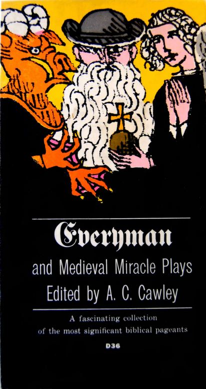
Everyman and Medieval Miracle Plays, 1959
Although Push Pin was on the cutting edge of popular art, it was nevertheless, influenced by design styles of Expressionism, Art Nouveau, and Jugendstil, and thus during the heydays of postmodern decades (1960-80) it was criticized as regressive. But he has continued to ride above the twists and turns of postmodernism fashion, and looked at various styles as tools for realization of his artistic concepts. It is reported that according to Chwast; "What became known as the Push Pin Style—the distinctive, eclectic union of illustration and design—derived, not from premeditation but from the requisites of the assignments themselves. It was a desire to state the client's message in as personal yet as accessible a vocabulary as possible". Chwast creative, expressive and adventrous approach to type and layout has been the conduit of a new design wave based on revivalism—a radical alternative to the postmodenism. 
Pablo Picasso is depicted as a Satyr (symbol of fertility), with horns on his head, and flute.

UCLA Extension 1998 Summer


David Lance Goines was born in Grants Pass, Oregon, in 1945. He was the oldest of eight children with a civil engineer father, and a mother who was an accomplished artist and calligrapher.Two years after enrolling at the University of California at Berkeley as a Classics major, Goines was expelled from the university because of his involvement with the Free Speech Movement. However, when he was readmitted, he refused to return to university and instead in 1965 he apprenticed with a Berkeley printer, and soon he turned into a skilled journeyman.


In the same Berkeley printshop he founded Saint Hieronymus Press in 1968, and worked on his graphic designs and printing using both letterpress and photo-offset lithography. Goines was not allured by the fad of the 1960's counterculture. He adhered to the classical rules of aesthetics and pushed further the frontiers of artistic excellence. His artwork has been reproduced in numerous professional publications, and his writing and artwork have been the recipients of many awards, most notably the 1983 American Book Award for his book, A Constructed Roman Alphabet. His artwork is represented in both public and private collections including; Fine Arts Museums of San Francisco, Smithsonian Institution (Washington, DC), Hiroshima Museum of Modern Art, Library of Congress (Washington, DC), Museum of Modern Art (New York), Museé de la Publicité (Palais du Louvre, Paris), Oakland Museum (Oakland CA), Philadelphia Museum of Art, and so on. He lectures frequently in various places nationwide, and has taught occasionally at the University of California, Berkeley, at the UC Extension, and the California College of Arts and Crafts, Oakland.


He studied for two and half years at East Texas State and then moved to the School of Visual Arts on 23rd Street in New York, while living in the Chelsea Hotel. But, around 1973 feeling the summer is too hot and not being able to see the sky, he returned to Oklahoma and in the fall, he registered at Art Center College of Design in Los Angeles, as a 5th semester student studying under John Casado and Jamie Odgers. It was competitive and intense. After graduation, he worked for a short while as assistant to John Casado and later on the assistant to Los Angeles illustrator, Dave Willardson, at the same time he was working for the art directors like Mike Salisbury of West magazine and Rolling Stone magazine, and Roland Young, the art director at A&M Records.


After visiting San Francisco, Schwab realized that this is the city he belongs, and approached Chris Blum, the creative director for Levi Strauss & Co. for a job. Blum was famous for the very artistic, award-winning Levi’s posters and animated commercials, and once offered job Schwab created several historic posters for Levi’s with him. By 1976, he had founded his own studio in San Francisco, while living and working in a loft setting on Telegraph Hill, with a view of The City. He has said of those years;
I watched and listened to my mentors and saw how they talked on the phone with clients and art directors. Truthfully, being in art school, you don’t learn anything about business. I didn’t take any MBA courses. I had to make up my own rules and keep track of what I was getting paid. No one was really there to tell me how to do it. I treated my apprenticeships as learning opportunities — like graduate studiesFrom his studio in Marin County, with stunningly powerful minimalist compositions, Schwab creates award wining graphic designs, which are aesthetically exquisite . His clients include: Nike, Polo, Wells Fargo, Amtrak, Sundance, Pebble Beach, Muhammad Ali, Robert Redford, and the Golden Gate National Parks Conservancy.


Go to the next chapter; Chapter 27 - Gustav Klimt, and the Vienna Secession Movement
.
References
- Wilczak, Susan A. The posters of Edward Penfield for Harper's New Monthly Magazine: a reflection of American society in the 1890s [Thesis]. Ann Arbor, MI: Department of Art, Michigan State University, 1996.
- Exman, Eugene. ''The House of Harper: One hundred and fifty years of publishing''. New York: Harper and Row, 1967.
- Johnson, Diane Chalmers. American art nouveau. New York: Harry N. Abrams, 1979.
- Jones, Sydney R. Posters and their designers. London: The Studio, Ltd, 1924.
- Keay, Carolyn. American posters of the turn of the century. New York: St Martin’s, 1975.
- Les maitres de l’affiche. 5 vols. Paris: Imprimerie Chaix, 1896, 1897, 1898, 1899, 1900. King, Julia. The flowering of Art Nouveau graphics. Salt Lake City, UT: Peregrine Smith Books, 1990.
- Bauwens, Maurice; Hayashi, T.; La Forgue, Jules; Meier-Graefe, J.; Pennell, Joseph; and Boudét, G., editors. Les affiches étrangères illustrées. Paris: G. Boudet, 1897.
- Koch, Robert. Will H. Bradley: An American Artist in Print. Manchester, Vermont: Hudson Hills Press, 2002, LLC. ISBN 1555952240.
- Clarence P. Hornung, Will Bradley: His Graphic Art, Dover Publications, 1974, ISBN 978-0486207018
- Bambace, Anthony. Will H. Bradley: His Work. A Bibliographical Guide, New Castle, Delaware and Boston, Massachusetts: Oak Knoll Press and Thomas G. Boss Fine Books, 1995, ISBN 9781884718083
- Achilles, Rolf, The Chap-Book and Posters of Stone & Kimball at The Newberry Library, The Journal of Decorative and Propaganda Arts, Vol. 14, (Autumn, 1989), pp. 64-77
- Binder, Carla: Joseph Binder, ein Gestalter seiner Umwelt. Plakate, Werke graphischer und freier Kunst. Aufzeichnungen aus der Joseph Binder Collection, Wien 1976.
------------------------------------------------------------------------------------

This work is licensed under a Creative Commons Attribution-No Derivative Works 3.0 Unported License.
This work is licensed under a Creative Commons Attribution-No Derivative Works 3.0 Unported License.
No comments:
Post a Comment