
Table of Contents: |


-----------
The American movie studio system of poster design has been rather peculiar in the 20th century. The movie studios had usually their own art departments, run by their art directors who subcontracted various elements of a poster to various artists including illustrators, typographers and photographers. Some artists themselves had founded commercial graphic studios, and applied the same mass producing industrial structure. While, this system was responsible for the poor quality of so many of the American movie posters, it created occasionally authentic masterpieces, when a group of talented artists, like the instrument players of an orchestra, gather under the direction a of great art director, who directs like a maestro. Of course, some art directors have been exceptionally talented graphic designers themselves, and had created genuine pieces of art works. However, in the final analysis, it is now very difficult to attribute the artistic credit of a poster to the art director alone when an illustrator's work dominates the design. The process is rather similar to, let's say, performing the Brahms violin concerto by a virtuoso player under the direction of a maestro. In fact, when the art director Bill Gold, published a 450-page limited-edition book, entitled Bill Gold: PosterWorks, Reel Art Press, it raised some eyebrows since many of the posters in that book were considered the works of artists such as Bob Peak, Steve Frankfurt, Philip Castle, and so on, and thus in reviewing the book, in the Spectator, on 23rd April 2011, Bevis Hillier wrote ;
When I first riffled through this book, I found, amid the many luxurious illustrations, one of the famous poster for A Clockwork Orange by the English artist Philip Castle, that brilliant master of the air-brush. I was mystified as to what Gold’s role was in that. The answer to that conundrum comes at the end of Christopher Frayling’s introduction:
The initial idea for this book came about when Bill and [his wife] Susan ... were having lunch at an Italian restaurant in Bridgeport, and saw a French poster for Camelot on the wall. When they explained to the proprietor that it was Bill who had designed the original poster, the proprietor replied, ‘No, he couldn’t have, Bob Peak designed it.’ Bob Peak was the illustrator. The designer of the poster was in fact Bill Gold, even though the artwork was signed by Peak. This convinced Bob and Susan that the record ought to be set straight.


Of course, the art director, was not the final decision maker about the poster, as most often the views of the director and producer carried the main weight. For instance, for the Empire Strike Back poster, George Lucas insisted that he wanted an image like Gone With the Wind that would capture the spirit of an epic romance. Art director Sid Ganis, contacted artist Roger Kastel, and a number of other illustrators to depict the romance of Han and Lila, in the same posture as Rhett and Scarlett.

Some of the earliest graphic designs for the Empire Strike Back was created by Tom Jung. These were clearly inspired by his poster for the re-release of Gone With the Wind, which was solicited by Sid Ganis. Jung incorporated a half-sheet kind with an image of Luke and Leia before Vader and another with Luke in the bizarre gear of Hoth beside a half naked Leia side-saddling on tauntaun. After these romantic designs were rejected by Lucas and Ganis, Jung finally came with an authentic design of the film's darker theme, represented by Vader's imposing prominence in the composition, outstretching his hand. The poster became the signature feature of the film.
By the end of the previous century, with the intrusion of digital techniques, the art of poster design went through a drastic change. Many major studios closed their publicity departments. Although still in the current practice a single poster design is the product of many different hands - those of an art director, a graphic designer, a photographer, a typographer and a computer programmer, and so on, the human touch has been replaced by computer's slick and soulless attitude. Digitally mass produced movie posters have became almost identical in their various genre, and completely pathetic in their communication missions, in the final analysis they are now worthy of being exhibited in Tate modern of London!
Robert "Bob" M. Peak (1927-1992) was born in Denver, Colorado and grew up in Kansas. From an early age Peak knew that he wants to be a "commercial illustrator". He majored in geology from Wichita State University and got a part time job in the art department of McCormick-Armstrong. After serving the military during the Korean War, Peak transferred to the Art Center College of Design in Los Angeles, California, graduating in 1951. He was perhaps the greatest graphic designer active in the U.S. after World War II. An accomplished artist, and a superb draftsman, his striking command of figurative compositions and expressive portraiture, were masterful, elegant, and aesthetically authentic.
In 1953, Peak moved to New York City, landed an Old Hickory Whiskey advertising campaign. His work went on to appear in major advertising and national magazines. United Artists studio hired Peak in 1961 to design the poster images for the film West Side Story. Peak's innovative approach to movie advertising from basic collages of film stills or head shots to flamboyant artistic illustrations was revolutionary. His bold composition of a single montage-became the first of over 100 such posters, among them “My Fair Lady,” “Camelot.” In the mid-1970s Peak's style would become familiar to fans of science fiction films when he created the poster art for the futuristic film Rollerball (1975), followed by the first six Star Trek films, Superman (1978), Excalibur (1981), In Like Flint, and Apocalypse Now (1979). Peak was not short on editorial assignments with 45 covers of Time Magazine featuring his illustrations-most notably the portrait of Mother Teresa. Sports Illustrated, and TV Guide were regular showcases for Peak's work in the 1970s and 1980s.
Bob Peak has been hailed as the “father of the modern Hollywood movie poster.” his extensive list of accolades include being named Artist of the Year by the Artists Guild of New York in 1961 & 1977, elected into the New York Society of illustrators Hall of Fame. A Key Art Lifetime Achievement Award granted by The Hollywood Reporter and elected, along with Norman Rockwell and NC Wyeth, into the prestigious Illustrators Hall of Fame. Peak received a commission from the U.S. Postal Service to design 30 stamps for the 1984 Summer Olympics in Los Angeles and the 1984 Winter Olympics in Sarajevo, Yugoslavia.


-----------
Howard Terpning was born on November 5, 1927 in Oak Park, Illinois. He was raised by his mother, an interior designer, and father, who worked for the Northwestern Railroad. He grew up in the Midwest living in Iowa, Missouri and Texas as well as Illinois. As a boy he liked to draw and knew by the age of seven that he wanted to be an artist. At age 15, he became fascinated with the West and Native Americans when he spent the summer camping and fishing with a cousin near Durango, Colorado. When he turned 17, he enlisted in the Marine Corps and served from 1945 through 1946. He was stationed in China for nine months. After leaving the Marines he enrolled at the Chicago Academy of Fine Arts in their two-year commercial art program using the G.I. Bill to pay his tuition. To further his study he attended the American Academy of Art in Chicago for six months where he honed his life drawing and painting skills.
After art school a family friend introduced Terpning to Haddon Sundblom, a successful and highly regarded illustrator of that time. Based on the recommendation and the strength of Terpning's drawings Sundblom hired Terpning to work at his Chicago studio as an apprentice for $35 per week. Initially, Terpning ran errands, cut mats, built crates and cleaned brushes. After about a year and a half he began to work on his own commissions. In 1955, he moved to a Milwaukee studio where he stayed for three years before relocating to New York where he was hired by a major Chicago studio. By 1962, he was working as a freelance artist using an agent to facilitate the business side of his craft. As a result Terpning was able to work from his home studio eliminating the long commute into NYC. During his 25 years as an illustrator he created magazine covers, story illustrations and advertising art for publications such as Reader's Digest, Time, Newsweek, Good Housekeeping, Field & Stream, McCall's, Redbook, and Ladies' Home Journal.
In addition to illustrating for magazines Terpning completed over 80 movie posters starting with The Guns of Navarone in 1961. Other examples include Cleopatra, Doctor Zhivago, The Sound of Music, The Sand Pebbles, and the 1967 re-release of Gone with the Wind. Today, Howard Terpning is celebrated as one of the most talented and prolific artists in his field. His visually stunning artistic ability has garnered Terpning numerous esteemed awards and recognitions throughout his illustrious career, including the prestigious 2005 Masters of the American West Thomas Moran Memorial Award and a lifetime achievement award from the Autry National Center, as well as an award from the Eiteljorg Museum of American Indians & Western Art for excellence.


--------------
Bill Gold was born in Brooklyn in 1921. From his early childhood he was interested in art, and soon he was making copies from Norman Rockwell’s works. Gold went to elementary school in Brooklyn where he took several art courses, and later after graduating from Tilden High School, he enrolled at the Pratt Institute to study advertising art, including lettering, layout & design and illustration. Son of an insurance broker, he was fascinated by movies, and thus after Pratt, he went to show his portfolio to Joe Tisman, the art director of Warner Brothers’ advertising department in New York City. As part of his interview process, Tisman asked him to go and design three posters for "The Adventures of Robin Hood", "Winter Meeting" and "Escape Me Never". He did and got the job. The art department employed seven graphic designers, with three artists solely devoted to lettering, with backgrounds in sign painting. As a result their typography was clear, bold and sharp.
According to Gold:
MGM was known for its spectaculars and musicals -- they had more stars than in heaven -- and Manhattan had Broadway and Tin Pan Alley. Warner's was all about gangsters and gritty realism and having a social conscience -- three things easily found in Brooklyn.
Yankee Doodle Dandy, and Casablanca, both directed by Michael Curtiz, were Gold's first two assignments. However, in 1942, Gold was drafted into the army, and after eight weeks of training he was transferred to the Air Force Photography Unit, where he made instructional films about aircraft maintenance. He rejoined Warner’s in 1948, two years after being discharged from the army. He succeeded Joe Tisman as the art director, and in 1959, after Warner Bros closed its in-house advertising department in New York, Gold moved to Los Angeles to set up Bill Gold Advertising, and continued to accept contract work from Warner’s.
 |
| Yankee Doodle Dandy, 1942, Michael Curtiz. A patriotic poster, with the American flag stars that are like the shimmering sparks of fireworks. The poster projects bright, spangled, and lively entertainment. |
 |
| Casablanca, 1942, Michael Curtiz. With Bogart in the forefront and the rest of the cast in relief, shadowed behind a blood red color, the viewer gets the sense of intrigue, romance and drama.. In the words of Michael Bierut; "On the Casablanca poster ... you see everything you need to know about the movie, about the era, about that point in time of studio filmmaking.” A rare patriotic film noir, Casablanca was a success in its initial run during World War Two, and it is now included almost every year in the best film lists. |


 |
| Art work by Ted CoConis , Commissioned by Bill Gold |


---------
Print is very important. Selling of films through posters makes a difference between success and failure...The goal of poster art is to crystallize a film into a simple image - to catch a moment. Tom Jung
Tom Jung was born in Boston, in the 1940s. His parents were in show business, and he exhibited his artistic talent from his early school days, when he was sketching various scenes of life on paper. He was very interested in movies and he watched them at the Boston Art Museum, three times a week. After his graduation from school he found a job in the Boston Museum of Fine Arts. But after two years he was drafted in the Army. He worked as a freelance illustrator and art director with a number of major advertising agencies in New York, after his discharge from the Force.


Jung's first break came in 1958, when he was assigned by an acquaintance to redesign the ad-campaigns for Federico Fellini's 1954 La Strada and Roger Vadim's 1956 And God Created Woman. Jung's redesign of these posters helped the films to appeal to the American taste, and contributed to the introduction of these important directors to the American audiences. Soon, Continental, the largest distributor of foreign films at that time, contracted Jung for ad-campaigns of such classics as; Jack Clayton's 1959 Room at the Top and Sidney Lumet's 1962 A View From the Bridge.
 |
| Illustration by Howard Terpning, Poster design by Tom Jung |
 |
| Ice Station Zebra, 1968, John Sturges. The top half of the poster down to the bottom of the submarine was drawn by Robert McCall. The actors were drawn by Howard Terpning. The poster design and layout itself were done by Tom Jung. |
 |
| The artwork, poster design, and layout by Tom Jung |
Jung became a freelance art director at Metro-Goldwyn-Mayer in 1962, when the Director of Marketing at Continental, left the company to go to MGM and he took Jung with him. Included among the posters Jung designed for MGM were; "Dr. Zhivago," "Ice Station Zebra," "Shoes of the Fisherman" and the re-release of the "Gone With the Wind." In 1968, Jung was contracted by Cinema Center Films to handle the art direction for their entire release schedule of nearly 30 films. Despite the fact that Jung had worked as an art director and designer his own artwork was not yet accepted to be included in the posters. However, in 1973, the director, Franklin Schaffner, and the producer, Ted Richmond, of "Papillon" accepted Jung's artwork for a poster that was also designed by him. This was the first major break for Jung's artwork, in which he depicted the inner personalities of the film's main two characters, a stubborn and defiant Henri 'Papillon' Charriere, who is wrongly convicted of murder in the 1930s and sentenced to life imprisonment in a French penal colony on Devil's Island in French Guiana, and his cagey and crafty fellow convict Louis Dega, who is helping Charriere in his many escape attempts.


 |
| Artwork by Howard Rogers, Poster design by Tom Jung |
 |
| Artwork by Howard Terpning, Poster design by Tom Jung |
----
Ted CoConis was born in Chicago, in 1927. He was a child prodigy, and in 1939, at the age just twelve years old and still in grade school, he was awarded a scholarship to the Art Institute of Chicago. Three years later, in 1942, he abandoned his formal education, added a few years to his age and trained as a pilot with the US Air Force. However, he was honorably discharged after the Air Force realized that he was underage. CoConis did not give up, and soon joined the Merchant Marines, serving as an ordinary seaman. on the way to Russian-occupied Romania.
After returning to Chicago, in 1945, he decided to return to art, and headed to Las Vegas, then moved to Los Angeles, and finally ended up in San Francisco, where he landed his first freelance commission as an illustrator. It wasn’t long before a major art studio in New York recognized his talent. He moved East and his signature technique graced the pages and covers of such magazines as Cosmopolitan, Playboy, Ladies’ Home Journal and Good Housekeeping. He was commissioned to create book covers for novels like Ada and The Devil Tree, and his posters for Academy Award winning films like Man Of LaMancha, Fiddler On A Roof, Hair, and Labyrinth quickly established him as one of the U S's preeminent illustrators, gaining worldwide recognition for the outstanding movie posters, book covers and story illustrations he created in collaboration with his wife Kristen.


----------
Steven Chorney was born in 1951, Washington, DC, and raised in Buffalo NY. He did have any formal art education, but according to him his father, a trained commercial artist in Toronto, Canada "made the largest impact on my decision to follow this chosen field". In 1971, Chorney moved to Southern California to pursue his dream of becoming a visual artist. He landed a job with a small independent agency, doing animation and designing television commercials. In 1976, his entry to the Chicago International Film Festival garnered the First Place Award for Animated Television Commercials. Soon the marketing departments of some of the major Hollywood studios discovered his charmingly refined and thoughtful artistic talent.
Over the 1983-86 period, Chorney created dramatic art designs for over 50 TV Guide ads for CBS and NBC television programs, including, Dynasty, Miami Vice, Mickey Spillane’s Mike Hammer, T.J. Hooker, and Cagney and Lacey. In 1987 his work on the popular television series Designing Women won First Place in The Hollywood Reporter Key Art Awards for television. Chorney’s drawing skills and dramatic technique have been applied to over 120 motion picture campaigns for many of the major studios including Disney, MGM and Warner Bros. Recognized for his design and conceptual abilities, Chorney has frequently been asked to develop the direction and design of the final One-Sheet concept for movies as diverse as Who Framed Roger Rabbit, License to Kill, Indiana Jones, and the Last Crusade.
Steve Chorney’s work in the pop culture includes illustrating books such as the popular Star Wars young reader series as well as creating works for Universal Studios Parks, Paramount Parks, and Knott’s Berry Farm. He currently lives in Santa Barbara California.
I wrote Chorney to ask why some of his movie posters are also credited to a number of other artists, his response is fascinating in that provides a glimpse into the inner working of art departments of movie studios;
Often artists were used to create initial designs and layouts for presentation while yet another might actually finish the final painting. At times it was a scheduling reason, (sometimes one artist was faster than another or already busy on a another assignment) other times it was a conscious decision for a certain look. Some artists visualize well, others paint well, sometimes they did both.
Deadlines were of such critical importance there was little time to wait for sending art to another area for creation, revisions etc. There were no computers to immediately transfer electronic data as seen today. The general rule of the day: only artists from the Hollywood area were called in. As a result, the pool of talent was a relatively small roster of reliable artists who could withstand the constraints of producing artwork 'on demand'. At times the completion of the final poster painting would be required within 24 hours! A demanding profession indeed! But it was exciting too!
 |
| STAR TREK Adventure, Univesal Studios tour. |
 |
 |
 |
 |
 |
| Zathura Jumanji meets Buck Rogers in Columbia Pictures sci-fi adventure Zathura. Based on the best-selling book by acclaimed children's writer Chris Van Allsburg |
 |
 |
 |
------
Drew Struzan was born in 1947 in Oregon City, Oregon. At the age of Eighteen, he enrolled at the Art Center College of Design, in California. According to him; "The first thing the counselor asked me was 'what do you want to major in,' so I asked what the choices were." After being told that he had two choices: either fine art or illustration, and if he chose fine art he could paint what he wanted, but as an illustrator he could paint for money, it didn't take him too long to choose his course of study. "I'll be an illustrator," he decided. "I need to eat." In his first year, he married and became a father.
After graduating in 1970, with honors and a Bachelor of Arts degree. Struzan resided in West Los Angeles, California. He would also complete two years of graduate studies and eventually return to the school in later years (the campus relocated to Pasadena, California) to teach for a short time.
"I was poor and hungry, and illustration was the shortest path to a slice of bread, as compared to a gallery showing." Struzan has said, "I had nothing as a child. I drew on toilet paper with pencils – that was the only paper around. Probably why I love drawing so much today is because it was just all I had at the time."
In the mid-70’s, Struzan landed some commission to do movie posters, and soon he got his first break with the re-release of Star Wars in 1978. Working with fellow artist Charles White III, they created a poster that was later dubbed “the circus poster”. After discovering that there wasn’t enough room on the original poster for the actors and crew names, the poster was expanded to look like an original torn poster stuck to a wall. Nevertheless, “the circus poster” gave Struzan's career a big boost.
Struzan's association with George Lucas, expanded later on . He created a logo for Lucasfilm division Industrial Light & Magic (ILM), and worked on the posters for both the Star Wars saga and Indiana Jones which was Created by George Lucas and Steven Spielberg. As well, Struzan illustrated the posters for the Special Editions of the original Star Wars trilogy, and subsequently created the posters for The Phantom Menace, Attack of the Clones and Revenge of the Sith.
By the late 1990’s as the production and design of the movie posters utilized digitally composed photo montages, and the conventional posters were abandoned, Struzan began to work on comic books, US Postage stamps, board games and Franklin Mint collectible plates. Struzan retired in 2008. His life became the subject of a 2010 a documentary, Drew: The Man Behind the Poster, directed by Erik Sharkey. Struzan works have been the subject of a number of books including; The Movie Posters of Drew Struzan (2004), The Art of Drew Struzan (2010) and Drew Struzan: Oeuvre (2011).
According to Steve Chorney who has kindly provided comments and suggestion on this chapter;
we used to be close in the 70s/80s and that poster from Jeff Bridges Nadine was done in an Agency called Tony Seineger Advertising. He was sometimes called the 'grandfather of the Movie Poster' out here in LA. Like Bill Gold but the fastest, most furious group at the time.


 |
| Add caption |


------
Resist the Usual,
Stephen O. Frankfurt was born in the Bronx, New York in 1931. His mother worked as the secretary to a president of Columbia Pictures, and the highlight of her life was a date with Rudolph Valentino. When Frankfurt was eighteen, he enrolled at Pratt Institute, and was graduated after three years of study in 1952. A year later he went to Hollywood and visited every major studio and ad agency, but not one of them had any interest in either him or his talent. It was James Cantwell at KNX, the CBS affiliate in Los Angeles, who tried to help the young man's career. He assigned Frankfurt to redesign the KNX logo week after week. Cantwell also put him in touch with the growing UPA studio, which made a tentative job offer. An interesting scholarship offer from Pratt and Cantwell's astute admonition sent Frankfurt back to New York. He began to work at UPA-New York, where he had to paint backgrounds, which gave him some exposure to animation and camera techniques. But, UPA was New York's busiest studio and Frankfurt, the youngest employee there, could not keep up with the pace of work, so he lost his job. But his experience with animation and camera together with his considerable artistic talents made him a force to be reckoned with in the advertising world. When he was still working at the UPA, Frankfurt, shuttling film cans between the studio and Young & Rubicam, a prominent ad agency, became acquainted with Y & R executives Jack Anthony and Jack Sidebothom, who offered him the job of assistant art director in their fledgling TV department.
In 1956, he married Suzanne Allen who was working at Y & R. Allen was an interior decorator who popularized 18th- and 19th-century Russian furniture among corporate raiders of the 1970-80's; she was also an early collaborator of Andy Warhol. In 1957, Frankfurt was promoted to a TV art supervisor and a producer, a position that offered him a considerable freedom to launch his creative talent through the full phases of a project from the start to finish, that is from artistic concepts through to completion. As a producer, his innovative and sophisticated commercials helped to redefine the role of the art director in the industry. Frankfurt divorced Suzanne Allen in 1968, the very same year that that he became the president of Young & Rubicam Advertising. As the youngest man in history, and as an art director, holding the office of the presidency of a major corporation he gained international fame. It was at this time, that Frankfurt learned that his assignments at KNX had been just make-believe jobs created by Cantwell's charitable character to help him.
In 1962, when Alan J. Pakula, a director of many psychologically penetrating and celebrated films decided to produce To Kill A Mockingbird he thought of Frankfurt's award-winning commercials, and thus hired him to design the main titles for the film. Frankfurt design ranks amongst the most sophisticated and thought provoking opening title sequence in this history of cinema. Both as an extraordinary creative designer, and a brilliant marketing executive Frankfurt revolutionized the art of publicity, where he saw all the promotional materials including; the titles, posters, trailers and ads as part and parcel of the same package that must convey a common look and theme. In 1968, Frankfurt and Phil Gips, an internationally recognized Yale designer, joined forces to create the industry changing advertisement campaign for Rosemary’s Baby. In !972, Aubrey Balkind, a Colombia MBA with post graduate studies in Architecture, joined them. Frankfurt Balkind's office was opened in LA in 1987, focusing on entertainment. In 2002, Peter Bemis assumed the leadership of the agency and its name changed to Bamis Balkind. Nevertheless , the penetrating influences of Frankfurt are discernible in many of the movie posters of Bemis Balkand.
The posters for Rosemary’s Baby (1968), Dracula Has Risen from the Grave(1968) Downhill Racer (1969), The Front (1976), The Good Son (1993), Wolf (1994), and Spartan (2004) all are among the most exquisite posters ever made, and reveal Frankfurt's tasteful and elegant style in his strive for simplicity, directness and meaning. He brought to design a European-style sensibility--strong graphics and a bold, fresh look that didn't fit into any formula. According to Frankfurt;
... clients come to us expecting to see something different. We tend to come at things in an unexpected way. We offer a point of view on a film. We try and create a strong copy line or image that everything else can be hung on...You have to reflect the film's essence. You have a generation of fast-forward kids out there zapping movies. The challenge is to find a way to be different. The people who come here to work are misfits. They don't fit in anywhere else. These people go out and have fun together at night. Bill Murray dropped by and took them all out to dinner. You can't fake that.


------
Rudy Obrero was born in Kaneohe, Hawai‘i, in 1949. He attended Castle High School, where his classmates remember him in the chemistry class of Mr. Chocks drawing all the time. After graduation in 1967, he joined the Air Force; "I loaded bombs for B52s. I just happened to be stationed on Guam where there was nothing to do. I was 18 years old." Finding Guam too small and having nothing to do, Obrero went to the island's hobby store.
I just happened to buy a sketchbook instead of a car model. I was going to build plastic models of cars but I found a sketchbook instead. I started sketching from there. I sketched throughout my time in the military. I wasn't very good but it was something to do.
Upon his discharge from the military Obrero enrolled at Leeward Community College in Pearl City, Hawai‘i. Leeward was a regional community center, creating both an environment for academic learning and a center of cultural life for the community, it allowed Obrero to create an art portfolio which he submitted with his application to Los Angeles Art Center College of Design. He was admitted and in 1973 earned his B.F.A. Trained in classic illustration, he began his freelance career with New York West, an ad agency soon he was commissioned to illustrate posters for movies like Never Say Never Again, The Postman Always Rings Twice, Earnest Goes to Jail, and A Fish Called Wanda.


According to Obrero Here is how it works;
The studio would commission a bunch of ad agencies to do a bunch of different ideas and compositions for each promotion. I was just one artist working for one agency among many... I was limited to the references I got and to the art direction involved. Each agency gets a direction from the client, each agency works and hires a number of different artists and we get our own directions so that our works don't overlap. It would be useless for three people to be working on the same idea.
I had the montage and all the action stuff and the two ladies and James Bond which is the 'big head'. It's called a 'big head plus the ladies'. I had action elements in there, which they all were taken out. All of those were removed for legal reasons. The lawyers got involved. Which is really sucks when you think about it. At time we had lawyers trying to tell artists what they should do. Although it was based on "Thunderball", they would cross out any issues that might give rise to legal problems. They kept pulling the pieces out one at a time. It had to not look like any James Bond movie at all. If you'll notice there is no flames in the poster. No fire, no explosions. We had to keep the fire out which is kind of weird for an action movie not to have explosions. When you think about it, it looked as if it might have all been done in ice as there was no big orange flame. But, what are you going to do?
I got two or three thumbnails. I worked in pencil so it looked more accurate as to what it's going to be. Then the art director chose one of those sketches, or bits and pieces from them and they assembled one composite layout that they liked. I went ahead and did a full sized 'comprehensive'. It is a painting that is as tight as a finish but in some small ways it is not a finish. I did three for the Bond movie. The most challenging aspect of the work was having it make sense every time an element would be pulled out. I'd have to have this big spot that was big and empty. All of a sudden, how did I accommodate the big and empty space and balance it out again? Because, this layout was symmetrical. It was balanced on both sides. When you pulled one element out it looked heavy on one side. It wasn't digital back then, I had to paint out and redraw and put it back in.
Obereo's repertoire of freelance assignments includes work in advertising, ad concepts, illustration, and photo collages and retouching. His list of clientèle includes; Disney, Warner Brothers, Twentieth Century Fox, Universal Studios, Trans World Entertainment, Fox 11, Burger King, Indy Mac, The Los Angeles Zoo, Los Angeles Magazine, Toyota, and many more.


----
Robert Edward McGinnis was born in Cincinnati, Ohio in 1926 and grew up in Wyoming, Ohio. He lived almost all his life in Connecticut, but his root could be traced in Midwestern conservatism and rural depression Ohio, where his parents, Nolan "Dutch" McGinnis and Mildred Finch, first noticed their son's artistic talent, "Dutch" encouraged him to draw his beloved "Popeye" and other cartoon characters, and Mildred insisted that he should attend a drawing class held on Saturdays at the Cincinnati Art Museum.
After finishing high schoolin 1943, McGinnis hitchhiked west to become an animation and cartoon-illustration apprentice at Walt Disney studies. The onset of World War II forced McGinnis to return home. He enrolled at Ohio State University to study fine art and took night classes at the Central Academy of Commercial Art. After wartime service in the Merchant Marine McGinnis and his wife Ferne, a talented artist and musician, moved to New York City, in the mid-Fifties; and landed a job at at the Fredman-Chaite Studios where he created advertising posters. A chance meeting with Mitchell Hooks in 1958 led him to be introduced to Dell Publishing where he began a career drawing a variety of paperback covers. This was a game changer for McGinnis' artistic career, as he began to create a striking body of figurative art, studying female beauty, that was aesthetically profound, well balanced and stylishly expressive.


-----------
Richard Amsel was born in Philadelphia in 1948. A 1969 graduate of the Philadelphia College of Art -- now The University of the Arts, Amsel created some of the most recognizable, iconic show business-related imagery of the late 20th century before he died in 1985. His “AMSEL” signature can be found on posters for more than 30 major motion pictures, close to 40 TV Guide cover illustrations and numerous album covers and concert posters.
The early 1970s Amsel created a number nostalgia art for the release of old records, old movies, and old stage shows, including RCA Victor's re-release records of Helen O'Connell, Maurice Chevalier and Benny Goodman classics. As well, Bette Midler chose Amsel's art for the cover of her first Atlantic Records album and a number of her subsequent records. Amsel created posters for the movies such as "Up the Sandbox" (Streisand), "The Sting" (Paul Newman and Robert Redford), "Lucky Lady" (Liza Minnelli), "The Shootist" (John Wayne and Lauren Bacall), "The Late Show" (Lily Tomlin), "Julia" (Jane Fonda and Vanessa Redgrave), "Flash Gordon," "The Muppet Movie" and "A Star is Born" (both the 1976 Streisand remake and the 1983 reissue of the Judy Garland classic). Amsel also provided illustrations fot TV Guide, including a 1972 cover of a made-for-television movie chronicling the Duke and Duchess of Windsor's love affair; as well as portraits of Mary Tyler Moore, John Travolta, Elvis Presley, Ingrid Bergman, Katharine Hepburn, Vivien Leigh and Clark Gable and many more. The most memorable among Amsel's portraits was that of Lucille Ball which was for an article discussing her retirement, and commemorating her 23 years of television career. According to Amsel;
I did not want the portrait to be of Lucy Ricardo, but I did not want a modern-day Lucy Carter either. I wanted it to have the same timeless sense of glamour that Lucy herself has. She is, afterall, a former Goldwyn Girl. I hoped to capture the essence of all this.Amsel's last assignment for TV Guide, completed shortly before his death, featured the portraits of TV news anchors Tom Brokaw (NBC), Peter Jennings (ABC) and Dan Rather (CBS).
Despite his considerable artistic talent, Amsel was a modest man,. He once remarked:
Commercial art can be and sometimes is art, but if someone hangs a poster, it is still a poster pretending to be something it's not. My work is basically for the printed page, and not for hanging in living rooms... If, however, I paint or draw something that takes people into the realm of fantasy, then I feel that I've accomplished something.


--------------
Reynold Brown (1917-1991) was born William Reynold Brown in Los Angeles, California. His father, a locomotive engineer, was Wilhelm Rheinhold Brown, who had run away from his home in Hays, Kansas, and settled in California. He married, Ada Fairley, Reynold's mother, who had immigrated to the US with her mother from Belfast, Ireland. Brown's maternal grandfather was William Fairley, a member of the British Royal household, who had lost his wealth and left the family destitute. After his death his wife, Mary Agnes (Magee) Fairley, and her children immigrated to the US, where she placed them in foster homes until she could establish herself. When Reynold Brown arrived in California he boarded in the home of Mary Fairley fell in love with her daughter, Ada,a hat maker, and married her.
Encouraged by his protective mother Ada, Reynold Brown, a left handed artist, started to draw from his early childhood. He attended Theodore Roosevelt Grammar School in San Gabriel, where the teachers tried to cure him and eventually forced him to become right handed in his writing, but he continued to draw left handed. In 1931, the Brown family relocated to Temple City where Reynold continued his education at Alhambra High School. He was an admirer of famous illustrators such as Leyendecker, Cornwell, Rockwell and N.C. Wyeth. Needing a job, Brown began work on Tailspin Tommy, the very first aviation oriented cartoon strip, created by Hal Forrest. Later, Brown met Rockwell who advised him to leave the cartoon business if he wanted to learn to be an illustrator.
With the outbreak of the WWII, Brown worked as a technical illustrator at North American, where he met his wife Mary Louise Tejeda, also an artist. Later on, Brown did many phantom drawings and illustrations for a number of popular books and magazines including; Flying, the Earl Stanley Gardner, Perry Mason series while living in New York. After the war, Brown's illustrations appeared in Saturday Evening Post, Argosy, Popular Science and Popular Aviation. He also drew many paperback book covers. While teaching at the Art Center College of Design, he encountered Misha Kallis, the art director of Universal Pictures. Kallis, offered Brown his first movie poster commission for the Gregory Peck film The World in His
Arms (1952), and many other such commissions, such as John Wayne's The Alamo (1960) established Brown's career as a movie poster designer. Reynold Brown suffered a severe stroke in 1976 which left his left side paralyzed and ended his commercial work. But with the help of his wife he continued to paint landscapes until his death in 1991.


------------
Resistance from those with a less creative view of the task ahead and politics get in the way. I try to overcome these and any other unforeseen obstacles by persevering with why I'm there in the first place: to create imagery. In the face of resistance, this is sometimes the most difficult thing to commit to and accomplish. Also, over the years, I have developed an unfailing belief in myself and my skills. Now, with greater experience, I have finally learned to trust my instincts and it is paying off in spades.
John Alvin (1948-2008) was born in Hyannis, Massachusetts. His parents Albert and Rena Troutman Alvin, both have been career Army officers, moving around various military bases before finally settling down in Monterey, California. From his early childhood Alvin became fascinated wit movie art, when he would inspect carefully the Sunday newspaper's movie ads.
"From the time I was 12, I guided myself toward the entertainment industry, at times unknowingly. The closest I could get to the movies without being an actor, author or cinematographer, was to draw 'terrific art' about them."
Awe-struck by movies like "The Vikings" and "The Time Machine" he sketched his recollections of scenes. In 1971, he graduated from the Art Center College of Design, which was then in Los Angeles (now in Pasadena). After college, Alvin found himself working for the prestigious Hanna-Barbera animation studio.
In my first years out of art school, freelance work was irregular and as my wife Andrea and I were beginning our life together, Hanna-Barbera offered me a chance to bring home a weekly paycheck. Andrea was then a professional animator and for a short while, we both worked there. I designed and drew layouts that set up the scenes for animators.He worked as a freelance animator for three years before getting his big break, when when a friend invited him to work on a poster for the upcoming Mel Brooks comedy Blazing Saddles, which was released in 1974. The poster was an outstanding visual communication art, once the posters went up, they were immediately torn off the wall by admirers, and every time they went back up they were taken off just as quickly. The poster was as much of a hit as the movie itself. "Mel Brooks liked it," Alvin said in a 2007 article in the Santa Fe New Mexican. "I didn't look for work for about 15 years after that; it came to me. I just kept getting calls from strangers who asked, 'Are you the guy who did so-and-so film?'. He said that his work "created the promise of a great experience" and in that he never failed.

In a career that spanned more than three decades, Alvin worked on such films as "Young Frankenstein," "Gremlins," "City Slickers," "Batman Returns," "The Color Purple" and "The Lord of the Rings" trilogy. He also created anniversary posters for "Star Wars." He entered the industry at the time when the major studios were shutting down their publicity departments; yet, because of his artistic skills, he was able to obtain commissions despite the fact that the demand for traditional poster artists had collapsed.


------------------
I work pretty loosely and if it’s something I really enjoy drawing, it goes pretty fast. When it gets down to doing really tight work and the client is pretty picky, you can have it, because I don’t want it.
John Burton "Jack" Davis was born in 1924, in Atlanta, Georgia. At the age of 12, Davis saw comic book publication and he contributed a cartoon to the reader's page of Tip Top Comics on December, 1936. He drew for his high school paper and then spent three years in the Navy, where he contributed to the daily Navy News. Attending the University of Georgia on the GI Bill, he did drawings for the campus newspaper and helped launch an off-campus humor publication, Bullsheet, which he described as "not political or anything but just something with risqué jokes and cartoons." He worked one summer inking Ed Dodd's Mark Trail comic strip at The Atlanta Journal, a strip which he later parodied in Mad as "Mark Trade" . A training manual he illustrated in 1949 for the Atlanta-based Coca-Cola company earned him enough money to buy a car and take off for New York, where most of the good cartooning jobs were to be found. Attending the Art Students League of New York, he found work with the Herald Tribune Syndicate as an inker on Mike Roy's The Saint comic strip. His own strip, Beauregard, which involved humor in a Civil War setting, was carried briefly by the McClure Syndicate. After rejections from several comic book publishers, he began freelancing for William Gaines' EC Comics in 1950, where editors Al Feldstein and Harvey Kurtzman found his unusual style ideal for such titles as Tales from the Crypt, Two-Fisted Tales and The Vault of Horror. It was at EC that he achieved the highest accolade that can ever be bestowed on an illustrator of horror comics — two of his panels were reprinted on the opening page of the art section of anti-comics crusader Fredric Wertham's 1954 book, Seduction of the Innocent, as shocking examples of the sort of comic books that were corrupting America's youth.

His style of wild, free-flowing brushwork and wacky characters made him a perfect choice when Harvey Kurtzman launched Mad as a zany, satirical EC comic book in 1952. Davis contributed to other Kurtzman magazines - Trump, Humbug and Help! - eventually expanding into illustrations for record jackets, movie posters, books and magazines like TIME and TV Guide. In 1961, he wrote, drew and edited his own comic book, Yak Yak, for Dell Comics. In 1965 he provided "serious" illustrations for Meet The North American Indians by Elizabeth Payne, and published by Random House, New York, in their children's Step Up Books line. His publishing and advertising client list includes many of the US largest corporations. In the 1960s Davis’s work first appeared on film in the theatrical trailer for the Stanley Kramer film, It’s a Mad, Mad, Mad World. The photomation sequence consisted of a variety of camera shots; zooming in and panning across the artwork, Davis created for the film’s official one sheet movie poster. Around this same time Davis crossed paths with Arthur Rankin Jr.
Rankin, a fan of Davis’s work; hired the illustrator to design the characters for the Rankin/Bass full length, stop-motion animated film called Mad Monster Party. The film boasted the voice talents of Boris Karloff, Phyllis Diller, Alan Swift, and Gale Garnett, with music by Rankin/Bass staff composer Murray Laws.Jack Davis was inducted into the Comic Book Hall of Fame in 2003. He also received the National Cartoonists Society Milton Caniff Lifetime Achievement Award in 1996. A finalist for inclusion in the Jack Kirby Hall of Fame in 1990, 1991 and 1992, he received the National Cartoonists Society's Advertising Award for 1980 and their Reuben Award for 2000. In June 2002, Davis had a retrospective exhibition of his work at the Society of Illustrators in New York. He was inducted into the Society of Illustrators Hall of Fame in 2005.


----------
McCall is the nearest thing we have to an artist in residence in outer space. Isaac AsimovRobert Theodore McCall (1919, 2009) was born in Columbus, Ohio. He had wanted to be an artist since he was ten years old, and was fascinated with airplanes and looking at Moon craters through a telescope. His first drawings were from the skating scenes on ice covered ponds around the Columbus area. "I drew the blades and lacings of speed skates, figure skates-anything I could think of." He was also inspired by the artistic illustrations in the books and magazines such as one by N.C. Wyeth,"He was a giant; the passion and drama that he developed in his work were just remarkable." Young McCall frequently visited the rare book room at the Carnegie Public Library. "They had these beautifully bound books by artists like Audubon. I could spend hours looking at page after page of these beautiful, hand-colored lithographs and illustrations." He had a life-long fascination with painting armor-clad and uniformed knights and other heroic figures. "I drew their likenesses from the books of fairy tales that we had." McCall was proficient enough by age 17 to work as a commercial artist for a local silkscreen company while on a scholarship in the Columbus School of Fine Arts for two years. and served in the Army Air Forces during World War II as a bombardier instructor. With the outbreak of the WWII he was enlisted in the Army Air Corps in 1941 as an aviation cadet. He wanted to be pilot, but being color blind under certain lighting conditions, he had to serve as a bombardier instructor in the AT-11, B-17 and B-24. McCall used his off-duty hours “painting pictures of Airplanes”.


After the war ended, McCall married, Louise Harrup, and the couple moved to Chicago, where he worked as an advertising artist, while aiming "to become a first-rank illustrator, like Norman Rockwell or N.C. Wyeth," and by By the mid-1950’s, his work appeared regularly in full color national advertising campaigns for major aerospace corporations such as United Technologies, Pratt & Whitney, GE, Douglas, Boeing, and General Electric. McCall also used his skills in drawing airlines and parts for TWA, Pan Am and SAS as well as art for Mobile Oil and Champion Spark Plugs.
In 1949, McCalls moved to New York, where in the early Cold War years he found himself documenting national defense issues for LIFE Magazine, Colliers and the Saturday Evening Post. "One of the first jobs I got for Life was doing a series of illustrations of the events at Pearl Harbor. It was a real challenge and a fabulous opportunity". These large works are on display in the National Air & Space Museum. McCall’s expertise naturally led to major works for LIFE documenting the early space program. His growing expertise in this new subject led to his being invited by NASA to cover the Mercury, and Gemini programs where he lived and worked among the pioneer astronauts. "I became directly involved with NASA in 1956, when I met astronauts and visited actual launch sites." As a member of the Society of Illustrators, McCall was given wide access to NASA, its plans and projects, this close association provided the inspiration for the rest of his career. He went on to create hundreds of vivid paintings, from representations of gleaming spaceships to futuristic dream cities where shopping centers float in space. His most famous image may be the gargantuan mural, showing events from the creation of the universe to men walking on the Moon, on the south lobby wall of the National Air and Space Museum on the National Mall in Washington. More than 10 million people a year pass it.


Evidence of this expertise was not lost on Stanley Kubrick who engaged McCall for the advertising posters for his 1968 movie classic “2001: A Space Odyssey”. He was to create conceptual paintings for other movies such as Disney’s “Black Hole”, and Paramount’s “Star Trek: The Motion Picture.” McCall also designed more than a dozen stamps for the United States Postal Service, and a set was ceremoniously canceled on the lunar surface by David Scott, commander of the Apollo 15 mission.


McCalls moved from Chappaqua New York to their home and studio in Paradise Valley, Arizona in the 1970s. They have worked in media ranging from line and wash, watercolor, oils and stone lithography. They also worked in glass, creating the remarkable stained- glass Chapel-in-the-Round in their Valley Presbyterian Church in Paradise.
-------
Frank McCarthy was born in New York City in 1924. His interest in drawing started at his grade school years in Scarsdale, New York. Enthralled by superheros such as; Prince Valiant, Flash Gordon, and the N.C. Wyeth's characters he drew them and covered the walls of his tree house with these sketches. In 1938, as a teenager, he studied during a summer at the Art Students League under George Bridgma n, in Manhattan. Bridgman, instilled in McCarthy an appreciation of a strong grounding in human anatomy. McCarthy then studied with Reginald Marsh, a well-known painter of the Depression Era. After his high school, McCarthy enrolled at Pratt Institute, in Brooklyn New York. where he was accepted. Later on he recalled with modesty; "I was by far not the best student — but somehow I managed to muddle through." Being totally captivated by art, he attended frequently the Society of Illustrators listening the lectures given by artists such as John Gannam, Al Parker, and Harold Von Schmidt. Soon after graduation, McCarthy worked as an apprentice at Illustrators Incorporated, where he did many errands, including wrapping packages, making deliveries, and assembling mechanicals. When he finally became a staff artist he started with many Saturday Evening Post ads for which he had to retouch his own screened photographic prints, a task that before the advent of Photoshop required meticulous attention to pattern, value, and contrast. This attention to minute details become a sought-after hallmark of McCarthy's work. In the early 1950s he joined Fredman Studio, which would later become the Fredman Chaite Studios. His reputation began to grow as that of a talented illustrator of both paperback covers and magazine stories — especially those with Western, action-oriented, or as McCarthy puts it, "shoot 'em up bang bang" themes. For five decades he painted illustrations for magazines, such as Collier's, Outdoor Life, Redbook, True, and publishers, including Avon, Dell, and Fawcett. When in the 1960s film studios finally realized that that illustrators, are much better in dramatizing a scene, relative to photographers, their demand for McCarthy's promotional materials for major movie studios like Paramount, United Artists, Universal, and Warner Brothers surged. "Anything they couldn't photograph, they'd have me paint," recalled McCarthy. He created works that became posters for such movies as "The Green Berets," with John Wayne, "Thunderball," with Sean Connery, "The Ten Commandments," with Charlton Heston and "The Great Escape" with James Garner. He left the world of commercial art in 1968, when Charlie Dorsa, a good friend from his first studio job, introduced him to a sales person at a gallery who, upon seeing McCarthy's paperback covers, remarked, "If you can do that for me, I can sell them." and thus began McCarthy's fine art career of painting Western art after moving to Sedona, Arizona.
Retrospective showings of Frank McCarthy's paintings have been held at the Museum of the Southwest, Midland, Texas; the R.W. Norton Museum in Shreveport, La.; the Thomas Gilcrease Museum in Tulsa, Ok.; and in 1992, at the Cowboy Artist of America Museum in Kerrville, Texas. Frank McCarthy was invited
to join the prestigious Cowboy Artists of America organizaton in 1975 and was an active member in the CAA group for 23 years. He was inducted into the Society of Illustrators Hall of Fame in 1997.


--------
Frank Frazetta (1928 – 2010) was born and raised in Brooklyn, New York. At the age of eight, at the insistence of his school teachers, Frazetta's parents enrolled him in the Brooklyn Academy of Fine Arts, a small, short-lived art academy with the sole instructor Michael Falanga, an award-winning Italian fine artist. From 1936 to 1944, Frazetta studied at the academy with Falanga, who was greatly impressed with Frazetta's artistic talent, so much so that he dreamed of sending Frazetta to Europe, but he died suddenly in 1944 and the Academy was closed about a year after his death. At 16, Frazetta was forced to find work to earn a living.
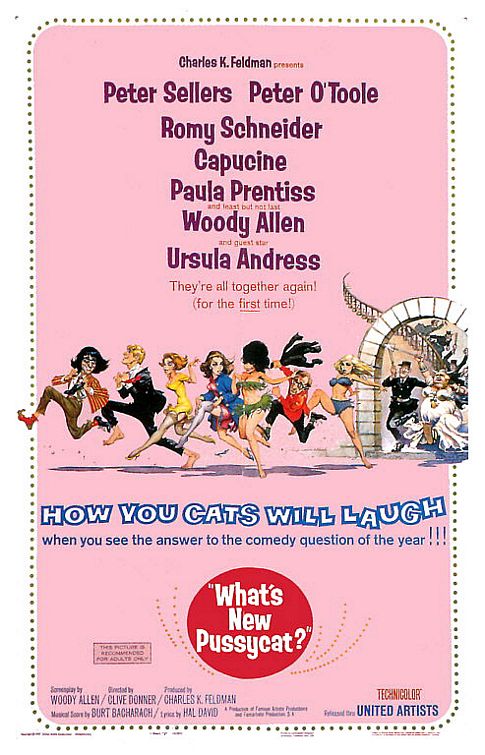
Frazetta started drawing for various comic books. By the early 1950s, he landed commissions with EC Comics, National Comics (including the superhero feature "Shining Knight"), Avon and several others where he collaborated with his artist friends Al Williamson and Roy Krenkel. While working on the Buck Rogers' covers for Famous Funnies, Frazetta began to work with Al Capp on his Li'l Abner comic strip. As well, Frazetta began to produce his own strip, Johnny Comet, while assisting Dan Barry on the Flash Gordon daily strip. In 1961, after nine years with Capp, he left for Harvey Kurtzman doing the parody strip Little Annie Fanny in Playboy magazine. In 1964, an art director in United Artists studios noticed one of Frazetta's magazine ads. and approached him with a commission to do the movie poster for What's New Pussycat. Frazetta accepted his offer and earned his yearly salary in one afternoon. Soon a number of other movie posters followed. Many publishers then approached Frazetta to produce paintings for paperback editions of adventure books, including the cover for the sword-and-sorcery collection Conan the Adventurer by Robert E. Howard and L. Sprague de Camp, published by Lancer 1966, that created a buzz. The demand for Frazetta's illustrations surged. He illustrated covers for paperback editions of classic Edgar Rice Burroughs books, and many other books. In 2003, a feature film documenting the life and career of Frazetta was released entitled, Frazetta: Painting With Fire.
Finally, a series of strokes impaired Frazetta's manual dexterity to a degree that he had to switch to left hand, until his death on May 10, 2010, in a hospital near his residence in Florida


-------
Andrea Alvin was born in 1949 in California. She graduated from the Art Center College of Design in Los Angeles (now of Pasadena) in the advertising design class of 1969. After graduation, she immediately began working as an animation designer and animator at film production houses making television commercials. She contributed creatively to many national and regional commercials such as Tootsie Roll, Chicken of the Sea, Six Flags, and numerous films for The Children’s’ Television Network. She later produced and directed three films for the Electricity exhibit at the Los Angeles Museum of Science and Industry.
In 1976, she began painting and exhibiting her unique art in various galleries and venues throughout California. In 1989, she joined ranks with her husband, John Alvin, creating their own design and illustration studio specializing in key art for movie posters. Andrea Alvin has contributed to the design and creation of ad campaigns for such movies as “Batman Returns,” “Batman Forever,” “The Mighty,” “Innocent Blood,” “Grumpier Old Men” for Warner Bros.; “Pinocchio,” “The Hunchback of Notre Dame,” “Hercules,” “Mulan” and “The Little Mermaid” for Disney Studios; and “Doc Hollywood,” “Dragonheart” and “Jurassic Park” for Universal. She is also known for the cover art for the MCA/Universal Classic videos of the Bob Hope, Bing Crosby, Claudette Colbert and Cecil B. DeMille collections.
Andrea Alvin co-illustrated books for Disney Publishing with John Alvin, including “Simba’s Pride,” various story books for “Tarzan,” “A Bugs Life,” “Toy Story,” “101 Dalmatians” and “Winnie the Pooh.” Together they created package art for Disney consumer products for supermarket food product lines geared toward children, ranging from Kellogg’s cereals, Blue Bunny ice cream, and fruit drinks and bottled water from Coke. In 2003, she moved from Los Angeles to New York’s Hudson Valley to pursue her fine art career. She continued to paint throughout her commercial career, and it is now her full-time occupation. Her work is influenced by Pop and Photorealism. After the untimely and sudden death of her husband, she is managing the estate and legacy of John Alvin.


-----------------------------------------------------------------------------------

Seriously good article.
ReplyDeleteExcellent article
ReplyDeleteVery informative. Thanks.
ReplyDeleteDear Ms. Novin:
ReplyDeleteWe have been reading your \"A History of Graphic Design,\" and we laud your efforts; it\'s very interesting and well written.
Would you please be so kind as to review and correct two errors in Chapter 47? The artwork for the movie poster Petulia was created by Ted CoConis (not Bob Peak). Also, though the art for Dorian Gray was commissioned by Bill Gold, the painting itself was created by Ted CoConis.
Ted will be painting his way into his 90th year next month, and it would be absolutely wonderful if you were to honor his creative efforts by giving him due credit for those two magnificent pieces of art.
Thank you very much.
Kristen CoConis