
The Jugendstil Movement
The Jugendstil movement is the name of an artistic Renaissance that appeared in the late 19th century in southern Germany. This emerging art (also known as art nouveau in France, modernismo in Spain, Sezessionsstil in Austria, Stile Liberty or Stile Floreale in Italy) was artistically elegant and stylistically revolutionary. The Jugendstil artists and designers were concentrated around Munich, and while their work stylistically appeared similar to that of the French Art Nouveau of the fin de siècle era, in essence their art was authentic both in terms of it aesthetics and also its Teutonic themes and mythology.


Cover of Jugend Magazine, 1916, No 1
The movement was strongly supported by Munchner Jugend an art magazine which extensively employed the graphic designs and illustrations of the Jugendstil movement, including black and white and tinted illustrations, hand lettering and even architectural and furniture design in many ways similar to the traditions of the Arts and Crafts movement. Jugend was established by Georg Hirth, a real Renaissance man and one of the foremost intellectuals in Munich whose books such as Aufgaben der Kunstphysiologie (Responsibilities of Art Physiology) in 1891 were influential in the development of German creative art during the turn of the century.
For twenty years, until his death, Hirth was Jugend's editor in chief. The first major artist that joined Jugend was Emil Hansen, later known as Emil Nolde. Hansen who had been teaching decorative design in St. Gall since January 1892 met Georg Hirth in 1895, and began to work as one of the main illustrators for the magazine.

German-Danish painter and print maker, Emil Hansen was born in Nole, a small village whose name he took as his own in 1902. He came from a family of peasants, and his simple and rural origin at the extreme north of Germany close to the Danish border, influenced his work. He was connected with land, and its folk culture, which was half pagan half protestant. He was one of the most powerful exponents of Expressionism. Although he was a member of the Die Brucke group of expressionist painters, he remained a relatively isolated figure, due to his temperament and circumstances. His unique contribution to 20th century German Expressionism lies in the intense emotion of his radically simplified - sometimes grotesquely distorted - drawings, and vivid colours. At the same time he was one of the greatest watercolourist painters of flowers. His most famous works include The Prophet He loved ancient Germanic legends, and he used them in his works.


Initially sympathetic to National Socialism, Nazis nevertheless confiscated 1,052 of his works, more than from any other artist. Prohibited by Nazis from painting in 1941; worked secretly in watercolor. His studio in Berlin, with archive of his prints, was destroyed by bombs in 1944.


Initially sympathetic to National Socialism, Nazis nevertheless confiscated 1,052 of his works, more than from any other artist. Prohibited by Nazis from painting in 1941; worked secretly in watercolor. His studio in Berlin, with archive of his prints, was destroyed by bombs in 1944.

Children of the Woods, 1911

Tingel, Tangel II. 1907

Der Pflüger. 1911.

Ernst Haeckel (1834-1919), a contemporary of Darwin, was a physician, anatomist, zoologist, naturalist, biologist and last but not least a master visual communicator. Haeckel studied under Carl Gegenbaur at the University of Jena for three years, earning a doctorate in zoology, before becoming a professor of comparative anatomy at the University of Jena, where he remained 47 years, from 1862-1909. Between 1859 and 1866, Haeckel worked on many invertebrate groups, including radiolarians, poriferans (sponges) and annelids (segmented worms).

During a trip to the Mediterranean, Haeckel named nearly 150 new species of radiolarians.Influenced by the German Romantic Movement, his pursuits included a medical doctorate, professorship of zoology, studies in biology, taxonomy, lecturer, and painting. Although Haeckel's ideas are important to the history of evolutionary theory, and he was a competent invertebrate anatomist most famous for his work on radiolaria, many speculative concepts that he championed are now considered incorrect. For example, Haeckel described and named hypothetical ancestral microorganisms that have never been found.
However, not all of Haeckel's speculations were incorrect, when Darwin first published On the Origin of Species by Means of Natural Selection (1859), no remains of human ancestors had yet been found, but Haeckel postulated that evidence of human evolution would be found in the Dutch East Indies (now Indonesia), and described these theoretical remains in great detail. He even named the as-of-yet unfound species, Pithecanthropus alalus, and charged his students to go find it. One student did find the remains: a young Dutchman named Eugene Dubois went to the East Indies and dug up the remains of Java Man, the first human ancestral remains ever found. These remains originally carried Haeckel's Pithecanthropus label, though they were later reclassified as Homo erectus.

Darwin’s 1859 book On the Origin of Species had immense popular influence, but although its sales exceeded the publisher's expectations, it was a long and difficult technical book with few illustrations. Haeckel's Natürliche Schöpfungsgeschichte, published in Berlin in 1868, and translated into English as The History of Creation in 1876, was frequently reprinted until 1926. did a great deal to explain his version of "Darwinism" to the world. His next book Kunstformen der Natur. Art Forms of Nature, originally published in two volumes, in sets of ten between 1899 and 1904 consists of 100 lithographic and autotype prints of various organisms, many of which were first described by Haeckel himself. Olaf Breidbach,the editor of modern editions of Kunstformen, has suggested that
(Art Forms of Nature) was not just a book of illustrations but also the summation of his view of the world.

The over-riding themes of the Kunstformen plates are symmetry and organization. The subjects were selected to embody organization, from the scale patterns of boxfishes to the spirals of ammonites to the perfect symmetries of jellies and microorganisms, while images composing each plate are arranged for maximum visual impact.
Kunstformen der Natur became very influential in early 20th century art, architecture, and design. In particular, many artists associated with Art Nouveau were influenced by Haeckel's images, including René Binet, Karl Blossfeldt, Hans Christiansen, and Émile Gallé. One prominent example is the Amsterdam Commodities Exchange designed by Hendrik Petrus Berlage, which was in part inspired by Kunstformen illustrations.

Hans Christiansen is considered one of the key figures in German Jugendstil. His artistic vision and bold creativity had a significant influence on the German graphic design. Christiansen worked as decorative painter apprentice in Flensburg during the 1881-85 period, and then joined a decoration firm in Hamburg for the next two years. in 1887, he went to Munich to study, and two years later traveled to Italy to expandhis artistic horizon. After his return he began to teach at a technical college in Hamburg. He was also workind as a freelance decorative painter and was actively involved in promoting the "Volkskunst-Verein", with the aim to reform the German graphic design in accordance with the achievements of the British Arts-and-Crafts movement.
He visited Chicago in 1893, where he saw glass works by Louis Comfort Tiffany, that had a great impression on him. Next he moved to Paris, and studied painting at the "Academie Julian" over the 1896-99 period. During this time, he created a number of cover designs for Jugend and became renowned as a great decorative painter during the 1920s.

Cover design for Jugend Magazine, 1896

L'Heure du Berger, 1900s

Hugo Höppener, Known as Fidus (1868 - 1948) was the son of a confectioner in Lübeck. Early in life, he discovered his artistic talent, and at18 he joined an artists commune in Munich, led by Karl Wilhelm Diefenbach, the so-called "apostle of nature", whose Lebensreform (life reform) movement critiqued and rejected industrialization and urbanization, promoting a vegetarian diet, clothing reform to free people from physically constricting fashions, and Freikörperkultur (nudism). He was a pioneer of the peace movement, life in harmony with nature, abolition of monogamy, and rejection of all religions. His philosophy appealed enormously to the young Höppener, so much so that for Diefenbach's sake he served a brief prison sentence for public nudity, earning him the nickname Fidus ("faithful").

Die Ersten Menschen, (the first human), 1908
Fidus moved to Berlin in 1892 and set up another commune, while working as an illustrator for the magazine Sphinx. He created many decorative drawings, book designs, and posters which were informed by German mythology, and he often combined mysticism, eroticism, and symbolism in Jugendstil. He was one of the first artists to use advertising postcards to promote his work. Although, he joined the Nazis in 1932, they seized his work in 1937 and prohibited the sale of his images. He died in 1948 relatively forgotten, but was rediscovered in the 1960s.

An advertisement for a vegetarian restaurant in Berlin. 1900

Kommune, 1900

Ernst Barlach ( 1870 – 1938) was a German expressionist sculptor and graphic designer. He was born in Wedel in Holstein. In 1888 he attended a vocational school in Hamburg, and two years later he entered the Dresden 'Akademie', where he continued to study sculpture and became Robert Diez's master student. He then traveled to Paris in 1895 and 1897, and to Russia in 1906. In 1910 he settled at Güstrow (Mecklenburg), Germany, and had his first exhibition at Paul Cassirer's in Berlin in 1917. Two years later, he became a member of 'Preußische Akademie der Künste' in Berlin. In 1930 a retrospective of Barlach's sculptures and graphic designs was exhibited at the 'Preussische Akademie der Künste' in Berlin.

From 1928 onward Barlach created many anti-war sculptures which reflected his experiences of the war. His pacifist attitude was opposed vehemently during the Nazi era. In particular, when the city of Magdeburg commissioned the Magdeburger Ehrenmal (Magdeburg cenotaph) as a memorial of World War I, Barlach created a sculpture with three soldiers of different ages, all standing in horror in a cemetery, flanked by a mourning widow covering her face in despair and a skeleton wearing a German army helmet. Barlach added a figure of himself as a civilian with his eyes closed and blocking his ears in in despair. The monument was very controversial with the right wing nationalist , some of whom argued that the soldiers cannot be Germans, since they are not acting heroic. Finally, under their pressures the sculpture was removed. Barlach's friends rescued the sculpture and hided it until after the war, when it was returned to the Magdeburg Cathedral. In 1936, Nazis confiscated his works as "degenerate art", and he himself was prohibited from working as a sculptor.

Aus de Walpurgisnacht, Woodcut, 1923

Julius Klinger (1876- 1942) was born in a Jewish family in Dornbach near Vienna. He his first job at nineteen with a Vienna fashion magazine, Wiener Mode, in 1895. Where he met his teacher Koloman Moser, who later recommended him to the Meggendorfer Blätter. He moved to Munich, in 1896 where he worked as an illustrator for the Meggendorfer Blätter, and a year later to Berlin where he contributed to Jugendstil magazine until 1902. He also worked as a commercial graphic artist during 1897-1915.

Poster for the Johannisthal airfield in Berlin, Johannisthal Airfield Daily Flights If the Weather Permits, 1912
Collaborating with printing house Hollerbaum und Schmidt, Julius Kilinger's international reputation as a creative poster designer grew, and in 1912 he designed the above poster for the Rund um Berlin air show in Johannisthal. The poster was a creative advertisement for daily flight, in which Klinger let the viewer to create in his imagination the aircraft of his choice. In Berlin he also contributed to Das kleine Witzblatt, Lustige Blätter and Das Narrenschiff, humorous magazines.

Artist Poster, for Hollerbaum & Schmidt Entwurf print company, 1900


Klinger's posters were sophisticated, enigmatic and aesthetically stunning.

Advertisement for the "Tabu" cigaret, 1919

Advertisement for the "Tabu" cigarette, 1919
Over the 1918-19 period, Klinger designed an advertising campaign for the "Tabu" cigarette company that used rolling paper, in Vienna. His campaign strategy was ahead of its time, encompassing small newspaper ads, billboards, painted firewalls, construction site fences and other venues.
After his last poster for the Ankerbrot-Werke factory, a Jewish-owned company in 1937, the company was confiscated by the Nazis in 1938. According to Viennese police records, Klinger was scheduled to be deported to Minsk on June 2, 1942. It is believed that he was deported and was killed on that year.

Otto Eckmann (1865-1902) was born in Hamburg. A painter, graphic artist, typographer, and crafts designer, he was a leading exponent of German Jugendstil. After studying at the Hamburg Kunstgewerbeschule, he moved to Munich, where he studied painting at the Art Academy. He worked as a painter until 1894, and then he devoted himself exclusively to graphic design and crafts, especially embroidery designs.

Otto Eckmann, Embroidered panel design, 1900
Otto Eckmann was the first Jugendstil artist to be invited to Darmstadt by Grand Duke Ernst Ludwig of Hesse-Darmstadt. In 1893, seven years before the artists' colony was founded on the Mathildenhöhe in Darmstadt, the Grand Duke commissioned him to design his study in the Neues Palais on Wilhelminenplatz. From 1895 Otto Eckmann produced illustrations for the journals "Pan" and "Jugend". A year later, he began to teach at the Kunstgewerbeschule in Berlin as a professor of applied art.

Cover of the magazine 'Jugend', No. 14, 1896


Jugendstil typefaces: Eckmann-Schrift designed by Otto Eckmann in 1900
One of the distinguishing features of Munchner Jugend was the extensive use of original hand lettering and unique type design in their covers, titles and advertising content. The magazine was lavishly decorated with black and white and colored illustrations, decorative borders and humorous vignettes. Around 1900, Otto Eckmann, like Peter Behrens, designed a Jugendstil script. Eckmann script revolutionized typography. Influenced by neither antiqua nor Fraktur, the Eckmann script was what was known as a bastard script to be construed at will by typesetters, a principle entirely in accordance with the formal intention underlying Jugendstil. Also. like Peter Behrens, Otto Eckmann worked for AEG (Allgemeine Elektrizitäts-Gesellschaft), designing trademark logos for their products.
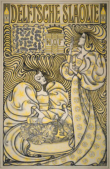
In the Netherlands Jan Toorop who had worked in various styles, including Realism, Impressionism, and particularly Symbolism was gradually drifted towards Jugendstil. The best-known example of his work is the above poster for 'Delftsche Slaolie' (Delft Salad Oil) in 1894. The litho was printed in various colour combinations.
Jugendstil rejected the traditional forms of the nineteenth-century "Gründerzeit", trying to encompass all aspects of life and synthesizing architecture and visual art, with nature as its template and the total celebration of emotions in its works. It encompasses all forms of architecture and art: industrial facilities, elevated-train systems, villas, churches, as well as the interior design of bars and coffeehouses. As a comprehensive “life-reform movement”, it permeated all aspects of day-to-day life, breaking down the borders between high and low art and between free art and arts and crafts.

 |
Winged female statue by Othmar Schimkowitz on the roof of Otto Wagner's Austrian Wiener Postsparkasse building Otto Wagner was the leading figure of the Viennese Sezession. The Wiener Postsparkasse, his most famous piece of work, considered to have paved the way for Functionalism. The entire interior furnishings of this post office bare Wagner’s signature. Even Wagner’s decorative elements are functional. His pupil, Joseph Maria Olbrich, who was soon to join the colony in Darmstadt, designed the Sezession building known as the Temple of the Movement |
 |
The Wienzeilenhaus by Otto Wagner |
 |
Othmar Schimkowitz angel at Otto Wagner church |
 |
On behest of the Grand Duke of Hesse, Ernst Ludwig the young architect Wilhelm Jost designed several bathhouses that are tremendously in harmony with their city surroundings. A wonderful example of Gesamtkunstwerk in . And step by step, from 1901 to 1912 there was a 'Sprudelhof' embedded in a complex of parks, ponds, fountains, colonnades, a theater, bathhouses where one could bathe and Resources houses where one could orally take. The salty stuff, to himself |

|  |

|
 |
 |
Hans Dieters House by Olbrich built in 1900: an interesting Art Nouveau villa in the Mathildenhöhe, Darmstadt. Darmstadt, the Mathildenhöhe artist colony was brought about by the grand duke Ernst Ludwig of Hessen. Amongst others, he appointed Peter Behrens of Munich and Joseph Maria Olbrich of Vienna patrons of Darmstadt to enliven the region by propagating the Arts and Crafts movement. Artists were able to buy property at very low cost to build houses. While these were to serve as model houses during exhibitions, they were a place for the artists to live out the full range of their craft. |
 |
“We must build a city, a whole city! Anything less would be pointless! The government should give us [...] a field, and there we shall create a world. To build a single house means nothing. How can it be beautiful if an ugly one stands next door? What good are three, five, even ten beautiful houses […] if the armchairs inside are not beautiful or the plates are not beautiful? No – a field; nothing less will suffice. A broad, empty field; and then we shall show what we can do. From the overall design down to the last detail, all governed by the same spirit, the streets and the gardens and the palaces and the cottages and the tables and the armchairs and the lamps and the spoons all expressions of the same sensibility, but in the middle, like a temple in a sacred groove, a house of labour, both artists’ studio and craftsmen’s workshop […].” (Joseph Maria Olbrich, quoted in: Hermann Bahr, “Ein Dokument deutscher Kunst”, in: Bildung. Essays, Leipzig 1900, p. 45 f.)The co-founder of the Vienna Secession and artistic director of the Darmstadt Artist Colony, Joseph Maria Olbrich, set out to tackle the task in Darmstadt armed with this vision. The Lebensreform around 1900, the unity of art, architecture, interior decoration and life are the central themes of those seven artists, who made the colony which was to be founded the subject of their first exhibition “A Document of German Art”: they presented eight individually designed, completely furnished artist and private dwellings, the studio building, the “Temple of Work”, and a number of temporary structures including a playhouse, a restaurant, the “House of Surface Art”, the entrance portal, and a flower-house. The Darmstadt Artist Colony opened on 15 May 1901 with the official, highly symbolic inaugural play “Das Zeichen” based on an idea by Peter Behrens, who also wrote the commemorative publication “Festivals of Life and Art” |
 |
| The Heimbach power plant, commissioned on August 8, 1905 is one of the most beautiful art nouveau style buildings in Germany. |
 |
 |
 |
Baischstraße. Hermann Billing (1901/02) |
 |
A house at Lundvej 39 in Varde Denmark in Jugendstil style -- 'Skonvirke' in Danish |
 |  |
 |
Luther Church (1907), Designed Robert Curjel and Karl Moser |
 |
Christian Rothfuß: Mietwohnhaus (1904), Sophienstraße 136 |
 |
One of the best examples of Art Nouveau in Switzerland, Paulskirche, a Reformed Church in Bern, built by Swiss architect Karl Moser in 1902 |
 |
The 29 avenue Rapp is a singular, and exuberant, work of art. Winner of the façade award of Paris in 1901, the building is indeed a real catalogue of all kinds of patterns: flowers, animals, motives, persons. |
 |
Lyon born architect Jules Aimé Lavirotte, together with ceramist Alexandre Bigot created this unique and striking apartment building a mere 300 metres from the Eiffel Tower in 1901. This was not the only building that Lavirotte designed for the 7th arrondissement but certainly his most extravagant. It is a work of art and also contains some innovative features including double walls with an airlock to provide soundproofing and an early form of reinforced concrete, whereby Lavirotte had the hollow bricks filled with iron and concrete in the same way that Besser Blocks are utilised. |


 |
| The woman's head of the Lavirotte building The whole facade is decorated, but the main door is guarded by two small figures, as well as a woman's head wearing a bun, representing Madame Lavirotte. |
 |
The statues of Parisian buildings are numerous, nevertheless, in general there are three main categories: caryatids, Atlanteans and cherubs. Caryatids refer to statues of women, most often dressed in long tunics and Atlanteans are their male versions. The cherubs, are the famous little angels represented naked and plump, also called cherubim. The Atlantis and Caryatids of the rue de Grenelle Rue de Grenelle. This is a duo of cariatide and Atlantis, under the balcony of the 2nd floor of number 148. The female figure, looking youthful, turns her eyes outward, while her male counterpart seems concentrated on the job, his face almost glued to the wall! 148 rue de Grenelle, 75007 |
 |
The Atlanteans of Crimea Street Two Atlanteans with protruding muscles seeming to work on the balcony of the third floor, of the facade of this building. One of the men handles the chisel, while the other seems to apply cement with a trowel, two unusual positions for such ornamental statues. 97 bis rue de crimée, 75019 |
 |
The Atlantics of Saint-Roch Street Among the most beautiful Atlanteans of Paris, those of the Saint-Roch building represent a mature man and a younger man with virile torsos. They adorn the façade of the Société des cuisiniers de France whose building was built in 1917 by architect Bruno Pellissier. 45 rue Saint-Roch, 75001 |
 |
The caryatids of the rue d'Abbeville At 16 rue d'Abbeville in the 10th arrondissement, These two magnificent Caryatids in are located at the corner of the rue du Faubourg-Poissonnière, on a building built in 1899 by the architect Georges Massa. Very graceful with their light drapes, they surmount the window overlooking the reception room of the first floor. |
 |
Alberta iela 8 1903., Mihails Eizenšteins It was in the spirit of art nouveau that the first professional Latvian artists were first recognised and appreciated. The art nouveau gems of Riga were created at a time when Riga, as the western “periphery” of the Russian Empire, enjoyed an economic upswing: Riga was home to entrepreneurs and engineers, educated in St. Petersburg, Moscow and the European metropolises, who succeeded at attracting German, Russian and Jewish capital; also, hope- and ambition-filled artists had returned here from their studies. This enabled the boundless imagination of the architects Konstantīns Pēkšens and Wilhelm Bockslaff and the building engineer Mikhail Eisenstein (the father of the legendary film director Sergei Eisenstein): the facades of the buildings are overflowing with decorative elements; above the cornices one finds obelisks, sphinxes, lions, vases, flowers and everything else that characterises abundance and celebration of life. |
 |
| Art nouveau in Latvia is closely connected to national romanticism, which is why some buildings feature not just the decorativism so typical for Europe, but also refer to Latvian spiritual values. Designers of the typically national romanticist buildings –Eižens Laube and Jānis Frīdrihs Baumanis – are still viewed as trailblazers of national culture. |

 |
Strēlnieku iela 4a 1905., Mihails Eizenšteins |

 |
Mikhail Eisenstein: Apartment building (1903), Elizabetes iela 10b |
 |
Rūpniecības iela 1 1903, Riga |
 |
Alberta iela 6 1903., Mihails Eizenšteins |
 |
Alberta iela 12 1903., Konstantīns Pēkšēns, Riga |
 |

|
 |
Building in the corner of rue de l'église and la place Etienne Pernet n°24 (Paris 15e arrond.) - Art Nouveau 19O5 - architect Alfred Wagon - Detail of the corner in rotunda of the floors. |
 |
National Opera House Tunis |
 |
National Opera House Tunis |
 |
| Details of an art nouveau building in the center of Tunis |

 |
Hotel de la Paix Tunis |
 |
Hotel de France , Tunis |
 |
The building located at number 9 of Charles-De-Gaulle Street in Tunis was built for the Italian lawyer Francesco De Guidi during the years 1903-1906 |
 |
Abita Buildings, 40 and 42 Oum Kalthoum Street, Tunis |
In 1896, two posters, Kunst-Anstalt for Modern Plakate and Die Alte Stadt, both by Otto Fischer was exhibited in Dresden. Otto Fischer (1870-1947) studied at the Dresden Academy, under Preller and Hermann Prell. Over the period 1894- 1914 he traveled throughout Europe and America, and then started to teach as a Professor of Art at the Dresden Academy.

Many art historians consider the above Fischer posters as the very first artistic attempts by the German graphic designers. With its reduction of naturalism and emphasis on flat colors and shapes, the first poster on the left was an advertisement for Wilhelm Hoffmann’s Studio in Dresden which printed modern posters. It depicts a couple studying intensely a large lithograph. The background is a very austere setting. The woman, dressed in a dark green shirt and black skirt, is siting on white wooden chair. Her male companion with a dark hat and a smoking cigar between his lips is standing behind her. The man's hat is a visual complement to the woman's dark skirt. The focal point of the poster is supposed to be the lithograph, which shows the image of two girls in a garden scene, but Fischer by choosing an orange headscarf for her female secretly invites the viewer to compare his poster against the traditional poster that the couple are viewing. The second poster shows a woman in her traditional costume in front of a Roman bridge towards an old town. The mouth of the bridge echoes the sleeves of the female character and her oval face, and these three geometric curved surfaces create a powerful overall balance. The strong and balanced flat compositions, vibrant and efficient uses of colors, and intelligent placements of text were the hallmarks of Fischer's posters.
Nine years later the 'Plakatstil' or "Poster style" movement revolutionized the pioneer works of Otto Fischer . There were two schools of Gebrauchsgrafik in Germany at the time, Ludwig Hohlwein in the southern city of Munich and Lucian Bernhard in the northern city of Berlin were the leaders of the new movement. Hohlwein's high tonal contrasts and a network of interlocking shapes and Bernhard's simple and bold designs made their works instantly recognizable. With few but vivid colours, a sharp, non-cluttered, minimal composition and bold, clear types the two designers produced some immortal works of art. The Plakatstil became very influential and had a considerable following on the graphic design scene in Germany.

Ludwig Hohlwein (1874- 1949) was born in the Rhine-Main region of Germany. He was trained and practiced as an architect until 1906 when he switched to poster design. He became the most masterful and accomplished German graphic designer of the 20th century. Early on in his career, Hohlwein developed his unique and exquisite style, which little changed over the next forty years. His compositions were powerful, ingenious and precise and benefited from his superb drawing skill. His works are associated with Munich and Bavaria in the southern Germany, and are characterized by soft and elegant pallet of colors. He utilizes the play of light and shade to define and substantiate his compositions which are of photographic qualities, and are testaments to his deep and intuitive understanding of graphical and architectural principles.


A large segment of Hohlwein's portfolio was executed over the 1912- 1925 period. These are the best posters created in the most important phase of his artistic life. His sharply defined forms, bright colors and a jovial and optimist outlook in his distinctive style are the hallmarks of this phase of his career. By 1925, he had already designed 3000 different advertisements. He had became the best-known German commercial artist of his time.


 |
And there, in old Düsseldorf on the Rhine
For the first time, art stepped seriously into your life.
You, who were captivated by her beauty,
And took up the study of her with a
religious zealotry
Oh, what a blessed happiness, what a rich time!
So completely in awe of her deliverance
With virtuous, like-minded colleagues,
Only striving towards the highest of ideals.
There, the bands of friendship were first woven,
Which remained tight and with time,
only became tighter.
Max Hertwig, “About Myself ” March 11, 19461
|
Max Hertwig (1881-1975) was born in Bunzlau, Silesia in 1881 to a merchant family. Upon the completion of his high school education his father died unexpectedly, and Hertwig was forced to look for work in order to support the family. He landed a job at L. Fernbach, a local printer, as a lithographer’s apprentice. This was a serendipitous occasion for him; since with a cutting edge innovative printing technologies, Fernbach provided Hertwig with a great opportunity to develop his technical knowhow as well as to sharpen his artistic skills. In mid October 1900 Hertwig left Bunzlau and moved to Westphalia, where with a strong recommendation from his former employer Fernbach, he was offered a job as lithographer for Rick & Geldsetzer, a packaging company, in the small city of Iserlohn. Hertwig was among the first garphic designers in Germany who got a training in a college. He studied at the Düsseldorfer Kunstgewerbeschule --Düsseldorf School of Arts & Crafts, during 1902-1906, at the the time when the new director Peter Behrens was overhauling the curriculum into the revolutionary style of German Jugendstil. F. H. Ehmcke, the renowned graphic designer who was associated with the German Werkbund and the Bauhaus, mentored him along with Mies van der Rohe.
Ehmcke, together with F. W. Kleukens, Clara Möller-Coburg, and Hertwig founded the influential Steglitzer Werkstatt -- Steglitz Studio, in Berlin, the first graphic design studio in Germany and a major force in launching the career of graphic designers. Aided by Ehmcke’s recommendation Hertwig landed a job as the main graphic designer for the printing firm Bügen & Co. in Hannover. The firm specialized in apothecary packaging and promotional items. Hertwig's designs for Bügen & Co. packages were bold and innovative, establishing him as one of the leading graphic designers of the era.
 |
| Advertisement for Fagus, draft by Max Hertwig 1912 |


Hans Rudi Erdt (1883- 1918 ) along with Ludwig Hohlwein and Lucian Bernard is one of the main representative artists of the Plakatstil movement. He was born in South Bavaria. After leaving school he apprenticed as a lithographer in Munich. Later on, he enrolled at Kunstgewerbeschule, the art school of Munich. In 1905 he moved to Berlin where he became a commercial poster artist. During the 1914-18 period he produced war posters for the German government, and played a key role for the Reich Film Committee(war movie posters).

PROBLEM CIGARETTES. 1912.
Erdt uses the text simply to introduce a brand name, with a sense that it is the integral part of the layout, which is strikingly bold and aesthetically agreeable. He is very creative and elegant with his handwritten typefaces. His compositions are balanced and monumental. In 1912, he created the first advertisement for Nivea, and designed the poster " Silhouette of woman ". He was part of a generation of graphic designers who for the first time became specialized in commercial art around the late 19th and the early 20th centuries.

As a commercial graphic designer, Erdt worked for brands such as Opel automobile, and cigarettes such as Manoli and Problem. Posters of Hans Rudi Erdt play on the plot created by a highly simplified composition in which every detail has been carefully erased, and the placement of his enigmatic personalities, with their cynical, detached air about them. Sometimes they carry forced smiles, and at times they look anxious or withdrawn, these features create a dramatic ambiance, that render Erdt poster so immortal, and relevant. Perhaps Erdt's posters give us a reading of the mood of angst and despair in Germany and Europe during the Bismarckian era, which stemmed from a fear of technology, urbanization, and the crumbling of old values.


Ernst Deutsch-Dryden (1887 , 1938 ) was born as Ernst Deutsch, the son of a Jewish merchant from Szeged in Vienna, and as a graphic designer he put his mark on magazines, haute couture, movie costumes, erotica, posters and more. By his own account he studied at Angabe Schüler der Kunstgewerbeschule , School of Applied Art (now Universität für angewandte Kunst -- university of applied art), it is often erroneously claimed that he studied with Gustav Klimt, but his name is not in the list of the enrolled students at the school, but it is possible that he may have been an auditing student. He became renowned as a poster designer in Berlin in the years before the WW I. After the war, he returned to Vienna to design menswear and in 1926 joined a Berlin fashion magazine as an illustrator. During the 1930's, he ventured to the United States, continuing his career as a couturier and ending up in Hollywood. Celebrating a "lost world of elegance," Dryden's graphic design is enchanting, humorous, thought provoking, and artistic.

Deutsch-Dryden's meteoric surge of career started in Berlin; at the age of 23 he was already at the top of the German graphic scene, and was ranked along with Ludwig Hohlwein, Lucian Bernhard, Julius Klinger, and Hans Rudi Erdt. In 1912, Julius Klinger wrote of him; "If I have to talk about his personality, I cannot be objective, I do love his style too much. He is smart, funny and surprising; sometimes a bit disagreeable, which highlights his sweet Viennese appearances so pleasantly". By his elegant, snappy style of drawing, his graceful strokes, and his sometimes experimentally tentative solutions, he created stunningly powerful work of art such as the poster for "Salamander Shoes". By depicting three pairs of women feet, the artist's line of view is from beneath the "decorous" hem line, and by preserving the anonymity of the women he forces the viewer to admit his role -- the role of a voyeur.

During the war years, he continued to illustrate for the "Neue Freie Presse" and created numerous magazine advertisements. In 1919, he re-branded his work under the pseudonym "Dryden". Why he did so remains a mystery. His name change was accompanied by the creation of "Dryden. Workshop for interior design", establishing his own fashion and decorative studio. From 1921, he was exclusively represented by the fashion houses "Knize" (Fritz Wolff) and "Hello". Dryden's posters of Vienna period signed under the name Dryden, over the 1919-26 period, became quite different from his earlier Berlin period. The depressed economic climate in the young republic, was the main reason for the artists to detach themselves from the representations of pomp, luxury and vice. At the same time this poor climate forced all poster designers of this period to adhere to the commercial taste of their clients. In spite of this, still one can detect occasionally a flash of aesthetic genius in his posters . Stylistically, Dryden moved between art deco illustrations and caricature-like drawings with a narrative element.

In 1926, Dryden left Vienna for Paris where he took over the art direction of the magazine "Die Dame". At the same time he also designed for Coco Chanel and his most daring work as a graphic designer was appeared for "Bugatti", "Cinzano", "Canadian Club Whiskey" and the perfume "Eau de Vie". In Paris, he hired a Viennese lawyer, for his official request for name change, and finally on 3 July 1931 Ernst Deutsch's name was officially changed to Ernst Dryden.

The worsening economic conditions in Europe forced Dryden to emigrate to New York, in November 1933. Although early on he doubted that he would be successful, as early as March 1934 he wrote Hello: "The launch was so successful that now the people scrambling around me ..." He worked for major fashion houses such as Germaine Monteil , Saks Fifth Avenue, Macy's, Marshall Field & Co. Later on he moved to Hollywood, where he designed costumes for films. Dryden died in 1938, five days after Hitler's invasion of Austria, at his villa in Hollywood, West Los Angeles of a heart attack.
Fritz Rehm (1871 - 1928) is another German illustrator of the fin de siècle era. Unfortunately, not much known about his personal life. He studied art in Munich and opened up his own studio there at the end of the 19th century. His earliest known poster dates to 1896, and he was one of the few German artists represented in the Mâitres de l'Affiche for his 1898 poster. His earlier works were in Jugendstil style, but he gradually moved towards plakatstil, in which his talent flourished.

Advertisement for a pub, in Jugenstil c. 1898
Rehm's posters are imbued with a sense of drama, their quiet suspensions inform us that something is about to happen. In his poster for Hans Solfrank, a tobacconist, Rehm, playing with shadows and light, depicts a multi-faceted atmospheric image in which two distraught gentlemen are smoking in a waiting room. The body language of the gentleman, who is seated at the back; reveals a reflective sense of submission to a personal tragedy. He is turning away both from us the viewers and the other character in the poster who is looking at him with a kind of sympathy. Designed in the prevailing German fashion of the period, with flat colors and practically no outlines, Rehm takes his design one step further and shows more facial detail than was usual for the time. Rehm posters are testament to his artistic sensitivity and technical skills.


Emil Cardinaux (1877-1936), a Swiss graphic designer, was strongly influenced by plakatstil movement. In his posters he tried to adhere to the political ideals of Switzerland. His role models were Albert Anker (a Swiss painter and illustrator who has been called the "national painter" of Switzerland because of his strikingly romantic depictions of 19th-century Swiss village life) and Max Buri (1868-1915),a Swiss painter who belonged to the group of artists around Hodler whose styles characterized by bright colors and powerful lines. Cardinaux believed in the Swiss ideals of home, country, family, order and political independence as the main characteristics of democracy, which strongly were informed his posters. His artistic talent was particularly evident in the designs of his commercial posters.


Go to the next chapter; Chapter 32 - Pioneers of Advertisement Posters and Newspaper Layout
References
- Bernhard Lucian - Werbung und Design im Aufbruch des 20. Jahrhunderts, Plakate, Gebrauchsgrafik, Verpackungsdesign, Buchgestaltung, Schriftentwuerfe; concept by Hubert Riedel, texts by Hubert Riedel, Rene Grohnert, Karl Bernhard; Institut fuer Auslandbeziehungen e.V. (1999), Linienstrasse 155, D-10115 Berlin, fax +49-30-282 3331
- Hoffman Julius (Editor). Modern Style: Jugendstil/Art Nouveau 1899-1905, Arnoldsche Verlagsanstalt; Bilingual edition (August 25, 2006)
- Ulmer Renate (Editor) , Art Nouveau: Symbolismus und Jugendstil in Frankreich, Arnoldsche Verlagsanstalt GmbH (January 1, 1999), ISBN-13: 978-3925369575
- Van Roojen Pepin, Jugendstil, Pepin Press (August 31, 2006), ISBN-13: 978-9057680977
- Weill, Alain, The Poster a Worldwide Survey and History, G K Hall, 1985, ISBN 9780816187461
------------------------------------------------------------------------------------

This work is licensed under a Creative Commons Attribution-No Derivative Works 3.0 Unported License.
This work is licensed under a Creative Commons Attribution-No Derivative Works 3.0 Unported License.
Thankyou for this. This is the only posting in English I've found on Otto Fischer.
ReplyDeleteThank you very much for your comment. I noticed that Otto Fischer's name was not included in the table of contents, and thanks to your observation added it. I appreciate any other comments you may have. gN
DeleteDo you think the work of Ernst Haeckel influenced German Art Nouveau?
ReplyDeleteThank you. I have added a segment on Ernst Haeckel. Obviously his masterfully executed organic forms were very influential in the development of European Art Nouveau.
ReplyDeleteHello - I am writing a book on Julius Klinger and wonder where you found the images which you used... would you be kind enough to let me know? My email is karen@laffichiste.com. Many thanks in advance, Karen
ReplyDeleteDear Karen,
ReplyDeleteI wish I could help you with this request. Had I knew that I may get a request like yours, I'd made sure to keep a file on my sources. Unfortunately, I have published more than a million photos and in order to not exhaust all the available space on my hard drive, after any upload I clean-up my disk.
I understand that Google Image search engine allows you to enter an image to find various sources. If that search leads you only to my site, then that means that the pictures have been scanned by some of my students from various sources.
I hope this is of some help.
muchas gracias por td esta importante información..
ReplyDeleteAre you familiar with an illustrator by the name of Gert Gagelmann? Very little of his work seems to be available. He was active in Germany from the 1920s to the end of WW II.
ReplyDeleteAs you have already mentioned very little is known about Gert Gagelmann's life. We know that he was among the three illustrators that the Berlin publisher Erich Gutjahr Bildverlag commissioned to create a series of propaganda posters entitled 'Frauen schaffen für euch" (Women working for you) in WWII. Gagelmann is also known for his illustrations for fashion-magazines. Between 1924 and 1930, Gagelmann's fashion illustrations was published in "Deutsche Elite" that also contained works by Rolf Niczky, Jeanne Mammen, and Ernst Ludwig Kretschmann.
Deletehttp://pantorijn.blogspot.com/2014/10/frauen-schaffen-fur-euch-postcards.html
Deletehttp://pantorijn.blogspot.com/2014/10/frauen-schaffen-fur-euch-postcards.html
https://i.pinimg.com/564x/b4/6c/ba/b46cba1f5a69a53e867cd24584bcd74c.jpg
Thank you for the links. I noticed that the last link was an unsigned watercolour that has a disputed attribution history connected to it. In your considered opinion, does this watercolour bear enough stylistic characteristics to the known work of Gert Gagelmann to lead you to think that he may also be the author of this particular watercolour? I trust that you are well aware that there are many more images of watercolours much like this one available on the web. An extremely dubious attribution is often also attached to them on many sites. Your thoughts on this curious designation?
ReplyDeleteUnfortunately, the few works attributed to Gaglemann do not convey distinct stylistic features in terms of colour, composition, movements, or expression to create firm criteria for identifying his visual grammar or artistic vision.
Delete