Chapter 55; Design for Book Covers and Dust Jackets.
Traditionally, most manuscripts were covered in materials such as vellum or calf lather, but with the mass production of printed books, in the early nineteenth century, publishers began using cloth bound covers for their books. Given the need for transportation of the books from the printing firms to bookstores, publishers had to protect these delicate covers with book jackets. These early versions were simple functional dust jackets, which paid scarce attentions to the advertisement about the contents of the books. Most of these dust jackets were discarded by the bookstores upon receiving the books and thus very few of them have survived.
 |
Wrapper belonging to Friendship’s Offering for 1830. Image courtesy of
the Bodleian Library, University of Oxford, G. Pamph. 2920,2921, fol. 19r. As Mark R. Godburn informs us: The existence of this jacket gives the Bodleian the rather odd distinction today of having the jacket but not the book for the 1830 Friendship’s Offering and the book but not the jacket for the 1833 Keepsake. |
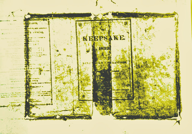 |
| Until the early 2009, the earliest known dust jacket was The Keepsake for 1833, an English literary annual issued in November 1832. This jacket was discovered in 1934 by the bookman and author John Carter. It was subsequently lost at Oxford University in 1951. |
The Keepsake, published by Longmans of London in 1832 was covered by the earliest known printed dust jacket. Fortunately, the English bibliophile John Carter photographed it, before being lost during transit to Oxford's Bodleian Library in 1952. Up to the last decade of the nineteenth century most of the jackets used typographical designs in buff-colored, with no illustration other than a decorative border around the title, sometimes printed in red. Some carried advertisements for other titles on the back from the same publishers. They usually covered a binding of gilt-stamped moiré silk.
Russian artist Aleksander Rodchenko and English illustrator Aubrey Beardsley were among the most influential early book cover designers. Beardsley created artwork for Henry Harland's popular "Yellow Book" series of the 1890s. The earliest protective wrapping in the United States is mentioned on the
Atlantic Souvenir for 1829, but the earliest dust-jacket in the United States is probably the one on
The Bryant Festival at "
The Century", published by Appleton in 1896. The dust jacket for The Shadow of a Dream, by William Dean Howell published in New York in 1890 is the first known dust jacket with illustration.
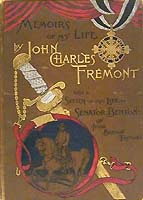 |
Frémont, John Charles. Memoirs of My Life, with a Sketch of the Life of Senator Benton by Jessie Benton Frémont. Chicago: Clarke & Co., 1887.
Brown cloth blocked in gold, black, silver, blue, and red on front; gold, black, blue, and red on spine; with beveled boards
|
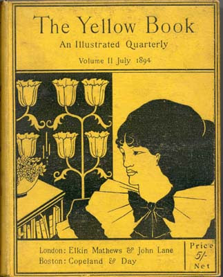 |
The Yellow Book: An Illustrated Quarterly. London: Elkin Mathews and John Lane, 1894-1900.
The Yellow Book was the brain-child of Beardsley. It was inspired by by the French decadent novels, which were often issued in yellow wrapper. Beardsley proposed a new illustrated quarterly dedicated to modern literature and art because "many brilliant story painters and picture writers cannot get their best stuff accepted in the conventional magazines, either because they are not topical, or perhaps a little risqué." John Lane agreed to publish the quarterly with Henry Harland as the literary editor and Beardsley as the art editor. The Yellow Book published some of the best authors and artists of the Nineties, often causing scandals to the conservative public.
The first issue of The Yellow Book provoked outrage. The Times referred to the "repulsiveness and insolence" of the cover; The Westminster Gazette remarked about the "Portrait of Mrs. Patrick Campbell" it would take "a short act of Parliament to make this kind of thing illegal."
|
As Richard Overell, in his magnificent preface to
Coloured Cloth Bindings Highlights from the Monash University
Rare Books Collection had written;
The publishers of the nineteenth century produced some very beautiful books. At the beginning of the century books were still being produced in much the same way as they had been since Caxton's time. A bookseller would purchase the copy for a book and arrange for it to be printed. He would sell it through his shop either in sheets or bound in paper boards or in a simple leather binding.
The purchaser would then have the sheets or the book bound in leather in a style to match the other books in his library.
In the early nineteenth century many revolutionary changes were introduced in the printing and book trades. Publishers assumed a greater role and they were one of the main forces behind the replacement of wooden presses by iron ones. Nineteenth Century American Education is often referred to as "The Common School Period." It was during this century that education went from being completely private to being available to the common masses. The rise of literacy was considered a prerequisite for the advancement of an industrial civilization. As Horace Mann, wrote in 1849
:"Those who have been accustomed to exercise their minds by reading and studying… have greater docility and quickness in applying themselves to work [and] greater appetite, dexterity or ingenuity in comprehending ordinary processes."
Book was regarded a the main instrument for advancement of literacy and education, as J. P. Quincy, wrote in 1876;
we may hopefully look for the gradual deliverance of the people from the wiles of the rhetorician and stump orator…. As the varied intelligence which books can supply shall be more and more widely assimilated, the essential elements of
every political and social question may be confidently submitted to that instructed common sense upon which
the founders of our government relied.
The new iron press technology reduced the production costs of books, but the leather bindery was prohibitively expensive. To reduce costs publishers decided to substitute leather with cloth, but finding a durable cloth that could compete with leather was a major barrier. Other technical problem was finding a suitable glue which would not discolor the cloth and at the same time fix it smoothly to the board; and finding a good match between the cloth and the ink so that the cover design of the book can be printed on the cloth. By the early 1820s these problems was partially resolved by pasting a paper label onto the spine or front cover. However, the industry found the suitable variety of cloth by the 1830s so that the cover design could be printed directly on the cloth bindings. Applying metal blocks, which were used to stamp designs on leather in the past, publishers began to transfer the cover design on the cloth bindings in the late 1820's. Cloth cover binding was now as versatile as leather, in blind, ink, and even in elegant gilt.
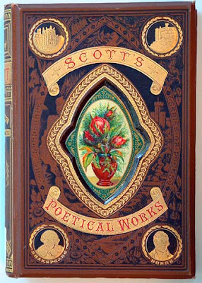 |
The Poetical Works of Sir Walter Scott.
Edinburgh: Gall and Inglis, 1870. PR 5305 1870,
This striking cover has a heavily stamped centerpiece containing an enameled image of a vase and flowers. The use of such elaborate cover designs diminished as publishers adopted the cheaper plain cloth boards and relied more heavily on the eye-catching components of the book jacket.
|
With the mass production of books the cover design gradually evolved, and the designers used various elements of design and typography to entice the readers to purchase a book. The evolution started with the early elegant leather bindings of the Grolier strap-work like Henry Noel Humphreys'
A history of the art of printing moved to Persian designs of books like James Grahame's
The Sabbath, then to floral designs of the romance novels such as Annie S Swan's
St. Veda's, and finally by the end of the century the art nouveau illustrations of books like Henry Van Dyke 's
Fisherman's luck, and some other uncertain things appeared.
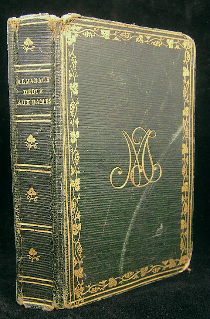 |
Almanach dedie aux Dames pour l'an 1809, issued Paris: 1809, le Fuel, de Launay.
A full leather binding, gilt-tooled boards and spine.
|
 |
| Théodore Faullain de Banville, Les princesses, 1875 |
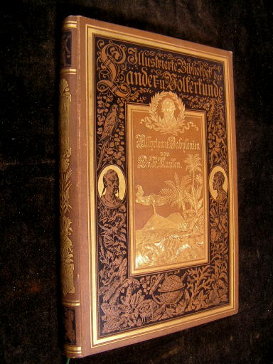 |
von Dr. Fr. Kaulen, nach den neuesten Entdectungen,issued Frieburg im Bresigau, Germany: 1885.
A late-19th century German history of the Assyrians and Babylonians in publisher's brown cloth with gilt and black stamped pictorials to spine and front board.
|
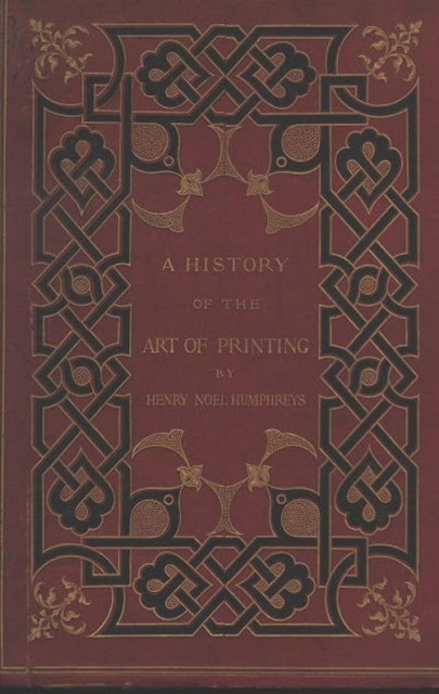 |
| Henry Noel Humphreys, A history of the art of printing from its invention to its wide-spread development in the middle of the 16th century : preceded by a short account of the origin of the alphabet and the successive methods of recording events and multiplying ms. books before the invention of printing / by H. Noel Humphreys ; with one hundred illustrations produced in photo-lithography by Day & Son, Limited, under the direction of the author. (London : Bernard Quaritch, 1867) |
 |
James Grahame, The Sabbath : Sabbath walks and other poems / by James Grahame ; illustrated by Birket Foster. (London : James Nisbet, 1857)
Blue cloth with bevelled edges and an elaborate Persian design in gil
|
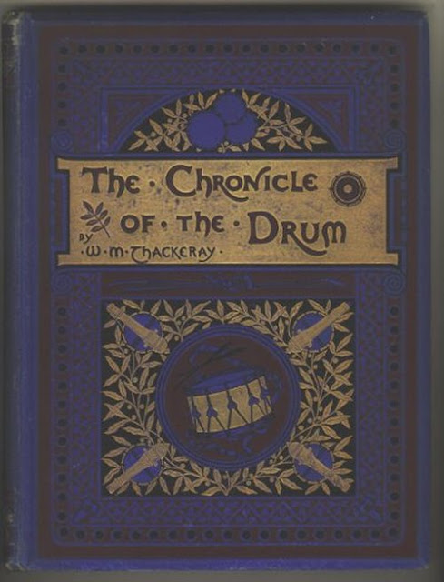 |
William Makepeace, The chronicle of the drum. (London : Frederick Warne & Co., 1886)
Dark blue cloth with design in red, black and gilt, showing a drum surrounded by cannons. In this design the integration of typography and decorative illustration is remarkable. |
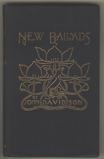 |
John Davidson, New ballads. (London : John Lane, The Bodley Head, 1897)
This was a uniform binding of black cloth with a minimalist art nouveau design in gilt of intertwining flowers and birds, with an elegantly composed typography |
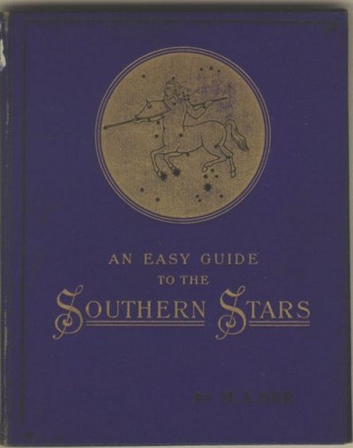 |
Mary Ackworth Orr, Southern stars : a guide to the constellations visible in the southern hemisphere. (London : Gall and Inglis, [1896])
A minimalist gilt design with a delightful typeface
|
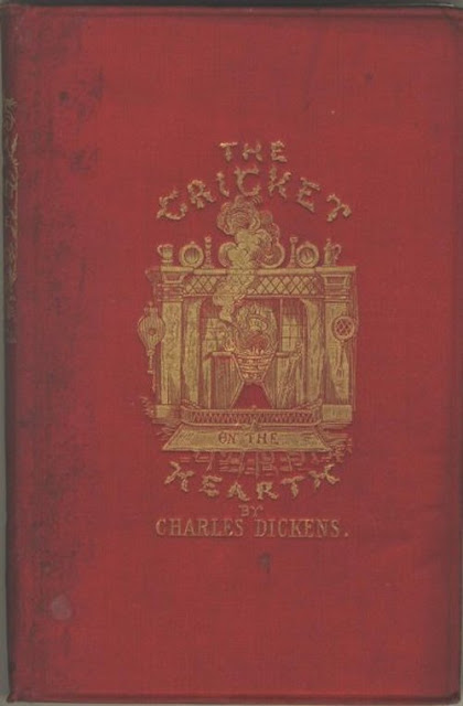 |
Charles Dickens, The cricket on the hearth : a fairy tale of home. (London : Chapman & Hall, 1886)
Red cloth with designs in gilt. This is a good example of an exquisitely designed gilt vignettes. |
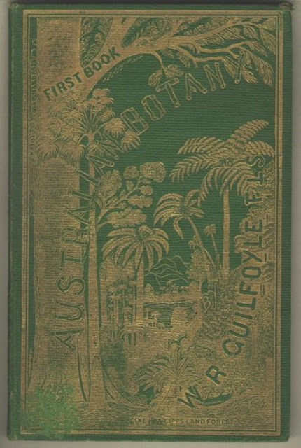 |
William Robert Guilfoyle, Australian botany : specially designed for the use of schools. (Melbourne : Samuel Mullen, 1878),
A beautiful school text-book cover on botanical education, illustrating a "scene in a Gippsland forest," with a gilt full-cover design and startlingly well integrated typography bound in green cloth, |
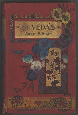 |
Annie S. Swan, 1859-1943. St. Veda's. (Edinburgh : Oliphant Anderson & Ferrier, [189-?])
Bound in red cloth with a design in blue, black, yellow and gilt. The design incorporates pansies, a flower much favoured by the artists of the coloured book-cloth. |
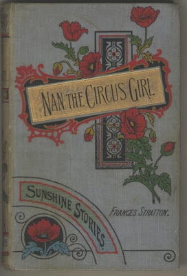 |
| Frances Stratton, Nan the circus girl. (London : John F. Shaw, [1900?]) |
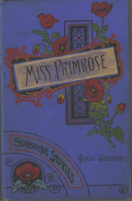 |
| Agnes Giberne, Miss Primrose. (London : John F. Shaw, [1904?])
These are romances in the "Primrose stories" series. They have uniform designs in black, green, yellow, red and gilt. |
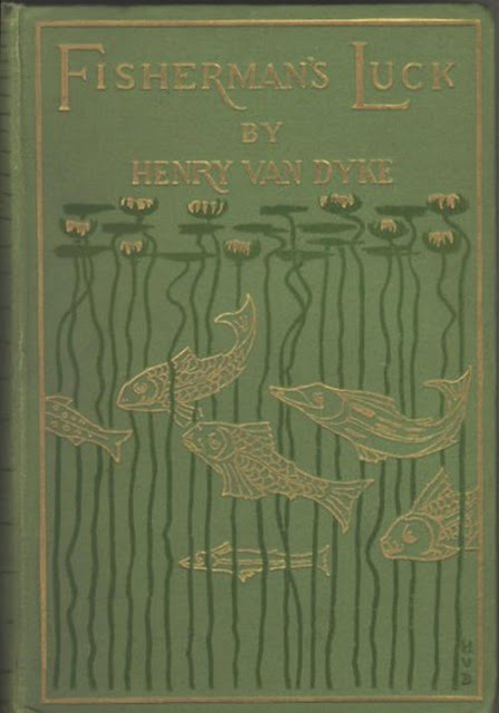 |
Henry Van Dyke, Fisherman's luck, and some other uncertain things. (London : Sampson Low, Marston, 1899)
Light green cloth, with a design in dark green and gilt, of fish swimming among the stems of water hyacinth. The design by Henry Van Dyke, the author. is a beautiful example of art nouveau style.
|
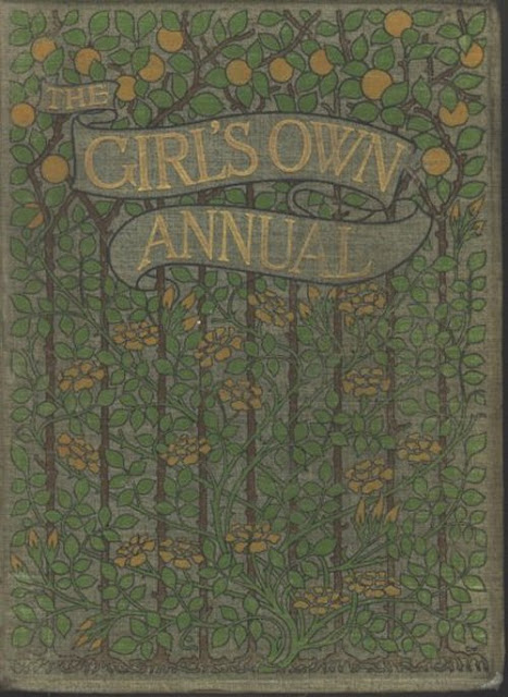 |
The Girl's own annual. (London : The "Leisure Hour" Office, 1880-1950)
This art nouveau style design of vines and espalier lemon trees is influenced by William Morris and is bound in a light green cloth, printed in dark green, brown yellow and gilt.
|
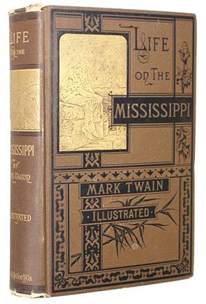 |
Mark Twain, Life on the Mississippi, James R. Osgood & Co, 1813
First American Edition in brown cloth stamped in black & gilt. |
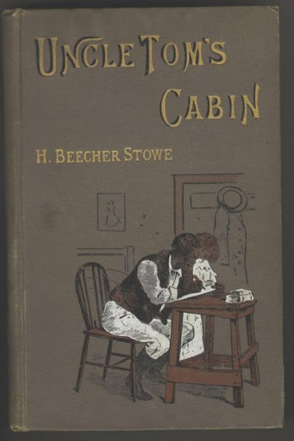 |
Harriet Beecher Stowe, Uncle Tom's cabin , (London : Ward, Lock, [1902])
Fawn cloth with design in brown, black, white and gilt, showing Eva and Tom writing a letter to Tom's wife. |
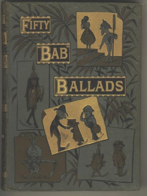 |
William Schwenck Gilbert, Fifty "Bab" ballads : much sound and little sense / by W. S. Gilbert ; with illustrations by the author. (London ; New York : G. Routledge, 1884)
Grey cloth with design in black, brown and gilt. This design by Gilbert, of the Gilbert and Sullivan comic-operas' fame, anticipates a Dadaist composition. |
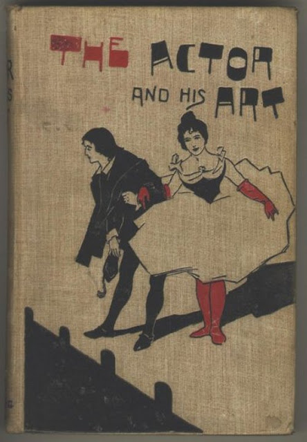 |
Stanley Jones, The actor and his art : some considerations of the present condition of the stage. (London : Downey & Co., 1899)
A remarkably well executed design with a bold typography and brilliant minimal color composition . |
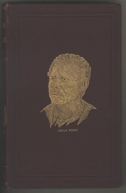 |
James Bonwick, Daily life and origin of the Tasmanians. (London : Sampson Low, Son, & Marston, 1870)
The designer has created a powerful poetical image of Lalla Rookh or Truganini, the last of the Tasmanian Aborigines, on brown cloth with design in gilt, for a book of her poetry.
|
Daniel Mróz, and Polish Book Covers
Daniel Mróz (1917-93) was born in Kraków, as one of two sons of Stanisław Mróz, a journalist at "Ilustrowany Kurier Codzienny", one of the largest polish newspapers of 1930s. After graduationg from university, Mróz studied for two years at School of Artistic Crafts in Kraków.
After the invasion of Poland by Nazi Germany in September 1939, his father was arrested by Nazies for publishing an underground Polish newspaper. In 1940, his mother died, and a year later, his father died at Auschwitz-Birkenau concentration camp, allegedly due to pneumonia.
After the war ended, Daniel Mróz illegally crossed the German border in 1945, to find his girlfriend, who had been taken to Ravensbrück. Upon his return to Kraków, he studied from 1946 at Fine Arts Academy where one of the professors, Marian Eile, also the founder and editor in chief of Kraków weekly Przekrój, offered him a job as an illustrator and a graphic designer. Mróz received a diploma in graphic design with honors in 1952.
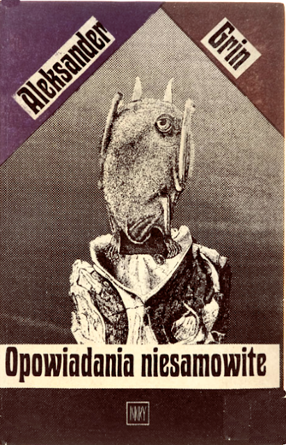
During the 1951-1978 period, Mróz worked as the illustrator and cover designer for "Przekrój", developing his distinct style using humor and polish historical references. At the same time, he worked as a set designer for various theater companies in Poland. He also had several shows of his work in Poland and abroad. However, it was his book cover deigns for authors like Stanislaw Lem and Sławomir Mrożek, as well as Franz Kafka, Jules Verne, Jerzy Szaniawski, Jan Stoberski, Ludwik Jerzy Kern, Stanisław Jerzy Lec that brought him fame.
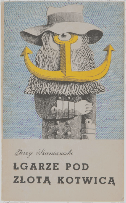 |
Daniel Mróz, cover for Liars Underneath the Golden Anchor, 1983
|
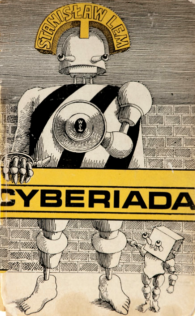 |
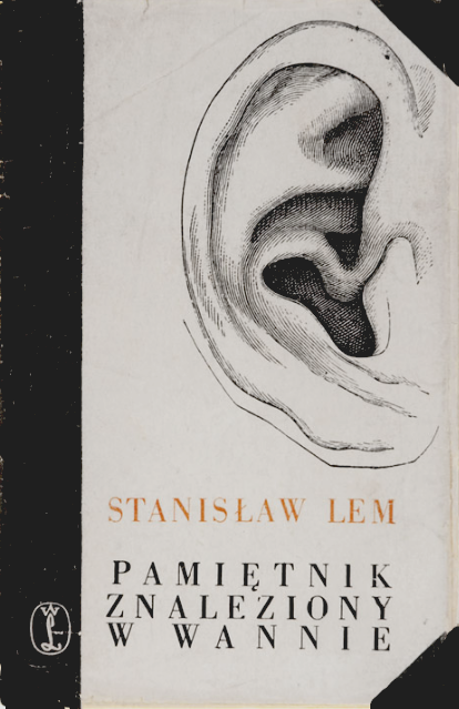
Daniel Mróz, cover for The Cyberiad, 1972
|
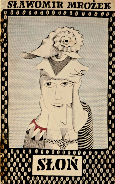 |
Daniel Mróz, cover for The Elephant, 1957
|
 |
|
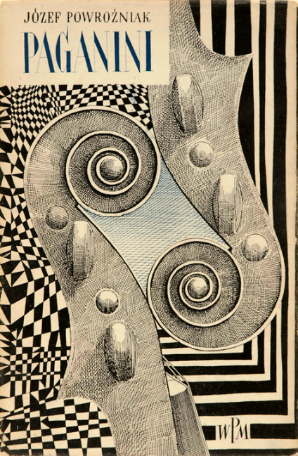
Daniel Mróz, cover for Paganini, 1958
|
|
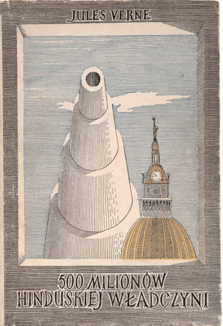 |
Daniel Mróz, cover for The Begum's Fortune, 1959
|
 |
|
Daniel Mróz, cover for Memoirs Found in a Bathtub, 1961
|
|
 |
Daniel Mróz, cover for Amazing Stories, 1971
|
 |
|
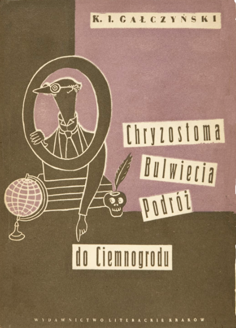
Daniel Mróz, cover for Chrystoma's Bulwiec's Trip to Hicksville, 1954
|
|
 |
|
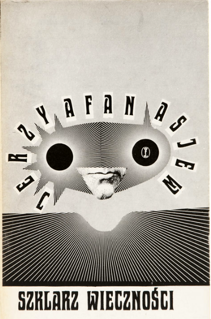
Daniel Mróz, cover for The Glazier of Eternity, 1974
|
|
Penguin Design of Dust Jackets
Since it started, in 1935, Penguin adopted a radically new approach to typography and cover design, with the aid of graphic designers like Jan Tschichold in the 1940s and Germano Facetti in the 1960s. The idea, the brainchild of the publisher Allen Lane, was, of course, to produce affordable paperbacks of good books with the artistic cover design that could replace the elegant desirability of hard-covered editions.
 |
| A Farewell to Arms by Ernest Hemingway, 1935 edition
Design: Edward Young, Penguin Books |
 |
| Ariel by André Maurois, 1935 edition, Design: Edward Young, Penguin Books |
The name Penguin was suggested by Lane’s secretary and the logotype for the company was designed by Edward Young, the office junior, who went to London Zoo to sketch for the logo. Based on Lane's suggestion that the cover design should be minimalistic horizontal grid in colours that signified the genre of each book:orange for fiction, green for crime, and blue for biography; it was Young who designed the covers of the first set of ten paperbacks, published in the summer of 1935. Penguin's strong commitment to design from the start was established by Young's rigorous simple, and yet powerful integration of colour, grid and typography in those early designs .
 |
|
| The Second Part of Henry the Fourth by William Shakespeare, 1947 edition
Design: Jan Tschichold
Publisher: Penguin Books |
|
 |
Virgil's Pastoral poems, Jan Tschichold, Penguin Classics
Featuring
Eric Gill’s Perpetua typeface, and a roundel (circular illustration) by
William Grimmond, centered layout and decorative border, Tschichold's
integrated design with the colour of roundel echoing the frame, a
swelled rule to separate author and imprint, and the patterned border,
to produce a truly remarkable balanced design.
|
Jan Tschichold (1902-1974) who joined Penguin during the 1946, introduced his disciplined and coherent approach to design asserting vigorously his design philosophy that was based on typographic systems. Designing a template for all Penguin books, with specified positions for the title and author’s name separated by a line, Tschichold integrated the design of the front, spine and back and stylized Edward Young’s somewhat unsophisticated Penguin logotype in eight variations.
Among his other innovations was a set of Composition Rules which,Tschichold insisted, had to be followed by Penguin’s typographers and printers to ensure that the same style was always applied.
 |
| Design by Hans Schmoller |
 |
| Design by Hans Schmoller on vertical grid |
After Tschichold returned to Switzerland in 1949, Hans Schmoller (1916-1985), an extremely knowledgeable and careful typographer, succeeded him at Penguin. Refining Tschichold’s templates Schmoller’s design for the 1950s architectural series, The Buildings of England written by the historian Nikolaus Pevsner, was startlingly elegant. In 1951, he finally changed the Penguin grid from horizontal to vertical. Schmoller's modified vertical grid, was originally created by Erik Ellegaard Frederiksen at Tschichold’s behest. The modified version divided the cover into three vertical stripes, providing sufficient space for illustration while adhering to the tri-partite division and the original 1930s colour coding of Penguin.
 |
In 1961 Penguin appointed Germano Facetti (1926- 2006), who may be
described as the foremost expert of branding long before it became a strategic business policy as its art director. Facetti was born in Milan in 1928 and spent part of the Second World War in the Nazi concentration camp Mauthausen, in Austria. His early career was spent on a variety of design projects and with the architectural practice Banfi,
Belgiojoso, Peressutti Rogers in Milan, where he met and married the English architect Mary Crittall. They came to Britain in 1950.
In London, Facetti attended Edward Wright's evening classes in typography at the Central School of Arts and Craft. He worked with Theo Crosby and Ed Wright in 1956 on the entrance area of the seminal exhibition "This is Tomorrow" at the Whitechapel Art Gallery; he also designed the Poetry Bookshop in Soho. A brief spell in Paris followed, where he worked as an interior designer for the marketing arm of the advertising agency Snip, and helped set up the Snark Picture Library.
Facetti's book covers for Penguin, over the 1961-72 period, created a remarkable congruity and stunning visual force to a style that was already extraordinary because of the Jan Tschichold's design. Facetti's overwhelming command of art history and his an impeccable artistic judgment for selection of a design that would convey the essence of a book revolutionized Penguin's covers. |
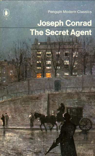 |
Joseph Conrad - The Secret Agent, Designed by The nude on the cover, by Toulouse-Lautrec, stares out insolently.
Even when obliged to omit a picture entirely, as with Germano Facetti, Penguin Modern Classics 2059, 1963
Facetti uses this intriguing detail from 'Hampstead Hill' (1883) by John Atkinson Grimshaw to represent this 19th-century fiction on terrorism.The stunning integration of typeface and the logotype with the image is the hallmark of the design.
|
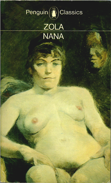 |
Émile Zola - Nana, Penguin Classics L263, 1972; Designed by Germano Facetti.
Facetti 's selection of this detail from a nude by Toulouse-Lautrec provides a strong hint to the Zola's main prostitution theme of Nana in a portrayal of Paris social life in the decadence of Napoleon III's Second Empire and its very daring eroticism for the time. Again the balance created by the typeface both horizontally with the logo in the middle of Penguin Classics, and vertically with Zola, and Nana at the two sides of a dividing line is integrated beautifully with the image.
|
A year after his appointment, Facetti who had studied architecture in Milan and worked for Domus magazine there before moving to London to design for Olivetti, a design-smart company, commissioned Romek Marber, a Polish-born freelance designer, to create a new grid for the Penguin Crime series. Marber's design was so effective that soon Facetti adopted its variations across other Penguin publications including to the blue-spined Pelican non-fiction list. For Penguin Classics, Facetti introduced historic paintings, representing the themes of the book, that still underpins the picture research of Penguin Classics today.
". . . it was assumed that the majority of great works of art have been created with a bearing to literature,"
Facetti later wrote. Later he widened his approach for Penguin Modern Poets for which he commissioned a series of photograms by Peter Barrett, Roger Mayne and Alan Spain. For the typographic style he used the modernist Swiss typography, with the sans serif typefaces Standard and Helvetica for the author, book title and series name.
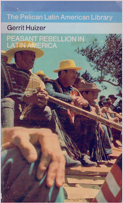 |
Peasant Rebellion in Latin America, Designed by Germano Facetti, 1973
Penguin First edition published as a Pelican in the Pelican Latin American Library shows meeting of farmers in the Lima Region. |
Having to create seventy covers each month, Facetti hired freelance and staff designers like: Derek Birdsall, Alan Fletcher, Colin Forbes, David Gentleman, Richard Hollis, Jock Kinneir, Bruce Robertson, Alan Spain, Denise Yorke, Who worked under his artistic direction, to ensure the integrity and consistency of Penguin cover design. As he explained:
"It is much more important that Penguin has established a high standard throughout, rather than swinging from good to bad, cover to cover, as almost all other publishers do,"
During his tenure at Penguin, not only Facetti succeeded to modernize the publisher's cover design, but also to repudiate a design strategy based on an
ad hoc unstructured approach, which he described as
“the arty-crafty approach of the single beautiful achievement”
.
Facetti's final decisions before leaving Penguin in 1972 was to commission Derek Birdsall to redesign its education titles.
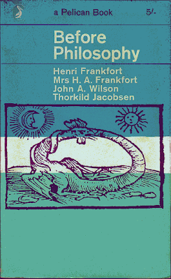 |
| Before Philosophy, a Pelican Book, Designed by Germano Facetti, Publisher: Penguin Books, 1949 |
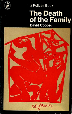 |
The Death of the Family, a Pelican Book, Designed by Germano Facetti, Publisher: Penguin Books, 1971
Facetti uses an offset color lithograph by the American artist Su Negrin, entitled
The Family, 1970 in which four family members squeezed into a house too small.
|
The Post-Facetti era in Penguin
Penguin has tried to maintain its artistic design heritage in the post-Facetti era. David Pelham continued Facetti 's tradition of a Marber-style grid for the Penguin Modern Classics but in the early 1980s Cherriwyn Magill who succeeded Pelham created a new cover design. The new design was completely different from Facetti's Modern Classics. Magill centered the text and the Penguin logo sheltering beneath the overarching series name on the artwork, placed on white covers, with an orange-and-white spine. The next change of design was in the late 1980s when the name
Penguin Modern Classics changed to
Penguin Twentieth-Century Classics. The artwork in the new design covered the entire front cover, which was overlaid with the typeface of the book's author and title inside a text box. The Penguin logo floated over the artwork, inside an
eau de Nil roundel, with spines and back covers in the same colour.
 |
Using, most often, great artistic design; Penguin classics covers literature across various genres and disciplines.
|
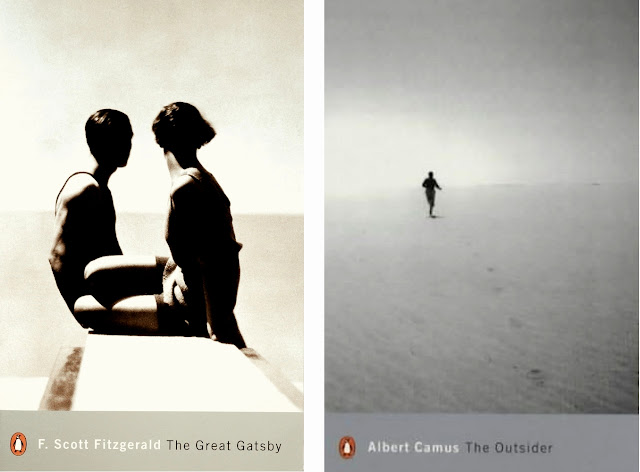
John Hamilton attended the Glasgow School of Art and Design and specialized in illustration. He then became a junior designer, designing books, and continued on this path ever since. He joined Penguin in 1997 as Penguin Art Director and was the driving force behind dropping the orange spines from the majority of Penguin fiction. He commissioned a number of designers to bolster sixty of the old Penguin's best sellers, quadrupling the sales of twentieth-century greats like Fitzgerald, Forster, and Camus.
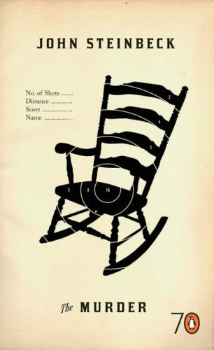 |
| Murder, 1999, art director: John Hamilton, |
Many of the designers that Hamilton recruited were designers of his favorite CD covers and magazines, including those at Tomato and Raygun. Many of his job offers were accepted, because it's hard for a deigner to turn down a chance to work on books such as In Cold Blood, A Clockwork Orange and so on. Adrian Shaughnessy, creative director of Intro, did the covers for
George Orwell's Down and Out in Paris and London, Hunter S. Thompson's
Hell's Angels, and Robert Graves' Goodbye to All That. According to Shaughnessy, whose design firm was creating CD covers, and posters for recording artists like Talvin Singh and Roni Size,
"[Hamilton] asked us to try to capture the essence of the book. I hate the sort of jackets that cram every reference point onto the cover. Publishers should be designing better covers rather than turning them into point-of-sale items, which is why most book jackets look like."
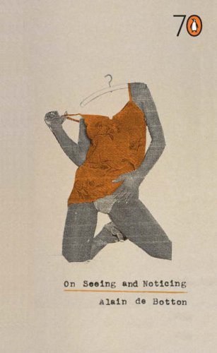 |
| On Seeing and Noticing, 2005, designer: Laura Oakden
art_directors: John Hamilton, |
 |
| The Snobs, 1999, designer: Sara Fanneli
art_director: John Hamilton
|
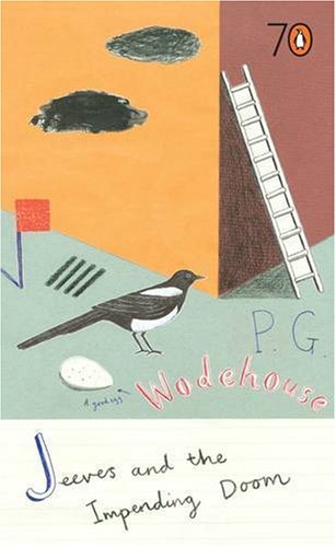 |
| Jeeves and the Impending Doom, designer: Harriet Russell
art_directors: John Hamilton, and Jim Stoddart, 2005
|
Hamilton was responsible for art directing Penguin's hardback imprints, Viking, Hamish Hamilton, Michael Joseph,
Fig Tree and Penguin Ireland.
In 2000, Pascal Hutton, , a new art director in the company, oversaw the redesign of Penguin’s Modern Classics, a concerted attempt to appeal to a new generation of readers. He hired designer Jamie Keenan to redesign the
"Twentieth-Century Classics", and restored the original Penguin "Modern Classics" name. The covers were a stunning return to form.
Hutton-Keenan team used silver spines with a matching
silver panel across the base of the front cover, on which the typefaces for the title and author’s name, plus the Penguin logo, were tucked away. The picture took up most of the space, and the availability of a larger space enhanced its visual impact.
The designers commissioned many of the images, which were often arrestingly oblique. According to Jim Stoddart, who succeeded Hutton in 2001;
“We still get feedback from members of the public who long for the previous eau du Nil spine, but you have to reinvent it. These have to sit next to modern fiction in bookshops, and feel confident and attractive. The commissioning of photography was a key part of that.”
 |
| Hutton-Keenan designs for Penguin Modern Classics |
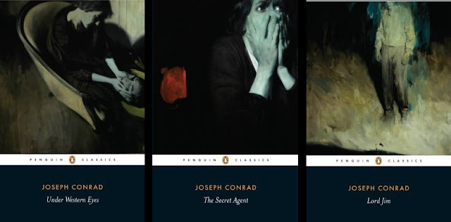 |
Phil Hale cover designs for the Joseph Conrad books
In 2004, the Hutton-Keenan design was slightly altered by the addition of a white band containing the Penguin logo and the words 'MODERN CLASSICS',
bringing the Modern Classics into line with the 2001 redesign of the "black" classics.
|
 |
Penguin Modern Classics,
In September 2007, Penguin drastically changed the design of its Modern Classics. The design adopted white spines which were matched by narrow white bands at the top and bottom of the front cover. A gigantic typeface in white introduced the author, and the name of the author was in a somewhat smaller type in silver underneath . |
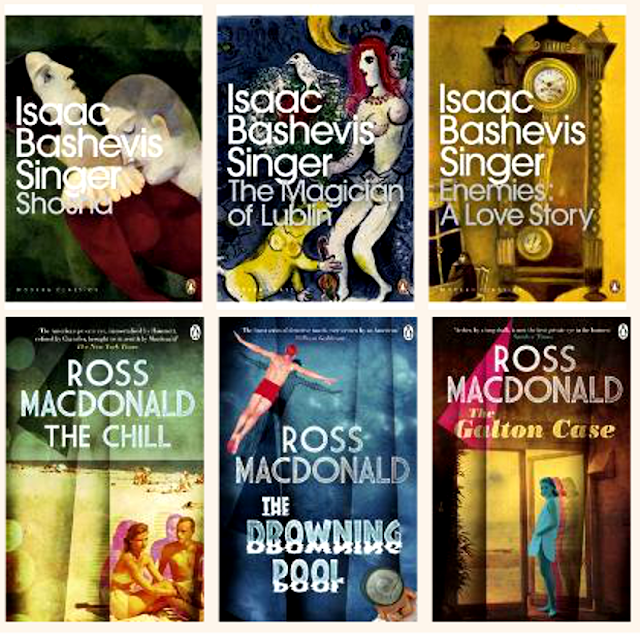 |
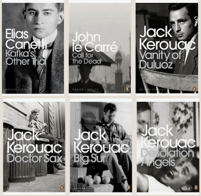
Penguins new Modern Classics cover design worked marvelously for Bashevis-Singer series, both from the standpoint of content and ideas, as there are many common threads to Bashevis-Singer's work and Marc Chagall's, stemming from their shared East European spiritual Jewish heritage. Bashevis-Singer was born into a Hasidic ultra-Orthodox family in the small town of Radzymin, with a pious rabbi, who served as rabbinical judge for the community, as a father and a mother who was the daughter of the rabbi of Bilgorei. Marc Chagall was also born into an Orthodox home, in the town of Vitebsk, where he grew up with Hasidic values that encourages intuitive contact with the Creator and combines the joy of life with mysticism and universal love for all God's creatures. They both were also influenced by modern art -- Chagall consciously drew upon the influences of the avant-garde of early 20th century Paris, while Bashevis-Singer was influenced by modern authors such as Knut Hamsun and Edgar Allan Poe.
In contrast, the design for Ross MacDonald series was utterly banal which was reminiscence of the young adult fiction series with the same depth as a passage, for instance, in Jess C. Scott's The Other Side of Life;
“That’s sad. How plastic and artificial life has become. It gets harder and harder to find something…real.”
which follows by this observation from the speaker Nin, who interlocking his fingers, and stretching out his arms continues;
“Real love, real friends, real body parts…”
|
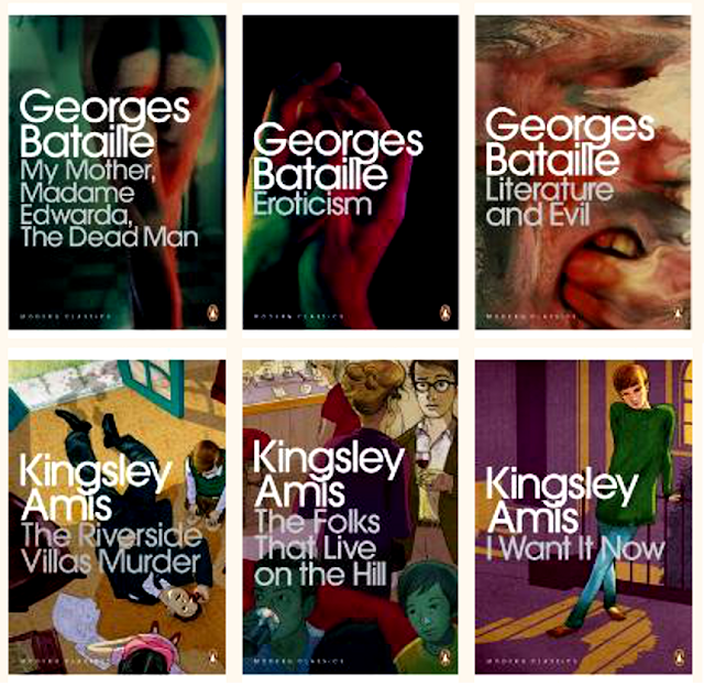 |
| Of course, the new design was not utterly hopeless using modern illustrations, as the Georges Batille series with their film noir ambiance demonstrated. But it looked hopeless when the designers applied the new design template rigidly and perilously, such as the cover design for Kingsley Amis series, that was completely inconsistent using a clean sanserif typeface in conjunction with a naïve illustration style. |
Coralie Bickford-Smith, a senior cover designer at Penguin Books, was born in Norwich, Norfolk in 1974. Bickford-Smith graduated from Reading University in 1998 after studying Typography and Graphic Communication. In 2002, Jim Stoddart, Penguin's art director spotted her latent talent in the page layouts for a supermarket pet club magazine. According to Bickford-Smith's own recollections;
Before working at Penguin I was doing a lot of whole book design. After graduating I got my first job at Quadrille, a small publishing house. I was enticed by the fact they worked on Tricia Guild books, all beautiful fabrics and interior design; I ended up doing a lot of lush cookery books. Petrified I might never be able to break out of publishing, I only lasted at Quadrille a year. Then I got a job at Black Sun, a ‘strategic, marketing and communications agency’, which turned out to mean long hours and a lot of designing for a supermarket magazine called Pet Club. That was a dark year. I ran out the door with no job and started freelancing for my old publisher and working for another small publisher doing beautiful coffee table books … I realized then that publishing was what I enjoyed, and I dreamed of Penguin. Somehow Jim Stoddart, Art Director at Penguin, saw the merits of my Pet Club layouts, I got the job, and I have been happy here ever since.

Coralie’s book covers have been recognized by the AIGA (NY) and D&AD (UK) and have featured in a numerous international magazines and newspapers including The New York Times, Vogue and The Guardian. She was also selected as one of the rising stars in British Publishing by The Bookseller, 2011.
Her work with Penguin Classics on the clothbound series disregard the usual paper jacket for a cloth hardback that features foil stamped patterns.
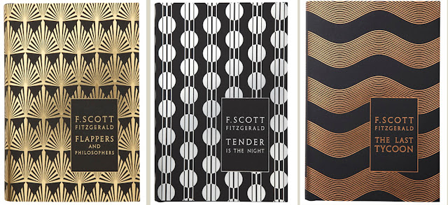 |
Bickford-Smith’s design for F. Scott Fitzgerald series, features metallic art deco designs. Although not very original, they show clearly that the power of some of the old-fashioned design is not yet exhausted, and she has chosen the right path to fulfill her desire that:
“I want these book covers to be cherished as much as the literature inside ... If something is well considered, it will entice. People want to explore it, feel it. That design shines through and connects.”
|
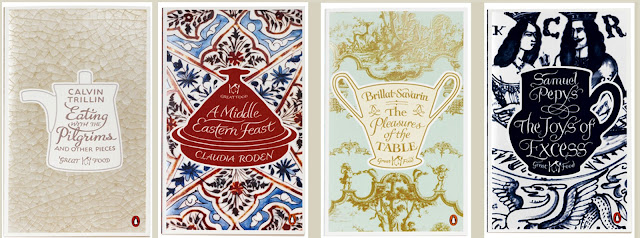 |
| Bickford-Smith’s interesting covers for Penguin's Great Food series are inspired by patterns on china and ceramics: Japanese Raku with crackle-glaze for Calvin Trillin, Persian fritware for Claudia Roden, Sèvres porcelain for Brillat-Savarin and Brislington blue-and-white earthenware for Samuel Pepys. |
Jim Stoddart (1971 - *). He studied at Sheffield, and after graduation in 1993, he landed a job at Bill Smith Studio in London, designing record and CD covers for EMI, Virgin, BMG, Mute and Trojan Records. In 1998, he joined Penguin, where he worked as a cover designer for eighteen months. During the 2000-01 he worked with Chris Ashworth under Lewis Blackwell at Getty Images. In 2001, after Pascal Hutton left the company, Penguin offered Stoddart the position of Art Director, where he oversaw the redesign and rebranding of Penguin Classics and Penguin Modern Classics, as well as designing and art directing covers for Penguin's Allen Lane hardback imprint, the Particular Books imprint and Penguin non-fiction paperbacks.
Stoddart was assisted by designers David Pearson, Antonio Colaco, and Coralie Bickford-Smith; full-time picture researcher Samantha Johnson; and one part-time picture researcher. Stoddart relied extensively on photographic images, but Penguin’s legendary heritage of consistency was somewhat eroded under his watch. He stated that photographic images "is a key part of our design heritage, but we need to justify it. Almost every book uses a huge amount of picture research.”How he justified it not on the artistic merits, but on how it grabbed the attention of a book buyer. He wrote
Each cover may face a wide range of hurdles and conflicting opinions, his is the very nature of book covers. Good designers tend to be very focused and resilient, and the value of a good sense of humor cannot be underestimated. As with most design jobs there is a balance of concept, craftsmanship and time dexterity required. Any number of changes to the brief may occur even once the design is finished. But in Penguin Press it is widely appreciated that the more a cover is 'tweaked' by a committee the less chance there is of retaining that original spark that we all know helps a book stand out in a world where thousands of books are vying for attention.
When a number of honed front cover visuals are ready I will take them back to the cover meeting and recommend one for approval. If others in the meeting concur, the designer will finish off any details or amends and prepare the back cover and spine artwork. We'll then circulate the artwork for sign-off from everyone involved.
He offered the example of the jacket for
The Junior Officers' Reading Club, to describe the cover design selection under his directorship;
{This}is a unique book written by Patrick Hennessey, an active soldier on duty with his regiment in Iraq and Afghanistan. Hennessey describes life in a modern army and our early discussions about the cover worked around the idea of showing the solace and escapism (or lack of) a book brings in tense surroundings. Hennessey even had a great range of photos he had taken himself and one particular shot of him at rest with some of his squadron seemed to sum up much of the book quite concisely. Hennessey is pictured reading while his colleagues sleep, weapons piled up around them:
Stoddart presented the following initial three templates, in which according to him;
the designer tries a few different approaches, some too booky, and some possibly better for a paperback rather than a hardback:
Stoddart chose the following design for the front cover of the jacket;
But when he realized that the book is not received very well by the market, he decided to dump the cover for the following which was a more crowd pleaser.
He wrote:
But having lived with this cover for a couple of months there was a general feeling emerging at Penguin that this cover was possibly to journalistic and didn't convey some of the more literary qualities of the book. So I asked freelance desiger David Wardle to come up with some new ideas, and this one leapt out as a great front cover, and this is now the final jacket, printed and in the shops just a few weeks later. The book is selling very well:
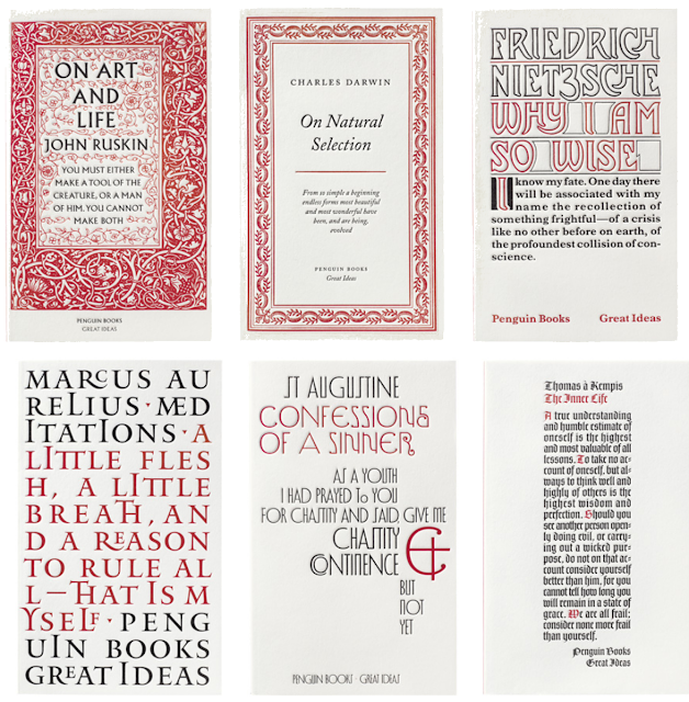 |
Penguin Books, Great Ideas, 2004.
On Art and Life, On Natural Selection, and Inner Life are designed by David Pearson. Why I am So Wise and Meditations are designed by Phil Baines, and Confessions of a Sinner is designed by Catherine Dixon.
The ‘Great Ideas’ series, was the brainchild of Penguin editor Simon Winder, who after a visit to Italy and seeing philosophy books on sale in tobacconists’ kiosks, decided that the cover for each volume should be typographic, and that the type or lettering on the cover should reflect the time in which the essays were written. Stoddart gave the task of designing Great Ideas to Pearson, then a junior designer at Penguin. Together, they decided to define a graphic identify for the series
whereby each of the twenty books was designed in a typographic style
typical of its original publication date in black and burgundy against a
white background.
Pearson designed thirteen covers and commissioned the
rest from the freelance designers Phil Baines, Catherine Dixon and
Alistair Hall. Later Pearson admitted that he involved Baines and Dixon as a ‘panic measure’ when he suddenly realised the scale of the project, relying on the knowledge and taste of his former tutors to prevent him making ‘grotesque historical inaccuracies’. Yet the tutors surprised Pearson by contributing covers that were much more expressive than he had imagined: ‘They bent the rules straight away!’ The Great Ideas volumes are the size of the original Penguin paperbacks and resemble pamphlets. The designers have handled the typographic
interpretations with great aplomb, and the typefaces were debossed, making the books a
pleasure to touch. They looked like title pages; with some
lavishly ornamented. As Stoddart
noted.;“We liked the idea of them getting dirty after you buy them,”
|
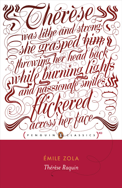 |
| Thérèse Raquin, designed by Jim Stoddart |


Alvin Lustig (1915 – 1955), a talented and masterful graphic and industrial designer, was born in Denver, Colorado to a family that he said had “absolutely no pretensions to culture.” He reached the zenith of his incredible career in the early 1950s before his tragic early death. Lustig's family moved to Los Angeles when Alvin was just five. The family was poor, and Alvin was skipping classes to act as a drifting magician for various school assemblies. However, “an enlightened teacher” introduced him to modern art, sculpture and French posters.
“This art hit a fresh eye, unencumbered by any ideas of what art was or should be, and found an immediate sympathetic response. This ability to ‘see’ freshly, unencumbered by preconceived verbal, literary or moral ideas, is the first step in responding to most modern art." (Personal Notes on Design, AIGA Journal, Vol. 3 No. 4, 1953)”
He began his unusual art education which included one year at Los Angeles Community College and one at the city's Art Center School, while he also took a job as art director of Westways, the monthly journal of the Automobile Club of Southern California, followed by independent study with both architect Frank Lloyd Wright for three months at Taliesen East, and artist Jean Charlot.
At age 21 Lustig set up his first design office in Los Angeles, and became a freelance printer and typographer, doing jobs on a press he kept in the back room of a drugstore. It was here that he began a remarkable professional career with innovative graphic and typographic design for book publisher Ward Ritchie, and for several local clients for whom he designed a visual identity through creation of stationery, programs and other printed pieces. Proclaiming that he was “born modern” and had made an early decision to practice as a “modern” rather than a “traditional” designer, he experimented with completely abstract geometric designs using ornamental typeface. Believing fervently that design could change the world, a year later he abandoned printing to concentrate on graphic design. He joined designers like Saul Bass, Rudolph de Harak, John Folis and Louis Danzinger to become a charter member of the Los Angeles Society for Contemporary Designers. These were artists whose believed in the principles of the Modern design and aimed to challenge the traditional aesthetic vision of West Coast design establishment.
He revolutionized the design of book jackets by refusing the traditional styles. As James Laughlin, a publisher who hired him in the early 1940s writes:
“His method was to read a text and get the feel of the author’s creative drive, then to restate it in his own graphic terms,” (The Book Jackets of Alvin Lustig” , Print, vol. 10 no. 5, October 1956)
Laughlin, was a progressive publisher with an intuitive understanding of the artistic graphic design, who commissioned Lustig to create book jackets for such important thinkers as Henry Miller, Gertrude Stein, D.H. Lawrence and James Joyce, and he gave the artist the freedom to experiment and develop his personal style in a fertile ground for visual poetry and modern typographical explorations.
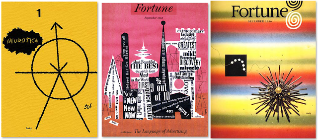
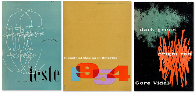
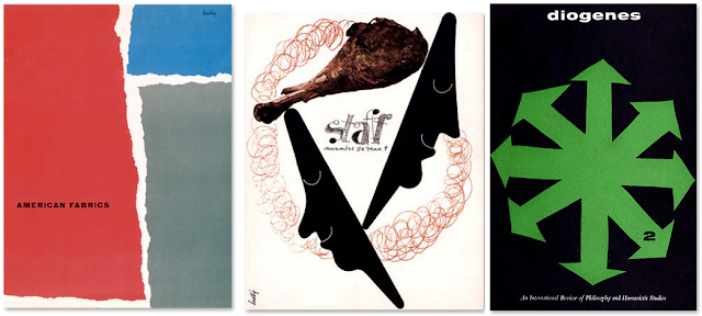
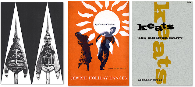
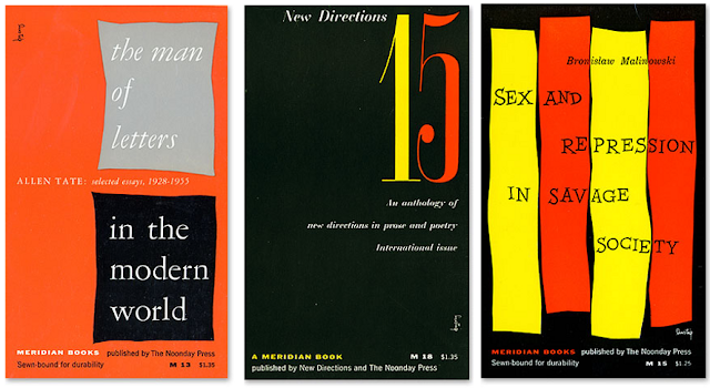
Seven years later, in 1944, Look Magazine offered him the post of Director of Visual Research in New York, but after two years Lustig returned to California and opened a design office in Beverly Hills. The late 1940s saw the development of Lustig's architectural and interior design practice, and a number of industrial design commissions for lighting fixtures,fabrics and furniture. Lustig kept his hand in graphic design, continuing to produce quantities of book jackets for the New Directions, Knopf and Noonday presses during the 1940s and 50s, and covers for several periodicals including Fortune magazine.
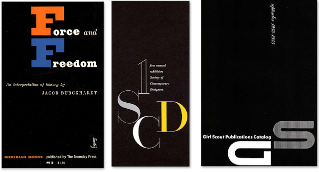
A move back to New York in 1950 brought a return to a concentration on graphic design with projects for the Girl Scouts of America, American Crayon Company, Whitney Publications and Intercultural Publications, in addition to several museums and art galleries. Lustig's career as educator began with a teaching assignment at North Carolina's Black Mountain College in the summer of 1945, and led to further contracts with the Art Center School at Los Angeles and Yale University. A one-man exhibition of Lustig's work was mounted by New York's A-D Gallery in 1949 and traveled to Walker Art Center in Minneapolis; five years later he had completely lost his sight, a complication of diabetes. Alvin Lustig died in New York on December 5, 1955, survived by his widow Elaine Firstenberg
Lustig, whom he had married in 1948.
Lustig pushed back the accepted boundaries of Modern design. He was intensely interested in photomontage as practiced by the European Moderns of the 1920s and 1930s. The preceding New Directions titles, which Laughlin described as jacketed in a “conservative, ‘booky,’ way” were completely overshadowed by Lustig's later works, starting with his first jacket for Laughlin, a 1941 edition of Henry Miller’s
Wisdom of the heart. Influenced by Frank Lloyd Wright, at the time Lustig was exploring the possibilities of non-representational compositions made from metallic typefaces. Despite the fact that
Wisdom of the Heart was innovative for the early 1940s, still Laughlin criticized it some years later as “rather stiff and severe…" as compared to artist's design for the New Directions New Classics series, over the 1945-1952 period, which still appear innovative and imaginative designs, in which which he was influenced by his favorite artists, Paul Klee and Joan Miro. Indeed, his style was varied as he freely adopted various elements from the works of any painters who he admired.
In Many of his photo-illustrations, done in collaboration with many photographers, Lustig rendered a fresh interpretation of the visual communication design of of the Bauhaus, Dada and Surrealism and inextricably wedded them to contemporary avant-garde literature. Although many other American designers also experimented with artistic jackets, as described by Laughlin in Print,
“Lustig’s distinction,lay in the intensity and purity with which he dedicated his genius to his idea vision ...I have heard people speak of the ‘Lustig Style,’ but no one of them has been able to tell me, in fifty words or five hundred what it was. Because each time, with each new book, there was a new creation. The only repetitions were those imposed by the physical media.”
Lustig erroneously believed that, painting was dead, and design would emerge as a primary art form – hence his jackets were not only paradigmatic examples of how Modern art could successfully be incorporated into commercial art, but showed other designers how the dying (plastic) arts could be harnessed for mass communications. He also believed that the book jacket should become the American equivalent of the glorious European poster tradition.

 |
| Paul Hogarth, Faber and Faber Ltd, London 1989. |
 |
London: Faber and Faber, 1965.
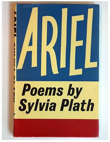
The presiding genius of Faber and Faber books was Berthold Wolpe (1905-89), who joined Faber in 1941 and retired in 1975. As a typographer he is best known for Albertus, one of the great faces of the century, which is the characteristic but not exclusive typeface of Faber book jackets during his era. Often his designs combined beautifully with panels of plain colour. The jacket for Sylvia Plath's Ariel, published two years after her suicide and containing five poems written in the last week of her life, is one such Wolpe design.
|
 |
London: Faber and Faber, 1957. Designer: Berthold Wolpe
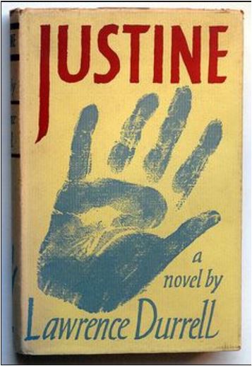
The well-known and distinctive book jackets of Lawrence Durrell's Alexandria Quartet, published by Faber and Faber between 1957 and 1960. The simple effective covers have Berthold Wolpe's artistic touch, most notably his freehand calligraphy.
|
 |
Published 1964 by Farrar, Straus & Giroux, Designer: Berthold Wolpe
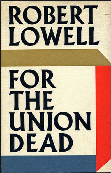
Faber and Faber, the independent British publisher founded in 1929 by Geoffrey Faber, hired the German-Jewish typographer Berthold Wolpe, fresh out of an Australian internment camp. Wolpe had designed the typeface Albertus during a prewar stint with Monotype in homage to the lofty lettering carved into bronzes and tombstones. But times were lean now, and Wolpe, designing dust jackets for eminent authors like T. S. Eliot and Philip Larkin, would have to hand-draw his titles to save money.
Contrary to bringing the visual quality down, Wolpe’s precise strokes, towering ascenders, and gestural serifs gave these jackets a sculptural quality that became strongly identified with Faber and inspired generations of designers.
|
 |
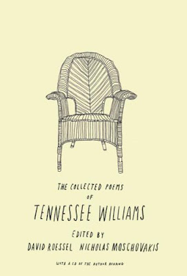
| Charlotte Strick has been a designer and an art director at Faber & Faber, Inc and the paperback line at Farrar, Straus, Giroux. She is also the designer and Art Editor of the world famous Paris Review magazine.
|
 |
| Isaac Tobin is a senior designer at the University of Chicago Press. |
 |
| Darren Haggar is currently the art director of Penguin Press in New York. |
____________________________________________________________________________
This work is licensed under a Creative Commons Attribution-No Derivative Works 3.0 Unported License.


Thank you for such an incredible account of influential designers! I am a new graphic design teacher, trying to overhaul a very old and tired curriculum and we are currently re-designing book covers. This was so very helpful, thank you!
ReplyDeleteThank you very much dear Lys for your kind words.
ReplyDelete