French design has been at the cutting edge of creativity since the appearance of the stunning posters of Henri de Toulouse-Lautrec (1864- 1901), and his contemporary Jules Chéret (1836 -1932). With their captivating typographies and visual compositions, it was them who showed the world how much of the artistic beauty and inspiring harmony could enter into the poster. As early as 1898, André Mellerio in his influential text of
La Lithographie en Couleurs noted that:
It seems to us that colour lithography has existed before in the conditions in which we have seen it bloom, and consequently it is the distinctive artistic form of our time . . . The modern print was no longer a facsimile reproduction of just any original work in colour, but a personal conception, something realized for its own sake . . . This principle, applied victoriously by Chéret to the poster, whose nature and function made it special, was to be applied by others to the print, whose characteristics differed in many ways. But the right of the colour print to exist comes directly from the principle we consider an axiom: any method or process which an artist develops to express himself, is for that very reason legitimate.
Mellerio, thus empathetically grounded the legitimacy of the poster on the artist's attempt at self-expression, an inherent feature that distinguishes the French School of graphic design. He also recognized the vitally important role of the printer in assisting the artist to arrive at that self-expression and to create an authentic poster as a manifestation of the artist's liberated inspiration. He wrote:
This close and much needed collaboration between the artist and the printer would be reached by suggestion and agreement. They would thus overcome the difficulties of the craft at the same time that the liberated inspiration would assert itself more directly and more intensely"
 |
| Henri de Toulouse-Lautrec
|
 |
| Jules Chéret |
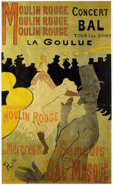
The 1880s were the
Golden Years of French Poster, which started with the
“défense d’afficher”, or “posting forbidden”, legislation of July 29, 1881, by the French government that allowed the posting of advertisement on the miles and miles of Paris’ broad, bare, masonry walls. In fact, since the 17th century there was a ban in France against posting bills without permission. In 1761, sign-boards in France were fixed flat against walls for safety by order of Louis XV , which is considered as the main reason for the invention of billboards.
In 1869, with Cheret's posters, the main features of modern advertisements were defined. It is interesting to note that in an interview with the English critic Charles Hiatt, Cheret revealed his taste for artistic qualities when he stated that for him posters were not necessarily a good form for advertising but that they made excellent murals. This concern for aesthetic criteria can be detected in almost all the body of work of French founding fathers of graphic design. However, posters were not supposed to be political. In the July, 1881 law the French government implicitly recognized the link between posters and revolution. The law, that was enacted ten years after the Paris Commune of 1871, reflected the same anti-revolutionary urban political spirit as Baron Haussmann’s architectural re-structuring of Paris. Haussmann created for Paris the
grands boulevards, streets too wide for barricades. Similarly, the third chapter of
Loi du 29 Juillet 1881 concerns with the displaying of posters on walls, and it still remains one of the most visible laws in France. The text is the following;
"Dans chaque commune, le maire, désignera, par arrêté, les lieux exclusivement destinés à recevoir les affiches des lois et autres actes de l'autorité publique"
(In each town, the Mayor will decide, by decree, the places which will be used exclusively to display papers describing laws and other acts of public authority), as wll the law tries to ban the gluing of political posters to the Paris walls. This is because, in more revolutionary times, the public authorities needed to ensure that laws were clearly visible and understood by the people, and also to ensure that unofficial messages were kept off the city walls. It also became an offense to damage any such officially displayed texts, and tearing one today could still get one a stiff fine.
 |
| Defense d'afficher - loi du 29 Juillet 1881, posters forbidden - law of 29 July 1881 prohibiting gluing of posters to the walls. The law has been amended several times. In particular, the law of 12 April 1943 for the first time tried to reconcile freedom of aesthetic display and protection of city monuments. It allowed the city to enact local rules of advertising, on aesthetic grounds. |
 |
| Atget, Photograph of rue de l'abbaye, La Bibliothèque nationale de France, Paris 1898, (simulated colour) |
Consequently, the law pushed the poster art towards decorative styles that would have less difficulty in getting permission to display. Graphic artists used the newly re-designed streets of Napoleon Ill's Paris, as an exhibition gallery for their decorative art, and writers and art critics like Joris-Karl Huysmans, Edmond de Goncourt and others wrote about the artistic qualities of these works. It is of note that the first documented evidences of the modern French advertisement appeared in 1715, for folding umbrellas, and in 1800 for Bonne Bierre de Mars, an illustration of young couples drinking at an inn.
L'Art Nouveau, Bing and La Maison Moderne
During the nineteenth century Paris, that had became the centre of a powerful national school of painting and sculpture, culminating in the dazzling innovations of Impressionism and Post-Impressionism, also began to develop a powerful and versatile French School of Graphic Design that was informed by the experiments in other fields of visual art, creating an stunning positive feedback loop. As a result, in the early years of the twentieth century, Paris became a magnet for artists from all over the world and the focus of the principal innovations of modern art, notably Fauvism, Cubism, Abstract Art and Surrealism, that provided a solid base for experiments in visual communication design. By bringing together major international and national artists from the various fields of visual art Paris, had created a conducive ambiance for creativity and artistic synergy. Paris had already gave birth to the
Art Nouveau style (1895-1910) which was the first expression of French School of graphic design, characterized by naturalistic sensuous lines derived from vegetative curves with willowy leaves, subtle light, feminine figures with curly hair, fluent dresses and attitudes, twisting waves and evanescent smoke. Of course,
Art Nouveau 's controlled lines, geometric details, colorful new shapes were informed in essence by the French Rococo style.
Rococo also was a French movement in the arts in the early 18th century, which had been stemmed from
the Baroque era. With the onset of the age of
Enlightenment, a time of celebrating new rational ideas about human existence, Rococo art was the visual representation of the enlightenment's optimism and the triumph of reason. The aristocratic Rococo reflected on the futile lives of the privileged elite with a sense of humor, respecting neither church nor state. Rococo art was an anti-style, rejecting the grandeur of the Baroque and aiming to simply please the taste. After decades of religious strife and endless preaching, the sheer aesthetics of the Rococo was a great relief to weary viewers. In fact, it can be argued safely that the
Art Nouveau was a turn-of-the-centnry retooling of the Rococo for the new age of advertisement.
Siegfried Bing (1838-1905), a German born French, who was the founder of
La Maison de l'Art Nouveau in Paris in 1895, was instrumental in the birth of
Art Nouveau. In fact it was his gallery that gave its name to the new style. Bing, later known as Samuel Bing, was a collector of Japanese Art, whose gallery
La Maison Bing was specialized in decorative arts. He started exhibiting the avant-garde work of contemporary artists, such as Henry Clemens Van De Velde (1863 -1957), a Belgian architect and teacher who together with his compatriot Victor Horta is considered as the originator of the Art Nouveau. Henri van de Velde designed furniture and interiors for the galleries of Samuel Bing in 1896. Later as a teacher in Germany, Van de Velde created his most significant contributions to modern design after his exhibition of furnished interiors at Dresden in 1897. In 1902 he became artistic adviser to the grand duke of Saxe-Weimar in Weimar, where became interested in the work of William Morris and the
Arts and Crafts Movement, and reorganized the
Kunstgewerbeschule, Arts-and-Crafts School, and the academy of fine art, which later in 1919 were joined under Walter Gropius into the Bauhaus.
 |
Henry Clemens van de Velde, Tropon, l'Aliment Le Plus Concentré (Tropon, the most concentrated nourishment)
In the 1890s Van de Velde used the fashionable, highly stylized language of Art Nouveau to advertise a product as mundane as an egg-based protein extract. The late nineteenth century witnessed a revolution in industrial-food processing, starting with coffee, cocoa, and a range of meat and dairy products. Such processed foods and their burgeoning brand identities rapidly became integral to modern living, transforming traditional patterns of shopping, cooking, and at-home food storage.
|
 |
Henry Clemens van de Velde, Gooische Tentoonstelling. Circa 1930.
Mercury, God of Trade, is bearing on his shoulders the typographic block advertising for an exhibition of foreign workers in Hilversum, a city southeast of Amsterdam. At the bottom, a train, ship and plane illustrate the commercial content of the show.
|
Four years after Bing's successful launch of
L'Art Nouveau Bing, Paris attracted a German competitor by the name Julius Meier-Graefe (1867-1935) who opened
La Maison Moderne, another gallery instrumental in the development of the French School, which exhibited the work of graphic designers such as Manuel Orazi and Maurice Biais. Meier-Graafe founded the periodical Dekorative Kunst (published in Munich, 1897–1929) and a companion title in French, L'Art décoratif (1898–1914), as Bing had published
Le Japon artistique from 1888 to 1891. Meier-Graefe had been co- founder and the first art editor for
Pan in 1895, a journal that introduced Art Nouveau to Germany, but he was soon dismissed for his alleged neglect of German artists. La Maison Moderne closed in 1903 and Meier-Graafe returned to Berlin where he published
Entwickelungsgeschichte der modernen Kunst (Developmental history of modern art, 1904, which was translated and published as Modern Art, 1908). After the ascendancy of the National Socialists in Germany in the early 1930s, Meier-Graefe was condemned for his support of
decadent art , and forced into exile in France. He died in Vevey, Switzerland in 1935.
Manuel Orazi (1860-1934), an Italian born lithographer known for his works in newspapers, book covers, opera posters, and the covers of sheet music was another important international graphic designer that was resided in France between 1883 and 1884, and participating in nurturing of the French School. In 1895, Orazi collaborating with author Austin De Croze created the imaginatively provocative calendar,
Calendrier Magique; printed in an edition of 777 copies to commemorate magic for the coming year of 1896. He also created jewellery for Meier-Graefe's famous shop, which became a center of design: Orazi's poster for
La Maison Moderne was an elegant and powerful advertisement for the fashion accessories of the period.
 |
| Manuel Orazi, Calendrier Magique |
 |
| Manuel Orazi, Calendrier Magique |
 |
| Manuel Orazi, La Maison Moderne, (c. 1905) |
 |
| L'Atlantide 1920, French movie poster (lithograph) by Manuel Orazi. Featuring Stacia Napierkowska (la Reine Antinea), directed by Jacques Feyder |
Maurice Biais (1875 - 1926) was another graphic designer of La Maison Moderne, whose simplified flat painted posters using elegant typefaces were exquisitely balanced and innovative. The son of a rich public notary, Maurice Biais also designed glass, ceramics and even murals for both Siegfried Bing's gallery l'Art Nouveau and Meier-Graefe's
La Maison Moderne. Biais gained some notoriety for his active Montmartre night life. In 1911, he married the performer Jane Avril, who subject of several posters by Toulouse-Lautrec, in a doomed, short-lived union. Throughout his career Biais traveled frequently, often to escape bad debts. He was a gambler, drinker and heavy smoker. He was not on speaking terms with his family and was known to disappear for weeks at a time.
 |
| Maurice Biais, la Maison Moderne |
 |
| Maurice Biais , Erard Pianos |
 |
| Maurice Biais, Jane Avril |
 |
| Maurice Biais , Saharet |
 |
| George De Feure, Casino |
 |
| George De Feure, Le Journal des Ventes |
 |
| George De Feure, Salon Des Cent. |
 |
| George De Feure, Le Diablotin |
 |
| George De Feure, Paris- Almanach |
George De Feure (1868-1943) was a Belgium born French designer, whose real name was George Van Sluijters who created paintings, fine furniture, porcelain and pottery, art glass, glass windows, carpeting, silverware and jewelry as well as many well known graphic arts and posters. He was also a set and interior designer. De Feure began his career by apprenticing in a book trade at the Hague, where he became acquainted with the work of Pierre Cecile Puvis de Chavannes, and in 1890 he moved to Paris to become a pupil of Jules Cheret and under him designed posters for the Salon Des Cent, Loie Fuler and Thermes Liegois. His paintings were exhibited at the Societé Nationale in 1894, in the Salon de la Rose Croix of 1893 and 1894, and at the 1896 Munich Secession. At this time, he was also designing interiors and held the post of 'Professor of Decorative Arts' at the Ecole des Beaux-Arts.
De Feure quickly became one of Bing's top designers. Bing encouraged De Feure to expand his talents to all areas of art and design. Although he never signed an exclusive contract with Bing his work was featured in the gallery from 1895 until it closed in 1904, one year prior to Bing's death. In 1902 his work was featured at the first Salon Des Industries Du Mobilier at the Grand Palais in Paris. Before the outbreak of WW1, he moved to England where he worked mainly as a set designer.
In 1928 he returned to Paris where he was appointed Professor at the Ecole Nationale Superieure Des Beaux-Arts. He continued to work during the Art Deco period.
 |
| Hector Guimard, Exposition Salon du Figaro, Le Castel Beranger, 19000 |
 |
| Hector Guimard, Art Nouveau decoration at the gate of Dauphine station, Paris , 1900 |
In Paris, French School of Graphic Design with its innovative typefaces was influencing architects; like Hector Guimard (1867-1942) who experimented with new compositions and aesthetic interactions in their designs of buildings and furnitures, and painters like Pierre Bonnard (1867-1947), who was also a successful draughtsman, photographer, printmaker, illustrator and interior designer. Bonnard, once described as
"très japonard," was particularly influenced by the flat planes, asymmetrical compositions, and decorative patterns of Japanese prints. His designs included a new expressive treatment of typography which was conceived at the outset as an integral element of the composition, and in complete harmony with the illustration. They are far-removed from earlier lithographic prototypes in which letterforms appear to have been added as an afterthought.
 |
Pierre Bonnard, la revue blanche
In la revue blanche word and image have brought into a sophisticated and harmonious interplay through the neat device of the closed umbrella which the letter 'a' in 'la' appears as a band that fastens the umbrella, and the letter 'V' in 'Revue' is defining its pointed head. La Revue Blanche, was an art review for
symbolist artists and writers, which aimed at creating a forum for presenting the full spectrum of artistic activities, with its pages "open to all ideas, all schools." It published works by Marcel Proust,
André Gide, and Henrik Ibsen, and illustrations by Edouard Vuillard, Henri de Toulouse-Lautrec, and Gauguin. |
 |
| Théophile Alexandre Steinlen |
 |
| Eugène Samuel Grasset |
Advertisement and Leonetto Cappiello
In 1897 Leonetto Cappiello, an Italian artist and caricaturist, who is considered as the 'father of advertising' arrived in Paris. In 1932 he wrote:
It was, I think in April or May¸ 1897, that I arrived in Paris the day the fire of the Bazaar of Charity plunged the whole city into dismay. In the streets, faces were scared with inquiring look, and it formed a striking contrast to splendor of this radiant spring day.
I had come to spend a month as a tourist, as an amateur, I stayed there thirty-five years. It seems to me that it would be enough to tell the influence that Paris had over me. Although they feel some modesty to express deep and intimate feelings, I confess, as you want it, that I love France as a lover loves his beloved. I love it for its beauty, for its mind, for its harmony and its generosity. I love it for its best love of Art. I don’t think that there is a country in the world where an artist is welcomed, appreciated, encouraged as in France - and by writing these few lines, I evocate one of the softest, the most touching memories of my life: loving welcome that I received from all friends who were the most famous artists of this age and the friendship which linked us since.
Leonetto Cappiello (1875 1942) was born in Livorno, Italy. He was a self-taught artist and his earliest known works date back to 1889. In 1896, he had already published an album of caricatures in Livorno entitled
“Lanterna Magica” and it was as an illustrator and poster designer that he continued to develop his artistic career in Paris. As a caricaturist Leonetto Cappiello worked with numerous French magazines, enjoying great success, thanks also to his extremely innovative language. From 1912 onwards, he also became involved in interior design, some of which can still be seen in different rooms of the
Galeries Lafayette in Paris and Villa Dreyfus in Saint Germain en Laye. In this period, Cappiello was one of the most successful painters and designers and also well known as a designer of advertising posters.
Cappiello's style with its dark, often black, backgrounds and a single bold image, was imaginative and new. His caricaturist approach offered a powerful insight into human nature and he used it as a potent visual communication device in his advertising posters.
Jean d'Ylen was born Jean Beguin in Paris in 1886, he adopted the trade name d'Ylen in 1912. After graduating from the Bernard Palissy School at Poitou-Charentes, in Fine Arts, he started to work for a jeweler on the Rue de la Paix, but with the outbreak of WWI he joined the 279th Infantry Regiment and was assigned to the Cartography Department of the Army.
After the World War I armistice was signed by Germany and the Allies in 1918 ending a four year war, d'Ylen joined Pierre Vecasson's printing studio in 1919 and began his career as a poster designer. According to Jack Rennert, in The Posters of Leonetto Cappiello, New York, 2004, d’Ylen succeeded Cappiello as the favoured house artist at Pierre Vercasson’s printing shop in Paris in 1922. Like Cappiello, his posters, were elegantly designed, projecting a confident artistic sense with an unbridled exuberance. He fully utilized the sturdy, simple forms of sen serif typefaces in his posters that allowed the characters to be condensed and expanded to achieve well balanced, and well integrated modern posters. His posters were enormously successful in both France and England .
He died prematurely in 1938.
The Great War, and French Propaganda Posters
France had initiated its plan for the First World War some years before the event - via the ill-fated Plan XVII - and so had in place a government policy of conscription. Nevertheless when war broke out the French government was prompt in advertising for more men - while simultaneously pleading the justice of the French cause.
The French war posters relied dramatically on symbolic representation of the traditional values expressed in the Republics motto: Liberty, Equality, and Fraternity and less on concepts of honor or the empire. The posters tended to evoke a sense of camaraderie between the allies, often depicting soldiers representing France, Britain, and the U.S. collectively defeating a symbolic representation of German forces, usually the black eagle. Liberty plays a large role in the propaganda posters as well. Since Liberty has been personified in French culture since the Revolution, it is not surprising that
her image was frequently used for its persuasive power on French propaganda posters. Images of Liberty, resembling a Greek goddess, complete with laurels, abound on posters with and without representations of the other allied nations.
The Inter-War Years (1919-39) constructivism and the "Fab-Four of French Graphic Design“
During the tumultuous inter-war years a new generation of French graphic designers came to fore, among them were the "Fab-Four of French Graphic Design“; Cassandre, Colin, Carlu and Loupot who redefined the French school of graphic design by developing a French constructivism genre that was mainly influenced by cubism.
A.M. Cassandre (1901- 1968), a graphic designer, painter, and set designer was born Adolphe Jean Édouard-Marie Mouron in Kharkov, Ukraine. At the age of fourteen Cassandre and his family resided in Paris, where after a brief attendance at the
Ecole des Beaux-Arts in 1918, he enrolled in Lucien Simon’s studio, at the
Académie de la Grande Chaumière and at
the Académie Julian . In the 1920s Cassandre joined the avant-garde circles of Robert Delaunay, Fernand Léger, the poet Guillaume Apollinaire, and the composer Erik Satie, and earned a reputation as the designer of bold, stringently geometric posters in the Art déco style.
His first notable success was The Woodcutter (1923; Paris, Mus. Affiche & Pub.), executed in clear, simplified forms, somewhat influenced by Cubism. In 1926 he published his first text on poster design in
Revue de l’Union de l’Affiche Française , in which he emphasized the role of visual communications, connecting it with the ancient and medieval traditions of communicating messages through pictures. Cassandre landed his first commission for a large poster for Au Bûcheron, a Parisian furniture store, in 1923. As prolific artist, he created numerous posters, among them posters for the apéritif Pivolo (1924), the newspaper "L'Intransigeant" (1925), and Pernod (1934). For the Compagnie des Chemins de Fer du Nord railroad company and several passenger steamship lines. His adhered to a Constructive style within the parameters of a strictly formal language that celebrated the new machine age of the 20th century. Taking the full advantage of the power of typefaces he made typography the integral part of his design and over the years created a number of innovative typefaces such as; Bifur (1929), Acier (1930), Acier noir (1936), and Cassandre (1968).
Together with with Charles Loupot and Maurice Moyrand, in 1930, Cassandre founded
Alliance Graphique Internationale , an advertizing studio that lasted until 1934. In 1935 a collection of Cassandre’s posters was published as
Le Spectacle est dans la rue , with a preface by Blaise Cendrars. At the same time he begun to teach at the
École des Arts Décoratifs as well as his own art school, but in 1936 moved to New York, where he freelanced as a commercial artist and under the auspices of Alexey Brodovitch, gained some commissions for creating several covers for
Harper's Bazaar. However, after spending three year in the United States, Cassandre returned to Paris, to work as a graphic and set designer as well as painting. After earlier commissions in the 1930s, in the 1940s and 1950s Cassandre was much occupied with stage designs, such as those for the ballet
Les Mirages . This was performed in 1947 and had a narrative written by Serge Lifar and Cassandre himself. In 1963 he designed the Yves Saint Laurent monogram. Cassandre committed suicide at the age sixty seven due to depression.
 |
| Billboard, Cassandre, 1935 |
 |
| A.M. Cassandre, Chemin de Fer du Nord,1929. |
 |
| Les Laboratoires du Dr. Charpy, A.M. Cassandre, 1930. |
 |
| Grande Quinzaine Internationale de Lawn-Tennis, A,M. Cassandre, 1932 |
 |
| Pivolo Aperitif, A. M. Cassandre, 1924. |
Paul Colin (1892-1985), a poster designer and a fan of the black actress Josephine Baker designed many Art Deco style posters to publicize Baker. Colin's career was launched by
La Revue Nègre and his illustrations graced Baker's memoirs, which was published in 1927. During the 1930s, Colin designed a number of film sets for including one for Fritz Lang’s
Carnet de Bal (1937.) The association of Baker and Colin was fortuitous for them both. Baker found a devoted supporter who introduced her to French society and some of Paris’ artistic elite. Colin found a muse and a career that produced some 1,900 posters and hundreds of stage sets, and brought him preeminence in the graphic arts in France.
 |
Paul Colin, Black Thunder; Josephine Baker, 1929
This is one of the two images in Le Tumulte Noir specifically portraying Josephine Baker: the other one shows her wearing a skirt of palm leaves. According to Baker's son and biographer, Jean-Claude Baker, this exotic costume was probably designed by Monsieur Christian, companion of the preeminent couturier Paul Poiret. Baker wore the original skirt of satin bananas that swung freely about her hips when she starred in her own show at the popular Folies-Bergère music hall in 1926. In her role as Fatou, set in a jungle, Baker descended to the stage by climbing backwards down a tree. The fashionable heiress Nancy Cunard described the provocative, improvisational dance that followed as "the purest of African plastic in motion-it was free, perfect and exact, it centered admirably on the spare gold banana fronds round the dynamic hips." The New York Times later wrote that "real stardom" for Baker dated to her banana clad appearance at the Folies-Bergère. Other female images in the portfolio, such as a figure dancing on a grand piano, evoke Baker's distinctive, long-limbed body type and flexible physique.
|
 |
| Paul Colin, Rosario and Antonio, 1949 |
 |
| Paul Colin, André Renaud |
In 1927, Colin contributed thirty illustrations to Baker's Mémoires and mounted a spectacular event called the
Bal Nègre at the
Théâtre des Champs-Élysées, which was attended by three thousand Parisians. Fourteen of these lithographs were exhibited at the Smithsonian’s National Portrait Gallery. This success and the growing craze for Baker-inspired music and dance
convinced him to celebrate, as well as capitalize on, the phenomenon by
creating
Le Tumulte Noir in 1929.. Colin drew the images for his portfolio directly on lithographic stone, and they were subsequently colored using the process known as
pochoir. Requiring great skill, this technique involves a series of hand-cut stencil plates for each color application, and short, stubby brushes called pompons. Pochoir prints, characterized by areas of rich, flat color painted in gouache or watercolor, determined the look of Art Deco graphics until the hand-color process gave way to less expensive photochemical methods around 1935.
 |
| Paul Colin, Paris, Exposition Internationale, 1937 |
 |
Paul Colin, Peugeot Accélération , 1935.
The near abstract composition of a treed avenue provide a visual context for two speeding cars passing each other in opposite directions. The trees' blurred outlines, enforce the visual illusion of speed that is conveyed by the curved shadows of tree trunks, producing the strobe effect, when moving at speed, as light flashes between the evenly spaced objects. The typographical composition of typeface for Peugeot echoes the evenly spaced treed avenue beneath which race the two acute accents of the word accélération.
|
 |
| Paul Colin, Serge Lifar of the Ballets Russes |
 |
| Paul Colin, Prenez L'R aperitif superieur. |
 |
| Paul Colin, Jean-Pierre Aumont, the actor whose career was established in Jean Cocteau's play, La Machine infernale |
Born in Bonnières, France, Jean Carlu (1900- 1997) came from a family of architects and studied to enter that profession. Carlu originally began training as an architect but turned to graphic design after an accident in which he lost his right arm. His early work reveals a fascination with the angular forms and spatial nuances of Cubism. During the 1920’s and 1930’s he was a leading figure in French poster design. Along with A. M. Cassandre and Paul Colin, Carlu translated the influence of Cubism into symbolic and architectonic imagery.
In 1937, Carlu was chairman of the Graphic Publicity Section of the Paris International Exhibition. He moved to the United States to organize an exhibition at the New York World’s Fair, for the French Information Service. He remained there when Paris was captured by the Germans. It was during his time in the US the he designed one of his most famous posters - “America’s Answer! Production” This poster won him a New York Art Directors medal as well as being voted poster of the year. He also designed work for Container Corporation of America and Pan American Airways. In 1953, he returned to France and continued his work as a poster designer and consultant for many companies, including Air France and Firestone France. He was the International President of AGI from 1945 to 1956 and retired in 1974.
 |
| Jean Carlu |
 |
| Jean Carlu |
 |
| Jean Carlu |
>
Loupot, Charles Henri Honoré (1892-1960), was born in Nice and died in Paris. He spent his early years in Switzerland, attended the
Ecole des Beaux-Arts in Lausanne and learned all about lithography at J.E. Wolfensberger in Zurich. His first posters were created in in Lausanne, Switzerland. In those
times, graphic design clients often ordered their posters from a printer, who would in
turn get suitable designs from artists. Apparently nobody was bothered
when the same picture was used for two or even three different clients,
and this is why there are two identical Loupot posters, one for a fashion shop
in Lausanne and another for a department store in Lucerne, dated 1917.
However, Loupot's talent soon became obvious, and the number of
commissions he received after 1918 for fashion and luxury goods makes it
clear that his elegant and colorful designs were well sought after. By
1923 his reputation had grown and he left Lausanne to work in Paris and became instantly famous thanks to two posters for Voisin Automobiles. Among his clients was the ''Canton'' furs store, which commissioned him repeatedly in 1919, 1924, 1930, and 1945 to create
advertisement posters. He initially used pictorial effects but his style took up elements of cubism and became strictly graphic. From 1947 he was in charge of the corporate image of Saint-Raphaël Apéritif and ran Saint-Raphaël’s advertising studio from 1955.
 |
Charles Loupot, St Raphaël
In 1936, Charles Loupot worked for the brand d’apéritif Saint-Raphaël, for which he redesigned the entire brand image. The produits dérivés published by Saint-Raphaël in the 1950s were so varied that they can evoke the feeling of a French cafe in Salle Charles Loupot : Saint-Raphaël at the Musée de Clamecy.
|
 |
| Charles Loupot, St Raphaël |
 |
| Charles Loupot, Peugeot, La Grande Marque Nationale |
 |
| Charles Loupot, Grand Prix Suisse |
 |
| Charles Loupot, Le Cafe Martin |
 |
| Charles Loupot, Sato Cigarette Egyptiens |
The Post War Era of Raymond Savignac
Raymond Savignac (1907-2002) is called the last of the great Parisian poster artists. Born in Paris, Savignac left school at 15 and spent a miserable time in the
city's transport drawing office, until he found a job with a company
making cartoon films for advertising, where his work involved drawing figures, cutting them out, and making
them move for the camera. In later years, he would always cite film -
especially American comedies - as his inspiration. By chance, Savignac met the celebrated graphic designer A.M. Cassandre while touring the Paris publicity agents, and in 1935, became his assistant. A year later Cassandre moved to New York, and Savignac found a place at the smart printers,
Draeger Frères, but to his disappointment "
Là, c'était l'horreur," he found out that Draeger commissioned their more interesting work to outside designers.
 |
| Raymond Savignac, Monsavon Au Lait. 1949 |
During the WWII, and the Nazi occupation of France, Savignac was again unemployed, and when a colleague suggested that he should hold an exhibition of his noncommissioned work. As he like other poster designers created various graphic ideas for imaginary brands, and then hunted for the advertisers who could match those designs to the appropriate clients.
Savignac's work was spotted by Robert Guérin, art director of the
consortium général de la publicité, who was looking for a poster representing the Monsavon soap. Savignac believed that his career began in 1949 with
the poster, Monsavon Au Lait.
"I simply thought of a cake of soap for Monsavon, and a cow for the milk,"
 |
| Raymond Savignac, Le Diable Probablement ..., a Film Poster, 1977 |
Savignac's delightful humor evoked a favorable consumers reaction. Not only his human characters were funny but also his animals looked cheerful.Using his brand of humor he could survive the ascendance of the photographic poster, in the 1970s, which by then had become less costly to produce. As he grew older, he became a social activist. He used an exhibition and a book,
Défense d'Afficher, to record his anxieties about the use of plastic, computers and new housing, which he described as "residential garages".
The poster's provocative violence, he said,
"transcends the limit of bad taste, and actually gives it a certain style. Moreover, there is something worse than bad taste, and that is good taste. There are 900,000 Parisians stuffed with good taste."
 |
| Raymond Savignac, Astral |
 |
| Raymond Savignac, Life |
 |
| Raymond Savignac, Air France |
 |
| Raymond Savignac, Bic |
 |
| Raymond Savignac, France comes to Texas, 1957 |
 |
| Raymond Savignac, Orange c'est si bon |
 |
| Raymond Savignac, Le Figaro |
 |
| Raymond Savignac, La Menthe C'Est --- Get |
 |
| Raymond Savignac, Vite 'Aspro' |
Marcel Jacno and his typography
Marcel Jacno (1904-1989) was a self-taught graphic and type designer and typographer. He taught advertising at the
Ecole Techniques de Publicite in Paris and at the
Ecole de L‘Union des Arts Decoratifs. In 1937 he designed the hall of the graphic arts museum at the Paris Expo. His best-known design was the Gauloises cigarettes package that he produced in 1936 and refined in 1946. Over 70 million of these were printed each week in the 1960s. His other major achievement was the design of several fonts for the type foundry Deberny et Peignot. He designed Le Film (1934), Scribe (1937), Jacno (1950) and the stencil typeface Chaillot (1954), used for the logo of the Théatre National Populaire (TNP) and shown on more than 100 TNP posters.
Jacno's designs completely integrated the composition, form and typography and his posters had signature character that was always recognizable.
Layout and book jacket design
Pierre Faucheux, born in 1924, is one of the foremost French graphic designers of the post WWII era. Faucheux was trained in Paris at the
Ecole Estienne, the school for the printing trades. In 1934, he learned typesetting, layout, proof correction, drawing and art history. At the age eighteen, he landed his first job as a typographic designer, during the German occupation. After the war Faucheux was employed by two short-lived weekly reviews. Following his own paste-ups, he made up the pages “at the stone,” where the type was assembled and locked into the chase before being moved to the press .
Over more than four decades of his career, Faucheux has designed hundreds of the books. Given the architectural sensibility that he has demonstrated in his book design, Faucheux is known as the “
architecte du livre,” and the man who introduced the “
livre objet.” As he he has stated in his book
Ecrire l’espace at the start of his career:
I thought about the state of publishing and the state of the book, fascinated by the old printers’ typographic invention, steeped in it, it wasn’t long before I began to question the way things were at the time (1946). A new trade had to be worked out: it took 20 years, and this book tells that story.”
In 1946
Signes, a luxury fashion magazine, commissioned Faucheux to work on a special issue on Cassandre. Using geometrical design that was part part of both Beaux-Arts and post-Cubist teaching, he used the opportunity to apply some of his architectural ideas on the design of the book, and warned the reader at the outset that:
“A little mocking smile is coming to your lips, but you’re wrong, quite wrong! I’ve used this method for 30
years (why not admit it?) and it’s never let me down – even if I’ve taken liberties with it, which I often have!”
In 1946, the French book club offered him commission, that lasted for eight years, to design their books. Although the French club was modeled on the American Book of the Month, each of its edition was a new one produced by the club. From his very first design for
Mimes des courtisanes , a play translated from the Latin, Faucheux applied his revolutionary layout design; his choices of typeface, jacket illustration, endpapers and prelim pages and so on that rendered the book appropriate for the twentieth century.
“J’ai toujours agi par le symbole.”
I have always acted by symbols. This is the way he has described his layout design and that highly utilizes symbolic images and typefaces. According to him the choice of typeface should be determined by the text:
“Ways of establishing connections between the text and its graphic
expression are so varied as to make it impossible to lay down absolute rules. The range of different forms of printed matter, and the topics which it deals with, calls for an equally wide range of TONE. The tone and the meaning of the graphics will be in direct relation to the REACTIONS that will be provoked in the reader. It is a matter of
striking a perfect balance between the text as words, and the meaning which the reader will give to the printed text: if different relationships governing the parts and the whole are brought together, we will make a new OBJECT for each new work.”
Over the next decade, starting in 1954, Faucheux joined the
Club des Libraires de France, as the production manager and designer, where he produced for 450 titles.
Faucheux was also also interested in architectural projects. In fact, as early as 1947, hoping to change to a career in architecture, he had visited Le Corbusier in his studio, and in 1957 he spent six months working with him. His architectural designs included the facade, interior and furniture for the La Hune bookshop. Using his architectural and graphic skills, designed 20 exhibitions over the 1947-67 period, among them was a design for French pavilion in the 1958 Brussels World Fair, French literature for Moscow in 1961 and in 1965, the prize-winning French pavilion at the Milan Triennale, the Paris Biennales at the old
Musée d’Art Moderne which led to his redesign of a large part of the building’s interior that opened in 1972.
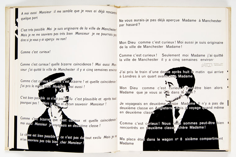
Robert Massin was born in 1925 is another key figures in the development of the French post-war graphic design. For twenty years, he was the art director of
Editions Gallimard, where he created the pocketbook collections '
Folio' and '
L'Imaginaire', and collaborating with photographer Henry Cohen, he conceived a graphic interpretation of Eugene Ionesco's absurdist play
La Cantatrice chauve (The Bald Soprano) for which he received the Leipzig International Book Prize. Massin’s wide-ranging work includes many imaginative and revolutionary projects.
 |
| Robert Massin and Henry Cohen, pages from La cantatrice chauve, by Eugene Ionesco. |
 |
| Robert Massin and Henry Cohen, pages from La cantatrice chauve, by Eugene Ionesco. |
 |
| La Lettre et l'Image, 1970 |
Massin's interest in graphic design started at childhood, when he collected all the graphic images and letterforms to be found in
his grandmother's grocery shop: logos, packaging, signs, posters, and
enamel advertising plaques.
At the age of seven, he was writing and designing small
books, signing them; "Robert
Massin, Author, Editor, Publisher, Typographer, and Photographer." According to him his father, a stone engraver, stimulated his interest "in letters and all graphic things,"
when at the age of four, gave
him a hammer and chisel and asked him to engrave his name in soft stone even though the poor child did not yet know how to write the
alphabet!
Massin's career began in 1949, when he began designing books for the
Club du Meilleur Livre, one of the major book clubs that appeared
in France after the WWII, at a time when most bookstores across the country have been shutdown because of the war, and he became one of the principal figures of the book design revolution of the 1950s. As an independent graphic artist, he has designed thousands of covers and jackets, and many layouts of books and posters.
In 1970 he wrote and designed the book Letter and Image, which has been continually updated and re-issued ever since. His work as a writer includes some thirty volumes, and the city of Chartres has published a catalogue raisonné of his typographical work in three volumes. Under the auspices of UNESCO he has received the International Book Award for his contribution to culture. From New York to Seoul and from Istanbul to San Francisco, dozens of cities around the world have organized retrospective exhibitions of his work. In 2001, he was elected to the Royal Academy of Belgium.


According to Massin his mentor was Pierre Faucheux who had been;
"one of the first designer/typographers to emphasize the importance of dynamic typography and documentary iconography on covers, at a time when illustration had not yet been replaced by photography. For my first covers, I was asking myself, 'What would Pierre Faucheux think?'"
His other influences include Saul Bass's title sequences for the movies of Alfred Hitchcock, and Tex Avery's animated cartoons.
"I have spoken often, about the cinematic quality of book design, revealing its narrative structure while constantly changing scale and rhythm, and alternating focal planes and perspective. Between the endpapers and the first signature, it was like creating a little flip-book within the book. It was quite common to have these elaborate introductory pages in the Clubs' books."
May 1968, Paris Spring and the Birth of Social Posters
The student and worker revolt in France in May 1968 was a socio-cultural revolution. France woke up shocked. So, presumably, did President Charles de Gaulle, who had gone to bed early. The strikes
began at Nanterre, where on May 3 a government decree had suspended
classes after students protested dormitory rules. On that same day,
students occupied the illustrious Sorbonne University in the heart of
Paris’ Latin Quarter. On Friday 3rd May a meeting was called in Sorbonne University to protest against the closure of Nanterre University the day before. This followed a week of clashes there between extreme right wing groups and students campaigning against the Vietnam War.
By the evening a pitched battle raged up and down the Boulevard St Michel, and by the end of it 72 policemen and untold number of young people had been injured, 600 had been arrested and what has now gone down in history as Paris Spring had begun.
The next day the press and media were full of comments about the unexpected reaction of the students. There was total surprise and incomprehension at the events. While, as usual, the government blamed a small group of agitators, one thing would become increasingly clear over the days and weeks ahead - a seeping sense of anger and frustration throughout French society, not just in the colleges and universities, but also in the factories and workplaces, was about to explode. This was a revolt against the rigidity of traditional conservatism, where the entire society began to reevaluate its fundamental values, or as André Malraux, the writer and politician and the French culture minister at the time suggested it was a harbinger of the death of God! By May 10, brutal fighting, clouds of tear gas, Molotov cocktails, exploding automobile gas tanks, cobblestones hurled at the police, students chased down and beaten, became the new normal. France and its President Charles de Gaulle were shocked. Events accelerated. The left mounted a huge march of solidarity with the students, who reoccupied the Sorbonne. Workers began occupying their factories. Within another week, The country was closed down by the general strike. On May 30, de Gaulle addressed the nation briefly on the radio. and announced new elections and hinted at using military means to restore order. A deftly prepared demonstration immediately flooded the Champs-Élysées with hundreds of thousands of citizens previously maintaining a low profile. In no other country did a student rebellion lead to a workers' revolt, one that rose up from the blue-collar grass roots and overwhelmed the paternalistic trade-union leadership as much as the paternalistic, conservative government. Jean-Paul Sartre, stood on a box outside the Renault factory at Boulogne-Billancourt telling the workers about the student-worker-intellectual paradise to come.
In 1968, however, under the famous slogan
“il est interdit d’interdire” (“it is forbidden to forbid”), students and artists glued posters and built barricades. Bernard Rancillac, participant at the atelier of the Beaux-Arts, remembers both posters and barricades as “nineteenth century” references, especially since “in our time, with tanks and helicopters and stuff like that, a barricade doesn’t last five minutes.” With slogans like "Marxist, Groucho tendency." "Be realistic, ask for the impossible." "Take your desires for realities." "Unbutton your brain as much as your trousers," the walls of Paris were covered with a new kind of monochromatic posters inspired by
l’Atelier Populaire , which were influenced by the work of Polish born Roman Cieslewicz who was living in France since 1963.
Roman Cieslewicz (1930 - 1996) was born in Lviv, which was part of Poland before the WWII and now in the Ukraine. At the age of thirteen Cieslewicz enrolled at the Arts Industry School and at the age of seventeen moved to Cracow to attend the School of Visual Arts, and finally after six years of study the Cracow Academy of Fine Arts and specializing in poster and display design, he obtained his art diploma in 1955. Apending some times in Germany and Italy,Cieslewicz moved to Paris in 1963, where worked in advertising, and book and magazine illustration. Eventually he became the artistic director of
Elle a women fashion magazine from 1965 to 1969. He also worked for
Vogue . From 1975, he began a partnership with the Pompidou Centre in Paris, and produced posters and exhibition catalogues. This work brought him international recognition and, in 1979, he was awarded the Art Print Grand Prix for the Paris-Moscow exhibition at the Pompidou Centre. Cieslewicz completely integrated typography into his work, since according to him:
“an image was naked if it is not accompanied by a word”
In his role as the designer for the arts magazine
Opus International, Roman Cieslewicz had a considerable influence on European design in particular his work was very
influential on the artists and designers that took part in the
Ateliers
Populaire in May 68, and especially on those that would go on to form
the political design firm Grapus.
L’Atelier Populaire Présenté par Lui-Même
In 1968, students demonstrated their intense politicization by the vast numbers of posters that they glued to the walls of Paris.
Gérard Tisserand, a member of the recently established
atelier populaire des ex-Beaux-Arts went to the newly occupied Sorbonne calling everybody to:
“Stop wasting your time talking nonsense, At the Beaux-Arts we need help making posters. All artists are invited.”
Many artists followed him and they occupied the
Beaux-Arts, printing their first poster on May 14. As well, other student artists who had occupied the
Arts-Déco since the night of May 13 a few days later began to create their defiant political posters. Although students ejected professors from the
Beaux-Arts and the
Arts-Déco, they were professional artists like the ones in
Jeune Peinture group who occupied the buildings and ran the workshops. The
Jeune Peinture artists collectively created many works and left them unsigned. They appropriated workers’ slogans and politicians’ words for their posters texts. Many of the artists at the
Arts-Déco were also working collectively and anonymously, and a number of them were influenced by the famous Polish poster artist Henryk Tomaszewski. According to Bernard, who had studied with him
" [The Polish experience] really, really changed my life. Tomaszewski’s teaching was a complete revolution. It was the discovery of ideological and moral commitment in the image. We implanted a practice that came from Poland, we wanted to have a product that was evaluated by the group... Poland was thought of a lot by those people whom I knew at the Arts-Déco workshop... As far as I am concerned, the artistic influence is primarily the Polish experience.”
Although most of the ateliers’ posters were printed to fulfill orders from the unions, who brought their own slogans, workers were conspicuously absent from both ateliers. The ateliers provided free designs to unions who were striking for better wages. However, the spring movement, which tried constantly to connect with the working class, failed to integrate them into poster production, and the radical artists did not succeed in converting the workers to their more extreme political perspective.
When in 1969 a large-format red-covered volume,
L’Atelier Populaire Présenté par Lui-Même --“The Popular Workshop Presented by Itself” published by the British publishing house Dobson; first in French, and shortly after in English, it became the authoritative reference on the posters of 1968, cited in virtually all scholarship on the subject. The posters reproduced in the book were exclusively products of the
Beaux-Arts atelier, whose members also wrote all the text. The prominence of this book helps to explain why the story and work of the Arts-Déco and other ateliers were forgotten.
The wide circulation of L’Atelier Populaire Présenté par Lui-Même brought French posters to the world. The immediate impact was on the international leftwing youth movements, with posters that appeared in radical student activists’ dormitories across the globe, on t-shirts and at demonstrations.
Grapus design collective; design for the public square
Grapus design collective was founded in 1970 by artist members of the French Communist Party (PCF), Pierre Bernard, Gerard Paris-Clavel and Francois Miehe, who had collaborated during the May 1968 student movement. They were joined in 1974-5 by Jean-Paul Bachollet and Alex Jordan. However Miehe left the group in 1978. In the beginning, by producing cultural and political posters for experimental theatre groups, progressive town councils, the PCF, the CGT (Communist trade union), educational causes and social institutions, Grapus sought to 'change life' by the twine dynamics of graphic arts and political action. The collective scorned the commercial advertising, and adhering to its founders idealistic principles, tried to bring culture to politics, and politics to culture. The Grapus visual communication style was powerful and highly distinctive, characterized by an unpretentious and mercurial combination of impulsive scribble, flat colors, licentious compositions and exuberant rowdiness. In 1984, 1985 and 1988 Grapus designed the corporate identity of the
Centre National des Arts Plastics, the
Parc La Villette and the
Louvre Museum respectively. From 1978 on, Grapus showed its work in major exhibitions at the
Musee de l'Affiche in Paris, the
Stedelijk Museum in Amsterdam, the Aspen Conference in Aspen, Colorado, and the Museum of Contemporary Art in Montreal.
The work of Grapus design collective belonged to the public square, it represented a dialog between governments and citizens; culture and politics, and in the final analysis the message and the form. Its visual communication in the public square was bold and honest it was aware of its presence and its impact; and at same time it was informed by the socio-cultural parameters of time in all its dimensions past, present and expected future which provided a contest for experimentation and innovation. Throughout their history, Grapus remained Communists and idealists and continued to operated collectively: all work left the studio signed ‘Grapus’ even when their studio numbers had grown to around 20, operating in three separate collectives.
François Mitterrand's socialist France of 1980s, focused on the the cultural democracy movement. Jack Lang, minister of culture, supported a wide range of avant-garde art projects, and graphic expression was one of them. Lang surrounded himself with a dynamic team of advisors, some of whom like Lang had been student activists in the Algerian struggle for independence. Every socialist city, town and village had to have its logo. All the government agencies felt compelled to acquire a graphic identity. And the Georges Pompidou Center had just mounted an exhibition called
Images d’utilite publique (Images for Public Use) that defined, for the first time, the role of graphic design in modern democracies. Most important for French Designers, a coherent graphic design theory was beginning to emerge. But instead of helping Grapus mainstream its revolutionary message, this sudden surge of public interest in graphic design challenged their very
raison d’etre. No longer in the opposition, the members of the collective felt that they were betraying their subversive mission. Like the [Situationist International], who disappeared as a group in the confusion of the student uprising they had fostered, Grapus dissolved when it’s confrontational ideology was successfully co-opted by the cultural establishment.
Grapus finally disbanded in January 1991, and after their break-up, they began practicing their craft, each on their own terms. Paris Clavel designed award-winning, leftist posters under the
Ne pas plier monkier (a pun on the "Do Not Fold" warning on mailing envelopes containing graphic material, the name suggests an inflexible state of mind), Miche began to teach at the
Ecole de Arts Décoratifs . Alex Jordan, who had joined Grapus in 1976, formed
Nous travaillons ensemble (We Work Together), another design collective known for it’s social involvement. Fokke Draaijer and Dirk Debage, two Dutch graphic designers who stayed on with Pierre Bernard to form ACG, also eventually left to create their own studios.
 |
| Gerard Paris-Clavel |
 |
| Gerard Paris-Clavel |
 |
| Francois Miehe |
Graphic Design in the 1990s and the M/M Counterrevolution
 |
| Affiche de l’exposition
Fanette Mellier et Xavier Antin produisent,
en modifiant la trame et les encres,
une réimpression de la première affiche
de M/M (Paris) pour le CDDB.
Imprimeur : Lézard Graphique |
One of the remarkable achievements of French graphic design from the 1990s are the posters created by Mathias Augustyniak and Michael Amzalag. In the early 1990s – more established French design companies, such as Grapus, were doing all the work in the cultural field, work generated by the socialist government of that era. M/M just took what was left. In Fact, until the early 2000, when bands like Air and Daft Punk emerged, "the French music scene was completely dead". As a result marketing music in France was enjoying a huge injection of finance. Since then, the so-called "French Touch" has helped young French graphic designers to emerge. Through their work as graphic designers and creative directors in the fields of art, fashion and music, Amzalag and Augustyniak have established M/M as a powerful force in contemporary French culture.
They both studied at the
École Nationale Supérieure des Arts Décoratifs of Paris in 1988 where they met and started working together in 1991, founding M/M in 1992. Michael left after two years, before receiving his diploma, to art direct the music magazine
Inrockuptibles . Mathias completed the degree and went on to study for two years at the Royal College of Art. The paths were very different but afterwards their mutual backgrounds proved to be very complementary. Education was a starting point, and after leaving the Royal College Mathias felt that that
"I knew it all, but once I began working I had to reassess everything".

|
| Balenciaga invitation card, 2002
Art Direction: M/M (Paris)
Photography: Inez van Lamsweerde & Vinoodh Matadin |
They have sinced worked together as graphic designers and art directors on fashion and art projects mostly for longstanding clients and collaborators – such as the fashion designers Yohji Yamamoto and Martine Sitbon, and the photographers Craig McDean, Inez van Lamsweerde and Vinoodh Matadin.
After starting out with music projects, M/M became involved with Yamamoto and Sitbon in 1995 and have since worked for other fashion houses including Balenciaga, Louis Vuitton and Calvin Klein. Their work in the art world ranges from commissions for museums such as Centre Georges Pompidou and Palais de Tokyo in Paris, to collaborations with artists like Philippe Parreno and Pierre Hughe. Amzalag and Augustyniak also work as creative consultants to Paris Vogue.
Prominent graphic designers have always cross-fertilized their creative and commercial success, by imbuing their work with depth and meaning. Often they've separated their commercial projects from personal, more expressive ones, but M/M makes no distinction between the two. Augustyniak and Amzalag see all of their work as a cultural endeavor - whether it's for global fashion brands like Calvin Klein, Balenciaga or Stella McCartney, Paris Vogue magazine, or a tiny Brittany theater - and draw their art exhibitions from their commercial archive.
"For us there's never been a question of purely expressive work versus
purely communicative work," said Amzalag. "It's all part of our body of
work."
 |
| Kanye West had asked M/M Paris last fall to design the album packaging for My Beautiful Dark Twisted Fantasy. West also had artist George Condo create several paintings which feature characters that represent West’s musical fantasies. M/M Paris created a series of hand drawn ornamented frames to compliment the the Condo paintings. All three decided to take all the elements in their creative process to create five full colour silk scarves. |
 |
The alphabet 2001
with inez van lamsweerde and vinoodh matadin,the alphabet series |
 |
| Affiche de la saison 2008 du CDDB, Théâtre de Lorient, sous la direction artistique de m/m (paris). variations typo d'après la marion, m/m (paris). automne 2007 |
 |
| The M/M posters break with a model of theater poster centered on a printed staging
of the play: they are works on meaning, conducted through symbolic and visual metaphor. Placed in the public space of Lorient with cultural-message status, the images create a link between theatrical performance and the “ordinary” experience of the spectator. |
M/M designed theater posters for the CDDB –
Théâtre de Lorient for more than fifteen years. Their imaginative posters draw on an iconography rooted in the two designers’ daily professional and personal lives. In M/M theater posters meaning remains on the margin; some posters appear to represent a backdrop, a symbolical narrative, a
memento mori, while others seem to suggest a routine circumstantiality.
The posters’ printing in four colours (CMYK), the default method of representation, contrasts with the sophisticated formal work on the lettering of the black-and-white titles. According to M/M:
We chose graphic design not just for the sake of being graphic designers. It was some kind of social commitment, a way to earn a living and also to disseminate our ideas. The activities related to graphic design are very suitable for us. We enjoy the thinking process, but we prefer that it be related to form and that ideas have tangible results. Also, we don’t create things out of the blue, we want to form a relationship with someone. But, as such, graphic design doesn’t excite us more than any other media, than film or books for example.
Based in France, we were able to completely redefine the way we see graphic design. There are so few French designers that the field is not precisely defined in the way it is in say Germany, the UK or the US. There, you settle down to do corporate design, or record sleeve design, whereas in France there is still a great deal of room for experiment and crossover. Our early influences include everything, but nothing in particular. The way we see life, one thing isn’t greater than another. Everything is interwoven.
 |
| Annlee: No Ghost Just A Shell, 2003
Silkscreened poster
Produced by M/M (Paris)with Pierre Hughe & Philippe Parreno |
 |
| Calvin Klein Jeans ad, 2002
Art Direction: M/M (Paris)
Photography: Inez van Lamsweerde & Vinoodh Matadin
Reproduced courtesy of CRK Advertising, NYC |
 |
| I Love Fast Cars book, 2000
Design: M/M (Paris)
Photography: Craig McDean |
French Touch, for 2000 and beyond
When Eric Morand, the confounder of the techno label
F Communication along with DJ Laurent Garnier declared in 1994 that:
‘We give a French touch to house music’
little they knew that the term ‘French Touch’ would soon define the French Graphic movement of the new millennium. In fact, soon after that declaration all the visual artists; graphic designers, video directors, and so on who were involved in creation of visual communication products were identified with a bold and new style of computer generated images. They were backed by France's strong pioneering inroads in digital technology. In fact, Pierre Bezier, a Frenchman, had developed CADÍCAM surface patches: mathematical definitions of complex surfaces, used in automobile CADICAM applications. Another designer, Henri Gourault, pioneered shading techniques for color graphics in the mid 1970s. In the 2010s France became a leader in industrial CAD applications software that was vital for animation. Early in the new millennium French achieved forms of rendering visual communication that was again unique and remarkable. France's graphic design and animation industry was completely restructured in less than five years. Similar to Mitterrand and Lang era's investment in art, the government subsidy and planning together with an industrial CADAM base, provided potent impetuses for the French visual artists to excel.
At the same time, collaborating with the emerging independent labels, French graphic designers created an authentic visual identity for Electronic music that was informed by such hindrances like the scarcity of production budget, the musicians’ desire to remain anonymous, and the arrival of the Macintosh and its simplicity as a design tool. Graphic designer Geneviève Gauckler, who had only just graduated from
the Ecole des Arts Décoratifs joined French label,
F Communication, which was just founded by Eric Morand and Laurent Garnier
. As she explains:
It’s like a challenge to create new artworks by following these rules, these constraints. It’s like children playing and trying to come up with a new story, a new game by always using the same toys. In a way, I’m trying to become more and more simple, but I wouldn’t dare to use the word ‘minimalist’, because it’s related to art and I’m not really connected to the art world – my work is closer to illustration and decoration. This simplicity is like a relief in our complicated, hi-tech world: no sophisticated filter, no artwork made with 500 Photoshop layers, just paint and pencils.”
 |
| Geneviève Gauckler |
 |
| Geneviève Gauckler |
Alex Goffer, Etienne de Crécy and Pierre-Michel Levallois, working with the H5 collective, created
The Solid label. The album covers like Super Discount album by Etienne de Crecy and the Child video by Alex Goffer redefined the concept of French Touch.
 |
| Alex Goffer |
 |
| Alex Goffer |
 |
| Etienne de Crécy |
 |
| Etienne de Crécy |
The Yellow label, created by Alan Hô and Christophe le Friant, alias Bob Sinclar, enlisted the talents of Serge Nicolas. These graphic designers, fresh out of school, broke free from the teaching they had received at college, with its insistent reference to the Polish and Swiss schools and the militant graphic design of the Grapus collective, and looked to Anglo-Saxon post-modernist graphic designers such as Peter Saville, Neville Brody and Designers Republic for their inspiration.
 |
| Bob Sinclar |
 |
| Bob Sinclar |
Vincent Perrottet was born in Sent-Denis in France in 1958. He studied at the
École Nationale Supérieure des Arts Décoratifs, department video/cinema. during the 1978-1984 period. In 1983, he met the group Grapus and worked with them until 1989. After his graduation, Perrottet worked for one year with two other members of Grapus ; Thève and Pierre Milville; and two years later, in 1987, he joined Pierre di Sciullo and Pierre Milville to establish
Courage which lasted for one year. Then in 1989, Vincent Perrottet and Gérard Paris-Clavel Created
les Graphistes Associés , one of the three
ateliers that arouse from Grapus with Jean-Marc Ballée, Anne-Marie Latrémolière and Odile José.
Les Graphistes Associés was committed to creating a public image based on social good, seeking to develop a socially responsible French graphic design.
Gérard Paris-Clavel left the group in 1992, and the rest of the
Les Graphistes Associés members including Sylvain Enguehard, Odile José, Anne-Marie Latrémolière, Mathias Schweitzer and Vincent Perrottet broke-up in 2000. After the break up Vincent Perrottet began to work as a free and independent graphic designer. Working together with Anette Lenz for the theater
d’Angoulême , he remained faithful to the idea of social good. As he notes:
Everyday, our eyes see hundreds of urban images (posters, signs, publications by some entity or the other ...) that are supposed to interest us, inform us, guide us or instruct us. However, if we are to be asked to tell or to describe one, even briefly, it is almost always impossible to remember what we have seen. It is as if we had seen them to just avoid them, as if there is nothing in their forms and messages that would cause us to think, nothing to impress us intelligently and significantly...I am trying to catch the attention of passers, to slow them down, to stop them and compel them to read what I have to say. Perhaps touching the sensitive area of their perception of form and meaning of our lives, making them to be critical in agreeing or disagreeing with my proposals, generating discussion between those who have learned something, and then hope to generate reflection and memory.
Perrottet also thought at
à l’École Supérieure d’Art et de Design d’Amiens (ESAD) in 1992-1993. As well, he has participated in numerous assignments such as lecturing, participating in conferences, Juries for entries and degrees at
l’ENSAD, l’ESAG, l’Ecole Estienne, l’ENSCI, l’École d’architecture de Marne-la-Vallée and a number of other art schools. Since 1999, Perrottet taught at
l’École d’art du Havre. . In 2004, together with Anette Lenz, Perrottet won the second prize at the
biennale d’affiches de Téhéran and won the grand prize at biennale d’affiche de Ningbo in China.
 |
Festival Transe poster for the 2010–2011 season at La Filature, a
theater in Mulhouse, France (designers: Anette Lenz and Vincent
Perrottet; client: Joel Gunzburger)
|
 |
| Les Nuits du Ramadan poster for the 2010–2011 season at La Filature, a
theater in Mulhouse, France (designers: Anette Lenz and Vincent
Perrottet; client: Joel Gunzburger) |
Toffe is the
nom de plume of Christoph Jacquet who is an important and original post-modern graphic designer, with a certain following in Paris, where he was born and still resides. Toffe enrolled in
the Ecole Nationale Supérieure des Beaux Arts de Paris to study painting and sculpture;
“ It was very formal, students received a classical art education. Emphasis was on drawing from the nude, and no graphic design was taught at all. But while I was there I discovered the Apple Mac computer. This was in 1984. A friend had an early Mac Plus – it was so new it even had American voltage. This was a nuclear moment for me. I decided to become a graphic designer on the spot. ”
 |
| Acousmonium. festival cute and splice. musique acousmatique. londres. 2006 |
 |
| pour jean sénac. collection a4. éditions rubicube, ccf alger. 2004 |
According to Etienne Hervy, the editor of French graphic design magazine
Etapes:
“ He is regarded by French designers as a one-off, a kind of curiosity. Someone who is somewhere else – in an intellectual sense. But there is a strong group of young designers that follow him and occasionally work with him on big projects, usually after being impressed by him during one of his workshops or visits to their school. If you disregard big stars such as M/M, or before them Grapus, he’s one of the few French designers to have this kind of “court” – the word is too strong, but I’m not sure what the right English word would be.
”
His work “bristles with contradictions” says Rick Poyner, combining ugly default computer settings with intricate fleurons and flourishes in jarring graphical juxtapositions.The name Toffe – suggests a character played by Jean Paul Belmondo in a light-hearted French gangster movie. Toffe's design is thoughtful, bold and imaginative. In his work he combines computer default settings with his own creative touches. As well his typefaces is an admix of Times New Roman with elegant filigree line work and hybrid digital fonts.
“I use a lot of default settings in my work, I like people to see the nature of the machine I have used. I was immediately enchanted with the computer, It gave me a sense of power. It did for me what the Internet does now. It meant that people all over the world were using the same machine. I was using the same machine as someone in America. I used MacPaint and MacWrite. I recently met Bill Atkinson, the guy who created MacPaint and I thanked him profusely. What really excited me about the Mac was the « undo’ function. You can’t undo a drawing or a painting. I found this psychologically stimulating. I was also obsessed with repetition. I had been making repetitive sculptures – bas reliefs – and this seemed to be a bridge for me between art and graphic design. ”
 |
| séri-graphique. maison pour tous. fontenay-sous-bois. 1997 |
 |
| edit ! normes, formats, supports. colloque école ba_bx. capc. bordeaux. 2009 |
Toffe has collaborated in recent times with the
Centre Cultural Francais d’Alger, which under the auspices of the French government, is dedicated to
“ the renewal of a dialogue between the two banks of the Mediterranean." As he explains:
"There is a very complicated relationship betweenFrance and Algeria, The director of the Cultural Centre, Aldo Herlaut, is an interesting man. He asked me to do the Centre’s visual identity. In my studio, I worked with an Italian designer called Gianni Oprandi, he was one of my students and I’ve worked with him on other projects. Together we made a style manual for all the centre’s communications. Also we did many other individual projects, including posters and leaflets. ”
To create a visual identity for CCF, Toffe delved into French typographic tradition and the noble grammar of Arabic ornament to incorporate in his design a mixture of Arabic and European signs and tropes .
“ The French ambassador thought it was dangerous. It might have been seen as the Kaabah, the cube-like shrine in the courtyard of the Sacred Mosque in Mecca, toward which Muslims
face in daily prayer. In fact, it’s a graphic representation of the shape of France. To make it
acceptable, I used a nice French blue for the octagon shape. I also adapted the classic French
typeface Normandie. It predates the French occupation of Algeria in 1830. It’s like Mistral and
Banco – typically French. Of course, I didn’t use it straight, I doctored it. I hope the identity
is provocative, and not colonialist. But I can’t help my French heritage. I can’t just throw
it away. ”
 |
| ccf alger. centre culturel français d'alger. algérie 2004-2007 |
 |
| ccf alger. centre culturel français d'alger. algérie 2004-2007 |
Toffe developed an approach using vector drawings to create a wire-like line that he could use to make abstract Arabic lettering, without it being readable. The motifs used in the CCF identity were based freely on Arabic typography which is like the Latin handwriting, and flows.
"I don’t think they find it disrespectful. They treat it like a gift. They view it in the same way they view cakes and delicacies, which are very important in Arabic culture. Eating, nice colours, icing, these are things that give pleasure. ”
Another striking piece of graphic design produced under the CCF banner is Toffe’s book
devoted to the French poet Jean Senac (1926 - 1977), who was murdered in Algeria in 1977. Senac, a homosexual, was a protégé of Albert Camus, and a fervent supporter of Algerian independence, as result of which he broke up with Camus. He became an Algerian citizen and expressed his deep love of Algeria through his poignant poetry. As Adrian Shaughnessy notes:
The book, titled pour jean sénac is a tour de force of graphic expression. It is laden with his trademark signs and symbolism. It is also a bravura display of the designer as editor. No conventional editor would ever produce a book like this. It is clearly the work of a visual artist engaging fully with the book’s subject matter, and using the rich gestural language of graphic design to impart a layer of visual commentary that adds to the accumulated pleasure of handling and studying this volume.
.... And others
_
 |
| Le cœurbarluet |
 |
Festival mondial des arts nègres
Annette Lenz et Vincent Perrottet
La Filature, scène nationale de Mulhouse
|
 |
Lieuxcommuns
La Criée, centre d’art comtemporain
|
 |
Helmo
Le Lieu du design
|
 |
Tom Henni
Festival d’improvisation « Spontanéous »
|
 |
M/M (Paris)
« Points on a Line », Sarah Morris
|
 |
Atelier Formes Vives, Adrien Zammit et Nicolas Filloque
Ville de Bobigny, pour la promotion et la défense des services publics
|

Laurent Fétis
Social Club

Mathias Schweizer
Antidote, la Galerie des Galeries

Paul Cox
Théâtre Dijon Bourgogne, centre dramatique national

Lieuxcommuns
La Criée, centre d’art comtemporain
____________________________________________________________________________
This work is licensed under a Creative Commons Attribution-No Derivative Works 3.0 Unported License.


Various skills are required to be honed and developed so that the kids’ personality, when they grow up, is sharp and bright.
ReplyDeleteIB Residential School
Choosing a web design company is not so easy if u haven't follow some basic principles while hiring.U have made the best points on the importance of website design and the tips to be followed.
ReplyDeleteGraphics Designing
kennethandrewmroczek@gmail.com
ReplyDeletekenneth (email: kennethandrewmroczek@gmail.com) wrote: I came across your blog http://guity-novin.blogspot.be/2012/03/graphic-design-and-french-school.html#Two
and I was wondering if you know of any definitive source for the graphic works of Henry Van de Velde.
many thanks
--------------------------------------
You may find these books helpful
*-Henry Van De Velde by Klaus-Jürgen Sembach Publisher: Rizzoli (September 15, 1989), ISBN-13: 978-0847808588
*-Henry Van De Velde by Herman Teirlinck, Publisher: Bruxelles: Ministry of Instruction, 1959,(January 1, 1959), ASIN: B001CD0YYQ
*-Henry Van de Velde, by Karl-Heinz. Huter, Publisher: Akademie-Verlag (1967), ASIN: B0000BRP09
*-Henry van de Velde, by Thomas Föhl , Publisher: Weimarer Taschenbuch Verl (March 1, 2010), in German ISBN-10: 393996402
*- Henry van de Velde in Weimar, 1902-1917: Kunstfuhrer (VDG Kunstfuhrer) (German Edition) by Dieter Dolgner (1996), Publisher: Verlag und Datenbank fur Geisteswissenschaften (1996), in German, ISBN-10: 3932124073
Great post with awesome designs. Very informative and useful post. Thanks for sharing. :)
ReplyDeleteThank you for your hard work! Gave me a great insight. Thank you for sharing!
ReplyDelete