Translate - برگردان به پارسی

Chapter 69; Copyright, Appropriation, Plagiarism and Code of Ethics


In 1759, Edward Young described the difference between originality and imitation;
The mind of a man of Genius is a fertile and pleasant field, pleasant as Elysium, and fertile as Tempe; it enjoys a perpetual Spring. Of that Spring,Originals are the fairest Flowers:Imitations are of quicker growth, but fainter bloom. (Young, 1966, p. 9)
In a less colorful style, one may argue that original work of visual art like original writing comes from inspiration which in the words of Ralf Waldo Emerson (1950) "depends on the simplicity of" its creator's "character, that is, upon" the artist's "love of truth, and desire to communicate it without loss"
However, within art and design there exist a culture of appropriation, where artists or designers 'quote' the work of others.


Left: Andy Warhol and Right: Richard Pettibone


A pioneer of appropriation art is Richard Pettibone (born 1938, Los Angeles) who in 1964 produced two tiny, exquisitely made copies of Andy Warhol's 1962 painting "Campbell Soup Can (Pepper Pot)," one in green, the other in gray, both stamped with Warhol's name and his own. He was making Pop Art and post-Pop Art. Marcel Duchamp, along with Andy Warhol were of significant influence. Pettibone encountered their ideas at full force in Warhol's first gallery show (of the Campbell soup cans) at the Ferus Gallery in Los Angeles in 1962, and in Walter Hopp's legendary Duchamp retrospective, at the Pasadena Art Museum in 1963, the first held in the United States.Between 2005-2006 the artist had a retrospective of approximately 200 paintings and sculptures at the Laguna Art Museum, Laguna Beach,California and The Frances Young Tang Teaching Museum and Art Gallery at Skidmore College, Saratoga Springs.

Andy Warhol, Turquoise Marilyn, 1962 (left). Elaine Sturtevant, Warhol Licorice Marilyn, 2004

Another "artist" that has "appropriated" wholesale from other artworks was Elaine Sturtevant, who in the 1960s tried to reproduce, ‘as exactly as possible’,the works of her contemporaries, including Roy Lichtenstein, Claes Oldenburg, Jasper Johns, Frank Stella and Andy Warhol. She aimed to use the same techniques they used, and in some cases enlisted their aid: on at least one occasion, Warhol lent his screens for her copies of his silkscreen works. Sturtevant has said that in the 1960s, she usually allowed in one ‘mistake’ which distinguished her product from the original work. But in general, the results were very close to the originals.

Left: Roy Lichtenstein and Right: Elaine Sturtevant

Left: Sherrie Levine, After Walker Evans, 1981; Right: Walker Evans, Alabama Tenant Farmer's Wife, 1936

Sherrie Levine has produced a substantial body of photographic appropriations during the 1980s. For these works, she sought out reproductions of well-known works by artists such as Walker Evans and Alexander Rodchenko in art history books and catalogues, photographed the reproductions, and presented the resulting photographs as her own work.

In 2001 Michael Mandiberg created a web site, AfterSherrieLevine.com, which appropriates from Sherrie Levine’s many appropriations of the photographs of Walker Evans. Mandiberg took the same exhibition catalogue and scanned the reproductions of Evans’s works at high resolution to make them available on line. In the introduction to the website wrote:
In 1936 Walker Evans photographed the Burroughs, a family of sharecroppers in Depression era Alabama. In 1979 in Sherrie Levine rephotographed Walker Evans' photographs from the exhibition catalog "First and Last." In 2001 Michael Mandiberg scanned these same photographs, and created AfterWalkerEvans.com and AfterSherrieLevine.com to facilitate their dissemination as a comment on how we come to know information in this burgeoning digital age.

Here on AfterSherrieLevine.com you will find a browsable selection of these images. Links to the high-resolution exhibition-quality images to download and print out. Along with a certificate of authenticity for each image, which you print out and sign yourself, as well as directions on how to frame the image so that it will fulfill the requirements of the certificate. (...) This is an explicit strategy to create a physical object with cultural value, but little or no economic value.
The apologists for appropriation artists argue “Appropriation art” questions the notion of authorship! Contemporary postmodern art is all about ideas, and various expressions can build off similar sources. The appropriationists pointedly use the work of previous artists to make a new statement about the work and the surrounding world. Art historian Martha Buskirk writes, “The copy is . . . the basis for a conception of art-making in which artists incorporate increasingly subtle and layered references to the history of art as well as other sources (...) The daunting situation faced by the artist of the early twenty-first century is one in which all choices seem possible”, well! maybe that is so. Here is an idea for a budding appropriationist why not to frame a yesterday's copy of New York Times, or here is a new reference to the history of Walker Evans' photographed of the Burroughs, and subsequent appropriations. It's a new statement about the work and its surrounding digital world potentiality for appropriation .

The daunting situation faced by the artist of the early twenty-first century is one in which all choices seem possible!


Of course, some artists approach to appropriation is less "quasi-theoretical", and more artistic. As Jonathan Wakuda Fischer (known also as Wakuda,) an artist active in Seattle underground and street art movements, puts it:
"About appropriation. You can’t not do it. So do it well. If you’re just ripping off something for a profit, it will show."
Wakuda uses this technique in order to pay homage to classical styles of art, exploring Japanese Ukiyo-e woodblock culture, for instance. Exploring the real world historical instances which influence his art in different ways, he also uses the very medium to examine cultural methodologies. Going back to the stenciling, and exploiting its reproducibility, Wakuda experiments with ways to produce originality in the midst of repetition in "a very Japanese way of thinking".


So the questions is where to draw the line between appropriation and plagiarism?
In an article for Design Observer, entitled Bird in Hand: When Does A Copy Become Plagiarism? William Drenttel has argued that the January-February 2005 cover of STEP Inside Design featured a stock photograph by Marcie Jan Bronstein that was very similar to a photograph by Victor Schrageron that hung in his living room since 1998. He wrote:
The photographs are not exactly the same. The tonality is different, as is the deep-of-field. The hand and bird are more predominate in the Bronstein photograph. Nonetheless, there seems to be a deep similarity. What I cannot answer is why Marcie Jan Bronstein took this particular photograph, or others in this vein, and entered them into a commercial stock photography archive. Her source of inspiration is unknown to me.
He argued that ideas come from many sources in graphic design: they recur, regenerate, take new forms, and mutate into alternative forms. In the world of design and photography, there seems to be an implicit understanding that any original work can and will evolve into the work of others, eventually working its way into our broader visual culture. Drenttel concluded;
The charge of plagiarism is not a simple one. Malcolm Galdwell has explored the complexity of this issue recently in The New Yorker. Designers should take note: the idea of borrowing ideas is getting more complex everyday. Inherent in the modern definition of originality, though, is that ideas are extended, language expanded, and syntax redefined. Take a psychologist's ideas and experiences, as explained through the eyes of a journalist, and turn them into a play, a work of fiction — this is a work of complex "appropriation." I believe the design world benefits greatly from such an understanding of complexity.
The same idea is expressed by Douglas Crimp, in his Appropriating Appropriation (in Richard Hertz Ed. Theories of Contemprary Art, Prentice Hall Inc, USA 1985) who states:
Appropriation, patiche, quotation - these methods can now be seen to extend to virtually every aspect of our culture, from the most calculated products of the fashion and entertainment industries to the most committed critical activities of artists
Left: STEP Inside Design, Cover, Jan.-Feb. 2005. Right: Photograph by Victor Schrager.

Appropriation in art maybe defined as a broad replicating of certain aspects of an art object into a new work, relocating it into a new matrix. The history of appropriation in modern art may be traced to avant-garde movements aims at the turn of the twentieth century, with Marcel Duchamp appropriating ordinary objects, such as a bicycle wheel and a urinal, and put them on display as art in order to make a statement about the meaning of art itself.

The image on the left is an unidentified reference photo. On the right is Cézanne’s Bather(c. 1895).


On the left is a reference photo of the painter Eugène Boch. On the right is Van Gogh’s portrait of Boch (1888).
The image on the left is cropped from an 1890 photo by Henri Lemasson. On the right is Gauguin’s Mother and Daughter (1902).

In modern art, the Cubists, surrealists, pop artists, and others reproduced parts of an art or non-art object to explore various ideas, some could be regarded as artistically serious while others nothing more than junks. Robert Rauschenberg’s 1955 Satellite combines oil paint, fabric, paper, and wood on canvas with a sock and a stuffed pheasant (with missing tail feathers) has defined the very boundary of the two categories. The hideous appropriation work  was supposed to create a layered set of self-referential meanings, for the initiated. The artistic ones, such as Roy Lichtenstein appropriation of comic book imagery in many of his early paintings could communicate to its viewers, at a deep philosophical level, the elusiveness of meaning and reality.

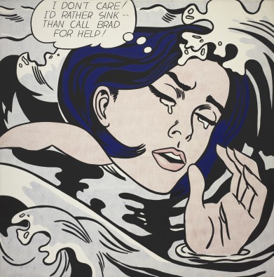
For example, his painting Drowning Girl that was appropriated from a 1962 Tony Abruzzo panel in “Run for Love!, in DC Comics’ Secret Love #83" with an  ambiguous shortened caption “I don’t care!” now negotiates a new meaning for that chronic, disquieting feeling of the modern age, suggesting that the reality is deceiving and something not so good is about to happen. In the early 60s Andy Warhol went further and removed all traces of the artist's hand in the production of his work and isolated his image vocabulary down to the icon, brand names, celebrities, dollar signs. Repetition and redundancy of his large colour silk-screens evoked the mechanical reproduction of the image, mass culture, consumerism, and the pleasures of abundance and excess. Yet his work conveyed an elegant sense of aesthetics.


Andy Warhol, Campbell's Soup Cans, 1962, synthetic polymer on 32 canvases. Museum of Modern Art, New York.

In the late 1980s, renowned artist Jeff Koons was sued for creating a sculpture called “String of Puppies” from a black and white photograph by Art Rogers of a man and women with an arm full of puppies for use of greeting cards and other merchandise. Koons exaggerated small details of the copyrighted image, changing the puppies to blue and distorting the image of the couple holding the animals, and sold multiple copies for hundreds of thousands of dollars. After Rogers sued for copyright infringement, Koons claimed fair use by parody. The United States District Court for the Southern District of New York held that sculptor infringed photographer's copyright, issued permanent injunction and turnover order. There's no doubt however that Koons' work was artistic.


In 2013, Richard Prince won a lawsuit at the Second Circuit Court of Appeal against photographer Patrick Cariou. The issue was whether Prince was fairly appropriating images from Yes Rasta, a 2000 Cariou's book documenting his time with Rastafarians of Jamaica. A previous court case had found that his work was copyright infringement. Prince “admits to using at least 41 photos from Yes, Rasta”, according to the judge’s decision, but had claimed “fair-use” for transforming the original works, as opposed to creating derivative images. There's no doubt however that Prince's work was a piece of junk.

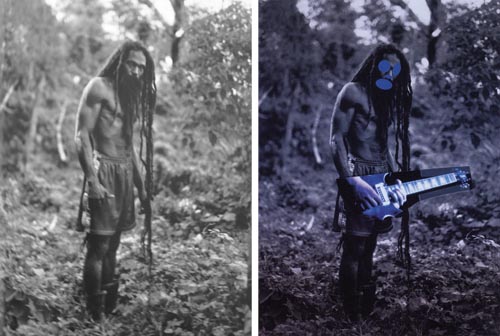
Left, a photo of a Rastafarian from Patrick Cariou's "Yes, Rasta" and, right, a painting from Prince's Canal Zone series


A more interesting case of appropriation is that of Shepard Fairey's Hope poster. Fairey was sentenced to two years probation in a U.S. District Court in Manhattan in 2012. Known for the "HOPE" posters he created during President Barack Obama's 2008 presidential campaign, Fairey pleaded guilty in February of that year to charges of criminal contempt, and admitted to destroying and fabricating evidence related to a civil lawsuit with the Associated Press. That lawsuit, which revolved around whether or not Fairey’s infamous poster based on an AP image violated copyright laws, was settled out of court in 2011. Fairey received his formal training at the Rhode Island School of Design, where he took several courses in photography and screen printing. After graduating, he worked as a screen printer, designer, and illustrator. He divided his time between graphic design projects commissioned by clients and his own art. Much of Fairey’s art has been characterized as havig a distinctive aesthetic, which he has described as a “bold iconic style that is based on stylizing and idealizing images.” Fairey's poster was artistically designed and elegantly executed.


In 1991, photographer Annie Leibovitz photographed actress Demi Moore, naked and pregnant, for the cover of Vanity Fair magazine. Paramount Pictures' advertising campaign for a movie called "Naked Gun 33 1/3: The Final Insult," was centered around a parody of that photo. The ad digitally manipulated Leslie Neilsen's face superimposed on the body of a naked and pregnant woman. Leibovitz filed a lawsuit against Paramount alleging copyright infringement. Paramount argued that the ad was a parody and a fair use of the photograph. The court verdict based on the elements of Fair Use was that the Paramount ad was a legally allowable parody. There's no doubt however that the poster was a piece of non-art.


The fundamental question that maybe posed is whether and under what circumstances it is appropriate for an artist to appropriate the intellectual property rights of another person. The appropriation of Cariou's images from Yes Rasta, for example, may be technically legal and may arguably not violate specific ethics codes, but true artists still face an ethical dilemma, are they appropriating intellectual property rights of another person? Of course, many of appropriated works fall into the category of ethical transgressions, whether from ignorance or malice. Artists that chose to appropriate the feature of another artists work have an obligation to openly address their objectives and participate in the debate about intellectual property and artistic freedom. As Marie C. Malaro states in her essay Deaccessioning: The American Perspective:
The law is not designed to make us honorable - only bearable - and therefore we often engage in some highly questionable conduct and yet stay within the law. The law however,does have clout. If you are found guilty of violating the law you must pay fines or you may go to jail.

Ethicks are adifferent matter. A code of ethics set forth conduct deemed necessary by aprofession to uphold the integrity of the profession. It sets a higher standard because it is based on principles of personal accountability and service to others. A code of ethics, however, frequently has no enforcement power. it is effective only if there is personal commitment and informed peer pressure.
In the final analysis the issue is not of finance, as Alexander Adams has argued
" In the opaque art market, the authenticity of an art object is the foundation of its financial value, yet this quality is contestable and subject to sudden change. Both Picasso and de Chirico on occasion repudiated their own paintings, leaving frustrated owners with genuine paintings that were hard to sell. In more recent years, work produced by assistants that has left artists’ studios under unclear circumstances has been considered “unauthorised” or “unapproved” rather than inauthentic. Today’s boundaries of art have expanded to encompass everyday readymade items elevated to the status of fine art by nomination alone and authentic paintings relegated to a hazily defined legal limbo of the unauthorised art object.
The issue, thus, is deeply personal, and can only be understood by the true artists and the genuine art lovers, and this is why the context of the third code from “Ethics for the Starving Designer” is so relevant:


------------------------------------------------------------------------------------
Creative Commons License
This work is licensed under a Creative Commons Attribution-No Derivative Works 3.0 Unported License.

Chapter 68: Is Graphic Design Art?


There has been an insidious and ongoing controversy in some art circles about the difference between graphic design and fine art. Some have questioned if graphic design is art? In fact, in many cultures having artistic merits are among the most important criteria for assessing the validity of a potent and powerful design. It appears that for French, German, Italian, Japanese, Persian, Polish, Russian, and Spanish designers posing such a question would sound rather bizarre.

In a 1974 interview, the American graphic designer, Milton Glaser stated that in contrast to design that must convey a given body of information, the "essential function" of art is to "intensify one's perception of reality." Of course, he allowed for the possibility that sometimes, these functions coincide, as in a medieval stained glass window, but he maintained that in modern times they have diverged. This statement appears to crystallize the essence of the argument in the Anglo-Saxon art circles. The British designer John O’Nolan in an article for Web Designer’s Depot have articulated this view into five seemingly ad hoc axioms, these are: ·

  • Good Art Inspires. Good Design Motivates. 
  • Good Art is Interpreted. Good Design is Understood. 
  • Good Art is a Taste. Good Design is an Opinion. 
  • Good Art is a Talent. Good Design is a Skill. 
  • Good Art Sends a Different Message to Everyone.Good Design Sends the Same Message to Everyone.
Let us examine these axioms: 


Good Art Inspires. Good Design Motivates.


O’Nolan argues that perhaps the most fundamental difference between art and design is their purposes. He claims that typically, the process of creating a work of art starts with nothing, a blank canvas. This is, of course, not true. Think for instance of Picasso’s Guernica. For three months, he was searching for inspiration for that mural. Many of Spain's most eminent artists, colleagues and representatives of the democratic government asked him to paint a protest mural. On May 1st, 1937, when the news of Hitler's practice bombing of the little Basque village in northern Spain and the massacre of its population reached him in Paris, Picasso had found his inspiration for motivating the humanity against this barbaric act. Picasso also portrayed prostitutes and their children at the women's prison of Saint-Lazare in Paris, idealizing their humanity. Of course, like any good design "a good painting" as Picasso has stated:
“is not thought out and settled in advance. While it is being done, it changes as one's thoughts change. And when it's finished, it goes on changing, according to the state of mind of whoever is looking at it."
It is interesting that the celebrated designer and architect Frank Gehry has described exactly the same process about his own work:
Every day is a new thing. I approach each project with a new insecurity almost like the first project that I ever did . I get the sweats. I go in, start working, not sure where I’m going. If I knew where I was going, I wouldn't do it. If I can predict it or plan it, I discard it.
More specifically, he talks of his source of inspiration:
And when I got to Autun in, in mid France, the Romanesque church, it was like Nirvana I was, it was my eureka, here was Gislebertu's sculpture, the medieval sculptor and these very strong spaces and the decoration was tough and I could relate to it, and I just fell into the hall and started looking at all those churches and looking at the sculpture, and before I knew it I was studying the art of the time, the music of the time, the like I want to do, and I was totally captivated by that and I think underlying my work is a big chunk of inspiration from that.

 
Francisco Goya, The Third of May 1808  


Vincent van Gogh, The potato eaters


Edgar Degas, L'absinthe, 1876


Agony, 1912 by Egon Schiele

The Feast of Pure Reason, Jack Levine, 1937

O’Nolan asserts that a “work of art stems from a view or opinion or feeling that the artist holds within him or herself.” According to him artists “create the art to share that feeling with others, to allow the viewers to relate to it, learn from it or be inspired by it.” By contrast, he argues designers “always have a fixed starting point.” For him it appears that starting point is the purpose of the work, which “is almost always to motivate the audience to do something: buy a product, use a service, visit a location, learn certain information.” Well, as we saw, art also tries to motivate its audience, and good design does not have a fixed starting point.

Of course, there are numerous other examples. One example I’m thinking of is Goya‘s commemoration of Spain's uprising against the French regime in his two paintings:The Second of May 1808 and The Third of May 1808(both at Museo del Prado). Here he depicts a brutal scene in Madrid's Puerta del Sol, where Spaniards fought against French-led soldiers on horseback, and the execution of captured Spaniards on the Príncipe Pío. I am also thinking of Van Gogh's potato eaters, which informs us about the reason people in his painting eat potatoes is because poverty does not leave them a choice. I am thinking of Degas’ L'Absinthe, in which the artist acts like a reporter informs us of a particular scene, with his female subject looking flustered, her shoulders hunched forward, her clothing and hat look shabby, her feet apart drinking absinthe, which was particularly frowned upon in France and later prohibited because of it's hallucinogenic, addicting qualities. Degas emphasizes her disheveled appearance with his pallet of brown and umber tones. Beside the woman sits an equally miserable male companion, completely disconnected from her, not communicating in any way, wallowing in his meaningless life a truly lost soul.

And then there are of course expressionist artists like Schiele,and social realists like Jack Levine. For instance, Agony, one of Schiele's paintings, depicts spiritual interchanges between a godlike entity and an acolyte. This is to preach unabashedly, like some of his other works, his belief that artists are spiritually enlightened beings who are called upon to share their noble vision with the more uncultivated masses.Levine's painting The Feast of Pure Reason which depicted a capitalist, a policeman, and a politician in a conspiratorial discussion. Virtually, everybody understand the artists motive of criticizing the unholy alliance between cops, politicians, and criminals. In fact, it was this understanding that caused MOMA’s Trustees to debate fiercely before admitting it among their collections. 


Good Art Is Interpreted. Good Design Is Understood.


Moulin Rouge: La Goulue by Toulouse-Lautrec This four-color artistic design featuring La Goulue, a well-known cancan dancer with her partner was an advertisement for Moulin Rouge. It is both subject of interpretation and understanding.


According to O’Nolan’s second axiom although an artist sets out to convey a viewpoint or emotion, that viewpoint or emotion has not a single meaning. He argues that “art connects with people in different ways, because it’s interpreted differently”. He offers the smiling Mona Lisa as his main evidence. The Da Vinci’s masterpiece has been interpreted differently by different people. O’Nolan asserts that “design is the very opposite. Many will say that if a design can be “interpreted” at all, it has failed in its purpose.” Of course, as we have seen in the above examples, unlike Mona Lisa’s smile, not all works of art are mysterious. Guernica and other masterpieces in the previous examples are not enigmatic and have a core prominent message. Furthermore, as we have seen in the previous chapters, a good design follows a visual grammar. It provides the observer with some rules to interpret its message, but they cannot totally eliminate the need for interpretation.

In fact, as philosophers would argue, every communication will only be transmitted through interpretation. Clearly, when you are reading this text you are interpreting it in your own way, every word is interpreted according to your cultural and socio-economical background and this is why various readers’ understanding of what I am writing is different.


June-Louis, Nike sportswear, with the post-illustrative effects by Camille and Julien.


El Patio magazine, Marina Gerosa


Vanity Fair, Jean Carlu, 1930


Poster for the Reitberg Museum of Zurich, Ernst Keller


Porsche ad.

Freshlife – Start a fresh life.

It is true that, as O’Nolan maintains, “the fundamental purpose of design is to communicate a message and motivate the viewer to do something.” But a design’s task is not to brainwash its audience and is not to be dishonest and thus your design is bound to communicate a message other than the one you intended, and your viewer can go and do something based on that other message, and that is perfectly all right. O’Nolan’s verdict that if this happens then the design has not met its requirement is wrong. With a good piece of design, the designer shares a personal experience with its viewers - it can’t be an exact message to be understood by the viewer. If there were an exact message it would be more efficient to write or record that message for the viewer to read.

A good designer understands that the viewer interprets and understands a message in a matrix of various dimensions; aesthetically, culturally, ethically, economically, and so on. A good design tries to communicate in all such dimensions. For example, consider the work of June-Louis, who was part of an ad campaign focused on Beijing’s thriving street basketball scene, and photographed local Beijing street basketball players, as well as the source backgrounds of a basketball court, Shanghai’s Forbidden City, and The Great Wall. His portrayal of young athletes wearing unique pieces by young Chinese fashion designers that fuse Chinese imperial gowns with Nike sportswear, together with the post-illustrative effects done by a French couple, Camille and Julien, is subject to a variety of wide and deep interpretations, and this makes it both a good design and a good art. 


Good Art Is a Taste. Good Design Is an Opinion.


Lora Lamm: Posters  for the department store "La Rinascente", circa 1959


Micheal Tersieff, A modern Dada poster for adance camp


O’Nolan argues that “Art is judged by opinion, and opinion is governed by taste,” and he refers to Tracey Emin’s piece “My Bed”, which was shortlisted for the Turner Prize in 1999 that can be regarded by some as “the height of artistic expression” and others as “an insult to the medium”. As I argued in chapter 43, in the last century a transitory fad swept the art world of the US and the UK, promoted mainly by the Gallery Tate of London and the Turner prize which were really some kind of publicity stunt. As the art historian Danto explicated at the time, an art-object was no longer distinguishable from a non-art object, as long as the artist who had chosen to exhibit a non-art object had a theory to take "it up into the world of art." In fact, this clumsy made non-art objects opened the door for people to argue that good art is a matter of taste and cannot be judged by a refined sense of aesthetics, and a degree of intellectual prowess that can be used to formulate an educated opinion.

I am not arguing, as Roger Scruton does that “This official uglification of our world is the work of the ivory-towered elites of the liberal classes - people who have little sympathy for how the rest of us live and who, with their mania for modernising, are happy to rip up beliefs that have stood the test of time for millennia.” My argument is simple: a non-art object is nothing more than non-art. And by the same token, a non-art design is also non-art. 


Good Art Is a Talent. Good Design Is a Skill.


Pablo Picasso (1881–1973), World Congress for General Disarmament and Peace , 1962 


O’Nolan argues that “the true value of an artist is in the talent (or natural ability) they are born with (…) good artists certainly have skill, but artistic skill without talent is, arguably, worthless.” Design, in contrast, he maintains: “is really a skill that is taught and learned". I am not sure of the logical base of this assertion. I do not agree with him that that “You do not have to be a great artist to be a great designer” unless we are lowering the bar so low that the producers of non-artistic designs can be regarded as great designers. Think of the "display device" industrial designer Jony Ive had designed for a computer with a flat-screen which was perhaps a good design but could not satisfy the artistic sensivity of Steve Jobs. However, it became a “great design” for the iMac, 2002, when he accompanied Jobs to his home, to Palo Alto, Calif., and was inspired by sunflowers Jobs’ wife had planted in their beautiful garden behind their house. As Isaacson relays:
"They were walking around, and they just looked at the sunflowers and how there's a certain essence of the sunflower, and how it floats above the plant — and that became that iMac."


Good Art Sends a Different Message to Everyone. Good Design Sends the Same Message to Everyone.

As O’Nolan himself has admit this axiom really falls under the second one about interpretation and understanding, I agree and thus I am not spending any words on it. As Charles Eames, one of the most influential designer of the mid-twentieth century, has stated ‘design is an expression of purpose. It may (if it is good enough) later be judged as art.’ Artists have never seen any borders between art and design, between ‘free’ and ‘applied’ creation, and have always been obsessed with elevating industrial design to an art form. Even in the height of the last century's fad of admitting non-art objects into the domain of art artists like Frank Lloyd Wright, Charles and Ray Eames, Isamu Noguchi,Frank Gehry, and others distanced themselves from functional based design and the artificially imposed commodification, and were creating unique artistic objects imbued with aesthetic sensitivity.

Fallingwater, Frank Lloyd Wright
The house in southwestern Pennsylvania, was designed for Edgar Kaufmann. It hangs over a waterfall using the architectural device known as the cantilever. Wright described his architectural style as "organic"--in harmony with nature.
Consistency in grammar is therefore the property- solely - of a well-developed artist-architect. Without that property of the artist-architect not much can be done about your abode as a work of art. (Wright, The Natural House, 1954, pp. 182-183)

The Charles and Ray Eames loveseat is the last piece of furniture produced by the Eames Office, which completed the design after Charles Eames died in 1978.
Born in St. Louis, Missouri, Charles Eames grew up in America's industrial heartland. As a young man he worked for engineers and manufacturers, anticipating his lifelong interest in mechanics and the complex working of things. Ray Kaiser, born in Sacramento, California, demonstrated her fascination with the abstract qualities of ordinary objects early on. She spent her formative years in the orbit of New York's modern art movements and participated in the first wave of American-born abstract artists.

Although they advocated mass-production of architectural components, furnishings, and accessories as the ideal way to spread low-cost, high-quality modern design, Eameses tried to integrate high and low art forms.


Arts & Architecture, Cover Designed by Ray Eamese, 1944,


Fountain designed by Isamu Noguchi,

The Japanese-American sculptor Isamu Noguchi (1904-1988) was preoccupied with search for meaning. Through a lifetime of artistic experimentation, he created sculpture, furniture and lighting designs, drawings, ceramics, architecture, landscape and set designs. He believed strongly in art and design’s social role, and he thus dedicated much of his life to creating public works such as parks, plazas, and fountains throughout the world.


Frank Gehry, Lou Ruvo Center for Brain Health in Las Vegas.
“If I knew where I was going, I wouldn’t do it. When I can predict or plan it, I don’t do it.”


Much of Gehry’s work falls within the style of Deconstructivism, which is often referred to as post-structuralist in nature for its ability to go beyond current modalities of structural definition. In architecture, its application tends to depart from modernism in its inherent criticism of culturally inherited givens such as societal goals and functional necessity. Because of this, unlike early modernist structures, Deconstructivist structures are not required to reflect specific social or universal ideas, such as speed or universality of form, and they do not reflect a belief that form follows function


Stuhlhockerbank by Yvonne Fehling and Jennie Peiz.

Stuhlhockerbank is a series of seating for public spaces that approach users and viewers in an extraordinary way. The dividing lines between different types of furniture (chair, stool, bench) are eliminated as the three types blend. The pure purposiveness these immobile constellations as pieces of furniture are enhanced by the their narrative elements as well as sensual and poetic dimensions that are subject to various interpreatations.


Pablo Reinoso, Spaghetti Bench, 2010


Michael Beitz' Picnic Table was commissioned by the Bemis Center for Contemporary Arts, in Omaha, Nebraska, as a permanent installation on its front loading dock, in conjunction with the Bemis Gardens exhibition and design laboratory.


Designer Gitta Gschwendtner is originally from Germany but has been living in London for over 20 years and has worked from her studio in Hackney, east London. She worked outdoors using rustic wood-crafting methods to create this bench from her Bodge series.

Haim Steinbach, Untitled, (Daybed Coffin), 1989 Holz, Mies van der Rohe Liege "Barcelona"


Folding wall by ID Modus


Lighting „Snug“ by Bina Baitel


Extract from the special gallery made ​​skating preview of the World Figure Skating and Ice Dance Championships in Tokyo - Japan 2011 (ISU World Figure Skating Championships March 21 to 27, 2011). Photos by Olivier Gerard and Brajon Vandystadt / Agency Sports Glance - Vandystadt.com (season 2010-2011)


Penrose Annual, Paul Rand, 1958
The same message to every one?!


I sum up by suggesting that there is no difference between art and design in how they look or in what they do. They have identical purposes, they are made in the same way, and must be judged by the same criteria. In fact, there has never been a clear border between product design and art. Both a true artist and a great designer typically begin with more than a blank canvas, a lump of clay, a musical instrument and so on. They have some idea of what they want to do, and how to communicate that idea to others. Both are confronted with various restrictions, financial, and other physical restrictions, size of studio, light, the media’s range of possibilities, and so on. A designer, of course, may face other restrictions, imposed by the client. Nevertheless, both must use their talent and their skills to surmount those restrictions and produce an artistically authentic object.


BRANSCH artist Jean-Louis Wolff was commissioned by Mitteschoen, a Berlin magazine, to shoot a fashion editorial entitled, “Soleil Noir,” featuring pieces by local Berlin-based designers: Thone Negron, Martin Niklas Wieser, Kaviar Gauche, NCA Berlin, Karlotta Wilde, Augustin Teboul, Kunert, Filippa K. The theme of the issue was surrealism, and Jean-Louis had the freedom to flirt with dreams and the bizarre.
The art director, Dörte Lange, asked him to suggest few possible titles for the editorial in French, and she picked “Soleil Noir”, a piece of verse from Gerard de Nerval’s “el desdichado”.


A poster designed for Bally  shoes of  Swiss by Bernard Villemot , 1982.


BALILLA 1934 Marcello Dudovich


Manifesto 2008 Vendemmia Barolo Bruno Sacchetto


------------------------------------------------------------------------------------
Creative Commons License
This work is licensed under a Creative Commons Attribution-No Derivative Works 3.0 Unported License.