

After the second world war the Swiss Grid Style, also known as the International Typographic Style was developed by Swiss designers, such as Armin Hofmann, Josef Müller Brockmann, Max Bill, Richard P Lohse, Hans Neuberg, and Carlo Vivarelli who began to experiment with typography and photo-montage. Characterized by a cold, emotionally sterile grid style; they used structured layout, and unjustified type, that became very influential in the mid twentieth century and influenced a vast audience. These pioneering graphic artists saw design as part of industrial production and searched for anonymous, objective visual communication. They chose photographic images rather than illustration, and typefaces that were industrial-looking rather than those designed for books.
In short, the visual characteristics of the International Typographic Style include:
- Asymmetrically organizing the design elements on a mathematically-constructed grid to create Visual unity in a composition.
- Presenting visual and textual information in a clear and factual manner, using objective photography and illustration, and ensuring that it filters any propaganda and the exaggerated claims of commercial advertising
- Using sans-serif typography set flush left, ragged right -- The movement believed sans-serif typography expressed the spirit of a progressive age and that mathematical grids were the most legible and harmonious means for structuring information.
- Design is a socially worthwhile and serious vocation.
- In design there is no room for eccentricity and/or idiosyncrasy. Design should be grounded on universal artistic principles, and using a scientific approach should provide a well-defined solution to a problem.
- The designer is a visual communicator and not an artist. The designer acts as an objective and reliable transmitter of important information between members of society.
- The ideal of design is to achieve clarity and order.
I have always aspired to a distinct arrangement of typographic and pictorial elements, the clear identification of priorities. The formal organisation of the surface by means of the grid, a knowledge of the rules that govern legibility (lines length, word and letter spacing and so on) and the meaningful use of colour are among the tools a designer must master in order to complete his or her task in a rational and economic matter.The greatest works of art impress through their balance, their harmony, their proportions, all of which can be measured. That is one of the reasons why paintings, sculptures and buildings that are thousands of years old – by the Egyptians, Chinese, Assyrians and so on – are still fascinating to us today.The objective was an effective and efficient visual communication: information presented this way was assumed not only read more quickly and easily, but is also more easily understood and retained in memory.

Josef Müller Brockmann was born in Rapperswil, Switzerland in 1914 and studied architecture, design and history of art at the University of Zurich and at the city’s Kunstgewerbeschule. He began his career as an apprentice to the designer and advertising consultant Walter Diggelman before, in 1936, establishing his own Zurich studio specialising in graphics, exhibition design and photography. According to his own account;
" I became a graphic designer by accident". At school I was loth to write much for compositions so I put in illustrations instead. My teacher enjoyed them and thought I had talent. He suggested that I should pursue an artistic career: gravure etching or retouching, for instance. So I was apprenticed as a retoucher in a printing works. I lasted one day because I said that this wasn’t artistic work. After that I was apprenticed to two elderly architects. With them I lasted four weeks. Then I went to see all the graphic designers I found listed in the telephone directory because I wanted to find out what they did. Afterwards I enrolled to study graphic design at the Zurich Gewerbeschule."

As a graphic designer, Müller Brockmann's skills included letterpress, silkscreen, and lithography. His geometric style was demonstrated in “Musica viva”, a series of concert posters for the Zurich Tonhalle in 1951. It is arguably claimed that his work was an adaptation of concrete art; which had been described by Theo van Doesburg around 1930, as works of art that are created by means of art's most genuine means of composition and principles, entirely doing without allusions to phenomenon of nature and their abstraction. New realities were supposed to be created by forming colors, space, light and movement.
The style had to incorporate mathematical methods of spatial organization into graphic work, which drew on the language of Constructivism to create a visual correlative to the structural harmonies of the music. Müller Brockmann's 1955 poster, Beethoven, was supposed to portray Beethoven's music through a series of concentric curves, and has been offered as an example such an adaptation, and this assertion had been accepted at its face value by many pundits, who were impressed by the novelty, elegance and the simplicity of design. As Müller Brockmann has stated:
In my designs for posters, advertisements, brochures and exhibitions, subjectivity is suppressed in favour of a geometric grid that determines the arrangement of the type and images. The grid is an organisational system that makes it easier to read the message...The grid is an organisational system that enables you to achieve an orderly result at a minimum cost. The task is solved more easily, faster and better. It brings the arbitrary organisation of text into a logical system in keeping with the conflict. It can demonstrate uniformity that reaches beyond national boundaries, a boon to advertising from which IBM, for instance, has profited. Objective-rational design means legible design, objective information that is communicated without superlatives or emotional subjectivity.


From 1967 he was European design consultant for IBM. He is the author of The Graphic Artist and his Design Problems (1961), History of Visual Communication (1971), History of the Poster (with Shizuko Muller-Yoshikawa, 1971). Nevertheless, Müller Brockmann's work was rigid and soulless, suffering from certain self-imposed restrictions of the Swiss style, and dogmas such as the rejection of symmetry since fascists had liked it! He has said:
symmetry and the central axis are what characterise fascist architecture. Modernism and democracy reject the axis... I have taken my love of order to the point of manifest boredom, producing design solutions which are valid but deadly boring. Thanks to the passage of time, I am now just about able to examine my posters for the Zurich Tonhalle to discover why some are better than others. I am amazed how many are bad. The Beethoven poster is good, also the “Musica Viva” poster of 1970 with the green lettering on a blue background and the two Tonhalle posters of 1969 and 1972 with the rhythmic type.Looking at this juncture at these posters, when digital software packages can do any of them in just few minutes and with few of clinks, it is easy to dismiss the whole exercise as boring and insignificant. Of course, the world would have become a boring place should all posters have adopted the Swiss grid style. However, we have to remind ourselves that when these posters appeared on the scene their geometrical aesthetics were quite novel and rare. Perhaps ironically, Müller Brockmann has stated that he did not like experiments such as that of Neville Brody's typefaces that have the potential to rescue the grid style.
Müller Brockmann was totally dismissive of Brody's powerful artistic impact. The fact that not all viewers are of commercial types, and not everybody is concerned with profit maximizing attitudes that just require to get the information in an efficient and cost effective manner; the fact that there are also viewers that are interested in looking at a poster's typeface from an artistic view point and reflect on them, which in the process may also convey the message of an advertisement appears to have been totally alien to him. He has said;
Some set themselves the task of making typography so unreadable that it is almost like a picture puzzle. The illegibility is then sold as an artistic project. I wouldn’t read something like that unless I had to. The same rational criterion applies to wobbly forms and blurred contours: can I read this faster? Text is communication of content, a fact reflected in classical typefaces and legible typography... (typefaces designed for Neville Brody) are not suitable for advertisements and posters. They are exceptions to the rule and individual cases are not a basis for teaching graphic design. These alphabets are confused, aesthetically lacking and bad. Playing around is always an excuse for too little understanding, which makes people fall on imagination and speak of artistic freedom, inspiration and good ideas. Such typefaces are interesting as studies in legibility. But I don’t see any sense in them. They are a personal attempt to deal with a problem and I find them not only bad but senseless because they lack an area of application.In an interview with Eye Magazine for their Winter 1995 issue, just one year prior to his passing, he was asked what order meant to him:
Order was always wishful thinking for me. For 60 years I have produced disorder in files, correspondence and books. In my work, however, I have always aspired to a distinct arrangement of typographic and pictorial elements, the clear identification of priorities. The formal organisation of the surface by means of the grid, a knowledge of the rules that govern legibility (line length, word and letter spacing and so on) and the meaningful use of colour are among the tools a designer must master in order to complete his or her task in a rational and economic manner.


Max Bill (1908–1994), was born in Winterthur, Switzerland. An architect, painter, typographer, industrial designer, engineer, sculptor, educator, and graphic designer, Bill was initially a student at the Kunstgewerbeschule and apprenticed as a silversmith before beginning his studies in 1927 at the Bauhaus in Dessau, Germany, with teachers such as Wassily Kandinsky, Paul Klee, and Oskar Schlemmer. Bill permanently settled in Zurich, Switzerland, in 1929, and in 1937 became involved with a group of Swiss artists and designers named the Allianz. The Allianz group advocated the concrete theories of art and design and included Max Huber, Leo Leuppi, and Richard Paul Lohse.
In 1950, Max Bill and Otl Aicher founded the Ulm School of Design (Hochschule fur Gestaltung-HfG Ulm) in Ulm, Germany, a design school initially created in the tradition of the Bauhaus and that is notable for its inclusion of semiotics, the philosophical theory of signs and symbols, as a field of study. Bill was of the view that "It is possible to develop an art largely on the basis of mathematical thinking." Over, the 1967-71 period, Bill taught at the Staatliche Hochschule fur Bildende Kunste in Hamburg where he was the chair of environmental design. As a graphic designer, he enthusiastically embraced the tenets and philosophical views of this modernist movement. The majority of his graphic work is based solely on cohesive visual principles of organization and composed of purist forms—modular grids, san serif typography, asymmetric compositions, linear spatial divisions, mathematical progressions, and dynamic figure–ground relationships.


 |
| Simultaneous Constructions, 1945-51 |
 |
| Three Groups, 1947 |
 |
| Construction in Black, 1939 |

Richard Paul Lohse (1902-1988) was born in Zürich (Switzerland) in 1902. In 1918 he joined the advertising agency Max Dalang where he trained to be an advertising artist, but in his artistic career he started with figurative works and gradually moved to post-cubism style. Lohse worked for the Max Dalang agency until 1927, where he became interested in the international avant-garde movements in both its artistic and political aspects. In 1937 Lohse, a key figure in the "Swiss School", and Leo Leuppi joined forces to establish Allianz, an association of Swiss modern artists, promoting publications, exhibitions and the dissemination of avant-garde art. He collaborated with Max Bill and Verena Loevesberg in the Zurcher Konkrete group, which was affiliated with Allianz. In 1938, Lohse and Irmgard Burchard, his first wife, organise the "Twentieth Century German Art" exhibition in London. Soon after Lohse joined the resistance movement where he met his second wife Ida Alis Dürner. In 1942 Lohse formulated his conception of constructive painting, a style that was highly structural. In the words of Fr. W. Heckmanns;
His horizontal and vertical structures follow each other in serial and modular orders within the rectangular limits of the canvas. The essential content of his work is a rational interpretation of the relationship between artistic practice and the problem of the form of social organization, in short a human attitude towards the balance of law and freedom.In the years 1947-1956, Lohse was an editor and designer for the swiss architectural magazine bauen+wohnen or construction+habitation. A special edition of the magazine was launched for Germany in 1952. Lohse's style was characterized by his devotion to precision and clarity in his theoretical framework. He saw structure not as a preliminary foundation but as a totality of concept in the image. He conceptualized the canvas as a field of interacting modules, in which the color and the form are complementary in creation of a formal color structure.


 |
| Richard Paul Lohse, "Fifteen systematic vertical color lines with diagonal violet", 1975 |

Armin Hofmann was born in 1920 in Winterthur, Switzerland. During the 1937-39 period, Hofmann studied at Kunstgewerbeschule in Zürich and apprenticed as a lithographer until 1943. From 1943 until 1948 He worked as lithographer in Basel and Berne and in his own graphic atelier. In 1946, Hofmann joined the Allgemeine Gewerbeschule (AGS) in Basel, where he and Ruder established a world renowned advanced course in graphic design.


Kenneth Hiebert, a former student of Hofmann; recalls that in the early sixties, Hofmann would occasionally bring in a Cassandre or Stoecklin poster and perfunctorily tack it to the wall. When the students cringed at this apparent maltreatment, Hofmann would say, “A good poster can take it.” What he really meant was that the posters were not intended as museum pieces but as things that should weather the harsh treatment of the streets. In the words of Paul Rand
His goals, though pragmatic, are never pecuniary. His influence has been as strong beyond the classroom as within it. Even those who are his critics are eager about his ideas as those who sit at his feet. He had a visiting professorship at the Philadelphia College of Art in 1955. Then came an appointment at Yale University, where he regularly conducted working seminars in graphic art and became director of the advanced graphic course in 1967. He carried on teaching abroad in Ahmedabad, India. Hofmann’s book Graphic Design Manual: Principles and Practiceis is a seminal work in graphic design. He has created many posters, logos, color concepts, signage systems and art-in-building projects, as well as participating in many exhibitions. According to him“ primary in black and white posters is to counteract the trivialization of color as it exists today on billboards and in advertising.


Typography has one plain duty before it and that is to convey information in writing. No argument or consideration can absolve typography from this duty. -Emil RuderEmil Ruder (1914-1970), was a key player in the development of the Swiss Style. Born in Zurich, Ruder began his design education at the early age of fifteen when he took a compositor’s apprenticeship. By his late twenties Ruder began attending the Zurich School of Arts and Crafts where the principles of Bauhaus and Tschichold’s New Typography were taught, leaving an indelible impression on Ruder.
Academia would continue to play a major role in Ruder’s life, though it would naturally evolve into the form of teacher rather than student. In 1947 he took a position as the typography instructor at the Schule für Gestaltung, Basel (Basel School of Design). He, along with the great Armin Hofmann, developed a program structured on principles of objectivity in design. He broke away from the subjective, style-driven typography of the past and encouraged his students to be more concerned with precision, proportions and above all, the role of legibility and communication with type.


Born in Basel, Switzerland in 1930, Karl Gerstner was a painter and a graphic designer, who studied design at Allgemeine Gewerbschule in Basel under Emil Ruder. In 1959, he and Markus Kutter confounded Gerstner & Kutter a design agency, which later when the architect Paul Gredinger joined them changed its name to GGK.

Gerstner's theory of ‘The Colour Form Model' presented in his book, The Forms of Colour is one of his most significant contribution to graphic design. Inspired by the rich and colorful patterns of a Moroccan craftsman art, in this book Gerstner explored the multifaceted and intricate relationships between colour and form, as the basic structural components of Islamic art. Analyzing graphical interrelationships among various dimensions of colour spaces and formal systems of perspective, topologies, fractals and so on he framed his theory in the context of Wilhelm Ostwald's 1922 rational theory of forms, which provides a seemingly unlimited mathematical base for formal variations.

Gerstner discussed the work of a like-minded mathematician/artist, Hans Hinterreiter, who as an early adherent to Ostwald's theory, adopted deconstructive style of painting, experimenting with forms and colors, based on laws of "color organ and form." Hinterreiter was also inspired by the Moorish interpretation of Islamic ornamentation of the Alhambra after his 1934 trip to Spain. Presenting his own colour-form theory, Gerstner assessed Kandinsky’s idiosyncratic metaphysical assertions on the correspondence between colour and form (square=red, triangle=yellow, circle=blue) and suggested his own system of ‘Colour Signs’. Using computer programming, he developed a system of new primary forms, such as astroids, diagons and sinuons and discussed their possible correspondence with aural and tactile sensory modes. Gerstner's book ‘Designing Programmes’ 1964 was a manifesto for system orientated design, which he described as ‘programmes’. He defined a design ‘program’ as a set of rules for constructing a range of visual solutions, and connected his methodology with the new field of computer programming and presented examples of computer generated patterns that were made by mathematically describing visual elements and combining them according to simple rules.
 |
Gerstner’s grid for the journal Capital, designed in 1962, is still often cited by some as near-perfect in terms of its mathematical properties. The smallest unit in Gerstner’s grid, or matrix as he called it, is 10pt—the baseline to baseline measurement of the text. The main area for text and images is a square, with an area above for titles and running heads. The cleverness lies in the subdivision of the square into 58 equal units in both directions. If all intercolumn spaces are two units, then a two-, three-, four-, five-, or six-column structure is possible without any leftover units.
|
 |
Gerstner wrote: “The typographic grid is a proportional regulator for type– matter, tables, pictures and so on. It is a priority programme for a content as yet unknown. The difficulty lies in finding the balance between maximum formality and maximum freedom, or in other words, the greatest number of constant factors combined with the greatest possible variability.”
|
 |
| Of course, sometimes grid becomes a trap -- even for an imminent artist like Grestner |
Gerstner’s typographic experiments with unjustified ragged-right text(Hollis 2002), and his proposed Integral Typography which extended Max Bill’s ideas on typography (Müller-Brockman and Müller 2000) have also been influential. Like the Italian futurists, Gerstner believed that typography can greatly contribute to the actual discovery of meaning with its whole impact to be greater than the sum of the words and the meanings.
 |
| We have to be careful in our aesthetic judgement -- Is it grid that renders this work so astoundingly powerful? |
 |
| I am sorry, adhering rigidly to a grid system does not guarantee the success of a work. |

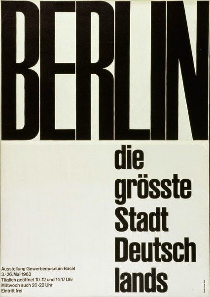
Hans Neuburg (1904 – 1983) was born in Grulich, Austria-Hungary, which later became part of Czechoslovakia -- the town is now called Králíky and after the division of Czechoslovakia most of the municipality become part of the the Czech Republic. At the age fifteen, Neuburg enrolled at Orell Füssli AG in Zurich and graduated in 1922. After graduation he worked at various positions in advertising, freelance graphic design, and magazine editor. Over the 1958-65 he and is fellow artists Richard Paul Lohse, joseph Müller-Brockmann and carlo vivarelli established “Neue Grafik” magazine. After a brief two years period assuming the directorship of the Gewerbemuseum in Winterhur in 1962-64 during which he also taught at the Hochschule für Gestaltung in Ulm, and writing a number of books including Graphic Design in Swiss Industry (1965), Publicity and Graphic Design in the Chemical Industry (1967) and Conceptions of International Exhibition (1969), he moved to Ottawa, Canada, to teach at Carlton University, School of Industrial Design in 1971.


The concept of the total grid has been the brainchild of Wim Crouwel, a dutch graphic designer, born in 1928. He is one of the five founders of Total Design, a multi-disciplinary design studio in the Netherlands. Crouwel studied fine art in Groningen before moving to Amsterdam in the early 1950s where he initially worked for an exhibition design company. Because of his interest in architecture, and his spatial sensitivities he applied for commissions for cultural institutions, such as the Van Abbe Museum in Eindhoven in 1956, and the Stedelijk Museum in Amsterdam shortly afterwards for which Crouwel was solely responsible to develop an identity by posters and catalogues. It was at the Stedelijk that Crouwel created his Neu Alphabet, an unconventional typeface based on grid system.

In 1963 Crouwel founded Total Design, a multi-disciplinary design agency, that its hallmark was modular structuring and grids. With a systematic approach to design projects, it created the identity for a large number of Dutch companies including some multinationals like IBM and Olivetti. Total Design altered the visual landscape of the Netherlands throughout the 1960-70 period. In the 1970s Crouwel designed the Dutch Pavilion for the Osaka World Fair, as well as numerous postal stamps for the Dutch post office and a controversial redesign of the telephone book using only lowercase letters.


Crouwel's typeface was constructed using only horizontal and vertical lines creating an alphabet of all lowercases. Although only half of the letters were recognizable, with the emergence of personal computers, his modern typeface was particularly aimed at digital systems in 1967. However, for many Crouwel's typeface appeared illegible. It challenged the design establishment, but Crouwel was happily engaged in the ensued controversy and readily confessed that he attaches a higher priority to visual aesthetics relative to functionality. Crouwel has stated;
"I simply wanted to make a consistent alphabet on the basis of that grid of squares. I did not want any cluttering of vertical stems and did not find a solution within the conventional structure of the characters. So I began researching the past, looking for alternative signs with which I could replace the conventional forms. One could have made them up, but I wanted them to have some kind of footing in the history of type"

His new typeface was redrawn by Brett Wickens and Peter Saville for the Joy Division album, ‘Substance’ in the late 80s and then digitized and made available for use in 1997 by The Foundry. Crouwel designed a number of other fonts including Gridnick, an appropriate reference to his use of grid systems and Mr. Gridnick became Crouwel’s endearing nickname. ----

The graphic designs of the Italian graphic designer couple, Lella Valle and her husband Massimo Vignelli, are also based on concept of total design in the confine of a grid. Born in Udine in 1936, Lella Valle studied architecture, and met Massimo Vignelli who also studied architecture in Venice, in the 1950s. The couple moved to to the US during the 1958-1960 period, where Lella Vignelli worked in New York for Skidmore, Owings & Merrill and Massimo Vignelli taught at the Chicago Institue of Design. In 1960 they returned to Italy and opened a graphic design studio in Milan. Five years later Massimo joined Bob Noorda and Jay Doblin in founding Unimark International, a design consultancy, in Milan.


In that same year, 1965, Vignellies moved to New York, in order to manage a Unimark branch that specialized in developing corporate logos and designing the corporate identity for the business clients. According to Massimo they intended to return to Milan after a short while, but that didn't come to pass and they settled in New York for good. In 1971, they rebranded the practice as Vignelli Associates, which created corporate identities for firms such as American Airlines, Bloomingdale's, Cinzano, Lancia, United Colors of Benetton, Ford, Xerox, and the International Design Center New York.
While working for Unimark, Vignellies redesigned the look of the NYC Metropolitan Transit Authority with a new subway map and train identification sign system. They Replaced the previously chaotic typography with Helvetica and reduced the train routes down to solid color, while geometric lines organized the map and allowed signs to be clearer and more distinct. In 1977, Vignellies designed the Unigrid System for the National Park Service. The module grid system allowed the the National Park to create brochures in ten basic formats and to keep a consistent, recognizable structure across all it’s materials.


With their training grounded in architecture, Vignellies established a vision of an organized, systematic structural approach early in their design careers. The underlying structure of many of their endeavors in corporate identity, publication, book design, and interiors continues to be the a strictly grid-based design. Lella & Massimo began exploring the grid structure early in their career in Milan by working on corporate entities and projects for various cultural organizations. These early works allowed them to build a design style focused on dividing space within a modular grid that was subdivided rationally into distinct zones. Breaking down the page into smaller intervals of space permitted a clear translation of complex informational material. Most of their designs utilize a limited color palette and use mostly five typefaces Garamond, Bodoni, Helvetica, Univers, and Century. According to Massimo:
"Bodoni is one of the most elegant typefaces ever designed. When I talk about elegance, I mean intellectual elegance. Elegance of the mind."
Vignellies are purists and have a distaste for the bitmap font tool, used by Zuzana Licko to develop the font for the influential Emigré journal. According to Massimo Vignelli, Emigré and Rudy van der Lans, are the worst thing to happen to typography. Rudy van der Lans who moved to America in 1981 to study photography at the University of California, Berkeley, where he met and married Zuzana Licko, founded the influential Emigré journal in 1984. Vignelli believes Jonathan Hoefler is someone who is carrying the typographic torch today.

“Quality graphic design stands out for the mindset it exhibits: stringent, reduced in form, always intense, never pretentious. In this way, Pierre Mendell developed a most distinct style. He flexibly dealt with particular tasks and through this, eminently lived up to the challenge of respective themes. Hence, Pierre Mendell’s posters are so simple and convincing and will continue to be of great significance beyond this day.” - Florian Hufnagl, Die Neue Sammlung – The International Design Museum Munich
Pierre Mendell, (1929 - 2008), one of the world's leading graphic designers, was born in Essen, Germany. Mendell lived in France between 1934 and 1947; emigrated to the USA in 1947; in 1953 returned to France, where he worked in the family textiles company; in 1958 began studying graphic design under Armin Hofmann at the Schule für Gestaltung in Basle; the Mendell & Oberer studio was founded in 1961 in Munich. For almost 30 years he played a role in creating the visual identity of the neue sammlung - the international design museum munich.Pierre Mendell has been designing the posters for the Staatsoper in Munich from 1993 to 2006. With over a hundred motifs to his name, he has not only successfully created an unmistakable identity for the Munich opera, he has also linked this opera house with a form of visual expression that is unparalleled in its originality and immediacy. Mendell’s simple, almost archaic, visual language is admired over the world and his poster designs are represented in leading collections such as the Museum of Modern Art, New York.
Pierre Mendell's work is characterized by elements which are often missing in much contemporary graphic design: vibrancy, communicative force, poetry, and humor. His cultural posters and corporate design identities -- including his designs for Vitra and Siemens, for which he is probably best known -- are timeless yet contemporary. The success of his designs demonstrate that the strength of all graphic work depends on an overarching concept, not on current fads. Pierre Mendell's awards include the Gold Medal from the Art Directors Club, Germany, the Gold Medal form the Art Directiors Club New York, Best German Poster of the Grand Prix International de l'Affiche Paris and the German Poster Grand Prix. Pierre Mendell's work has been exhibited in the Munich City Museum, the International Design Centre Berlin, the Galleria Aiap Milano, the Muzeum Plakatu Warsaw, the Museo Nacional de Bellas Artes Buenos Aires, the Centro de la Imagen Mexico City and the Visual Arts Musuem New York. His work is represented in the Graphic Design Collection of the Museum of Modern Art New York. Pierre Mendell taught from 1987 to 1996 at the Yale University Summer Design Program in Brissago, Switzerland.


Per favore fatemi sapere dove posso trovare una biografia e una fotografia di grande designer grafico; Alberto Longhi.
S'il vous plaît laissez-moi savoir où puis-je trouver une biographie et une photo de ce grand designer graphique, Alberto Longhi.


 |
| Guity Novin |

Swiss style focus on clarity, eye-friendliness, readability and objectivity has made it a powerful tool for web-communications, which enhanced by its strong reliance on elements of typography and universality. Grid systems in web design have spawned a number of the Cascading Style Sheets (CSS) frameworks. For instance, the 960 Grid System, Fluidable, Columnal and Cardinal are efforts to streamline web development workflow by providing commonly used dimensions. These CSS frameworks are designed to simplify the creation of webpages based on a grid system. A number of websites have been created using the framework. Some of the exemplars are good examples on how using a grid system can produce aesthetically beautiful websites.

Grids are used to present content in a consistent and predictable manner, helping to organise content in a methodical fashion. It affords conformity and uniformity, increasing the usability of any given system, by placing items and information in a predictable manner, reducing the cognitive overload of users. “According to the principles of consistency, systems are more useable and learnable when similar parts are expressed in similar ways, learn new things quickly, and focus attention on the relevant aspects of a task” (Lidwell, Holden and Butler, 2010: 24)


The style can be easily identified for its simplicity and clarity of purpose. These two principles are often manifested in the use of asymmetric layouts, grids, sans-serif typefaces, left-flushes and simple but impactful photography. These elements are produced in a simple but highly logical, structured, stiff and harmonious manner. It is clear that the Swiss Style is information-oriented. This is why designers should think of the information dissemination using its artistic principles.


Go to the next chapter; Chapter 43: Graphic Design and the Postmodern Epoch
The digital revolution and the introduction of the Macintosh computer in the mid-1980s made the construction and deconstruction of typographical elements easier than it had been in the past. Embracing technology that was growing exponentially more sophisticated, designers realized more and more complex typographic experiment. Neville Brody's FF Blur is one example. Influenced by the late-1970s punk rock aesthetic, Brody began his career at the London College of Printing and later designed record covers for various artists while art director of Fetish Records. The letterforms of FF Blur—fuzzy around the edges like an out-of-focus photograph—seem to celebrate their own imperfection, speaking to his unique background. FF Blur resembles type that has been reproduced cheaply on a Xerox machine—degenerated through copying and recopying.


Soon after Joan and Erik Spiekermann launched FontShop in 1989, Brody and Spiekermann cofounded FontFont, which would grow into the world’s largest independent collection of original typefaces until its acquisition by Monotype in 2014. Brody’s other major achievement in this field is FUSE, the quarterly magazine for experimental type design he cocreated with Jon Wozencroft.
Brody Fonts’ decision to join Type Network was no coincidence. It was the culmination of a longstanding professional relationship and friendship between Neville Brody and Type Network cofounder David Berlow, a shared history spanning three decades. The seeds of their collaboration were sown in 1987, when Berlow met Brody and Spiekermann at an ATypI conference in New York. “Two years later, we met again in San Antonio, ” Berlow explained in an interview with Yves Peters. “This time, I had retail fonts to offer them.” In his characteristic irreverent style, Berlow continued: “By then, FontShop was starting to talk about their global conspiracy to have an international distribution network.”

Brody released his first retail typefaces through Linotype. He based Industria on headlines he had drawn between 1980 and 1986 as the art director for the influential British fashion bible The Face; Arcadia and Insignia originated as a banner and a headline type for Arena magazine, which he art-directed from 1987 to 1990, after his departure from The Face. Following his stint at Linotype, Brody moved on to cofound FontFont, the first independent foundry (aside from Emigre) established by type designers. In short order, FontFont became the cool foundry everyone wanted to work with.
Peters remembered a conversation he had with Brody during the early days of FontFont: “He explained to me that he wanted the independent foundry to be a bit like a record label. To help designers break away from the tired old mainstays, FontFont planned to release new designs on a regular basis, ‘hit singles,’ so to speak. Changing trends would cause those typefaces to fade into the background, making way for fresh new type in tune with the times, in a perpetual cycle of typographic renewal. The current font market is remarkably close to his original vision.”

Brody enlisted Berlow’s company, Font Bureau, to work on the typefaces he planned to release through FontFont. “We helped him make sense of his wild geometric designs,” said Berlow. Font Bureau produced FF Typeface Four, FF Typeface Six, and FF Typeface Seven in 1991; and FF Gothic and FF Pop in 1992. Brody’s FF Blur, also developed during this period, proved to be a milestone: Paola Antonelli eventually acquired it as one of twenty-three digital typefaces for the Museum of Modern Art’s Architecture and Design Collection. After this successful start to their collaboration, Berlow sent one of the young designers from his studio to London—a guy named Tobias Frere-Jones. Frere-Jones assisted Brody in preparing FF World, FF Tokyo, FF Dome, and FF Tyson for release in 1993, as well as FF Harlem. 1994’s FF Autotrace and Brody’s contributions to the FF Dirty Fonts series in 1994 and 1995 recalled his efforts for FUSE.

True to his inquisitive and cutting-edge approach to graphic design, Brody had started questioning both the usual methods of type design and the actual shapes of the alphabet very early on in his forays into making digital typefaces. Barely one year after starting FontFont, the first issue of FUSE hit the proverbial stands. Each edition included four experimental typefaces by renowned and up-and-coming graphic designers, four posters showcasing those typefaces, and one or more additional typefaces by Brody, also with their own posters. For the most part, the contributors were not experienced type designers, so Font Bureau took on some of the production and mastering until the FontFont Type Department got up to speed.
At this point, FontShop had started hiring people to do production work on typefaces for both FontFont and FUSE, thus ending Font Bureau’s involvement; Brody and FontWorks also parted ways. Font Bureau and FontShop always had distinct, separate relationships with Brody, which continued beyond this period. In the early nineties, Font Bureau commissioned Brody to design their well-known logo. “Brody’s idea was to have a perpetually changing logo using different typefaces, so we created a logo font with twenty-six different quotes,” Sam Berlow said. “We were very happy with his design from start to finish,” David Berlow continued. “We never changed it, and only expanded the logo variations for all the formats and proportions it needed to cover, to give us the necessary flexibility with different tones of voice.” Sam Berlow added: “Brody came back to it in 2012 and developed the current Font Bureau identity and brand guidelines using Benton Sans.”

In the early aughts, Brody Studios ventured into custom typeface design, creating memorable typographic stylings for major publications and broadcasters, as well as for global brands. And now Brody is ready to unleash a new series of retail families sporting his signature wit and inventiveness.
Brody Fonts joins Type Network in exclusivity with two remarkable designs. BF Bonn is a geometric sans with a typical Brody twist. The display face blends art deco influences with futuristic tendencies in a series of eight weights ranging from a razor-sharp Thin to a dense, massive Ultra. Stylistic alternates rein in BF Bonn’s strong personality a little for more conventional applications.
With BF Buffalo, Brody goes full-on hard sci-fi. The face’s industrial features combine chiseled outside cuts with tense inside curves. Alternate capitals emphasize a faux-monospaced rhythm, while stylistic alternates for strategic characters increase the modularity of the letterforms. Set out of the box, the seven weights from Ultra Light to Ultra Black create striking headlines and titles. In the hands of adventurous typographers, the faceted character shapes morph into the pieces of an alphabetic jigsaw puzzle.

“Neville has had a close working relationship with Sam Berlow, Jill Pichotta, myself, and various other Font Bureau designers from the moment Tobias Frere-Jones walked through his door to the present,” said David Berlow. “Trying to distill your inspiration into a usable typographic language without what Neville calls ‘commercializing’ it is a challenge for all of us. Since those early years, we have been involved in helping him produce—and, in some cases, tame—his wildly imaginative designs into usable typefaces. David Jonathan Ross currently helps Brody produce his fonts. And now we’re moving forward with Neville opening his own store, Brody Fonts, under the Type Network banner, which we are very excited about.”

“Working at ad agencies and design studios in the 1990s in Dallas, Texas, I spied The Graphic Language of Neville Brody on the desks and in the hands of countless creatives,” said Tamye Riggs, a Type Network team member and FontShop alum who chronicled the early days of digital type for Adobe. “These big hardback books were well-thumbed and heavily sticky-noted, I can tell you that. How did a British designer have such an impact on impressionable young minds in the Lone Star State, before the web and social media was a thing? It’s a bit of a mystery to me, but Neville captured the zeitgeist in such a vibrant, typographically in-your-face way. He’s been so often imitated, but never really successfully. No one could ever hope to replicate what goes on in his head.”

“The Graphic Language of Neville Brody came out in my first year at the Royal Academy of Fine Arts. I immediately got a copy at the recommendation of my graphic design teacher, and Brody became a source of inspiration in my formative years,” said Peters. “Little did I know that, during my internship at Spiekermann’s MetaDesign in August 1991, my first FontShop assignment would be to design a FontWorks ad commissioned by Brody himself. We interacted many times during my tenure at FontShop BeNeLux in the early nineties. My personal highlight was inviting him as a speaker and jury member for the first FontShop BeNeLux Typography Award. Working with Neville again after all those years is like coming full circle.”

“I’ve long admired Neville’s work from afar and am so thrilled to have him on Type Network,” said General Manager Paley Dreier. “His one-of-a-kind voice and unique typefaces are a welcome addition to our growing family.”
*
The Revolutionary Art Director: Willy Fleckhaus and the Transformation of German Visual Design
.jpeg)
In the aftermath of World War II, as Germany was rebuilding itself from the ashes, a visionary emerged who would revolutionize the landscape of graphic design. Willy Fleckhaus (1925-1983) didn't just create layouts—he orchestrated visual symphonies that would influence generations of designers and fundamentally transform how publications approached visual communication.
Born in Velbert, Germany and rooted in the rich cultural soil of Cologne, Fleckhaus's journey began not with a pencil, but with a pen. His transition from cultural journalist to designer at the magazine Aufwärts marked the beginning of a remarkable metamorphosis. The Rhineland art scene, particularly the prestigious photokina exhibition, served as his creative crucible, shaping his distinctive aesthetic sensibilities. His Catholic faith, deep-seated in Cologne's spiritual tradition, infused his work with a sense of purpose and ethical foundation that would characterize his entire career.
The watershed moment in Fleckhaus's career came with twen magazine, where he elevated editorial design to an art form. His innovative layouts breathed life into pages through generous white space and modern typography, while his collaboration with photographers like Will McBride, Charlotte March, Guido Mangold, and Reinhart Wolf created a visual language that captured the zeitgeist of the era. The magazine's success wasn't merely commercial—though millions of copies sold certainly testified to its appeal—but represented a fundamental shift in how design could shape and reflect cultural movements.
What made Fleckhaus truly revolutionary was his synthesis of seemingly contradictory influences. He masterfully merged the precision of Swiss graphic design with the bold experimentation of American visual culture, creating a unique aesthetic that was both disciplined and daring. This fusion would reach its pinnacle in his final major project, the Frankfurter Allgemeine Magazin, where he once again demonstrated his ability to reinvent publication design.
Perhaps Fleckhaus's most enduring legacy was his pioneering of the art director role in Germany. When he began his career, layout design was often an anonymous craft, relegated to typesetters and copy editors whose names were buried in small print. By the time of his untimely death in 1983, he had transformed the profession, earning the moniker "the most expensive pencil in Germany" and establishing art direction as a crucial leadership position in the creative process. Under his influence, the art director became more than just a title—it became a vision-keeper, responsible for crafting and maintaining the visual integrity of publications.
Today, when we examine contemporary magazine design, we see Fleckhaus's influence everywhere, from the confident use of white space to the seamless integration of typography and photography. His work reminds us that great design isn't just about aesthetic appeal—it's about creating meaningful connections between content and form, between ideas and their visual expression.
.jpeg)


.png)
.png)
------------------------------------------------------------------------------------

No comments:
Post a Comment