In designing a typeface, there is a need to represent a smooth curve. However, curves and surfaces must be agreeable to the eye of observer aesthetically and not mathematically. Nevertheless, the ability to represent and transform complex curvilinear shapes has improved markedly with the advent of computer graphics. Progress in the area of curve representation stemmed from the need of mechanical engineers in the 1950’s and 60’s in the automobile and aircraft industries to accurately define freeform shapes. Transferring curves from the drawing board to the pattern shop was inefficient and inaccurate when designs contained anything other than basic lines, circles and parabolas. Although they possessed the hardware that allowed machining of complex three-dimensional shapes, software to communicate the particular specifications was lacking. (Farin, 1988).
 |
| Pierre Bézier |
To solve this problem, Pierre Bezier, a French engineer working for the automobile company, Renault, used parametrically defined surfaces, expressed with polynomials exhibiting special characteristics, to develop what is now viewed as the beginnings of Computer Aided Geometric Design (CAGD). Unbeknownst to Bezier, Paul De Casteljau had just finished similar work, but because De Casteljau’s work wasn’t published until later, Bezier’s name is associated with these surfaces and curves. Bezier and de Casteljau’s insight into how to use these special polynomials to represent curves has had an important impact on the computer graphics field. The Bezier Curve representation is a method to represent a curve between 2 given points, by a polynomial parametric formula, with the additional idea of using a few “control points” that specifies the tangency of the given points.
A Bezier curve has two points (the context point and ending point) and two control ones (CP) that determine its shape.
De Casteljau Algorithm
 |
| Paul de Faget de Casteljau |
 |
| Citroën’s DS 19 was introduced at the 1955 at the Paris Motor Show. Within the first 15 minutes of the show, 743 orders were received. |
Paul de Faget de Casteljau was born in Besançon, France on November 19, 1930. After his studies he did his military service in the war in Algeria. Having returned toFrance, he applied for a job position as a physicist at Citroën in Paris in 1958. Already during the same year he developed significant ideas within the local research group Fraisage Numérique of the department Service Outillage which would revolutionize the modelling of car bodies. His first theoretical results were filed with the French Patent Office INPI (Institut National de la Propriété Industrielle, Paris). For quite some time, the circle of specialists never learnt anything about them. During the mid-sixties, Pierre Bézier at Renault, , came up with similar approaches and was able to publish them shortly after. This is why the curve class found by Paul de Casteljau is now called Bézier curves. Thanks to Prof. Wolfgang Boehm of the Technical University of Braunschweig, the fundamental work of Paul de Casteljau finally became known in the mid-seventies. Since then, the algorithm containing its central idea is rightly called algorithm of de Casteljau, which plays a central role in the area of modelling and representing geometric objects.
 |
| Here is a control polygon |
 |
| Each polygon segment is now divided in the ratio of t ( for example: t=1/2) . By doing so a next polygon level is created. |
 |
| Each segment between the new points is divided in the ratio of t. |
 |
| Here is the solution for the point t=1/4 |
 |
| The outline of a glyph is a mathematical description of the glyph's shape using lines and Bézier curves. The control points are needed to scale the glyph to the desired type size and resolution. |
Glyphs are drawn using Bézier curves, but human intervention is necessary to make a precise mathematical design looks right. There are a number of facts to take into account during the design process. A square appears to be square only if it is drawn 1% wider and the same is true for circular forms. To make a circular form appear the same size as a square, it should extend an extra 2% to 3% on each side. The point of a triangle appears to line up with a square only if it extends 3% further.
 |
| When making the strokes and bowl of the characters of a geometric typeface perfectly parallel and geometric the optical adjustments become apparent. |
In more complicated curvatures it is recommended to use as few control points as possible. Too many points makes it hard to get a smooth, flowing line on a long curve. Too few points restricts the possible path the curve can follow. In designing a typeface it's good to get into the habit of placing the extreme left, right, top, and bottom points of a curve at the anchor locations with respect a rectangle enveloping the curve. For instance, on a circle, these would be at clock points 12, 3, 6, and 9. Of course, if the anchor points are on the extremes, the control handles will be either perfectly vertical or perfectly horizontal (assuming it's not a corner).
Vector art is represented by collections of strokes and paths containing quadratic and cubic Bézier curves. Unlike conventional bitmaps, vector representations are resolution-independent and can be transformed arbitrarily without pixilation artifacts.
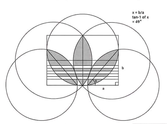
The geometry of Adidas logo
What does the Adidas logo mean? In 1967, the first design concepts included three stripes on each shoe, allowing Adolf Dassler to call Adidas a “three stripe company”. The meaning of the stripes of the Adidas logo was not associated with a specific symbol. In fact, the three-bar brand was purchased from Finnish sports brand Karhu Sports.
Little is known about the company, which is experiencing public controversy over the history of brand (Adolf Dassler was attracted by Nazi ideology during WWII). Equipped with a desire to showcase diversity, the Adidas trefoil has come to life. It is a tri-leaf adidas logo representing North America, Europe, and Asia - the top three countries where Adidas shoes have been sold. As you can see, the original three stripes are still there. Adidas trefoil has reserved its place for the original Adidas collection.
The geometry of Apple logo
According to Rob Janoff, who designed the original Apple logo:
The apple shape changed slightly from my original design in the early 80's. The design firm Landor & Associates made the changes. They brightened the colors, they made the shapes much more symmetrical, much more geometric. When I designed it I pretty much did it freehand.
A mathematician, however, has shown that the Apple logo is broadly consistent with the Golden Ratio principle.
Interestingly, this sparked a bit of controversy, as one designer on May 17, 2013, went to great lengths in Forbes magazine to argue that: "So in a funny way, the Apple logo feels like it adheres to some system because it doesn't."
The geometry of Apple logo
Marva Warnock, the wife of co-founder John Warnock, designed the Adobe first logo in 1982.. She employed two geometric design elements–a rectangle and an styized typeface for the letter A . The logo consisted of “Adobe” written in caps on a slate gray quadrangle with “Systems incorporated” underneath. The current logo is the white “A” derived from the original 1982 logo on a red background and “Adobe” written below in black.
The geometry of Nike logo
On May 30, 1971, Nike changed its brand from "BRS" and changed its logo to the current swoosh logo, mainly because it produced and marketed shoes instead of importing.
Nike co-founder Phil Knight paid his student Caroline Davidson (at Portland State University) $ 35 to design the first Nike logo. Interestingly, Knight wasn't very happy with the first Nike logo at first glance, but Caroline's design met the need for the Knight shoe logo to be “simple with stripes”.
The geometry of Under Armour logo
The original Under Armour logo was introduced in 1996 and was composed of the emblem in monochrome, where two vertically mirrored and overlapping arches, standing for “U” and “A”, were accompanied by lettering above and under it. The upper level featured “Under”, and the bottom “Armour” . The classic simplicity of black and white colour is a powerful feature of the Under Armor brand.
The geometry McDonald logo
The logo of the Golden Arches, the emblem of McDonald’s , has been revamped several times before it went through the final iteration in 2003. After Ray Kroc took over the business in 1961, he incorporated the two arches to form the new McDonald’s logo that looked like the letter “M”.
The geometry of Tweeter logo
The initial in-house bird logo design was created by Biz Stone, a founder of the company. The logo was tweaked in 2009 with the help of designer Philip Pascuzzo. A year later, they created the silhouette version, which was ultimately streamlined by Doug Bowman, the company's former Creative Director, in its current form.
According to Doug Bowman, “Twitter is the bird, the bird is Twitter,” . Resembling a mountain blue bird with a hint of a hummingbird thrown into it, the Twitter bird flies skyward in what Bowman has called "the ultimate representation of freedom, hope and desires. unlimited possibilities ”.
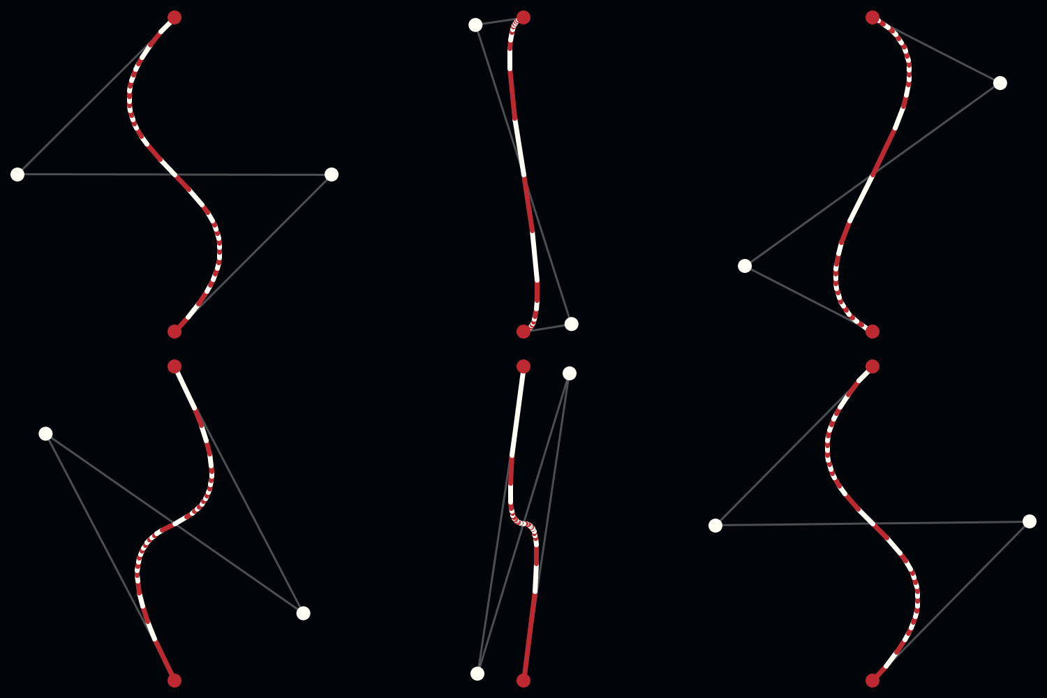
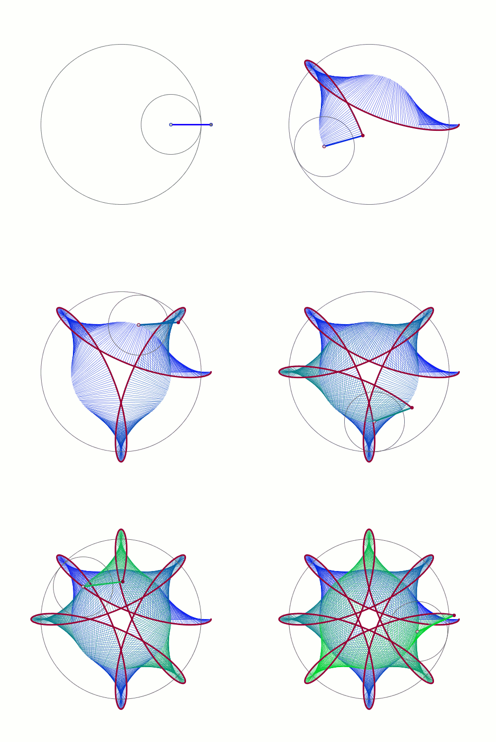
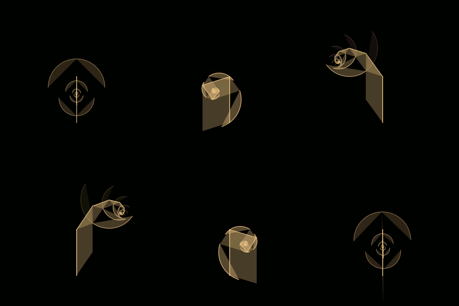
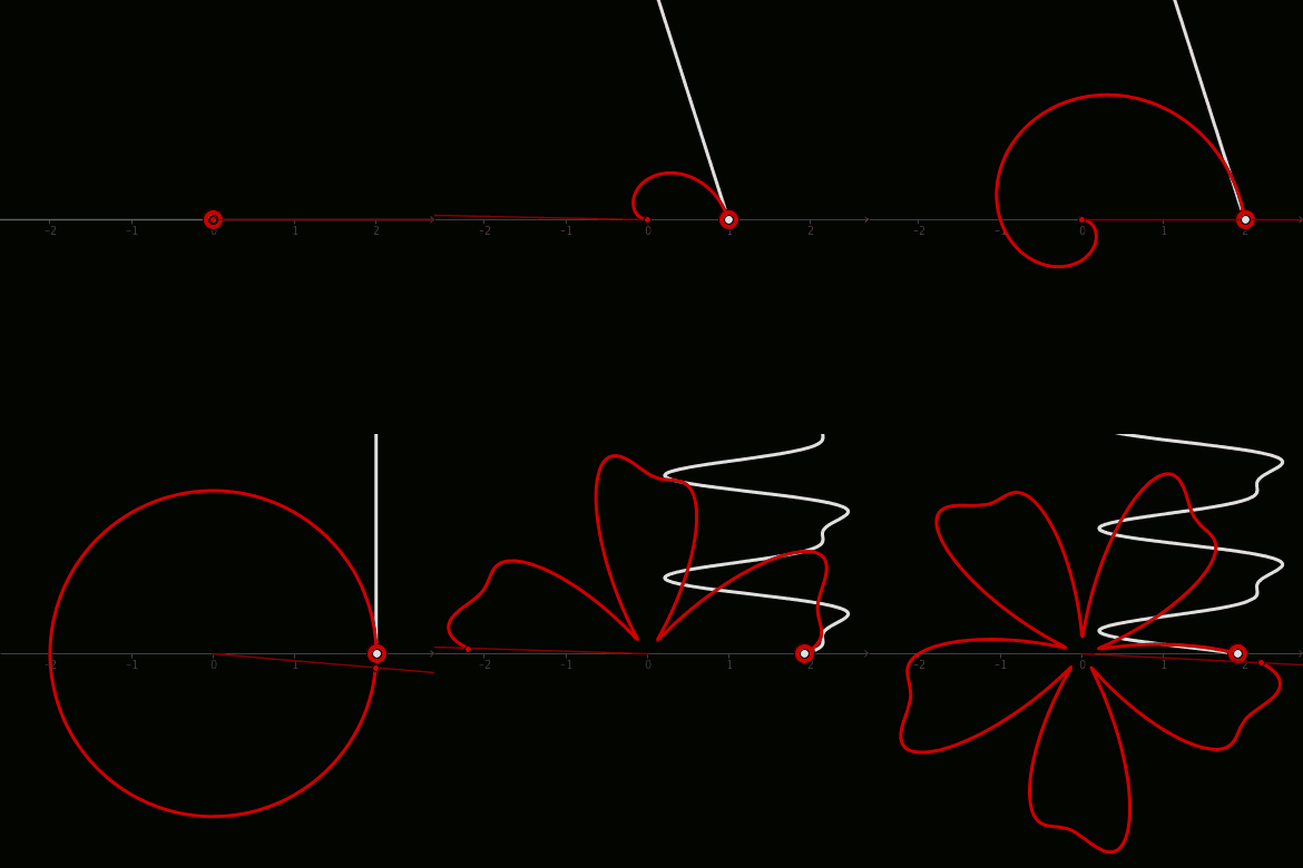
De Casteljau's Algorithm and Bézier Curves
From: malinchristersson.tumblr.com
This work is licensed under a Creative Commons Attribution-No Derivative Works 3.0 Unported License.




No comments:
Post a Comment