
The packaging and presentation of recorded music was transformed when Alex Steinweiss, an art director and graphic designer at Columbia Records, created the first Album cover using graphic design in 1939.
Steinweiss was born in March 24, 1917, in Brooklyn. His father, a women’s shoe designer from Warsaw, and his mother, a seamstress from Riga, Latvia, emigrated to the Lower East Side of Manhattan and eventually settled in the Brighton Beach section of Brooklyn. He graduated from Abraham Lincoln High School and was trained by Leon Friend, the school's first art department chairman. He landed a scholarship from Parsons School of Design at New York and after graduating in 1937, worked as an assistant to Joseph Binder until 1939, when he was hired by Columbia Records.
I got this idea that the way they were selling these albums was ridiculous. These were shellac records and they were in four- or five-pocket albums to make one symphony. The covers were just brown, tan or green paper. I said: “Who the hell’s going to buy this stuff? There’s no push to it. There’s no attractiveness. There’s no sales appeal.” So I told them I’d like to start designing covers. Dolan’s response was: “Then we’ve got to buy plates and start printing, and it adds cost. I made very good friends with the vice president in charge of sales. He saw the value in what I was doing. He got all the dealers hopped-up about it. They had to balk. Bridgeport was a desert. The city was known for making guns, bullets, nuts and bolts. There were no typographers. There was no such thing as a photostat. There was an engraver, but he only worked in black and white – he did not know what the hell to do with colour (and process colour didn’t exist). So I had to teach the engraver what to do – it was really quite an effort. Sure, Columbia balked, but they saw the light. There was one album with a Brahms Symphony where sales shot up 800 per cent when I put a cover on it. That was enough of a convincer.Steinweiss' first cover, for a collection of Rodgers and Hart songs performed by an orchestra, showed a high-contrast photo of a theater marquee with the title in lights. The new packaging concept was a success: Newsweek reported that sales of Bruno Walter’s recording of Beethoven’s “Eroica” symphony increased ninefold when the album cover was illustrated.
During the 1940s, Steinweiss album covers dominated the music world. The records, which were usually sold at the backs of home appliance stores, had become popular items that could capture the imaginations of music lovers around the world, and the sleeve encouraged them to purchase records from jazz bands, classic symphonies and operas, and pop music. He said “I love music so much, and I had such ambition that I was willing to go way beyond what the hell they paid me for. I wanted people to look at the artwork and hear the music.”


 |
| 1947 Beethoven "Concerto in D Major for Violin and Orchestra" [Columbia Masterworks catalogue no. MM 624] signed Steinweiss |
 |
| Teddy Wilson - Billie Holiday Label: Columbia 78 rpm album early 1940s Design: Alex Steinweiss |


Soon the idea of cover design for records was adopted by every record company. In 1948, almost 10 years after Steinweiss proposed the illustrated album cover, Columbia presented the LP format to the public. Now the new sleeve for the LP provided a nicer platform for presenting a graphic design.
In 1952 Don Gabor who ten years earlier had founded Continental Record Company, officially announced that Curt John Witt was the new art director of Remington Records Inc. The company soon had found its way into the New York Jazz Scene where many of the Continental jazz recordings were made. Many of the designs for the early Remington red-label productions were made by a man named Freeman. Other names that came up were of Sherman Alpert, Raboni, and for Plymouth it was Roy E. La Gione, someone whose initials were E.D.L., Einhorn and Curt John Witt who also made many covers for the Plymouth releases which often contained the recorded material originally issued on Remington.
Around 1952, Rudolph de Harak (1924–2002) designed two covers for Don Gabor, one for a Remington release and another for a Pontiac release. A native of Culver City, California, Rudolph de Harak civilian life was abruptly halted when he was enlisted into the army during World War II. On returning to Los Angeles he became an apprentice at a Los Angeles art studio that catered to local advertising agencies. At the age of 26, de Harak landed a job as promotion art director at Seventeen magazine in New York City. A year-and-a-half later he founded up his own studio. De Harak designed about 400 book jackets for McGraw-Hill books in a span of three years. In retrospect, according to de Harak, his book jacket designs were a direct outgrowth and natural progression of his record album work in the late 1950s.
Adhering to principles of Swiss design during the late 1950s, De Harak adapted attributes of the movement such as grid structures and asymmetrical balance. continuously striving for a greater communicative clarity and a consistent visual grammar. His series of album covers for Westminster Records evoke a minimalistic conceptualization of the musical universe.
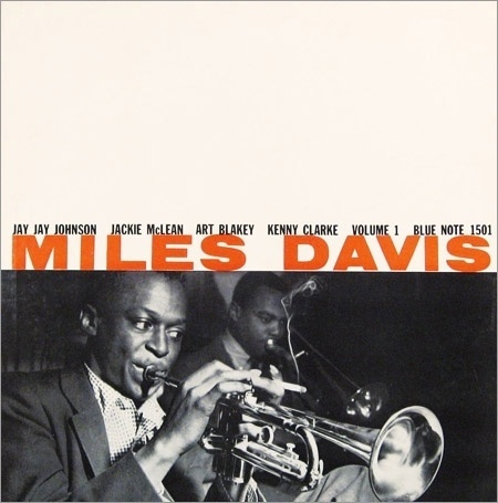
Reid Miles ( 1927 – 1993) was born in Chicago but, moved with his mother to Long Beach, California at the age of two following the Stock Market Crash and the separation of his parents. After graduating from high school Miles was enlisted in the Navy. He enrolled at Chouinard Art Institute at Los Angeles after being discharged from the army. In the early 1950s he relocated to New York working for John Hermansader and Esquire magazine. Soon he was commissioned by Francis Wolff of Blue Note to design its album covers. Miles designed several hundred covers, frequently incorporating the session photographs of Francis Wolff and, later, his own photographs.
Hermansader created the first eight covers in Blue Note's 1500 series. However, later on Reid Miles' covers became a virtual trademark for Blue Note and gave the label its distinctive look. Nevertheless, Miles was a freelance designer who also worked for other labels, notably Prestige. In 1958, after Blue Note changed the numbering on their albums from 1500 to 4000, Reid Miles continued to design most of its albums util 1967 creating many of his masterpieces.
There were also some other notable designers involved in the Blue Note production, including Andy Warhol, Harold Feinstein and Tom Hannan. In 1965 Blue Note was sold to Liberty, but without any changes in the music or graphic policy.
Born in 1921 in Waimea, Hawaii,graphic designer S. Neil Fujita worked at Columbia Records from 1954 to 1960 (with a break from ’57 to ’58) and designed album covers for Charles Mingus, Dave Brubeck, Art Blakey, and Miles Davis, among others.
For cool jazz albums such as Dave Brubeck's Time Out and more progressive works including Charles Mingus's Mingus Ah Um, Fujita used his own paintings which, like the prewar work of the abstract expressionists, were influenced by Pablo Picasso, Georges Braque, Paul Klee and Joan Miró. His abstract rectangles, scattered like pick-up sticks, worked for István Nádas's album of modern piano sonatas, and he memorably used a Ben Shahn painting for Bertolt Brecht and Kurt Weill's The Threepenny Opera.
By the mid 1950s, Prestige was the leading independent jazz label besides Blue Note Records. At this time Prestige reviving the "New Jazz" as a subsidiary label to record emerging musicians. Bob Cato took over from Neil Fujita in 1960 as art director at Columbia. A creative designer, he helped turn the album cover into an important form of contemporary art in the 1960s.
Born in New Orleans in 1923 to a Cuban emigrant mother and business executive father, Bob Cato moved with his family when he was 15 to Mexico City, where he began to study art with Jose Clemente Orozco and Pablo O'Higgins. During the Second World War, Cato was imprisoned as a conscientious objector, and then moved to Chicago to study with Lszl Moholy-Nagy. In 1947 he went to work for Alexey Brodovitch, the legendary art director at Harper's Bazaar, and one of most influential and revered figures in his field. As well as helping him at Harper's, Cato also assisted with the famous classes Brodovitch gave at the New School for Social Research. As Cato wrote for the catalogue of the 1972 show "Brodovitch and his Influence" at the Smithsonian in Washington,
Cato stayed at Columbia from 1960 to 1970, as an art director and the vice president of creative services and created or supervised some of the most memorable record-album covers of the 1960's. Some covers featured his own photography, for instance on Miles Davis's ''Miles'' album. In addition to his own creatings Bob Cato also employed some of the era's most influential painters, designers and photographers, including Andy Warhol, Robert Rauchenberg, Robert Crumb and Mati Klarwein.
John Berg was appointed as Bob Cato's assistent at Columbia in 1961. He took over as art director in 1965 when Cato was promoted to vice president of the creative department. As art director (and later creative director and vice president) of Columbia/CBS Records from 1961 until 1985, Berg oversaw a golden age of record cover design. From his office in New York's Midtown he created covers for Dylan, Springsteen and Monk, among others. He commissioned photography from Avedon and illustrations from Glaser and Chwast. He has stated in an interview that:
David Stone Martin (1913–1992), a prolific illustrator who drew more than 400 album covers and created covers for Time magazine and many other works, was born in Chicago and studied at the Art Institute there. During the 1930's and 1940's he worked for Government agencies, as supervisor of mural projects of the Federal Artists Project, art director for the Tennessee Valley Authority, graphic arts director for the Office of Strategic Services and art director for the Office of War Information, where he was a colleague and friend of Ben Shahn, the artist.
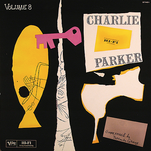
Martin's work is included in the collections of the Museum of Modern Art and the Metropolitan Museum of Art in New York City, the Art Institute of Chicago and the Smithsonian Institution. He won numerous awards from the Society of Illustrators and the Art Directors Clubs of New York City, Boston and Detroit.His album portraits, mostly done in distinctive heavy black-ink lines, included likenesses of Stan Getz, Count Basie, Charlie Parker, Billie Holiday, Art Tatum, John Coltrane, Ella Fitzgerald, Dizzy Gillespie, Jelly Roll Morton and Duke Ellington. Mr. Martin did nearly all the covers for the Asch, Clef and Jazz at the Philharmonic labels of the 1940's and 1950's. "He was essentially the first to develop an independent, serious image of jazz" and provided "an intimate insight into the music and life of jazz people," said Martina Schmitz, an art historian and musician who once assembled an exhibition of his work at Lincoln Center.
Mati Klarwein’s place in the history of 20th century art is perhaps unique, nestling at the crossroads of painting and music. From the end of the 1960s, a period as fruitful as it was revolutionary, numerous musicians such as Miles Davis, Carlos Santana and Jimi Hendrix recognised a statement of intent in his work and used it on their record covers as a manifesto. Born to Jewish parents in pre-war Germany, Klarwein’s family fled to Palestine when he was just two years old. There he grew up surrounded by three cultures; Jewish, Islamic and Christian. Values in opposition became the core of Klarwein’s understanding of the world at a young age and never quite left his grips. (Later in the late 1950s, Klarwein would add “Abdul” (which means “servant” in Arabic) to his name to represent a sense of understanding between the Jewish and Muslim hostility in the Middle East.) As a young man Klarwein moved to France, where he fell in love with a wealthy older woman. The two went on a 7-year trip around the world including Tibet, Indonesia, North Africa and Cuba. Klarwein later went on to become deeply enraptured with the surrealist movement and had Salvador Dali and Ernest Fuchs as personal mentors. Their work deeply affected him and their presence is felt in his work.
Jim Flora had been employed in the 1940s by Columbia Records, for whom he began designing 78 rpm album covers in 1945 or '46. In the 1950s, after a 15-month family hiatus in Mexico, he went freelance and designed RCA Victor LP covers jobbed out by his longtime friend, Robert M. Jones. Flora lavished record sleeves with outrageous caricatures of jazz giants Louis Armstrong, Gene Krupa, Benny Goodman, Shorty Rogers, and dozens of their swing- and bop-era brethren. Flora reduced these immortals to farcical creatures, with Picasso-skewed eyes, bedspread-pattern skin tints, and bonus legs. When you hired Flora, you got Flora.
Flora had done sporadic magazine work since the mid-1940s, and in the '50s he continued beefing up his resume, which included Fortune, Mademoiselle, Life, Look, Parade, Collier's, and countless others. By 1955 he had become a father five times, so he considered designing covers for kiddie books. After reviewing his illustration portfolio, renowned Harcourt-Brace children's editor Margaret McElderry said, "I need a Latin American-type book. Can you write one?" Flora demurred, "I'm not a writer, I'm an illustrator." McElderry persisted, and Flora returned to his studio to mull it over. "A few days later," he recounted, "I sent her a script for The Fabulous Firework Family, based on a family I knew in Mexico. From Grampa on down to the kids, they all worked on fireworks. Margaret accepted it immediately, and I was launched into the children's book business." The success of Firework Family offered Flora an alternative to the waning LP game. Over the next 27 years he wrote and illustrated 16 more books for young readers. By the time he retired in the early 1980s, he had enchanted several generations of moppets with his whimsical storytelling.
Impulse! Records was established in 1960 by producer Creed Taylor as a subsidiary of ABC-Paramount Records, part of the American Broadcasting Company (ABC). Taylor had previously worked with the New York-based Bethlehem Records label, as its inaugural house producer and A&R manager. He set the scene for the label’s most successful period with his far-sighted signing of John Coltrane. He left Impulse in the summer of 1961 to take over the running of Verve Records. Being almost exclusively an album-based label, Impulse! was able to exploit the new format to the fullest and its LPs are noted for their distinctive visual style. The label's trademark black, orange and white livery was devised by original art director Fran Attaway (then known as Fran Scott), whom Taylor also credits with establishing Impulse's tradition of using cutting-edge photographers for its covers.
The Impulse colour scheme was chosen for its brightness and because no other label used this combination. The label's striking logo featured the Impulse name in a heavy sans-serif lower-case font, followed by an exclamation mark that invertedly mirrors the lower-case "i" at the beginning. During the 1960s, Impulse! covers and disc labels featured variations on this colour scheme (a notable exception to the colour scheme is the John Coltrane album A Love Supreme, possibly the most iconic release of the label's catalogue, which uses the usual design in black and white only); for most of the 1960s the front cover of Impulse! albums typically featured the Impulse logo, usually (but not always) in orange letters in a white circle, with black-and-orange exclamation marks above it and the album catalog number below it.
Many of the best-known Impulse! covers were by designed by art director Robert Flynn and photographed by a small group that included Pete Turner (who also shot many renowned covers for the Verve, A&M and CTI labels), Chuck Stewart, famed portraitist Arnold Newman, Ted Russell and Joe Alper (also known for his early '60s photographs of Bob Dylan). The distinctive, sparse black and white back cover designs bore the slogan "The New Wave of Jazz is on IMPULSE!"; most Impulse! LPs were issued in a gatefold sleeve with photographs and liner notes or an essay inside or, in some cases, multi-page insert booklets.
Photographers of Jazz Records
The earliest examples of the use of photographs may be found on several RCA covers. From 1954 is the release of With Love From A Chorus on LM-1815, sung by the Robert Shaw Chorale. From then on also older recordings were reissued in covers adorned with photographs. When new, more cost effective printing techniques became available, art directors and copywriters started to work together with photographers who were commissioned to shoot photos along the lines of the art director's concept. Gradually the graphic artist was replaced by the photographer completely. The art director designed the basic layout and choose the picture and the various typefaces. This trend was initiated by RCA in the early i950s, and was followed by many a record company.
Harold Feinstein was born in Coney Island in 1931. He began his career in photography in 1946 at the age of 15 and within four short years, Edward Steichen, an early supporter, had purchased his work for the permanent collection of the Museum of Modern Art (MoMA). He joined the Photo League at 17 and became a prominent figure in the vanguard of the early New York City street photography scene where he exhibited at Helen Gee’s Limelight Gallery and was a designer for historic Blue Note Records. He was one of the original inhabitants of the legendary “Jazz Loft,” which he later turned over to his long-time collaborator and colleague W. Eugene Smith for whom he designed the original lay-out of the famous Pittsburgh Project. - See more at: http://www.haroldfeinstein.com/bio/#sthash.frAVJaQc.dpuf
Arnold Newman(1918—2006) was one of the most renowned portrait photographers of the 20th century. His photos of artists and musicians, presidents and prime ministers, are instantly recognizable as his work. Newman was born in New York City and studied painting and drawing. With a strong interest in the arts, he accepted a scholarship to study at the University of Miami at Coral Gables. His teacher at the university, a conservative artist, pointed him in the direction of modernism, and encouraged him to visit the Museum of Modern Art in New York. When he switched from painting to photography in 1938, it was first for financial reasons during the Depression, but then he came to love the field.
Charles Stewart (born 1927)is best known for his cover photos on as many as 2,000 albums featuring his portraits of such jazz, performers as Louis Armstrong, Count Basie, John Coltrane, Ella Fitzgerald and Miles Davis and artists in the R&B and salsa genres too.
Stewart was born in Texas in 1927 and grew up in Tucson, Arizona. He received an Kodak Brownie camera as a present when he was 13 years old and used it that same day to take photos of Marian Anderson who had come to visit his school. After they were developed, he was able to sell his photos for two dollars, making him a professional photographer from his first day he took pictures. He attended Ohio University as a photography major, one of the only two universities in the United States that offered the program at the collegiate level and the only one that would then accept African American students.
While in college, his friendship with photographer Herman Leonard helped him make connections with record companies in New York City. His clients would include Impulse, Mercury, Reprise and Verve, for whom he took cover photos of artists such jazz and R&B icons as Louis Armstrong, Count Basie, Ray Charles, Miles Davis, Ella Fitzgerald, Lionel Hampton, Rahsaan Roland Kirk, Charles Mingus, Max Roach, Sonny Rollins, Sarah Vaughan and Dinah Washington, appearing on more than 2,000 albums and in publications including Esquire, Paris Match and The New York Times, as well as in the Encyclopedia of Jazz by jazz journalist Leonard Feather. He also worked for Chess Records in Chicago (and its Argo subsidiary). Among his finest work is the many covers for Impulse in the 1960s.
A pioneer of color photography, Pete Turner’s career began during the infancy of color photography, at a time when color was used almost exclusively for commercial purposes. Unlike many contemporaries, Turner embraced color, seizing opportunities that allowed him to master the process and to create the imagery he felt compelled to make. Unconcerned with the labels of “art” or “commercial,” he has deftly created a life’s work that blurs these boundaries. Born in 1934 in Albany, New York, he graduated from the Rochester Institute of Technology in 1956. Pete Turner’s fine jazz photography is best know as a result of his collaboration with producer Creed Taylor. Their relationship started with ABC-Paramount in the 1950s, and continued with Impulse, Verve and CTI. The Color of Jazz (Rizzoli, 2006) is a comprehensive collection of his provocative album covers for CTI Records among many others.
Herman Leonard is one of the most respected Jazz photographers of all time, working or contributing to the field almost up to his death in 2010. He has photographed virtually every well-known Jazz artist since the 1950s, so much so that according to Quincy Jones, "...When people think of Jazz, their mental picture is likely one of Herman’s.” Leonard's passion for photography began when he was just nine years old. He saw an image being developed in his brother's dark room and was entranced. He later studied at Ohio University, the only place at that time that offered a degree in photography. Part of his success in his field may be credited to his years of apprenticeship to another giant in the field of portrait photography, Yousuf Karsh, who in Leonard's own words, was his "greatest influence in his whole life".
Leonard was the official photographer for the Montreal Jazz Festival, where he captured images of artists such as Tony Bennett and Dave Brubeck. In June 2010, the Montreal Jazz Festival awarded Leonard the Bruce Lundvall Award for his lifetime contribution to jazz. Leonard moved to New York and made arrangements with club owners there to photograph their musicians for marquee images. He formed lifelong friendships with Dizzy Gillespie, Quincy Jones and Bennett in this period.
Leonard rapidly became known for his smoky black and white images of jazz greats and celebrities. In the late 1950s Leonard moved to Paris and continued to photograph the jazz scene, as well as taking on fashion and editorial photography. In the 1980s, he moved from Paris to the island of Ibiza, and began putting together a book based on his jazz negatives. In 1985, he released his first book, The Eye of Jazz, and in 1988, he put together a hugely successful exhibit of his photographs in London. In 1992, Leonard moved to New Orleans and immersed himself in the city's lively jazz scene while continuing to do solo shows around the world. He released his second book, Jazz Memories, in 1995, an acclaimed work that earned him accolades. Bennett was quoted by Leonard's publicist paying tribute to the legacy the photographer has left. "Herman is my favourite artist of any technique. He's a painter with his camera, and he makes it look so effortless. His timing is as great as any Charlie Parker solo or Lester Young or Count Basie beat," the singer said. In 2005, Leonard's home and studio in New Orleans were severely damaged in Hurricane Katrina and his archive of over 8,000 prints was lost. Fortunately, his negatives were saved as they were housed at The Ogden Museum of Southern Art. Leonard, then 82, relocated to Los Angeles and began to rebuild his life and business there, a struggle that was captured in the 2006 documentary Saving Jazz. In 2008, Leonard was the first photographer to be granted a Grammy Foundation Grant for Preservation and Archiving, enabling him to digitize, catalogue and preserve his collection of nearly 60,000 jazz negatives..
Phil Stern, born in 1919, began his photography career in 1937 in New York City, working days as a studio apprentice and nights as a photographer for the Police Gazette. He later joined Friday magazine and was sent to L.A., where he began photographing Hollywood stars and freelancing for Life, Look, and Colliers magazines. After his World War II stint as a combat photographer, Stern returned to L.A., where he worked as both a freelance photographer and a “special” on the set of over 100 feature films, including Some Like it Hot, West Side Story, and What Ever Happened to Baby Jane? In 2001, Stern donated his library of Hollywood images to the Academy of Motion Picture Arts and Sciences. The author of Phil Stern’s Hollywood (Alfred A. Knopf, 1993), Stern lives in Los Angeles.
.
Esmond Edwards (1927 - 2007) Edwards became an avid photographer while still in high school and his early exposure to jazz via the Harlem community and especially the Apollo Theatre, clearly influenced Esmond’s later decision to specialize in music and photography. In the mid 1950’s and early in Esmond’s photo career, he “tagged” along with great jazz drummer, Arthur Taylor to a Prestige Records recording session, took a few photos at the session and subsequently showed them to Prestige owner Bob Weinstock. A new career was born! Esmond was soon photographing at most of the Prestige sessions, and the album art designers often used his photos in their cover layouts. Esmond’s continued association with Weinstock and Prestige Records eventually led him to supervising recording sessions and working with legendary recording engineer, Rudy Van Gelder. Esmond Edwards eventually left Prestige Records, going on to head the jazz divisions at Chess Records (Argo/Cadet), Verve, Columbia and Impulse. Although more time was devoted to heavier recording and administrative duties during this time, his photograph archives remains unparalled. The high quality and very personal style of Esmond’s photographs of John Coltrane and others are still sought after by collectors and are currently used on record company reissue programs. In addition to his jazz work, Edwards has done freelance photography for the New York Times Sunday magazine sections, and his photographs have appeared in various magazines and anthologies of outstanding record jacket designs..


Reference

In 1952 Don Gabor who ten years earlier had founded Continental Record Company, officially announced that Curt John Witt was the new art director of Remington Records Inc. The company soon had found its way into the New York Jazz Scene where many of the Continental jazz recordings were made. Many of the designs for the early Remington red-label productions were made by a man named Freeman. Other names that came up were of Sherman Alpert, Raboni, and for Plymouth it was Roy E. La Gione, someone whose initials were E.D.L., Einhorn and Curt John Witt who also made many covers for the Plymouth releases which often contained the recorded material originally issued on Remington.
 |
| Bebop and Blues original reissue on Remington R-1031, by Curt John Witt |
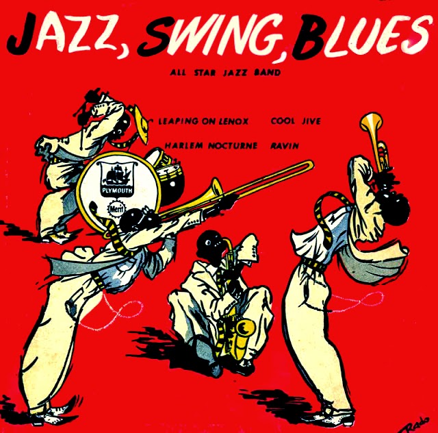 |
| Jazz, Swing, Blues,Plymouth P-12-113, cover by Otto Rado |
Around 1952, Rudolph de Harak (1924–2002) designed two covers for Don Gabor, one for a Remington release and another for a Pontiac release. A native of Culver City, California, Rudolph de Harak civilian life was abruptly halted when he was enlisted into the army during World War II. On returning to Los Angeles he became an apprentice at a Los Angeles art studio that catered to local advertising agencies. At the age of 26, de Harak landed a job as promotion art director at Seventeen magazine in New York City. A year-and-a-half later he founded up his own studio. De Harak designed about 400 book jackets for McGraw-Hill books in a span of three years. In retrospect, according to de Harak, his book jacket designs were a direct outgrowth and natural progression of his record album work in the late 1950s.
Adhering to principles of Swiss design during the late 1950s, De Harak adapted attributes of the movement such as grid structures and asymmetrical balance. continuously striving for a greater communicative clarity and a consistent visual grammar. His series of album covers for Westminster Records evoke a minimalistic conceptualization of the musical universe.
 |
| Introducing: Fou Ts'ong, Piano, Mozart Piano Cocerti , K503 & K595, Westminster , Rudolph de Harak |
 |
| High Fidelity Brass/Ancient & Modern, Westminster, Rudolph de Harak |
 |
| Ivor Novello's Music Hall Songs , Westminster, Rudolph de Harak |
 |
| Shostakovitch, Piano Concerto No. 1, Opus 35, & No. 2, Opus 102, Eugene List Piano, Westminster, Rudolph de Harak |
 |
| Rossini Overtures, Volume, Westminster, Rudolph de Harak |
 |
| While Making Love,.., Eric Johnson and his Orchestra, Westminster, Rudolph de Harak |
 |
| Franz Liszt, The Two Piano Concerti, Sir Adrian Boult, Conductor, Vienna State Opera Orchestra, Edith Farnadi, Pianist, Westminster, Rudolph de Harak |
Reid Miles ( 1927 – 1993) was born in Chicago but, moved with his mother to Long Beach, California at the age of two following the Stock Market Crash and the separation of his parents. After graduating from high school Miles was enlisted in the Navy. He enrolled at Chouinard Art Institute at Los Angeles after being discharged from the army. In the early 1950s he relocated to New York working for John Hermansader and Esquire magazine. Soon he was commissioned by Francis Wolff of Blue Note to design its album covers. Miles designed several hundred covers, frequently incorporating the session photographs of Francis Wolff and, later, his own photographs.
 |
| Sonny Clark Trio Label: Blue Note 1579 12" LP 1958 Design: Reid Miles |
Hermansader created the first eight covers in Blue Note's 1500 series. However, later on Reid Miles' covers became a virtual trademark for Blue Note and gave the label its distinctive look. Nevertheless, Miles was a freelance designer who also worked for other labels, notably Prestige. In 1958, after Blue Note changed the numbering on their albums from 1500 to 4000, Reid Miles continued to design most of its albums util 1967 creating many of his masterpieces.
There were also some other notable designers involved in the Blue Note production, including Andy Warhol, Harold Feinstein and Tom Hannan. In 1965 Blue Note was sold to Liberty, but without any changes in the music or graphic policy.
 |
| For decades the name Neil Fujita was synonymous with a kind of eclectic modernism of jazz-inspired era with an American flair. No wonder his work would tickle the fancy of anyone considering graphic design as an art with many facets. |
Born in 1921 in Waimea, Hawaii,graphic designer S. Neil Fujita worked at Columbia Records from 1954 to 1960 (with a break from ’57 to ’58) and designed album covers for Charles Mingus, Dave Brubeck, Art Blakey, and Miles Davis, among others.
 |
| S. Neil Fujita
Fujita brought the influence of modern art, including his own paintings, into his work, but rather than using them as decoration, he emphasised the concept of the cover reflecting the music or words inside. The designer Milton Glaser said Fujita "distinguished himself by having a rigorous design objective. It was a kind of synthesis of Bauhaus principles and Japanese sensibility."
|
When I got to Columbia, there was the beginning of some idea of album cover art but it was still just type and maybe a photo of the artist and some shapes arranged in an interesting way. That was the first concept of album cover art. Actually the first examples of album art that I can remember were on children's records, because they might have included a painting or something else to illustrate the idea. But I think that I was the first to use painters, photographers and illustrators to do artwork on album covers. As for the second part of the question, no, in fact I didn't go right into designing jackets. In fact, when I got to Columbia, I actually spent the first couple of months visiting the record factory in Connecticut because I wanted to learn how records were made, the whole process.(...) When I got to Columbia, Alex Steinweiss was at RCA, I believe. We met for lunch several times and would speak. The relationship was a friendly one, but I don't think we talked a lot about design. There were a lot of changes going on in the business and we were both searching for our own answers. I would travel across the country speaking to record sellers. I would ask them how they sold records because I felt that we needed a new approach. In those days, clerks would spend a lot more time actually selling records to customers. We thought about how we could use images or pictures in a more creative way. We thought about what the picture was saying about the music and how we could use that to sell the record. And abstract art was getting popular so we used a lot more abstraction in the designs—with jazz records especially but also with classical when there was a way for it to fit, like with the more modern composers.
 |
| Bobbie Humphry, Fancy Dancer (1975), Art Direction by Bob Cato/Lloyd Ziff. Illustration by Barbara Nessim. Design by Ria Lewerke. |
By the mid 1950s, Prestige was the leading independent jazz label besides Blue Note Records. At this time Prestige reviving the "New Jazz" as a subsidiary label to record emerging musicians. Bob Cato took over from Neil Fujita in 1960 as art director at Columbia. A creative designer, he helped turn the album cover into an important form of contemporary art in the 1960s.
Born in New Orleans in 1923 to a Cuban emigrant mother and business executive father, Bob Cato moved with his family when he was 15 to Mexico City, where he began to study art with Jose Clemente Orozco and Pablo O'Higgins. During the Second World War, Cato was imprisoned as a conscientious objector, and then moved to Chicago to study with Lszl Moholy-Nagy. In 1947 he went to work for Alexey Brodovitch, the legendary art director at Harper's Bazaar, and one of most influential and revered figures in his field. As well as helping him at Harper's, Cato also assisted with the famous classes Brodovitch gave at the New School for Social Research. As Cato wrote for the catalogue of the 1972 show "Brodovitch and his Influence" at the Smithsonian in Washington,
I became Alexey's "Man Friday" and all-round assistant in New York. I drove his car, worked at Junior Bazaar and "Big" Bazaar, cooked for him, kept the attendance books at school, did the shopping and generally kept things together for him and Mrs. B. I had been involved with the jazz scene for many years and it gave Alexey a great deal of pleasure to play host to my many musician friends, who would drop by to talk and drink Scotch with us.
 |
| Lea Roberts ‘Lady Lea’ (1975) Art Direction by Bob Cato. Photography by Doug Metzler. Design by Beverly Parker. |
Cato stayed at Columbia from 1960 to 1970, as an art director and the vice president of creative services and created or supervised some of the most memorable record-album covers of the 1960's. Some covers featured his own photography, for instance on Miles Davis's ''Miles'' album. In addition to his own creatings Bob Cato also employed some of the era's most influential painters, designers and photographers, including Andy Warhol, Robert Rauchenberg, Robert Crumb and Mati Klarwein.
 |
| Cato’s choice of Robert Crumb illustrations
for Janis Joplin’s Cheap Thrills (1968) was one of his most controversial decisions. The recent Joplin bio by Alice Echols explains this had not been the original conception: Columbia’s art director had planned a different cover, a photo of the group in bed in a hippie crash pad. The band arrived and discovered a bedroom done up in pink frills – like no hippie pad they’d been in. “Let’s trash it, boys,” Janis declared, and they did. The shot of them in bed naked, the bed covers pulled up only to their waists, was junked in favor of Crumb’s caricatures. Crumb himself was excited by the project but stated; “When I meet Janis I want to be able to pinch her tit.” The woman on the Cheap Thrills jacket is Crumb's idealization of Janis as the ultimate hippie chick, with proud, ripe buttocks and jutting nipples. Crumb also caricatured other members of the band, studying them as they played at a gig one night, and his impressions originally were planned for the back of the album. Janis was adamant that the title of the album should be ''Sex, Dope and Cheap Thrills.'' ''The title didn't seem quite right to me,'' Cato wrote years later in an unpublished memoir. He suggested to Janice that the words ''sex'' and ''dope'' on the cover would limit the record's radio airplay, and recommended using only the last two words for the title. Janice Finally agreed, saying, ''Well, I've always settled for cheap thrills, anyway.'' |
John Berg was appointed as Bob Cato's assistent at Columbia in 1961. He took over as art director in 1965 when Cato was promoted to vice president of the creative department. As art director (and later creative director and vice president) of Columbia/CBS Records from 1961 until 1985, Berg oversaw a golden age of record cover design. From his office in New York's Midtown he created covers for Dylan, Springsteen and Monk, among others. He commissioned photography from Avedon and illustrations from Glaser and Chwast. He has stated in an interview that:
I never directly thought about a “style” to my work. I was just trying to come up with a graphic solution, a concept for each project. If a style evolved over the years, it might be inventive typography concepts, one where the letterforms seem to illustrate what the words are saying—Dave Brubeck's Bossa Nova USA for example. Sometimes an illustration would solve the problem, sometimes a photograph. Those projects were great fun to do. On Thelonius Monk's Underground, a project with photographers Steve Horn and Norman Griner, the title of the album came from a current jazz movement, which I twisted into a version of the French anti-Nazi underground of World War II. An entire set was built and the scene was full of costumed extras. There was no problem with budgets in those days. I won a Grammy for that cover, by the way. Again with Horn/Griner, I devised the cover of Switched-on Bach with [a stand-in for] Bach and a Moog synthesizer.
 |
| “The Byrds: Fifth Dimension” by John Berg. Photo by Durell Godfrey |
 |
Loverboy Get Lucky. I commissioned the photograph. by John Berg. I wanted to pump as much color into the cover as I could. We found the best pair of red leather pants but they didn't fit any models. The photographer, named David Kennedy, had a 16-year-old daughter. They fit her perfectly. Then we got an Argentinian male model, 6 foot 5, and hired him on the basis of his big hands. |
David Stone Martin (1913–1992), a prolific illustrator who drew more than 400 album covers and created covers for Time magazine and many other works, was born in Chicago and studied at the Art Institute there. During the 1930's and 1940's he worked for Government agencies, as supervisor of mural projects of the Federal Artists Project, art director for the Tennessee Valley Authority, graphic arts director for the Office of Strategic Services and art director for the Office of War Information, where he was a colleague and friend of Ben Shahn, the artist.
 |
| Music for Loving, Ben Webster with String , MGN-1039, 1955, Verve Supervised by Norman Granz, Illustration by David Stone Martin |
 |
| Roy Eldridge: Swing Goes Dixie Label: Verve 1010 12" LP, 1956, Design: David Stone Martin |
Martin's work is included in the collections of the Museum of Modern Art and the Metropolitan Museum of Art in New York City, the Art Institute of Chicago and the Smithsonian Institution. He won numerous awards from the Society of Illustrators and the Art Directors Clubs of New York City, Boston and Detroit.His album portraits, mostly done in distinctive heavy black-ink lines, included likenesses of Stan Getz, Count Basie, Charlie Parker, Billie Holiday, Art Tatum, John Coltrane, Ella Fitzgerald, Dizzy Gillespie, Jelly Roll Morton and Duke Ellington. Mr. Martin did nearly all the covers for the Asch, Clef and Jazz at the Philharmonic labels of the 1940's and 1950's. "He was essentially the first to develop an independent, serious image of jazz" and provided "an intimate insight into the music and life of jazz people," said Martina Schmitz, an art historian and musician who once assembled an exhibition of his work at Lincoln Center.
 |
| Joe Beck – Beck (1975), by Mati Klarwein |
Mati Klarwein’s place in the history of 20th century art is perhaps unique, nestling at the crossroads of painting and music. From the end of the 1960s, a period as fruitful as it was revolutionary, numerous musicians such as Miles Davis, Carlos Santana and Jimi Hendrix recognised a statement of intent in his work and used it on their record covers as a manifesto. Born to Jewish parents in pre-war Germany, Klarwein’s family fled to Palestine when he was just two years old. There he grew up surrounded by three cultures; Jewish, Islamic and Christian. Values in opposition became the core of Klarwein’s understanding of the world at a young age and never quite left his grips. (Later in the late 1950s, Klarwein would add “Abdul” (which means “servant” in Arabic) to his name to represent a sense of understanding between the Jewish and Muslim hostility in the Middle East.) As a young man Klarwein moved to France, where he fell in love with a wealthy older woman. The two went on a 7-year trip around the world including Tibet, Indonesia, North Africa and Cuba. Klarwein later went on to become deeply enraptured with the surrealist movement and had Salvador Dali and Ernest Fuchs as personal mentors. Their work deeply affected him and their presence is felt in his work.
 |
| Kid Ory: New Orleans Jazz Label: Columbia 78 rpm album 1940s Design: Jim Flora |
"I had no idea of likeness at all. I always thought that the musicians did their thing, and it was my turn to do my thing. In 1956, with the advent of rock 'n' roll, the RCA Victor policy changed, and everything went photographic. Within six months I lost that account. As a matter of fact, Bob Jones told me that every time he came in with a new cover of mine, they'd say, 'I thought we weren't going to have any more Floras?' Bob protected me for a while. But after 1956, I did very little in the record business. I was out of it."
 |
| Gene Krupa and his Orchestra Label: Columbia 78 rpm album 1940s Design: Jim Flora |
Flora had done sporadic magazine work since the mid-1940s, and in the '50s he continued beefing up his resume, which included Fortune, Mademoiselle, Life, Look, Parade, Collier's, and countless others. By 1955 he had become a father five times, so he considered designing covers for kiddie books. After reviewing his illustration portfolio, renowned Harcourt-Brace children's editor Margaret McElderry said, "I need a Latin American-type book. Can you write one?" Flora demurred, "I'm not a writer, I'm an illustrator." McElderry persisted, and Flora returned to his studio to mull it over. "A few days later," he recounted, "I sent her a script for The Fabulous Firework Family, based on a family I knew in Mexico. From Grampa on down to the kids, they all worked on fireworks. Margaret accepted it immediately, and I was launched into the children's book business." The success of Firework Family offered Flora an alternative to the waning LP game. Over the next 27 years he wrote and illustrated 16 more books for young readers. By the time he retired in the early 1980s, he had enchanted several generations of moppets with his whimsical storytelling.
 |
| Elvin Jones - Richard Davis: Heavy Sounds Label: Impulse A-9160 12" LP 1968 Design: Robert and Barbara Flynn Photo: Charles Stewart |
Impulse! Records was established in 1960 by producer Creed Taylor as a subsidiary of ABC-Paramount Records, part of the American Broadcasting Company (ABC). Taylor had previously worked with the New York-based Bethlehem Records label, as its inaugural house producer and A&R manager. He set the scene for the label’s most successful period with his far-sighted signing of John Coltrane. He left Impulse in the summer of 1961 to take over the running of Verve Records. Being almost exclusively an album-based label, Impulse! was able to exploit the new format to the fullest and its LPs are noted for their distinctive visual style. The label's trademark black, orange and white livery was devised by original art director Fran Attaway (then known as Fran Scott), whom Taylor also credits with establishing Impulse's tradition of using cutting-edge photographers for its covers.
The Impulse colour scheme was chosen for its brightness and because no other label used this combination. The label's striking logo featured the Impulse name in a heavy sans-serif lower-case font, followed by an exclamation mark that invertedly mirrors the lower-case "i" at the beginning. During the 1960s, Impulse! covers and disc labels featured variations on this colour scheme (a notable exception to the colour scheme is the John Coltrane album A Love Supreme, possibly the most iconic release of the label's catalogue, which uses the usual design in black and white only); for most of the 1960s the front cover of Impulse! albums typically featured the Impulse logo, usually (but not always) in orange letters in a white circle, with black-and-orange exclamation marks above it and the album catalog number below it.
 |
| The Blues and the Abstract Truth Label: Impulse A-5 12" LP 1961 Design: Robert Flynn Photo: Pete Turner |
Many of the best-known Impulse! covers were by designed by art director Robert Flynn and photographed by a small group that included Pete Turner (who also shot many renowned covers for the Verve, A&M and CTI labels), Chuck Stewart, famed portraitist Arnold Newman, Ted Russell and Joe Alper (also known for his early '60s photographs of Bob Dylan). The distinctive, sparse black and white back cover designs bore the slogan "The New Wave of Jazz is on IMPULSE!"; most Impulse! LPs were issued in a gatefold sleeve with photographs and liner notes or an essay inside or, in some cases, multi-page insert booklets.
Photographers of Jazz Records
 |
| This cover of RCA LM 1817 from 1954 with an inspiring, sexy photograph covering Gaité Parisienne is among the covers that set the trend for using photographs in graphic desig. |
The earliest examples of the use of photographs may be found on several RCA covers. From 1954 is the release of With Love From A Chorus on LM-1815, sung by the Robert Shaw Chorale. From then on also older recordings were reissued in covers adorned with photographs. When new, more cost effective printing techniques became available, art directors and copywriters started to work together with photographers who were commissioned to shoot photos along the lines of the art director's concept. Gradually the graphic artist was replaced by the photographer completely. The art director designed the basic layout and choose the picture and the various typefaces. This trend was initiated by RCA in the early i950s, and was followed by many a record company.
 |
| Gigi Gryce, Signal Records, 1955Design and Photo: Harold Feinstein- |
 |
| Duke Jordan and Quintet, Signal Records, 1955Design and Photo: Harold Feinstein |
Harold Feinstein was born in Coney Island in 1931. He began his career in photography in 1946 at the age of 15 and within four short years, Edward Steichen, an early supporter, had purchased his work for the permanent collection of the Museum of Modern Art (MoMA). He joined the Photo League at 17 and became a prominent figure in the vanguard of the early New York City street photography scene where he exhibited at Helen Gee’s Limelight Gallery and was a designer for historic Blue Note Records. He was one of the original inhabitants of the legendary “Jazz Loft,” which he later turned over to his long-time collaborator and colleague W. Eugene Smith for whom he designed the original lay-out of the famous Pittsburgh Project. - See more at: http://www.haroldfeinstein.com/bio/#sthash.frAVJaQc.dpuf
 |
| Duke Ellington at Newport Label: Columbia 934, 12" LP 1956, Photo: Arnold Newman |
Arnold Newman(1918—2006) was one of the most renowned portrait photographers of the 20th century. His photos of artists and musicians, presidents and prime ministers, are instantly recognizable as his work. Newman was born in New York City and studied painting and drawing. With a strong interest in the arts, he accepted a scholarship to study at the University of Miami at Coral Gables. His teacher at the university, a conservative artist, pointed him in the direction of modernism, and encouraged him to visit the Museum of Modern Art in New York. When he switched from painting to photography in 1938, it was first for financial reasons during the Depression, but then he came to love the field.
 |
| The Blues and the Abstract Truth
Label: Impulse A-5 12" LP, 1961, New cover. Design: Robert Flynn Photo: Charles Stewart |
 |
| Archie Shepp: Four for Trane
Label: Impulse A-71 12" LP , 1964, Design: Robert Flynn Photo: Charles Stewart |
Charles Stewart (born 1927)is best known for his cover photos on as many as 2,000 albums featuring his portraits of such jazz, performers as Louis Armstrong, Count Basie, John Coltrane, Ella Fitzgerald and Miles Davis and artists in the R&B and salsa genres too.
Stewart was born in Texas in 1927 and grew up in Tucson, Arizona. He received an Kodak Brownie camera as a present when he was 13 years old and used it that same day to take photos of Marian Anderson who had come to visit his school. After they were developed, he was able to sell his photos for two dollars, making him a professional photographer from his first day he took pictures. He attended Ohio University as a photography major, one of the only two universities in the United States that offered the program at the collegiate level and the only one that would then accept African American students.
While in college, his friendship with photographer Herman Leonard helped him make connections with record companies in New York City. His clients would include Impulse, Mercury, Reprise and Verve, for whom he took cover photos of artists such jazz and R&B icons as Louis Armstrong, Count Basie, Ray Charles, Miles Davis, Ella Fitzgerald, Lionel Hampton, Rahsaan Roland Kirk, Charles Mingus, Max Roach, Sonny Rollins, Sarah Vaughan and Dinah Washington, appearing on more than 2,000 albums and in publications including Esquire, Paris Match and The New York Times, as well as in the Encyclopedia of Jazz by jazz journalist Leonard Feather. He also worked for Chess Records in Chicago (and its Argo subsidiary). Among his finest work is the many covers for Impulse in the 1960s.
 |
| Benny Carter: Further Definitions Label: Impulse A-12 12" LP, 1961, Design: Robert Flynn Photo: Pete Turner |
 |
| John Coltrane: Live at the Village Vanguard Label: Impulse A-10 12" LP 1961Design: Robert Flynn Photo: Pete Turner |
A pioneer of color photography, Pete Turner’s career began during the infancy of color photography, at a time when color was used almost exclusively for commercial purposes. Unlike many contemporaries, Turner embraced color, seizing opportunities that allowed him to master the process and to create the imagery he felt compelled to make. Unconcerned with the labels of “art” or “commercial,” he has deftly created a life’s work that blurs these boundaries. Born in 1934 in Albany, New York, he graduated from the Rochester Institute of Technology in 1956. Pete Turner’s fine jazz photography is best know as a result of his collaboration with producer Creed Taylor. Their relationship started with ABC-Paramount in the 1950s, and continued with Impulse, Verve and CTI. The Color of Jazz (Rizzoli, 2006) is a comprehensive collection of his provocative album covers for CTI Records among many others.
 |
| Recital by Oscar Peterson Label: Clef 694 12" LP 1956 Photo: Herman Leonard |
Herman Leonard is one of the most respected Jazz photographers of all time, working or contributing to the field almost up to his death in 2010. He has photographed virtually every well-known Jazz artist since the 1950s, so much so that according to Quincy Jones, "...When people think of Jazz, their mental picture is likely one of Herman’s.” Leonard's passion for photography began when he was just nine years old. He saw an image being developed in his brother's dark room and was entranced. He later studied at Ohio University, the only place at that time that offered a degree in photography. Part of his success in his field may be credited to his years of apprenticeship to another giant in the field of portrait photography, Yousuf Karsh, who in Leonard's own words, was his "greatest influence in his whole life".
 |
| Billie Holiday: Lady Sings the Blues Label: Clef 721 12" LP, 1956, Photo: Herman Leonard |
Leonard was the official photographer for the Montreal Jazz Festival, where he captured images of artists such as Tony Bennett and Dave Brubeck. In June 2010, the Montreal Jazz Festival awarded Leonard the Bruce Lundvall Award for his lifetime contribution to jazz. Leonard moved to New York and made arrangements with club owners there to photograph their musicians for marquee images. He formed lifelong friendships with Dizzy Gillespie, Quincy Jones and Bennett in this period.
Leonard rapidly became known for his smoky black and white images of jazz greats and celebrities. In the late 1950s Leonard moved to Paris and continued to photograph the jazz scene, as well as taking on fashion and editorial photography. In the 1980s, he moved from Paris to the island of Ibiza, and began putting together a book based on his jazz negatives. In 1985, he released his first book, The Eye of Jazz, and in 1988, he put together a hugely successful exhibit of his photographs in London. In 1992, Leonard moved to New Orleans and immersed himself in the city's lively jazz scene while continuing to do solo shows around the world. He released his second book, Jazz Memories, in 1995, an acclaimed work that earned him accolades. Bennett was quoted by Leonard's publicist paying tribute to the legacy the photographer has left. "Herman is my favourite artist of any technique. He's a painter with his camera, and he makes it look so effortless. His timing is as great as any Charlie Parker solo or Lester Young or Count Basie beat," the singer said. In 2005, Leonard's home and studio in New Orleans were severely damaged in Hurricane Katrina and his archive of over 8,000 prints was lost. Fortunately, his negatives were saved as they were housed at The Ogden Museum of Southern Art. Leonard, then 82, relocated to Los Angeles and began to rebuild his life and business there, a struggle that was captured in the 2006 documentary Saving Jazz. In 2008, Leonard was the first photographer to be granted a Grammy Foundation Grant for Preservation and Archiving, enabling him to digitize, catalogue and preserve his collection of nearly 60,000 jazz negatives..
 |
| Count Basie: Basie Jazz Label: Clef 633 12" LP 1954 Photo: Phil Stern |
 |
| Gene Krupa - Lionel Hampton - Teddy Wilson Label: Clef 681 12" LP 1955Photo: Phil Stern |
Phil Stern, born in 1919, began his photography career in 1937 in New York City, working days as a studio apprentice and nights as a photographer for the Police Gazette. He later joined Friday magazine and was sent to L.A., where he began photographing Hollywood stars and freelancing for Life, Look, and Colliers magazines. After his World War II stint as a combat photographer, Stern returned to L.A., where he worked as both a freelance photographer and a “special” on the set of over 100 feature films, including Some Like it Hot, West Side Story, and What Ever Happened to Baby Jane? In 2001, Stern donated his library of Hollywood images to the Academy of Motion Picture Arts and Sciences. The author of Phil Stern’s Hollywood (Alfred A. Knopf, 1993), Stern lives in Los Angeles.
.
 |
| Ray Bryant Trio´ Label: Prestige 7098 12" LP, 1957, Design: Reid Miles, Photo: Esmond Edwards |
 |
| John Coltrane Label: Prestige 7105 12" LP, 1957, Design and photo: Esmond Edwards |
Esmond Edwards (1927 - 2007) Edwards became an avid photographer while still in high school and his early exposure to jazz via the Harlem community and especially the Apollo Theatre, clearly influenced Esmond’s later decision to specialize in music and photography. In the mid 1950’s and early in Esmond’s photo career, he “tagged” along with great jazz drummer, Arthur Taylor to a Prestige Records recording session, took a few photos at the session and subsequently showed them to Prestige owner Bob Weinstock. A new career was born! Esmond was soon photographing at most of the Prestige sessions, and the album art designers often used his photos in their cover layouts. Esmond’s continued association with Weinstock and Prestige Records eventually led him to supervising recording sessions and working with legendary recording engineer, Rudy Van Gelder. Esmond Edwards eventually left Prestige Records, going on to head the jazz divisions at Chess Records (Argo/Cadet), Verve, Columbia and Impulse. Although more time was devoted to heavier recording and administrative duties during this time, his photograph archives remains unparalled. The high quality and very personal style of Esmond’s photographs of John Coltrane and others are still sought after by collectors and are currently used on record company reissue programs. In addition to his jazz work, Edwards has done freelance photography for the New York Times Sunday magazine sections, and his photographs have appeared in various magazines and anthologies of outstanding record jacket designs..

 |
| Charlie Parker with Strings Label: Mercury/Clef 101 78 album 1950 Also issued as 10" album Design: David Stone Martin |
 |
| Dizzy Gillespie: Dizzy in Paris Label: Contemporary C4011 7" EP 1955 Design: Robert Guidi |

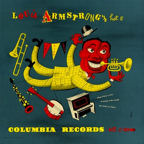 |
| Louis Armstrong´s Hot Five Label: Columbia 78 rpm album 1940s Design: Jim Flora |
 |
| AltoSaxes Label: Norgran 1035 12" LP, 1955, Design: David Stone Martin |
 |
| Miles Davis: Cookin´ Label: Prestige 7094 12" LP 1957 Design: Reid Miles Illustration: Phil Hays |
 |
| The Bud Shank Quartet Label: Pacific Jazz 1215 10" LP 1956 Design: William Claxton Illustration: Pauline Annon |
 |
| Billie Holiday Label: Clef 169 10" LP 1954 Design: David Stone Martin |
 |
| Coleman Hawkins Label: Asch Records 78 album 1940s Design: David Stone Martin |
 |
| Muggsy Spanier and Pee Wee Russell Label: Disc Records 78 album c.1947 Design: David Stone Martin |

 |
| Bird and Diz Label: Mercury/Clef 512 10" LP 1952 Design: David Stone Martin |
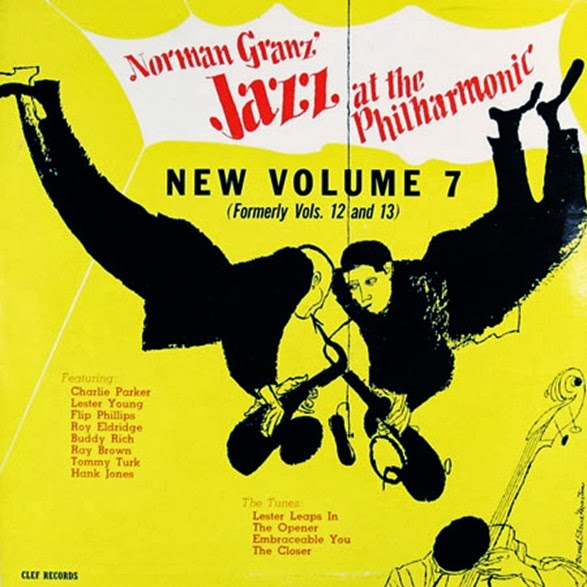 |
| Jazz At The Philharmonic, vol 7 Label: Clef New vol 7 12" LP 1955 Design: David Stone Martin |
 |
| Jazz at the Philharmonic, vol. 3 Label: Mercury/Clef, JATP vol 3 10" LP 1951 Design: David Stone Martin |
 |
| Charlie Parker plays South of the Border Label: Mercury/Clef 513 10" LP 1952 Design: David Stone Martin |

 |
| Charlie Parker plays South of the Border Label: Mercury/Clef 513 10" LP 1952 Design: David Stone Martin |
 |
| Johnny Hodges: Dance Bash, vol. 1 Label: Norgran EPN-117 7" EP 1955 Design: David Stone Martin |
 |
| Lester Young Label: Norgran 1022 12" LP 1955 Design: David Stone Martin |


 |
| The Magnificent Charlie Parker Label: Clef 646 12" LP 1955 Design: David Stone Martin |
 |
| Oscar Pettiford Label: Bethlehem BCP 1003 10" LP 1954 Design: Burt Goldblatt |

 |
| Kenny Burrell (vol. 2) Label: Blue Note 1543 12" LP 1956 Illustration: Andy Warhol Design: Reid Miles |
 |
| Roy Eldridge - Dizzy Gillespie Label: Clef 671 12" LP 1955 Design: David Stone Martin |
 |
| Miles Davis: Bags Groove Label: Prestige 7109 12" LP 1957 Design: Reid Miles |
 |
| Horace Parlan: Us Three Label: Blue Note 4037 12" LP 1960 Design: Reid Miles Photo: Francis Wolff |
 |
| Stan Getz at The Shrine Label: Norgran 2000-2 12" LP 1955 Design: David Stone Martin |


 |
| Art Taylor: A.T.´s Delight Label: Blue Note 4047 12" LP 1960 Design: Reid Miles Photo: Francis Wolff |
 |
| Johnny Griffin: Congregation Label: Blue Note 1580 12" LP 1958 Illustration: Andy Warhol Design: Reid Miles |
 |
| Kenny Burrell: Blue Lights, vol. 1 Label: Blue Note 1596 12" LP 1958 Illustration: Andy Warhol Design: Reid Miles |
 |
| Albert Ayler in Greenwich Village Label: Impulse A-9155 12" LP 1967 Design: Robert and Barbara Flynn Photo: Charles Stewart |
 |
| Jay Jay Johnson a.o.: Trombone by Three Label: Prestige 7023 12" LP 1956 Design: D. Martin |
 |
| Miles Davis and Horns Label: Prestige 7025 12" LP 1956 Design: D. Martin |
 |
| Archie Shepp: The Way Ahead Label: Impulse A-9170 12" LP 1968 Design: Robert and Barbara Flyn |
 |
| Jackie McLean: It´s Time Label: Blue Note 4179 12" LP 1964 Design: Reid Miles Photo: Francis Wolff |
 |
| Kenny Dorham: Trompeta Toccata Label: Blue Note 4181 12" LP 1964 Design: Reid Miles Photo: Francis Wolff |
 |
| Lee Morgan: The Rumproller Label: Blue Note 4199 12" LP 1965 Design: Reid Miles Photo: Francis Wolff |
 |
| John Coltrane: Coltrane Plays the Blues Label: Atlantic 1382 12" LP 1962 Design: Marty Norman/Bob Slutzky |
 |
| Phil Woods - Donald Byrd: The Young Bloods Label: Prestige 7080 12" LP 1956 Design: Tom Hannan |
 |
| Charles Mingus: Oh Yeah Label: Atlantic 1377 12" LP 1961 Design: Loring Eutemey |
 |
| Roy Eldridge: Collates Label: Mercury/Clef 113 10" LP 1952 Design: David Stone Martin |


 |
| Billie Holiday Sings Label: Mercury/Clef 118 10" LP 1953 Design: David Stone Martin |


 |
| Relaxin´ with Frances Faye Label: Bethlehem BCP 62 12" LP 1957 Design: Burt Goldblatt |


 |
| John Kirby and his Orchestra Label: Columbia 78 rpm album early 1940s Design: Alex Steinweiss |
 |
| Various Artists: Boogie Woogie Label: Columbia 78 rpm album 1940s Design: Alex Steinweiss |
 |
| Inside Sauter-Finegan Label: RCA Victor LJM-1003 12" LP 1954 Design: Jim Flora |
 |
| This is Benny Goodman Label: RCA Victor LPT-3056 12" LP 1954 Design: Jim Flora |
 |
| Various Artists: Mambo for Cats Label: RCA Victor 1063 12" LP 1955 Design: Jim Flora |
 |
| Bix Beiderbecke: Bix and Tram Label: Columbia 78 rpm album 1940s Design: Jim Flora |
 |
| Chicago Style Jazz Label: Columbia CL 632 / Philips 7061 (Europe) 12" LP 1955 Illustration: Ben Shahn Design: Neil Fujita |
 |
| Johnson, J.J. - Winding, Kai: Jay & Kai + 6
Label: Columbia 892 12" LP 1956 Illustration: Arnold Roth |
 |
| Jutta Hipp with Zoot Sims Label: Blue Note 1530 12" LP 1956 Design: Reid Miles |
 |
| Shelly Manne, vol. 2 Label: Contemporary C2511 10" LP 1954 Design: Catharine Heerman |
 |
| Claude Williamson Label: Bethlehem BCP 54 12" LP 1956 Design: Burt Goldblatt |
 |
| Hampton Hawes Trio Label: Contemporary 3505 12" LP 1955 Design: Pauline Annon Photo: Alex de Paula |
 |
| The Other Side of Benny Golson Label: Riverside 12-290 12" LP 1958 Design: Paul Bacon Photo: Paul Weller |
 |
| Ornette Coleman: Something Else Label: Contemporary 3571 12" LP 1959 Design: Robert Guidi Photo: Walter Zurlinden |
 |
| Lester Young: Lester's Here Label: Norgran 1071 12" LP 1956 Photo: Herman Leonard |
 |
| Carmen McRae Label: Bethlehem BCP 1023 10" LP 1954 Design: Burt Goldblatt |
 |
| Thad Jones: Detroit-New York Junction Label: Blue Note 1513 12" LP 1956 Design: Reid Miles Photo: Francis Wolff |
 |
| Herbie Nichols Trio Label: Blue Note 1519 12" LP 1956 Design: Reid Miles Photo: Francis Wolff |
 |
| Albert Ayler: Love Cry Label: Impulse A-9165 12" LP 1968 Design: Robert and Barbara Flynn Photo: Charles Stewart |
 |
| John Coltrane: Crescent Label: Impulse A-66 12" LP 1964 Design: Robert Flynn Photo: Charles Stewart |
 |
| John Coltrane and Johnny Hartman Label: Impulse A-40 12" LP 1963 Design: Robert Flynn Photo: Joe Alper |
 |
| Max Roach: It´s Time Label: Impulse A-16 12" LP 1962 Design: Robert Flynn Painting: Prophet (Richard Jannings) |
 |
| The Great J.J. & Kai Label: Impulse A-1 12" LP 1960 Design: Robert Flynn Photo: Arnold Newma |
 |
| Charlie Parker plays Cole Porter Label: Verve 8007 12" LP 1957 Design: Sheldon Marks |
 |
| Ray Brown: Bass Hit! Label: Verve 8022 12" LP 1957 Photo: Herman Leonard |
 |
| Sonny Stitt: The Hard Swing Label: Verve 8306 12" LP 1959 Design: Norman Gollin Photo: Tommy Mitchell |
 |
| Ben Webster: Soulville Label: Verve 8274 12" LP 1958 Photo: Phil Stern |
 |
| The Art Taum - Ben Webster Quartet Label: Verve 8220 12" LP 1958 Design: Gould Associates |
 |
| Sonny Rollins Label: Blue Note 1542 12" LP 1957 Design: Reid Miles Photo: Francis Wolff |
 |
| Sonny Rollins, vol. 2 Label: Blue Note 1558 12" LP 1957 Design: Harold Feinstein Photo: Francis Wolff |
 |
| The Amazing Bud Powell, vol. 3 Label: Blue Note 1571 12" LP 1957 Design: Reid Miles Photo: Francis Wolff |
 |
| Lee Morgan: City Lights Label: Blue Note 1575 12" LP 1958 Design: Reid Miles Photo: Francis Wolff |
 |
| Donald Byrd: Off to the Races Label: Blue Note 4007 12" LP 1958 Design: Reid Miles Photo: Francis Wolff |
 |
| Kenny Burrell at the Five Spot Cafe Label: Blue Note 4021 12" LP 1959 Design: Reid Miles Photo: Francis Wolff |
 |
| Dizzy Reece: Star Bright Label: Blue Note 4023 12" LP 1959 Design: Reid Miles Photo: Francis Wolff |
 |
| Lee Morgan: Lee-Way Label: Blue Note 4034 12" LP 1960 Design: Reid Miles Photo: Francis Wolff |
 |
| Tina Brooks: True Blue Label: Blue Note 4041 12" LP 1960 Design: Reid Miles Photo: Francis Wolff |
 |
| Dexter Gordon: Dexter Calling Label: Blue Note 4083 12" LP 1961 Photo: Francis Wolf |
 |
| Dexter Gordon: Dexter Calling Label: Blue Note 4083 12" LP 1961 Photo: Francis Wolf |
 |
| Donald Byrd: A New Perspective Label: Blue Note 4124 12" LP 1963 Design and photo: Reid Miles |
 |
| Dexter Gordon: Our Man in Paris Label: Blue Note 4146 12" LP 1963 Design: Reid Miles Photo: Francis Wolff |
 |
| Sam Rivers: Contours Label: Blue Note 4206 12" LP 1965 Design and photo: Reid Miles |
 |
| Phil Woods New Jazz Quintet Label: Prestige 191 10" LP 1955 Design: Dave Young Photo: Bob Weinstock |
 |
| Miles Davis All Stars, vol. 1 Label: Prestige 196 10" LP 1955 Design: Don Schlitten Photo: Bob Weinstock |
 |
| Sonny Rollins: Tenor Madness Label: Prestige 7047 12" LP 1956 Design: Tom Hannan Photo: Bob Weinstock |
 |
| Tad Dameron: Mating Call Label: Prestige 7070 12" LP 1956 Design: Tom Hannan Photo: Esmond Edwards |
 |
| Randy Weston: Cole Porter In A Modern Mood Label: Riverside 2508 10" LP 1954 Design: Paul Bacon Photo: Bob Parent |
 |
| Sonny Rollins: Freedom Suite´s Music Label: Riverside 12-258 12" LP 1958 Design: Paul Bacon Photo: Paul Weller |
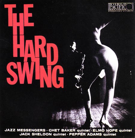 |
| Various Artists: The Hard Swing Label: World Pacific 508 12" LP 1958 Design: Charles Hyman Photo: Leo Stashin |
 |
| The Jazz Crusaders: Lookin´ Ahead´ Label: Pacific Jazz 43 12" LP 1962 Design and photo: Woody Woodward |
 |
| Charlie Mariano Plays Label: Bethlehem BCP 49 12" LP 1956 Design and photo: Burt Goldblatt |
 |
| Henry Grimes: The Call Label: ESP-Disk 1026 12" LP 1966 Photo: Ray Gibson |
 |
| Yusef Lateef: The Gentle Giant Label: Atlantic 1602 12" LP 1972 Design: Ira Friedlander Photo: Giuseppe Pino |
 |
| S. Neil Fujita, Cover art for Charles Mingus: Mingus Ah Um, 1959. Columbia Records |
 |
| S. Neil Fujita, Cover art for the Dave Brubeck Quartet: Times Out, 1959. Columbia Records |
 |
| Miles Davis – Bitches Brew (1970), by Mati Klarwein |
 |
| Santana – Abraxas (1970), by Mati Klarwein |
 |
| Miles Davis – Live/Evil (1971), by Mati Klarwein |


Reference
- Marsh, Graham, and Felix Cromey. Blue Note: The Album Cover Art. Chronicle Books, 1991.
- 1000 Record Covers, Michael Ochs, Taschen Publications, 2005
- "Alex Steinweiss and other Artists and Designers" The Remington Page
- "Alex Steinweiss: The Story of the World's First Record Sleeve Artist" The Vinyl Factory
- "The Blues: Album Cover Art", Chronicle Books, 1996
- Heller, Steven, "Alex Steinweiss, Originator of Artistic Album Covers, Dies at 94," New York Times, July 19, 2011
----------------------------------------------------------------------------------
RE: Chapter 72. Nice chapter with great info and artwork. Too bad you didn't hire an editor or at least a proofreader. They, as I did, would have noticed those missing words and letters.
ReplyDeleteّThank you very much, I reread this chapter quickly, but I missed those problems again. I will reread it later more carefully when I have a bit of time. Nevertheless, I very much appreciate if readers bring to my attention any typos, missing words or letters and so on.
ReplyDeleteVery useful information. Thanks!!!
ReplyDeletewow, your a special piece of work. a lot of effort went into this and that's the remark you make..
ReplyDeleteThanks for the great read.