Cuba is endowed with a rich visual design history, informed by its tumultuous and colorful history, both prior and after its revolution. The country's visual communications during the 1920-30 era was heavily influenced by the American culture, stemming from Cuba's economical and financial ties to the US economy. The Cuban sugar and tobacco plantations were virtually owned by the American conglomerates, and Havana was a tourist destination for the rich Americans. The desire to promote tourism tried to appeal to the Hollywood stereotype criteria of superficiality. Nevertheless, the graphic design of this period, highly influenced by Art Nouveau, is dubbed by some as the “Golden Age” of Cuban design.
 |
| Guajiro with Fighting Cock, circa 1930s |
 |
| "So near..so fast" Havana Fashion, Travel Poster, circa 1930s |
 |
| "Amazing Black Rumbera"Salsa, 1936 |
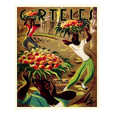 |
| "Fruit vendors in Havana" Circa 1930s |
However with its cultural and political transformation after the revolution Cuban graphic designers developed a unique sense of identity, and with her later gradual shifts in the 1990s towards a market oriented economy Cuban graphic design gradually moved to the forefront of a highly sophisticated and modern aesthetics, expanding and deepening the potentiality of the universal communications design.
The Castro regime employed visual communications designers to promote a new sense of cultural identity and gave the artists a free rein to create avant-garde posters in the state supported studios.Cuba’s far-reaching cultural exchanges with the world produced a unique style of silkscreen poster used to publicize widely varying activities such as health and education campaigns, historic commemoration, concerts, performances, exhibitions, rallies, and of course, movie posters (that is the subject of chapter 36 in this history).
 |
Brigade Venceremos - Antonio Reboiro, 1969
The Brigade Venceremos - "young Americans sharing the life and work of revolutionary Cuba" - was part of the Cuban effort to find sources of labour. Applying a pop-art hippie style Reboiro succeeded in communicating with young Americans. The poster was produced in very small numbers to be distributed in the US. Venceremos means "we will be victorious". |
 |
Better not to be, than not to be revolutionary. - Rene Mederos 1968
This powerful and stunning poster uses only a black and white geometric composition using only typography. |
 |
Solidarity with Zimbabwe - Jesus Forjans 1973
Arming a traditional african statue with an AK47, Forjans' plea for revolutionary freedom, set against the OSPAAAL logo. The minimalist approach of Cuban poster art uses some of the simplest ideas to create some of the most striking designs. |
The vast majority of posters produced in Cuba have been under the auspices of three agencies: Editora Politica, OSPAAAL (the Organization in Solidarity with the People of Africa, Asia and Latin America), and ICAIC (the Cuban Film Institute). Editora Politica (EP) is the official publishing department of the Cuban Communist Party, and is responsible for a wide range of (mostly) domestic public information propaganda in the form of books, brochures, billboards, and posters. At the height of Cuban poster design in the late 1960s design icons including Nico, Alfredo Rostgaard, Rene Mederos, Raul Mart nez, Elena Serrano, Felix Beltran, and others became internationally celebrated artists. With their limited resources due to crushing poverty, thanks in no small part to the US blockade, these artists created the stunningly striking imagery that speaks to humanity's best of characters.
 |
| La Odisea Del Gral Jose, Nico, 1969 |
In addition, many other agencies utilized the resources and distribution powers of EP for their own work, including FMC (the Federation of Cuban Women), the CNT (the National Confederation of Workers), and OCLAE (the Latin American Students Association). There are, also, other venues for poster production. The Taller Artistico Experimental de Serigrafía Rene Portocarrero, founded in 1983, is a fine-art studio in Havana, always abuzz with students and teachers. Other agencies also have small shops, such as ICAP (Instituto Cubana de Amistad entre los Pueblos, or the Cuban Institute for Friendship between the People). And finally, there are small workshops that will provide services for commercial clients.
 |
| El Arte del Tabaco, Antonio Fernández Reboiro – Cuba, 1977 |
Felix René Mederos Pazos was born November 20, 1933 in Sagua la Grande, Cuba. A self-taught artist, he began work in a Havana printshop in 1944 and was appointed Chief Designer for Cuba's most important television station in 1959. In 1964, at the beginning of the new wave of Cuban graphic design, Mederos began creating his first posters as head of the design team at Intercommunications.
In 1969 he was assigned by DOR (Department of Revolutionary Orientation) to travel to Vietnam to paint scenes of the war. After traveling along the Ho Chi Minh trail with the liberation forces, experiencing the brutal conditions of war and witnessing the courageous response of the Vietnamese people his paintings were exhibited in Hanoi, and were subsequently reproduced as a screenprinted series which has been shown throughout the world. He returned to Vietnam in 1972 to paint more. He also contributed to the solidarity posters produced by OSPAAAL (Organization in Solidarity with the People of Africa, Asia, and Latin America) which enjoyed worldwide distribution by virtue of their inclusion in the magazine Tricontinental.
In 1973 Mederos created a series of "vallas" (12-sheet billboards) on the history of the Cuban revolution and also produced a screenprint series commemorating the 20th anniversary of the assault on the Moncada, the event signalling the beginning of the armed resistance to the Batista government. He continued to design vallas and posters for DOR and its succesor Editora Politica (EP) on a wide range of domestic and international issues.
In 1991 Mederos visited the United States for the first time, where he designed and painted a mural at UCLA on U.S. solidarity with Vietnam. His last major project was a 14-panel portable mural series on Che Guevara.
As an artist, René Mederos' style, with its bright, firmly contoured surfaces, its ebullience of patterns in nature, and an unwavering sense of political direction, established a unique standard for graphic design in Cuba which influenced a whole generation of graphic artists all over the world. Despite all his honors and achievements, he was a modest man. He was generous to others and maintained faith in the goals of the Cuban revolution - a world of equality and peace.
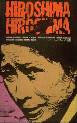 |
Anniversary of the bombing Hiroshima, René Mederos, 1968 |
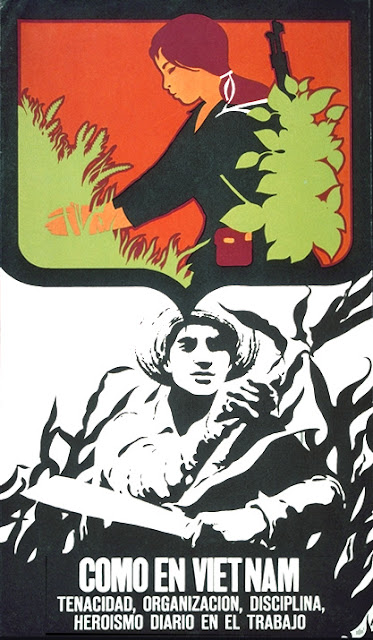 |
| As In Viet Nam- Tenacity, Organization, Discipline, René Mederos, 1970 |
 |
| Aprendiendo a morir (learning to die) - Antonio Fernández Reboiro (1964) |
 |
| LA GUERRA Y LA PAZ
, War and peace, NICO (Antonio Perez) ,1969.
|
 |
A silk screen poster designed by Ernesto Garcia Peña 1976.
Ernesto García Peña, was born in Matanzas, Cuba, in 1949. He graduated silk screen poster designed by Ernesto Garcia Peña 1976.
from the School for Art Instructors in 1965, and then in the the
National Art School to study Painting, and after graduation in 1970
he got a bachelor of Plastic Arts (Engraving) at the Higher Institute
of Art in 1987. During 1969-1970 he thought at the San Alejandro
Academy of Art, in Havana, and from 1970 to 1989 he became the head of
department at the National Art School in Cubanacan. He is a member of
a number of professional association including; the Experimental Workshop
on Graphic of Havana, the International Association of Art of the
UNESCO (IAA) and the National Union of Cuban Writers and Artists
(UNEAC). He has contributed to a number of books and magazines and
taken part in cultural exchange activities in Cuba, Mexico, Spain,
Nicaragua, Panama, the Czech Republic, Slovakia, Hungary, Angola,
Poland, Russia, Ukraine, France, Monaco, Ecuador, Canada and Japan.
|
The history of graphic design in Argentina cannot be understood without taking into account the context, the country’s history and, more recently, its social and economic policies. Argentina is a sovereign and federal state, fully cosmopolitan, and based on two founding ethnic groups — Spain and Italy- as well as minor migration movements from countries such as Poland, Germany, Peru, England, Paraguay, Bolivia, Wales, etc. A series of de facto rulers, economic breakdowns, historically rampant inflation, have made working in Argentina difficult for everyone and particularly difficult for designers, whose work depends mostly on factors associated with a nation’s prosperity and stability. Some pioneering work was began in Argentina, thanks to the efforts and talent of a number of designers such as Castagnino, Sabat, Quino, Mordillo and Tomas Maldonadoare and a few specialized publications, but it took many years for design to be acknowledged in the Argentinian society and become part of the university curriculum.
Juan Carlos Castagnino (1908 –1972) was born in the city of Mar del Plata, he studied in the Escuela de Bellas Artes in Buenos Aires. Along with Antonio Berni, Spilimbergo and Mexican muralist David Alfaro Siqueiros, he created a series of murals. He visited Paris in 1939, where he attended the atelier of cubist painter André Lhote, later traveling across Europe perfecting his art and in the company of Georges Braque, Fernand Léger and Pablo Picasso, among others. Castagnino returned to Argentina in 1941. He received numerous awards in subsequent years, including the Grand Prize of Honor of the Argentine National Hall (1961), the Medal of Honor at Expo '58 (Brussels, 1958), and a special mention for his drawings at the II Mexico City Biennale of 1962. His illustrations for a EUDEBA (University of Buenos Aires Press) edition of José Hernández's Martín Fierro (the national poem of Argentina), gained wide recognition. Castagnino died in Buenos Aires in 1972. Following its relocation to the landmark Villa Ortiz Basualdo, the Miunicipal Museum of Art in his native Mar del Plata, to which the artist had contributed over 130 works, was renamed in his honor in 1982.
 |
| Juan Carlos Castagnino "PONY" |
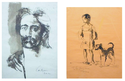 |
| Juan Carlos Castagnino, Self portrait, and the Boy with his Dog |
 |
| Juan Carlos Castagnino "PAMPA - FLIGHT - URBE" |
Hermenegildo Sábat (born June 23, 1933) is a renowned Uruguayan-Argentine caricaturist.
Life and work
Early career in journalism
Hermenegildo Sábat was born in the oceanfront Pocitos section of Montevideo, Uruguay, in 1933. Named after a grandparent who had been a noted local artist in his day, Hermenegildo was known as "Menchi," from early childhood. Montevideo's leading newsdaily, El País, first published a drawing of his - a portrait of Uruguayan national football team forward Juan Schiaffino - when the young artist was but 15 years old.
Sábat's first work experience in journalism began in 1955 as a graphist in Acción, returning to El País, in 1957. His career prospered in El País, and Sábat became an editor at the daily, as well as contributing work as a staff correspondent, photographer and illustrator. His byline was featured in other Uruguayan periodicals in subsequent years, such as Marcha, Lunes and Reporte, and he freelanced as a graphic designer. He married Blanca Rodríguez, in 1961, and the couple had two children. A dispute with El País' owners, however, led Sábat to emgirate to neighboring Argentina, in 1966. Following a stint at Editorial Abril, a Buenos Aires publishing house, his caricatures were soon included in Primera Plana and Crísis (then the leading Argentine newsmagazines), Clarín, and La Opinión, then an important Argentine daily, for which Sábat became the sole illustrator. La Opinión 's closure by the new dictatorship in 1977 led to Sábat's transfer to Clarín, where he would remain over the years.
 |
| Anton Chejov - Revista Teatro, Hermenegildo Sábat, 1996 |
 |
| Monsieur Lautrec, Hermenegildo Sábat, |
 |
| Poster de Carlos Gardel - Buenos Aires, Hermenegildo Sábat, 1985 |
Joaquin Salvador Lavado, known as ‘Quino’, was born in the city of Mendoza, Argentina in 1932.
Son of Andalusian Spanish immigrants, he was called from early childhood Quino in order to distinguish him from his commercial artist and painter uncle Joaquín Tejón. He was only 13 when he lost his mother,it was the very same year that Colonel Juan Domingo Perón rose to power, and Quino who had dissevered his love for the art at the primary school enrolled in the School of Fine Arts, in Mendoza. He dropped out of the art school in 1949, a year after his father. In his own words he was “tired of drawing vases and plaster”, and thought of the only possible profession: graphic humorist and artist. After a trip to Buenos Aires and searching for a job in every possible newspaper and magazine office in town he returned disappointedly to Mendoza three weeks later in 1951, and two years later was called to obligatory military service.


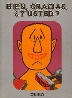
A year later, Quino settled in Buenos Aires, and continued his desperate search for job in a journal, when finally, a Buenos Aires weekly paper, “Esto Es” (‘this is’) published his first page of graphic humor. Shortly after other newspapers and magazines such as; “Vea y Lea”, “Leoplán”, “Damas y Damitas”, “TV Guía”, “Usted”, “Che”, “Panorama”, “Atlántida”, “Adan”, “Democracia” began to publish his works, and later on many published media throughout Latin America and Europe followed suit. In 1958 Quino began his graphic design career for advertisement. He exhibited his works for the first time in 1962 at a library in Buenos Aires, and a year later he published his first humor book, “Mundo Quino” (The World of Quino), a compilation of humorous graphic drawings, without text. In 1964, Mafalda his long-running and successful comic strips appeared, for the first time, in “Gregorio”, a humor extra of “Leoplán” magazine. This was his most successful cartooning venture which ran from 1964 to 1973. The comic was translated into more than 30 languages. However, it never received much of an audience in the English-speaking world, perhaps because, as Quino put it, the strip was "too Latin American." In 1976, the character Mafalda was chosen by UNICEF to be a spokesperson for the Convention on the Rights of the Child. Argentinian director Daniel Mallo translated 260 Mafalda strips into 90-second cartoons that aired in Argentina.
 |
| Mafalda, and her cast , Quino |
In 1974 Quino visited the US, for the first time. This was the year that Perón died. He had returned to Argentina from his exile in 1973, when on the day of his arrival, a horrendous massacre of Peronist party, organized by the extreme right wing took place at Ezaiza airport in Buenos Aires. Nevertheless, Peronism triumphed and Arturo Ilia was elected President. After Peron's death and his wife, “Isabelita”, then vice-president, assumed control over the government, while paramilitary activity, tortures, hostage-taking, disappearances and political murders increased. In 1976, after General Videla took power in a military coup, and the Armed Forces Commanders’ Junta (composed by Videla, Massera and Agosti) ousted “Isabelita”, establishing the “National Reorganization Process”, which initiated the darkest period in the history of Argentina, Quino and his wife Alicia moved to Milan: “The fact that I’m far from my country has made my humor turn a little less vivacious but possibly somewhat more profound.”
Quino's works have been celebrated and won great many awards and accolades throughout the world. In 1982, he was chosen Cartoonist of the Year by fellow cartoonists around the world, and has won twice the Konex Platinum Prize for Visual Arts. In 1988, he was named an "Illustrious Citizen" of Mendoza. In 2000 he received the second Quevedos Prize for graphical humor. Additionally, Buenos Aires' Colegiales neighborhood named their plaza "Plaza Mafalda."
Guillermo Mordillo was born in Villa Pueyrredon, Buenos Aires in 1932. The son of Spanish parents, he exhibited an early interest in drawing. Two years after obtaining the certificate of Illustrator from the School of Journalism in 1948, Mordillo joined the animation team Burone Bruch while at the same time illustrating children's stories such as Tales of Perrault, tales of Schmid, The Musicians of Bremen and The Three Little Pigs, edited by Codex and publishing some comic strips in local magazines.
In 1955, he departed for Lima, Peru, where he worked as a freelance designer for the advertising company McCann Erickson. In 1958 he illustrated Aesop's Fables and Samaniego for Editorial Iberia Lima.


After landing a commission to illustrate greeting cards for Hallmark, he traveled to the US in 1960. In 1963 he traveled to Paris, where he worked at the magazines Le Pelerin and Paris Match. shortly after his work was published in Germany's Stern. In 1980 he moved to Mallorca, Spain and was named President of the International Association of Authors of Comics and Cartoons (CFIA) based in Geneva, Switzerland. He returned to France in 1998.
He is most famous for his humorous, colorful, and wordless depictions of love, animals, nature, sports, and man's ultimately futile and hopeless endeavors in a language that is hilarious, disarmingly simplistic, graphically faultless and vibrantly colorful. He currently resides in Monaco.
 |
| This piece, commissioned by Amnesty International, features a
monochromatic townscape where the policemen are arresting a man who
dares to paint the roof of his house in vivid, wavy pink lines. A
brilliant depiction of the tragic rendered in comic language. |
The formation of Diseno Shakespear as a classic graphic design studio shaped the origin of the profession in the country and rendered the word “design” a meaningful word in a place where it had no clear meaning and inspired generations of young and talented visual designers.
Ronald Shakespear, was born in Rosario, in 1941, he founded Diseno Shakespear, a design studio in Buenos Aires together with his children Lorenzo, Juan and Barbara. He taught graphic design at the University of Buenos Aires FADU UBA over the five years period from 1985 -1990. He became the president of ADG, Asociacion de Disenadores Graficos de Buenos Aires in 1984, a position that he held for two years until 1986. Shakespear worked on several mega projects in urban signage, including signage systems for the City of Buenos Aires, the City Hospital, the Buenos Aires Subway and Temaiken Zoo. When Shakespear established his studio, there was little or no information about graphic design as a professional practice. Argentina, as always, kept its eyes on Europe more than anywhere else, and he was no exception to this. According to his own recounting;
meeting Alan Fletcher, a relationship that flourished with the passing of time, in the times of Fletcher Forbes Gill, as well as seeing the work of Jock Kinneir, the German masters (Aicher, Muller Brockmann, Hoffmann et. al.), Milton Glaser, and a few more, shaped and consolidated my vision but, above all, confirmed my intuition
.
 |
Hamlet, Ronald Shakespear, 1964
|
 |
| Señal de Diseño, Ronald Shakespear, |
 |
| The logo of Argentine bicentennial, by Juan Pablo Tredicce, Hernán Berdichevsky and Gustavo Stecher. The logo
synthesizes the Argentine Cockade and the Sun including each
of the decades of the two hundred years to celebrate, from 1810 to 2010,
in a story similar to the rings of a tree trunk to reveal his age. |
 |
| Estudio Almacen
|
 |
| Nat Filippini |
|
 |
| Venturis Ventis, by David Maruchniak, |
The origin of Brazilian graphic design can be traced to the works of pioneers like Ziraldo Alves Pinto, Aloisio Sergio Magalhaes and Alexandre Wollner.
 |
| Movie Poster, Ziraldo Alves Pinto, |
Ziraldo Alves Pinto was born Caratinga, in the State of Minas Gerais in 1933, the eldest of a family of seven brothers. After speding his childhood in Caratinga, he enrolled in a two years course at MABE (Modern Teaching Association) in Rio de Janeiro in1949. Howecer a year later he returned to Caratinga to be drafted for military service. Later he was admitted in the Faculty of Law of Minas Gerais in the capital of Belo Horizonte, and graduated in 1957.
 |
| Rio de Janeiro, Ziraldo Alves Pinto, Graphis Annual 67/68 |
Ziraldo's love for drawing started at a very tender age, and when he was only six years old the newspaper A Folha de Minas publised his drawing in 1939. In 1954 he started his career in the graphic journalsm by providing drawings for A Folha de Minas' humor page. In 1957, he started publishing his works in magazine A Cigarra, and later in O Cruzeiro. In 1963 he started working with Jornal do Brasil, where he still has comics strip. He also worked at magazines Visão e Fairplay. Ziraldo has made posters for several Brazilian movies including Os Fuzis, Os Cafajestes, Selva Trágica, Os Mendigos, among others . In Rio de Janeiro Ziraldo became one of the most well known and acclaimed graphic artists . He is also a painter, poster artist, cartoonist, caricaturist, journalist, author of plays, and writer. He launched the first Brazilian comics book by a single author, using a mythical figure in the Brazilian folklore, the one-legged Saci Pererê, as his main character.
 |
| Self-portrait |
In 1964, when the military came to power, his magazine was closed down as he could not tolerate the fascistic censorship of the coup leaders. Nevertheless, these characters were so typically Brazilian that they resisted the hard military years. During the Military Dictatorship period of 1964-1984 , Ziraldo participated as part of an intense resistance effort against repression. Together with other humorists he founded the most important non-conformist newspaper in the history of Brazilian press, O Pasquim. Ziraldo spent his nights assissting his activist freinds to hide without worrying for himself. Finally, he was arrested in his home, and was taken to the Forte de Copacabana, accused of being a dangerous element.
In 1968 Ziraldo's talent was acclaimed internationally with the publication of his productions in the Graphis magazine, a sort of Panthéon of the graphic arts. His works were also published in international magazines including Penthouse and Private Eye in the U.K., Plexus and Planète in France and Mad Magazine in the U.S. In 1969 he won the 32nd International Exposition of Caricatures in Brussels, and the Merghantealler Award, the highest honor granted to the free press in Latin America by the International Press Association in Caracas, Venezuela. He was invited to draw the annual UNICEF poster -- the first time a Latin artist was granted the honor
 |
| Logo Design, Aloísio Magalhães |
Aloísio Barbosa Magalhães (1927- 1982) was born in Recife, Pernambuco. He graduated in law from the Federal University of Pernambuco (UFPE), in 1950. As a student he took part in the Teatro
do Estudante de Pernambuco [Student Theater of Pernambuco] (TEP), where he assumed
the roles of stage and costume designer, in addition to being responsible for the puppet
theater. After receiving a scholarship from the French government, he studied musicology in Paris
from 1951 to 1953, while also attending the Atelier 17, a center for preserving the art of
engraving technique, where he was a pupil of the engraver Stanley William Hayter(1901-1988). Magalhães returned to Brazil in 1953, and three years later with a scholarship granted by the
American government, traveled to the United States, where he devoted himself to graphic art
and visual programming. Together with Eugene Feldman, he published the books Doorway
to Portuguese and Doorway to Brasília, and lectured at the Philadelphia Museum School of
Art.
In 1960, Magalhães returned to Brazil and opened a visual communication practice, a field in
which he was one of the pioneers within the country, executing projects for companies and
public institutions.


In 1963, Magalhães collaborated in establishing the Escola Superior de Desenho
Industrial [Higher School of Industrial Design] (ESDI), where he lectured in visual
communication. In 1964, he created the symbol of the 4th Centenary of Rio de Janeiro, the
first of his works to have major public impact, and in the following year, designed the first
symbol for the Bienal Foundation of São Paulo. From 1966 onwards, he developed designs
for Brazilian coins and banknotes. In 1979, he was appointed director of the National
Artistic and Historical Heritage Institute (Iphan), and in the following year, the chairman of
the Fundação Nacional Pró-Memória [National Memorial Foundation], when he initiated a
campaign for the preservation of Brazil's historical heritage. As a tribute to him, the
Metropolitan Art Gallery of Recife changed its name to the Aloísio Magalhães Metropolitan
Art Gallery in 1982. In 1997, the name of the institution was changed to the Aloísio
Magalhães Modern Art Gallery (MAMAM). He died in Padua, Italy at ahe age 55.
 |
| Book Jacket, Aloísio Magalhães |
 |
| Série preta e branca, by
Aloísio Magalhãe |
 |
| Índio Uaika, Amazonas, by
Aloísio Magalhãe |
Alexandre Wollner was born in São Paulo in 1928. He studied visual design at the Institute of Contemporary Design (IAC), created at the São Paulo Assis Chateaubriand Museum of Art (Masp), in 1950, where he studied with Lina Bo Bardi (1914-1992), Poty (1924-1998) and Sambonet (1924-1995).
Interested in the Concretist movement, in 1953, he joined the Grupo Ruptura [Rupture Group], presenting his constructivist works at the 2nd São Paulo International Biennial. Also in 1953, he was chosen by Max Bill to study at the Hochschule für Gestaltung [Superior School of Form] in Ulm, Germany, where he remained from 1954 to 1958. Upon returning to Brazil, together with Geraldo de Barros (1923-1998) and others he inaugurated Form-Inform, the first design consultancy in the country.
 |
| Fachbücher selbst ist der mann, Alexandre Wollner |
 |
| Alexandre Wollner & Geraldo de Barros - Cartaz para o Festival Internacional de Cinema do Brasil em 1954 |
 |
| Third Biennial, São Paulo Museum of Modern Art, Alexandre Wollner, 1955 |
 |
| Alexandre Wollner - Cartaz para a IV Bienal de São Paulo em 1957 |
 |
| Alexandre Wollner - Cartaz comemorativo dos 60 anos USP / 31 anos MAC-USP em 1994 |
In 1963, Wollner took part in the structuring and creation of the Escola Superior de Desenho Industrial (ESDI) [Superior School of Industrial Design], in Rio de Janeiro, the first higher level design institution in the country. During the 1960s, he opened his own visual programming office, where he developed logotypes for major companies. He exhibited his projects at the Masp and at the Museum of Modern Art of Rio de Janeiro (MAM/RJ) in 1980, opting for a show that emphasized the process of creation, execution and implementation of visual identity systems. In 1999, the Centre of Communication and Arts of Senac, in São Paulo, held his second individual exhibition.
In 2003, Wollner celebrated 50 years of design with his book Design Visual 50 Anos, and a photography exhibition at the Maria Antônia University Centre, in São Paulo.
 |
| Logo Design, Alexandre Wollner |
... And Other Designers
 |
| Mary Vieira - Cartaz para a Panair do Brasil, década de 1950 |
 |
| Antonio Maluf - Cartaz para a I Bienal de São Paulo em 1951. |
|
|
 |
| Leonardo Prause,
|
 |
| Caution // Risk of Brainstorm, by Tiago Bernardes |
 |
| Batman Zavarese |
 |
| Billy Bacon |
 |
| Rafo Castro |
 |
| Rafo Castro |
 |
| Eduardo Denne |
 |
| Morro de Alegria :: Spanta Neném, Eduardo Denne |
 |
| Ricardo Cunha Lima |
 |
| Thinking about Brazil , "Thinking about Brazil", For Correio Braziliense Newspaper , Ricardo Cunha Lima, 2001 |
 |
| A Guerra dos Mundos, The War of the Worlds, Ricardo Cunha Lima, |
 |
Sangue Errante (Blood's a Rover), Illustration for the cover of the book by James Ellroy,
Ricardo Cunha Lima,
|
Bruno Porto (1971) is a graphic designer, educator and consultant from Rio de Janeiro, Brazil, where he graduated with a degree in Graphic Design and took a post-graduate degree in Marketing and Enterprise Management. He has also attended the New York School of Visual Arts and studied under many distinguished professionals.
His graphic design and illustration work has frequently been awarded and exhibited in the Americas, Asia and Europe, and featured in over 30 international publications. He currently serves as Executive Coordinator for Brazil at Tipos Latinos Biennial of Latin American Typography, as Council Member at SIB – Society of Illustrators of Brazil, and as liaison member of the Brazilian Graphic Designers Association – ADG Brasil with Icograda. He has previously been a member of ADG Brasil’s National Board of Directors (2004 to 2007), its Rio de Janeiro Board of Coordinators (2002 to 2004) and Ethics Committee (2009 to 2011).
 |
| Discover the Brazilian Cinema, poster for an exhibition, Shanghai, Bruno Porto, 2007 |
 |
| The company & the challenge of global capitalism, Book covers, Bruno Port , 2004 |
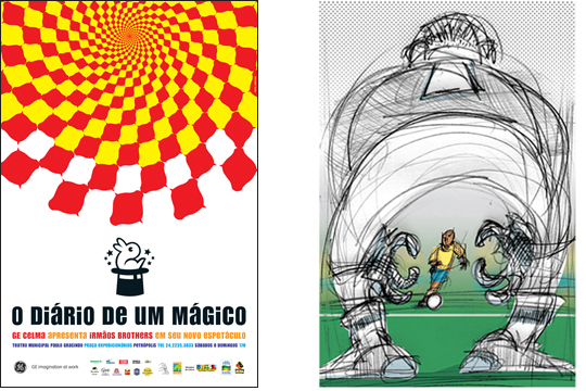 |
(R)The diary of a magician, Theater poster, Irmãos Brothers, 2006
(L) World Cup Poster, Poster for an exhibition 2006 |
 |
| Stephen Tedjakusuma |
From one of the most neglected outposts of the Spanish Empire, Chile developed into one of the most prosperous and democratic nations in Latin America. Throughout its history, however, she has depended on great external powers for economic exchange and political influence: Spain in the colonial period, Britain in the nineteenth century, and the United States in the twentieth century.
At the beginning of the twentieth century, the so-called Generación del 13 used painting to highlight social concerns by depicting local customs, and prior to the 1973 coup, the country had a long tradition of an active press, which was closely tied to the Chile's competitive political parties. Santiago had ten daily newspapers spanning the ideological spectrum. However, after the coup Chile's independent press disappeared. The papers of the left were closed immediately, and the centrist La Prensa stopped publishing a few months later. Newspapers that kept publishing strongly supported the military government and submitted to its guidelines on sensitive issues; they also developed a keen sense of when to censor themselves. The remaining media fulfilled the almost liturgical role of representing to the masses the goodness of the institutions of law and order. As a result, one of the basic codes for representing reality was to depict the unrestrained and irrational common folk contrasted with the civilized elites.
Nevertheless, during the period of the dictatorship, an art market for theoretical post-modern concepts was developed in Chile. New galleries opened up and the public was invited to participate in contemporary consumers' art. However, much of the general public has difficulty relating to the quasi-complex theoretical proposals of conceptual art, and their silly codes for processing the communicative facts. As pointed out by Tomás Andreu, director of the avant-garde art space Galería Animal, some art dealers drew on the seduction of material, shock impact and the surprise element as way of attracting the public’s attention. The patrons who financed theoretically driven post modern art exhibitions, the large corporations of the private sector, looking with favor on those artists who did not overtly politicize their works. Artists who demonstrated social or political consciousness were treated harshly. The traumatic experience suffered by artist Guillermo Núñez at his exhibition at the Chilean-French Cultural Institute is a case in point. Núñez’s installation consisted of various bird cages individually filled with diverse objects such as bread, flowers and a Chilean flag. After the opening day, the artist was detained by the police, subjected to six months of imprisonment, partially blindfolded and eventually released into exile. Local artists had to develop strategies to elude censure. The social message of their work became hidden through the use of artistic metaphors and indirect language.
Although in the recent times, these trends have begun to subside and the artists and the media have begun to ally themselves with the demands of the masses in order to unmask the irrationality and corruption of the institutions, Chile’s cultural depravity has made it one of the most repressive countries in the region and one with the highest rates of interpersonal mistrust.
In response, throughout the modern times the Chilean graphic artists have expressed themselves in the street art. For instance; in 1940 when during protests marches against a new government a young woman named Ramona Parra, was shot and killed, she became a symbol of struggle for liberation and the fight against tyranny. Her memory became immortalized through the underground art movement that decorates the streets of Santiago with illegal art and political slogans in favour of human rights. The art collective that calls itself the Brigada Ramona Parra travels the world making murals protesting against the global tendency towards capitalism. This incipient muralist movement of the 1940s, was influenced by the Chilean visit of Mexican muralist David Alfaro Siqueiros.


During the 1970-73 Chileans communicated with immense and magnified murals in vibrant colors that expressed their hope and desire for justice, freedom, and respect for human rights in a symbolic language of determined faces, hands that held banners, mothers that held their infants and birds that basked in the sunshine. A few poster artists were also trying to use a symbolic language, that like the secret communications of the early church, used signs and symbols to convey their defiant messages of anti-fascism. Unfortunately, Pinochet regime whitewashed all those murals and destroyed most of those posters. Today there are only a few sample of posters available, while some graphic artists have tried to recreate some of those murals.


With the onset of the economic crisis of 1983, censorship became weaker. An important group of exiled artists return, including José Balmes, who spearheaded a more politicized and testimonial art. Street mural painting appears in the shantytowns, suburbs and closed spaces. Like the early Christian art, these artists communicate with symbols on their murals, while harassed by their opponents or running from the police, The dove, hand, ear, star, are like the secret language of a new faith, which is bing whispered in the darkness of nights. In 1988, the government called for a plebiscite, and the muralist brigades became visible again in support of “No” vote to decide whether the military regime should continue in power.


Today the influence of Chilean murals can be detected in the works of artists such as Patricia Marin Spring, whose powerful and strikingly beautiful mosaic artworks graces the streets of Lo Abarca, a small village of 300 people in Cartagena, Chile. With the help of Lo Abarca's children and youth, and using local stones Patricia has given the town truly a unique character.
-----------------------------------------------------------------------------------
This work is licensed under a Creative Commons Attribution-No Derivative Works 3.0 Unported License.

 The Castro regime employed visual communications designers to promote a new sense of cultural identity and gave the artists a free rein to create avant-garde posters in the state supported studios.Cuba’s far-reaching cultural exchanges with the world produced a unique style of silkscreen poster used to publicize widely varying activities such as health and education campaigns, historic commemoration, concerts, performances, exhibitions, rallies, and of course, movie posters (that is the subject of chapter 36 in this history).


Thank you,
ReplyDeleteawsome!!!!!
ReplyDelete