

Introduction
Layout is one of the fundamental yet often least visible dimensions of graphic design. Before typography, before the printing press, and long before the appearance of the modern graphic designer, visual communication depended upon decisions about where words, images, margins, ornaments, and empty spaces should appear on a page. The page was not merely a surface upon which information was placed; it was an organized visual field through which the reader was guided.
The history of layout design is therefore also a history of changing ideas about order, hierarchy, proportion, movement, emphasis, and reading. The medieval manuscript page established sophisticated relationships among text columns, initials, marginalia, illumination, and surrounding space. Early printers adapted many of these conventions while gradually transforming them through the possibilities of movable type. During the Renaissance, mathematical proportion and classical theories of harmony provided new ways of thinking about the page. Later, industrial printing expanded both the scale and speed of production, while newspapers, posters, advertisements, magazines, and books introduced increasingly complex combinations of type and image.
By the beginning of the twentieth century, however, the traditional page had become the subject of deliberate experimentation. The avant-garde movements questioned inherited conventions of symmetry, centered composition, uniform typography, and predictable reading sequences. The Bauhaus, De Stijl, Constructivism, and Dada treated the page as an active visual space rather than as a passive container for text. Typography could move, images could be cropped, diagonals could create directional force, and asymmetry could become a means of establishing visual equilibrium.
These experiments transformed layout from an essentially architectural organization of the page into a more dynamic form of visual communication. The work of designers such as László Moholy-Nagy, Theo van Doesburg, El Lissitzky, Jan Tschichold, Kurt Schwitters, and Alexey Brodovitch demonstrated that the arrangement of elements could itself communicate meaning. The designer increasingly became an editor of visual relationships, controlling not only what the reader saw but also the sequence in which the reader encountered it.
The history of layout therefore cannot be separated from the history of technology. Every major change in the production of visual communication has altered the possibilities of composition. Manuscript culture established the conventions of the codex; movable type standardized many aspects of the printed page; industrial printing increased reproducibility and introduced new commercial forms; photography challenged the dominance of verbal information; modernist typography transformed the relationship between text and image; and digital media subsequently liberated the page from fixed physical dimensions.
The contemporary screen presents a particularly important transformation. A printed page possesses a predetermined physical boundary. A digital page may change according to screen size, orientation, user settings, interaction, and responsive design. The designer must therefore think not only about where an element is placed, but also about how that element behaves when the environment changes. The grid survives, but it has become flexible. The page survives, but it has become fluid.
This chapter follows that long transformation—from the manuscript page to the early printed book, from Renaissance proportion to industrial printing, from modernist experimentation to the magazine revolution, and finally from the fixed paper page to the digital interface. Throughout this history, one principle remains constant: layout is the visual grammar through which information becomes organized, legible, intelligible, and expressive.
Table of Contents
Part I: From Manuscripts to the Early Prints
The origins of layout design precede printing by many centuries. In the manuscript tradition, the arrangement of text upon the page was already governed by a sophisticated system of visual decisions. Scribes had to determine the dimensions of the writing area, the width of margins, the number of columns, the size and hierarchy of lettering, and the relationship between the principal text and supplementary material.
The medieval manuscript page consequently represents one of the earliest sustained examples of what we would now recognize as information architecture. The page established a hierarchy before the reader began to read. Large initials announced important divisions; headings identified new sections; marginal notes provided additional information; illumination created emphasis; and variations in lettering distinguished different levels of textual authority.
The relationship between the written area and the surrounding white space was equally important. Margins were not simply unused portions of parchment. They protected the text from the physical edge of the page, provided room for annotation, and contributed to the visual rhythm of the manuscript. The alternation between dense areas of writing and relatively open areas of parchment gave the page its characteristic visual balance.
In highly developed manuscript traditions, the page could become a carefully coordinated composition in which typography, ornament, illustration, and architecture were integrated. The scriptorium was therefore not merely a place in which words were copied. It was a place in which a visual system was constructed.
The arrival of printing did not immediately destroy this system. On the contrary, the earliest European printers borrowed extensively from manuscript conventions. The first printed books sought to appear familiar to readers accustomed to handwritten volumes. Typefaces imitated existing scribal hands; initials were sometimes added by hand after printing; and page proportions and margins often followed established manuscript practices.
This continuity is important because the history of graphic design is rarely a simple succession in which one visual language abruptly replaces another. New technologies usually inherit conventions from earlier technologies before gradually transforming them. The early printed page was therefore simultaneously a continuation of manuscript culture and the beginning of a new visual regime.
The significance of this transition extends beyond Europe. Manuscript traditions in Islamic, East Asian, South Asian, and other cultures had developed their own sophisticated relationships between script, ornament, image, proportion, and page architecture. The history of layout should consequently be understood as a plural history rather than as a single European progression. Different writing systems and material traditions produced different solutions to the fundamental problem of organizing visual information.
The emergence of printing nevertheless introduced a decisive new condition: the possibility of producing many substantially identical pages. A manuscript could vary from copy to copy according to the decisions of the scribe and illuminator. Printing introduced repeatability. Once the form of a page had been established in type, that arrangement could be reproduced hundreds of times.
This transformation would eventually make layout a central component of mass communication.
I.i. Incunabula: The Early Printed Page
The earliest European books printed before 1501 are conventionally known as incunabula, a term derived from the Latin incunabula, meaning “cradle” or “swaddling clothes.” The term is appropriate because these books belong to the formative period of European printing, when printers were still negotiating the relationship between inherited manuscript conventions and the new technology of movable type.
The early printed page was consequently characterized by both continuity and experimentation. Printers inherited the visual vocabulary of manuscripts—columns, initials, headings, decorated borders, marginal space, and familiar letterforms—but mechanical reproduction gradually encouraged greater regularity.
The distinction between manuscript and print became particularly visible in the treatment of initials. In some early printed books, the body of the page was produced mechanically while ornamental initials were added by hand. This created an intriguing hybrid object: mechanically reproduced text surrounded by elements whose individuality remained dependent upon the skills of the illuminator.
The development of type itself gradually changed this relationship. Once printers could establish a consistent typographic hierarchy, the page no longer depended upon the same degree of hand intervention. Typography could communicate distinctions of importance through size, weight, spacing, and placement.
At the same time, the physical limitations of early printing imposed their own discipline. Type had to be assembled, locked into a forme, inked, and transferred to paper. Every alteration to the composition required physical intervention. Layout was therefore inseparable from the material technology of printing.
This material dimension is essential to understanding the development of graphic design. A layout is never simply an abstract arrangement. It is shaped by the technologies through which its elements are produced. The manuscript page was governed by parchment, quill, ink, ruling, and hand illumination; the early printed page was governed by type, press, paper, ink, and the economics of repeated production.
The printed page consequently began to establish a new relationship between standardization and variation. Repeated pages could be identical, while different books could develop distinct typographic identities. This tension would remain fundamental to graphic design for centuries.
Part II — Canonical Structures of Classical Design
From the middle of the fifteenth century, when movable-type printing emerged in Europe, until the profound transformations brought about by industrialization, the book remained the principal field of typographic design. During this long formative period, book production was regarded not simply as a mechanical process but as a craft requiring considerable technical knowledge, visual judgment, and accumulated experience. Typesetting, including the spacing and positioning of individual characters, the use of ligatures, line justification, margins, and the relationship between text and page, was transmitted through the printing trade from master to apprentice.
The classical printed page was characterized by a remarkable sense of order. Text was generally arranged in a single justified column, while the facing pages formed a balanced spread. The inner margins were relatively narrow, while the outer margins were wider. The lower margin was usually larger than the upper margin, producing a stable visual base and leaving sufficient space for the reader's hands when holding the book.
This arrangement was not accidental. Early printers understood that the appearance of a page depended upon the relationships among its parts. The type area, margins, line length, leading, page proportions, and position of headings all contributed to the overall harmony of the composition. The page was therefore conceived as a geometric and visual structure rather than merely a rectangular container for words.
The classical approach also reflected a broader Renaissance interest in proportion. Designers and printers drew upon mathematical and geometrical ideas inherited from classical architecture and revived during the Renaissance. Relationships between points, lines, surfaces, and proportions were understood as contributing to visual harmony. The typographic page became, in effect, a small architectural composition.
This concern with craft and precision helps explain why typesetting acquired an almost mysterious reputation in some European printing traditions. In Germany, the term “black art” was associated with printing and typesetting, partly reflecting the technical complexity and specialized knowledge involved in producing a successful printed page.
The most important principle to emerge from this tradition was that good layout is relational. No individual element exists in isolation. The beauty of a page derives from the relationship between the text and the margins, between one page and its facing page, between the density of black type and the surrounding white space, and between the individual parts and the proportions of the whole.
The classical page thus established several principles that would survive even the most radical modernist revolutions: hierarchy, proportion, rhythm, alignment, consistency, and the deliberate use of empty space.
ILii. eonardo and the Renaissance Ideal of Proportion
The Renaissance provided a particularly fertile intellectual environment for the study of proportion. Artists increasingly regarded geometry and mathematical relationships as instruments for understanding visual harmony. Leonardo da Vinci's studies of human proportions are among the most celebrated expressions of this intellectual tradition.


Leonardo da Vinci, Uomo Vitruviano (Vitruvian Man). The study exemplifies the Renaissance fascination with mathematical relationships and the proportional organization of the human figure.
The Vitruvian Man should not, however, be understood simply as an example of a “golden rectangle.” Its importance lies more broadly in the Renaissance attempt to discover proportional systems through which the human body, architecture, geometry, and visual composition could be understood as interconnected structures.
This distinction is important for the history of graphic design. The later history of layout frequently invokes the “golden ratio,” sometimes attributing almost universal aesthetic authority to it. Yet historical page design was more varied than such explanations suggest. Printers employed different proportional systems, and the relationship between mathematical construction and actual historical practice remains a subject of scholarly discussion.
What can be said with greater confidence is that Renaissance culture strengthened the idea that visual composition could be governed by measurable relationships. This idea would become deeply influential in the subsequent history of typography and page design.
ILiii. Fibonacci and the Golden Proportions
One of the most familiar proportional concepts in graphic design is the golden ratio, traditionally represented by the Greek letter φ (phi). Its numerical value is approximately 1.618. A golden rectangle is a rectangle whose longer dimension bears this particular relationship to its shorter dimension.
The mathematical relationship can be described simply: when a line is divided so that the ratio of the whole line to the larger segment is equal to the ratio of the larger segment to the smaller segment, the resulting proportion is the golden ratio.
The association between the golden ratio and the Fibonacci sequence is particularly important. The sequence begins:
0, 1, 1, 2, 3, 5, 8, 13, 21, 34, 55…
Each number is obtained by adding the preceding two numbers. As successive Fibonacci numbers are divided by their predecessors, the resulting ratios converge toward approximately 1.618.
For example:
2 ÷ 1 = 2.00
3 ÷ 2 = 1.50
5 ÷ 3 ≈ 1.67
8 ÷ 5 = 1.60
13 ÷ 8 ≈ 1.625
21 ÷ 13 ≈ 1.615
34 ÷ 21 ≈ 1.619
55 ÷ 34 ≈ 1.618
The mathematical elegance of the relationship has made the golden ratio an enduring source of fascination for artists, architects, photographers, and graphic designers. It offers a method of dividing space that can generate related proportions while maintaining a sense of continuity between the whole and its parts.


The Golden Rectangle and Golden Spiral. The spiral is constructed from a sequence of related squares and quarter-circles, illustrating the relationship traditionally associated with the golden proportion.
The attraction of the golden section in graphic design is not difficult to understand. A designer who must divide a page into text areas, image areas, margins, or secondary information needs relationships that are visually coherent. Proportional systems provide a framework for making such decisions rather than leaving every measurement to arbitrary intuition.
A golden rectangle can be constructed geometrically from a square. By extending one dimension according to the appropriate proportional relationship, the designer obtains a larger rectangle that maintains the same basic proportion. The process can also be reversed, producing a succession of smaller related rectangles.


Construction of the Golden Rectangle. A simple geometric construction demonstrates how a square can be extended to create a rectangle based on the golden proportion.
ILiv. The Golden Canon and the Printed Page
The application of proportional systems to historical typography has generated considerable scholarly interest. One of the figures associated with this discussion was the Argentine typographic designer Raúl Mario Rosarivo (1903–1966), who studied Renaissance books using geometric analysis and argued that Gutenberg's page construction reflected a proportional canon related to the golden section.
Rosarivo's interpretation attracted attention because it proposed that the apparent harmony of early printed pages was not merely the result of intuitive craftsmanship but could be reconstructed through a systematic geometry.


Rosarivo's reconstruction of the canonical geometry of the printed page. The diagram illustrates the attempt to reconstruct the proportional relationships among the page, type area, and margins.
The Gutenberg Bible is particularly important in this history because its pages demonstrate an extraordinary degree of typographic discipline. The type area, margins, columns, line lengths, and relationship between facing pages produce a visual rhythm that remains remarkably coherent despite the complexity of the text.
The original chapter describes this organization through a system of proportional divisions, including the relationship between the page and its text block and the difference between inner and outer margins. Such reconstructions are valuable because they make visible a principle that can otherwise be difficult to perceive: the apparent simplicity of the classical page is supported by a carefully controlled system of relationships.
The position of the text block is also significant. The greater space below the text provides a visual and physical foundation for the page. It gives the composition greater stability and leaves room for the reader's hands without interfering with the printed area.
Whether every aspect of Gutenberg's page can be demonstrated to derive directly from the golden ratio remains more complicated than the popular account sometimes suggests. Nevertheless, the broader historical point is secure: Renaissance and early-modern printers developed highly sophisticated systems of proportion, and the construction of the page was treated as an ordered visual problem.
The enduring lesson for graphic design is therefore not that every successful page must obey one mathematical formula. Rather, it is that proportion can create relationships that make a complex visual field appear coherent.
ILv. Printing Press and Page Layout in the Nineteenth Century
The nineteenth century transformed the conditions under which printed communication was produced and consumed. Printing moved progressively from a craft centered primarily on book production toward an industrial system capable of producing newspapers, magazines, posters, advertisements, catalogues, pamphlets, and other forms of mass communication on an unprecedented scale.
This transformation changed layout design profoundly.
The traditional book page had evolved within a relatively stable environment. The printer's principal task was to organize extended textual material into a readable and harmonious form. Industrialization introduced a very different problem: printed material increasingly had to attract attention.
The rise of newspapers and commercial advertising meant that readers were confronted by growing quantities of competing information. A page was no longer necessarily intended to be read sequentially from beginning to end. It could contain multiple stories, advertisements, illustrations, headlines, captions, decorative elements, and typographic levels competing for the reader's attention.
Technological change made this possible.
ILvi. The Steam Press
The development of steam-powered printing machinery represented one of the decisive technological steps in the industrialization of printing. Friedrich Gottlob Koenig, working with Andreas Friedrich Bauer, developed a steam-powered press capable of dramatically increasing printing speed. The Times of London acquired Koenig presses in the early nineteenth century, helping demonstrate the commercial potential of mechanized printing.
The significance of the steam press extended beyond speed. When printing became substantially faster and more economical, the cost of producing large quantities of printed material declined. This helped create the conditions for the expansion of newspapers and other mass publications.
The printed page increasingly became part of a new communications economy.
Later nineteenth-century developments—including rotary and web-fed presses—further increased production capacity. Printing from continuous rolls of paper rather than individual sheets made very large print runs increasingly practical and contributed to the expansion of newspapers and illustrated periodicals.


Koenig steam press. Mechanization changed not only the speed of printing but the economic environment in which page design operated.
ILvii. From the Harmonious Page to the Crowded Page
The nineteenth century therefore produced a paradox. Printing technology made visual communication more accessible, but the multiplication of printed messages also produced increasing visual competition.
The classical page had emphasized order and continuity. Commercial printing increasingly demanded attention, differentiation, and immediacy.
Advertisements provide a particularly revealing example. They had to distinguish themselves from surrounding material and persuade readers to stop, look, and read. Typography became larger and more varied. Decorative typefaces proliferated. Illustrations became increasingly prominent. Borders, ornaments, rules, and different typographic sizes were combined within relatively small spaces.
The result could be visually energetic, but it could also become chaotic.

Advertisement from Harper's Weekly, February 9, 1884. The combination of text, illustration, borders, and multiple typographic elements illustrates the increasingly complex visual environment of nineteenth-century mass printing.
The advertisement is particularly useful for understanding why modernist designers eventually began to reconsider the organization of the page. The abundance of information created a problem of visual hierarchy. When everything competes for attention, nothing necessarily becomes the clear point of entry.
The issue was not simply that nineteenth-century designers lacked discipline. Their work reflected a rapidly expanding commercial culture in which novelty itself had become an important visual strategy. A striking typeface, ornamental border, unusual illustration, or dramatic headline could function as a competitive device.
Yet the accumulation of such devices eventually produced a new design problem: how could information remain intelligible when the page itself became crowded with competing signals?
That question would become central to twentieth-century graphic design.
The modernist revolution in layout can therefore be understood partly as a response to the visual conditions created by industrialization. The new designers did not simply reject the past because it was old. They confronted a new communications environment that required new methods of organization.
The twentieth century would transform the page from a primarily symmetrical and hierarchical structure into a more dynamic field in which asymmetry, scale, photography, geometric structure, directional movement, and spatial tension could be used deliberately.
The modern page was about to become an active visual instrument.
-
Part III — The Modernist Revolution in Layout Design
III.i. Layout Design in the Twentieth Century: From Order to Visual Dynamism
At the beginning of the twentieth century, the conventions that had governed page composition for centuries were confronted by a new visual culture. Photography, mass advertising, illustrated newspapers, modern painting, cinema, and the rapid expansion of commercial printing altered not only what could be placed on a page but also how readers could be directed through it.
The modernist transformation of layout did not arise from a single school or designer. It emerged from a convergence of Futurism, Cubism, Expressionism, Dada, Constructivism, De Stijl, and the Bauhaus. Each movement challenged a different assumption of the inherited page. The traditional page had generally treated typography as a relatively stable field: letters were arranged into orderly lines, lines into paragraphs, paragraphs into columns, and columns into balanced pages. The modernists increasingly regarded the page itself as an active visual field.
The change was therefore more profound than the introduction of new typefaces. Type could now become an image; photographs could become structural components of composition; empty space could acquire visual force; diagonal lines could disturb the horizontal and vertical equilibrium of the page; and different sizes and directions of type could establish visual hierarchy before the reader had read a single word.
Cubism had already demonstrated that visual reality could be fragmented and reconstructed from several points of view. Futurism extended this principle into typography. Dada turned the page into a field of disruption, chance, juxtaposition, and visual contradiction. Constructivism sought instead to impose a new functional and ideological order upon the printed page. De Stijl reduced composition toward elemental relationships of line, rectangle, direction, and proportion. The Bauhaus attempted to bring these experiments into a systematic language of modern communication.
In this transformation, layout ceased to be merely the invisible arrangement of printed matter. It became an expressive component of communication.
III.ii. Futurism and the Liberation of the Printed Page
The Italian Futurists were among the earliest modern artists to challenge the traditional typographic page. Led intellectually by Filippo Tommaso Marinetti, Futurism regarded the conventional book page as a remnant of an older cultural order. The Futurists rejected the assumption that a poem or literary text had to proceed through uniform lines and regular paragraphs.
Their experiments treated words as visual objects. Different type sizes, directions, weights, and positions could suggest movement, sound, speed, violence, machinery, or simultaneous events. The literary word and the visual word were brought together.
The resulting compositions could appear chaotic when measured against classical standards. Yet this apparent disorder was itself an aesthetic proposition: the page could represent movement rather than stillness and simultaneity rather than sequential reading.
The Futurists were therefore less interested in creating a new universal system of layout than in breaking the authority of the old one. Their experiments opened a field in which later designers could investigate the expressive potential of typography, photography, scale, direction, and empty space.

An example of the Futurist approach to the printed page.
The Futurists were poets as much as designers. Their experiments attempted to weld the literary word to the visual word, expressing meanings that could not be contained within conventional verbal syntax. Their deliberately disruptive compositions helped create the conditions in which a new visual grammar of typography could emerge.
III.iii. Bauhaus and Moholy-Nagy's Typofoto
The Bauhaus provided an important transition from revolutionary experimentation toward a more systematic theory of modern visual communication.
Johannes Itten's work represented one of the early expressions of this transformation. His layouts abandoned much of the restrained symmetry of classical typography and treated the page as a dynamic composition. The contrast of scale, direction, density, and empty space created a visual rhythm that was closer to modern painting than to traditional book typography.

Johannes Itten, Mein Vorkurs am Bauhaus, My Preliminary Course at the Bauhaus, 1963.
Itten's experiments helped prepare the way for the more radical synthesis of typography and photography developed by László Moholy-Nagy after he joined the Bauhaus in 1923.
Moholy-Nagy regarded typography not simply as an instrument for recording language but as an instrument of visual communication. In collaboration with Walter Gropius, he designed and published the Bauhausbücher, a series of fourteen books that provided an important platform for modernist approaches to typography, photography, and page composition.

László Moholy-Nagy, Bauhausbücher 5, Neue Gestaltung, Piet Mondrian, attributed to László Moholy-Nagy, 1924.
Moholy-Nagy's 1923 discussion of typography for the Bauhaus exhibition publication Staatliches Bauhaus Weimar 1919–1923 articulated an important principle: typography should communicate with maximum clarity, while its visual organization should respond to the optical character of the message.

László Moholy-Nagy, Staatliches Bauhaus Weimar 1919–1923, Bauhaus Verlag, Weimar, 1923.
For Moholy-Nagy, the new typography could employ different typefaces, sizes, geometric forms, colours, and directions when required by the communicative purpose. The important issue was not arbitrary novelty but the relationship between visual form and communication.
His concept of typofoto brought typography and photography into a single communicative system. Photography was no longer necessarily an illustration placed beside the text. It could become an integral structural element of the composition.
The significance of this idea extended beyond the book. Moholy-Nagy anticipated a new poster in which photographic techniques—enlargement, superimposition, distortion, retouching, and cropping—could interact with liberated typography. The printed page was becoming a simultaneous experience of visual perception and linguistic communication.

László Moholy-Nagy, The Law of Series (Das Gesetz der Serie), 1925.
The importance of Moholy-Nagy's contribution to layout lies precisely in this movement from typography as a passive carrier of words toward typography as an active visual language.
III.iv. De Stijl and the Diagonal Axis
The Dutch De Stijl movement introduced another dimension into the modernist transformation of the page.
Theo van Doesburg, the group's leading publicist and editor of De Stijl, was particularly important because he moved between different avant-garde traditions. He worked under several names, including I. K. Bonset as a Dadaist poet and Aldo Camini as a Futurist. This movement between artistic identities reflected his broader interest in the structural possibilities of visual communication.

Theo van Doesburg, Dada Ismus in Holland.
De Stijl had emphasized elementary relationships among vertical and horizontal lines, geometric forms, and areas of colour. Van Doesburg nevertheless introduced an important complication: the diagonal.

Theo van Doesburg, De Stijl, 1920.
The diagonal introduced tension into a composition otherwise dominated by horizontal and vertical relationships. It could destabilize the static character of the rectangle and create a sense of movement across the page.
Van Doesburg's experiments demonstrate an important principle of modern layout: a geometric element does not merely occupy space. Its direction establishes a relationship with the frame and with every other element surrounding it.
The page could therefore become a field of forces.
III.v. The Weimar Congress: Constructivists and Dadaists
In 1922, Theo van Doesburg organized a gathering of Constructivists and Dadaists in Weimar. Among the artists associated with this circle were Hans Arp, Kurt Schwitters, Tristan Tzara, László Moholy-Nagy, Max Burchartz, Werner Graeff, and El Lissitzky.
The significance of this encounter for layout history lies not simply in the personalities involved but in the convergence of different approaches to the modern page.
Constructivism sought a disciplined and socially purposeful visual language. Dada, by contrast, embraced spontaneity, disruption, chance, irony, and the collision of apparently unrelated elements. Yet both rejected the assumption that the traditional book page represented the natural or inevitable form of communication.
This distinction is important. Modern layout did not develop through a single linear progression from disorder to order. Rather, its vocabulary emerged from a continuing tension between freedom and structure.
The Constructivists wanted to construct a new visual order. The Dadaists wanted to expose the instability of the old one.
Both transformed the possibilities of layout.
III.vi. Constructivism and the Ideology of Production Art
Russian Constructivism developed in the extraordinary cultural environment following the Russian Revolution. Its practitioners challenged the traditional distinction between fine art and industrial production and explored the possibility that artistic practice could participate directly in the construction of modern society.
The idea of Production Art, or proizvodstvennoye iskusstvo, encouraged artists to consider design, advertising, industrial objects, typography, photography, and communication as part of a wider productive culture.
Alexander Rodchenko became one of the most influential figures in this development. His work with Vladimir Mayakovsky demonstrated how photography, typography, slogans, geometric composition, and commercial communication could be integrated into a single visual statement.

Alexander Rodchenko, Resinotrest Russian Shoes, 1920s.
The advertising poster demonstrates how typography could cease to be a rectangular block of text and instead become a participant in the movement of the composition. The message, image, direction, and spatial structure operate together.
Rodchenko's partnership with Mayakovsky produced a large body of posters, signs, commercial notices, package designs, and illustrations. Commercial communication consequently became one of the laboratories in which the modern language of layout was developed.
Constructivist design also demonstrated how the page could become an instrument of mass communication.

Everyone to the Elections together! Constructivist poster, c. 1922.
The Constructivists' contribution to layout was especially significant because they introduced a new kind of discipline into the revolutionary experimentation of the Futurists and Dadaists. Geometry, asymmetry, strong contrasts, directional typography, and photography could be organized into coherent visual systems.
El Lissitzky became particularly important in transmitting these ideas across Europe. His work demonstrated that typography and geometry could form a unified spatial structure rather than merely coexist on the same page.

El Lissitzky and Hans Arp, Die Kunstismen (The Isms of Art), Zurich, 1925.
The publication's multilingual presentation and bold spatial organization exemplify the emergence of an international modernist vocabulary. Grotesk typography, geometric structures, and asymmetrical placement created a visual architecture that could operate across linguistic boundaries.
Lissitzky's collaboration with Kurt Schwitters further connected Constructivist and Dadaist experiments.

Kurt Schwitters and El Lissitzky, Merz 8–9, special issue, Nasci (Nature), April–July 1924, cover.
III.vii. Dada: Disruption, Chance and the Destruction of the Conventional Page
If Constructivism attempted to create a new order, Dada approached the printed page through disruption.
Dada emerged from the cultural trauma of the First World War and rejected many of the cultural assumptions that had preceded it. Its artists frequently employed chance, fragmentation, nonsense, collage, unexpected combinations of type, and visual contradiction.
The Dadaist page could therefore resist the reader's expectation that typography should proceed in a stable and predictable sequence.
This was not simply a matter of making pages look disorderly. The disruption itself challenged the authority of conventional communication. A word could become an image; an image could interrupt a sentence; fragments could acquire meaning through their position rather than through grammatical continuity.
Kurt Schwitters provides one of the clearest bridges between Dada and the emerging discipline of modern layout.

Merz 8–9, special issue, Nasci (Nature), April–July 1924, edited by Kurt Schwitters and El Lissitzky, back cover.*
Schwitters' work is especially significant because he did not regard the printed page as a collection of separate components. Image, lettering, printed space, and unprinted space were forces within a single composition.

Kurt Schwitters, Merz 11, Typoreklame, A. Molling & Comp., Hannover, 1924.
Schwitters' formulation of the printed page is particularly important for the history of layout because it assigns positive visual significance to the unprinted portion of the page. The blank area is not simply what remains after the text has been placed. It participates in the composition.
This insight would become fundamental to modern graphic design.

Le Coeur à barbe, cover, Kurt Schwitters, edited by Tristan Tzara, Paris, 1922.
Schwitters later joined César Domela, László Moholy-Nagy, Friedrich Vordemberge-Gildewart, Willi Baumeister, and Walter Dexel in the ring neuer werbegestalter, a circle concerned with modern commercial design.
His conception of advertising was revealing. The purpose of the designer was not simply to add decoration to printed material but to organize the printed matter as a unified whole. Image, lettering, typographic material, printed areas, and unprinted areas had to exist in a state of equilibrium.
The significance of this principle extends far beyond Dada. It establishes one of the central propositions of modern layout: every element occupies visual space, including the space in which nothing has been printed.
III.viii. Johannes Molzahn: From Expressionist Energy to Modern Advertising
Johannes Molzahn occupies an important position between Expressionism, Constructivism, and modern commercial layout.
A second-generation Expressionist, Molzahn was associated with the Berlin gallery Der Sturm and became an influential theorist of the modern visual page. His work was characterized by energetic composition, strong contrasts, unconventional typography, and an understanding of advertising as an integral component of modern industrial society.

Johannes Molzahn (1892–1965), Wohnung und Werkraum, Friedrichdruck, Breslau, 1929, offset lithograph.
Molzahn also designed publications associated with the architect Bruno Taut, including Die Neue Wohnung – Die Frau als Schöpferin. These publications demonstrate how modernist principles of typography and composition could be transferred from the avant-garde art world into books dealing with architecture, housing, and everyday life.

Bruno Taut, Die Neue Wohnung – Die Frau als Schöpferin, Leipzig, 1924; designer: Johannes Molzahn.
Molzahn's approach also points toward an important development in twentieth-century graphic design: the movement of avant-garde visual principles into commercial communication.
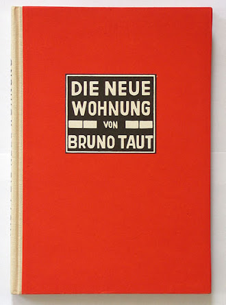
Cover design by Johannes Molzahn, using handwritten sans-serif typography.
The page was increasingly understood as an environment in which typography, image, geometry, and empty space could establish a coherent visual identity.
III.ix. Max Burchartz and the Emergence of Corporate Identity
Max Burchartz represents another important stage in the transition from avant-garde layout to modern commercial design.
Burchartz developed a bold style combining typography, photography, and photomontage. His work demonstrated that the new language of layout was not limited to political posters or experimental publications. It could also be applied to advertising and corporate communication.

Max Burchartz, Orion, C. L. Krüger GmbH, Dortmund, 1926.

Max Burchartz, Peter Wollbrandt and Wilhelm Heuschen, Rheinlandfahrt des BDG, A. Bagel A. G., Düsseldorf, 1926.
Burchartz also understood the importance of recognizable visual identity. His advertising work treated a distinctive visual mark not merely as decoration but as an identifying element capable of connecting separate pieces of printed communication.

Johannes Canis, Werbefachmann, c. 1928.
The orange square associated with Burchartz's publicity work is a particularly useful example of how a simple geometric device could acquire the function of a recognizable identity.
Thus the modernist revolution in layout was beginning to move beyond the individual page. It was becoming a system through which an organization, publication, or product could establish a consistent visual presence.


Max Burchartz, Johannes Canis. Fort mit dem Kronleuchter, Werbeblatt 2. 1925
III.x. Jan Tschichold: The New Typography
Jan Tschichold brought many of the disparate experiments of Futurism, Dada, Constructivism, De Stijl, and the Bauhaus into a more coherent theory of typography.
In 1925 he formulated principles for a new typography, and in 1928 he published Die neue Typographie. His objective was not simply to make typography appear modern. He sought to establish a rational relationship between communication, typography, space, and the structure of the page.

Jan Tschichold, Die neue Typographie, page layout, 1928.
Tschichold argued for clarity, economy, and purposeful organization. Typography was not to be confined within an inherited decorative framework. Its visual form should correspond to the communicative purpose of the text.
The asymmetrical page became one of the most recognizable manifestations of this philosophy. Instead of placing every element around a central axis, the designer could establish relationships through alignment, contrast, scale, direction, and spatial tension.

Spread and throw-out from Jan Tschichold's Asymmetric Typography, originally published in 1935.
The importance of asymmetry was not that symmetry had suddenly become aesthetically wrong. Rather, Tschichold demonstrated that balance could be achieved without bilateral symmetry.
The page could be balanced dynamically.
This distinction is fundamental to the history of layout. Balance does not necessarily mean equality of visual weight on either side of an axis. It can also mean equilibrium among elements of different size, position, density, and direction.

Jan Tschichold Sonderheft Typographische Mitteilungen 1925
 Jan Tschichold. Phoebus-Palast, Musikalische und Filmdarbietungen von Rang, Programm. 1927
III.xi. Tschichold Reconsiders the Canonical Page
Perhaps the most intellectually significant aspect of Tschichold's career was that his modernist revolution eventually brought him back to the historical page.
Tschichold studied medieval and Renaissance book construction in order to understand the structural principles underlying successful historical layouts. He was particularly interested in what he regarded as the hidden or "secret" canons governing the proportions of the page.
His investigation connected the modern page with the history discussed earlier in this chapter. The modern designer could reject superficial historical conventions while still learning from the deeper structural principles of proportion, margins, text area, and visual equilibrium.

Tschichold's reconstruction of the Golden Canon of Page Construction.
Tschichold's analysis of medieval page proportions led him toward a page relationship in which the proportions of the page, margins, and text area were mutually coordinated rather than independently selected.

Tschichold's geometrical reconstruction of the medieval page canon.
This was an important intellectual reversal. The modernist revolution had begun by rejecting inherited conventions. Tschichold's mature work suggested that the rejection of convention did not require rejection of history.
The deeper lesson was that good layout is structural rather than merely stylistic.
The page can appear modern, traditional, experimental, or restrained, but successful composition depends upon relationships among its elements. Typography, image, margin, proportion, direction, and empty space must work together.
Tschichold's return to historical page construction therefore creates a bridge between the opening sections of this chapter and the modernist revolution described here.
III.xii. From Revolution to a New Visual Grammar
The modernist revolution transformed the conception of the page in several interconnected ways.
First, typography became visual. Words could communicate through their semantic content, but they could also communicate through scale, position, direction, weight, and spatial relationships.
Second, photography became structural. The photograph was no longer necessarily an illustration subordinated to a block of text. It could determine the architecture of the page.
Third, negative space became active. The unprinted portion of the page could create rhythm, emphasis, separation, tension, and rest.
Fourth, asymmetry became a legitimate form of balance. A composition could achieve equilibrium without mirroring itself around a central axis.
Fifth, the page became a system rather than merely a container. Designers increasingly thought in terms of relationships among elements rather than isolated decorative decisions.
The modernist revolution therefore did not simply replace one style with another. It expanded the vocabulary of layout.
The historical sequence is revealing. Futurism liberated typography from the conventional line. Dada challenged the stability of the page. Constructivism introduced discipline and social purpose into the new vocabulary. De Stijl explored elemental geometry and directional tension. The Bauhaus sought a modern language of communication. Moholy-Nagy integrated photography and typography. Schwitters recognized the positive role of empty space. Molzahn and Burchartz carried experimental principles into advertising and commercial communication. Tschichold attempted to synthesize these developments into a coherent typographic system—and finally returned to the structural wisdom of the historical page.
The result was not the destruction of layout design but its expansion.
The page had become a visual language.
And once layout had become a language, the next transformation would occur not principally in Europe but in the world of American magazines, photography, advertising, and mass media.
That transformation forms the subject of Part IV: The American Revolution in Editorial Layout.
Part IV — The American Revolution in Editorial Layout
IV.i. The American Layout Design Revolution
The European avant-garde had transformed the possibilities of the printed page, but the next great development in layout emerged from a different environment: the rapidly expanding American magazine industry.
By the 1930s, magazines had become major instruments of mass communication. Photography was becoming increasingly sophisticated, advertising occupied a growing proportion of the available space, and readers were developing an appetite for visual journalism in which photographs could tell stories as powerfully as words.
The problem facing the magazine designer was therefore no longer simply how to arrange type attractively. The designer had to coordinate journalism, photography, advertising, headlines, captions, and white space within a limited physical format while maintaining the reader's attention.
It was in this environment that Alexey Brodovitch made his decisive contribution.
Brodovitch transformed the relationship between text and image in the magazine spread. His work demonstrated that a double-page spread could be conceived as a single visual composition rather than as two independent pages. The gutter between the pages could become part of the design, while photographs could cross, confront, interrupt, or balance blocks of typography.
His work with Harper's Bazaar became particularly influential. Brodovitch also played an important role in the development of modern commercial and fashion photography, working with photographers including Man Ray, Richard Avedon, and Irving Penn.
The relationship between photography and layout was thereby fundamentally altered. The photograph was no longer merely an illustration inserted into a predetermined typographic structure. It could determine the structure itself.

Man Ray, photographer, and Alexey Brodovitch. An article spread from a Harper's Bazaar issue of the 1930s.
The significance of the spread lies in its integration of three elements that had previously tended to be treated separately: photograph, typography, and empty space.
The photograph does not merely illustrate the accompanying text. Its scale and position establish a visual rhythm across the spread. Typography responds to the image rather than simply occupying whatever space remains available. The white areas become pauses within the composition.
The result is a visual sequence through which the reader's eye moves.
IV.ii. The Double-Page Spread as a Visual Composition
Brodovitch's importance cannot be understood simply by saying that he produced attractive magazine pages. His deeper contribution was conceptual.
He treated the double-page spread as a unified visual field.
The traditional page had often been organized around columns of text. Even when illustrations were present, they tended to remain subordinate to the typographic structure. Brodovitch reversed this relationship. The photograph, the headline, the body text, the caption, and the empty space could all become primary or secondary according to the requirements of the story.
This created a form of visual choreography.
A large photograph might establish the dominant movement of the spread. A small block of text might provide a counterweight. A headline might cross an image or align with an architectural feature within it. A large area of white space might isolate an important visual element and thereby increase its psychological force.
The designer was consequently no longer merely arranging information. The designer was determining the order in which information would be perceived.
This distinction is fundamental.
Reading is sequential, but seeing is simultaneous. A reader encounters an entire page before reading every word upon it. Layout therefore establishes a hierarchy before the linguistic content has been fully processed.
Brodovitch understood this relationship between visual perception and editorial communication exceptionally well.
IV.iii. The Art of Negative Space
One of Brodovitch's most important contributions was his understanding of negative space.
Magazine pages had traditionally been susceptible to visual overcrowding. Advertisements, photographs, captions, headlines, decorative borders, and blocks of text competed for the reader's attention. As mass advertising expanded, the pressure to use every available area of the page became particularly strong.
Brodovitch resisted this tendency.
He recognized that empty space is not necessarily wasted space. It can create emphasis, separation, rhythm, silence, and anticipation.
His approach is particularly important because the blank area of a page is often the least visible element when discussing design. Yet it can determine the effectiveness of every visible element around it.
As the original chapter observes, Brodovitch criticized designers who were afraid of blank spaces and responded to that fear by filling the page with images, text, shading, and coloured backgrounds.
His practice offered the opposite principle:
The designer does not need to fill the page in order to use the page.
White space can function as a frame. It can isolate an image. It can slow the reader's movement. It can establish hierarchy. It can provide relief between competing elements.
Most importantly, negative space gives the eye somewhere to rest.
This principle would eventually become one of the foundations of modern editorial design.
IV.iv. Brodovitch and the Photography Revolution
The transformation of editorial layout cannot be separated from the transformation of photography.
Brodovitch worked during a period in which photographic technology was making possible increasingly dramatic forms of visual journalism and fashion photography. The magazine designer could now work with photographs of extraordinary detail, unusual perspectives, extreme cropping, movement, and scale.
The relationship became reciprocal.
Photography influenced layout, while layout influenced the way photographers conceived their images.
A photograph intended for a magazine spread could be composed with the eventual page architecture in mind. The photographer might leave visual space around a figure, anticipate the gutter, or create a directional movement that could carry the reader from one page to another.
Brodovitch's collaboration with photographers such as Man Ray and Richard Avedon illustrates this emerging relationship between photography and graphic design.
The magazine became a meeting place between two visual professions.


A 1982 issue of Harper's Bazaar, with a Brodovitch layout and photograph by Richard Avedon.
The historical importance of such a spread is not confined to the photograph itself. It demonstrates how the image, type, and surrounding space have been designed as a single perceptual experience.
A photograph can be enlarged until it becomes almost abstract. A face can be cropped. A figure can extend across the gutter. A small typographic element can be positioned so that it becomes a counterpoint to the dominant image.
The magazine spread thus became a kind of cinematic sequence.
The reader's eye does not simply move from the upper-left corner to the lower-right corner. It moves through a hierarchy established by scale, contrast, direction, proximity, and space.
IV.v. Brvodovitch's Continuing Influence
Brodovitch's influence extended far beyond the particular pages he designed.
His approach helped establish an editorial design culture in which the art director became an essential participant in the production of a publication. The designer was no longer simply executing typographic instructions supplied by the printer. The designer participated in determining how journalism would be seen.
This was particularly important in fashion magazines, where photography, typography, illustration, advertising, and editorial content had to coexist within the same visual environment.
Brodovitch's legacy can be seen in the continued interest in his work among later generations of designers and editors.

A Vogue article from 2011 inspired by and discussing Brodovitch and his approach to layout.
His continuing relevance arises from a principle that remains applicable even when the medium changes: visual communication depends upon relationships, not merely upon individual elements.
A beautiful photograph can be weakened by poor placement. An elegant typeface can become unreadable through bad spacing. A strong headline can lose its importance if everything else on the page competes with it.
Brodovitch demonstrated that restraint can be as powerful as ornament.
IV.vi. From Magazine Page to Editorial System
The American magazine revolution also changed the relationship between design and editorial production.
Once the page was understood as a visual composition, design could no longer be isolated from the editorial process. The selection of photographs, the length of articles, the hierarchy of headlines, the placement of captions, and the sequence of pages all became interconnected.
This development prepared the way for the contemporary concept of editorial design.
Editorial design is not simply the decoration of information after the writing has been completed. It is the organization of information so that the reader can understand its hierarchy and navigate its sequence.
The magazine became a particularly sophisticated environment for this process because it combined different forms of communication:
long-form writing;
short headlines and captions;
documentary and fashion photography;
advertising;
illustrations;
charts and diagrams;
recurring departments;
covers and visual identities.
The designer's task was to make these heterogeneous materials appear to belong to a coherent publication.
This was a significant step toward the idea of the design system that would later dominate newspapers, corporate publications, websites, and digital interfaces.
IV.vii.The Americanization of Paris Match
The influence of American editorial design eventually became visible even in European publications that possessed strong national visual identities.
Paris Match, the French weekly magazine, had developed a distinctive tradition of photojournalism combining photographic reportage with news, analysis, and commentary. Its visual identity was closely associated with the dramatic use of photography and the magazine's particular French editorial culture.
The transformation of Paris Match described in the original chapter provides an instructive example of how editorial layout evolves when a publication attempts to reconcile an established identity with changing expectations of readability and navigation.
In 2008, Paris Match commissioned García Media, led by Mario García, to examine the magazine's editorial and visual structure.
García approached publication design from a journalistic rather than purely aesthetic perspective. His philosophy was expressed through the acronym WED — Writing, Editing, Design. The three activities were treated as interconnected components of effective communication.
This approach represents an important development beyond the earlier conception of the graphic designer as a specialist who works principally with type and image.
The editorial designer increasingly became part of a larger information system.
At Paris Match, García Media worked with editor Olivier Royant and art director Michel Maiquez. The process examined the magazine from cover to back cover, considering storytelling, content flow, and the organization of its substantial photographic and journalistic material.
The objective was not simply to give the magazine a different appearance. It was to make its content easier to find, easier to navigate, and more enjoyable to read.
The process described in the source is revealing. Designers worked in workshops with editors, developed sketches, converted ideas into page dummies, discussed them, revised them, and displayed the resulting pages for editorial evaluation.
The page therefore emerged through collaboration.
This is a continuation of the principle already visible in Brodovitch's work: layout is inseparable from the content it communicates.
IV.viii. The Transformation of Paris Match
The resulting redesign introduced a more distinctly Americanized editorial style.

Example of the redesigned Paris Match pages discussed in the original chapter.
The redesign illustrates a broader historical process.
European publications had developed their own traditions of editorial composition. American magazines, particularly mass-market publications, had developed a strong emphasis on visual immediacy, modular organization, dramatic photography, headlines, and rapid navigation.
The encounter between these traditions produced a hybrid form.
The redesigned Paris Match could retain the authority of photographic journalism while adopting a more modular architecture. Articles could be divided into visually distinct units. Headlines could become more prominent. Photographs could operate at different scales. Information could be organized into recognizable zones.
The page became easier to scan.
This is an important development because modern readers rarely encounter a page in the same way that readers of earlier books encountered a page. They scan before they read. They search for visual signals indicating where to begin and what deserves attention.
Editorial layout consequently became partly an art of navigation
 .
.
Another example of the redesigned Paris Match editorial architecture.
The modern page therefore has two simultaneous responsibilities.
It must create a visual experience.
And it must make information accessible.
These responsibilities can reinforce one another, but they can also conflict. An excessively dramatic page may attract attention while making information difficult to locate. A rigidly modular page may make information easy to navigate while sacrificing visual character.
The history of layout can consequently be understood as a continuing negotiation between expression and function.
IV.ix. From the Editorial Page to the Information System
The American editorial revolution transformed more than the appearance of magazines. It altered the conception of what a publication actually was.
A magazine was no longer merely a sequence of pages. It was an information system.
Its cover established identity. Its departments established recurring structures. Typography established hierarchy. Photography established emotional and documentary emphasis. White space regulated visual rhythm. Page numbers, captions, headings, and navigation devices helped readers understand where they were.
The modern editorial designer therefore worked simultaneously at two levels.
At the first level was the individual page or spread.
At the second was the publication as a whole.
This distinction would become increasingly important as newspapers and magazines moved toward standardized grids, modular page structures, recurring typographic hierarchies, and eventually digital interfaces.
The designer had to determine not only how one page should look but how the reader would experience fifty, one hundred, or several hundred pages as a coherent publication.
The concept of visual identity emerged from this need for continuity.
Yet continuity did not necessarily mean repetition.
A successful publication could maintain a recognizable identity while allowing individual pages to vary dramatically. The underlying system provided coherence; the individual composition provided expression.
Brodovitch's work is particularly important in this regard because his pages could appear spontaneous and even unpredictable while remaining carefully controlled.
The apparent freedom depended upon discipline.
IV.x. The Legacy of the American Revolution
The American revolution in editorial layout therefore extended the modernist transformation begun in Europe.
The European avant-garde had liberated the elements of the page. American editorial design integrated those elements into a mass communication industry.
The transformation can be understood as a progression.
Futurism demonstrated that typography could move.
Dada demonstrated that the page could be disrupted.
Constructivism demonstrated that visual elements could be organized into a new functional system.
The Bauhaus and Moholy-Nagy explored the integration of typography and photography.
Tschichold developed a theoretical language for modern typography and later rediscovered the structural principles of historical page construction.
Brodovitch brought these modernist possibilities into the magazine spread and demonstrated the expressive power of photography and negative space.
The American magazine consequently became a laboratory in which visual communication could be tested on a mass audience.
The reader, rather than the printer, became the ultimate judge.
IV.xi. From Brodovitch to the Digital Reader
The principles developed through twentieth-century editorial design did not disappear with the decline of the printed magazine.
They became the foundation of digital layout.
The screen introduced new constraints. Its dimensions could vary. Text could be enlarged. Images could move. Pages could scroll indefinitely. Links could connect one document to another. The reader could encounter the same publication on a desktop computer, tablet, or mobile telephone.
Yet the fundamental problem remained recognizable:
How should words, images, hierarchy, and empty space be organized so that a reader can understand and navigate information?
This question connects Brodovitch's magazine spreads with contemporary interface design.
The medium changed, but the underlying problem of visual grammar remained.
The next stage of the history therefore leads naturally from the American editorial page to typography, grids, templates, and the digital transformation of the page.
The question is no longer simply whether the printed page will survive.
It is whether the principles developed over centuries of page design will continue to govern communication when the page itself becomes fluid.
That question forms the subject of the next part.
Part V -Typography, Grids, Templates, and the Digital Page
The history of layout design is ultimately a history of the relationship between order and freedom. From the carefully proportioned manuscript page to the incunabula, from the classical canon to the revolutionary typography of the Bauhaus and Constructivism, and from the dynamic magazine spreads of the twentieth century to the contemporary digital screen, designers have repeatedly confronted the same fundamental problem: how can words, images, colour, and empty space be organized so that a reader does not merely see a page, but understands it?
The technological circumstances have changed profoundly. The page is no longer necessarily made of paper, and the reader is no longer necessarily holding a book or newspaper. Yet the underlying problem remains remarkably constant. Every visual composition establishes relationships between elements. Every margin, column, typeface, image, interruption, alignment, and area of empty space affects the movement of the eye and therefore the interpretation of the message.
This final part examines several of the questions that emerged from the modernist revolution: the controversy over capital letters, the development and use of layout grids, the rise of templates, and the transition from the paper page to the digital screen.
V.i. The Case Against Capital Letters
The modernist transformation of typography extended beyond the choice of typeface. It challenged some of the most deeply established conventions of written language itself. Among the most conspicuous controversies was the question of capital letters.
In the nineteenth century, Jacob Grimm's philological investigations into the German language led him to consider the possibility of abandoning capital letters for German nouns. The question subsequently acquired new significance during the rise of the New Typography. In the 1920s, publishers associated with the emerging modernist typographic movement reconsidered conventional German capitalization, while the Bauhaus became an important centre for experimentation.
Herbert Bayer, one of the instructors associated with the Bauhaus typography workshop, famously questioned the necessity of maintaining two alphabets when a single alphabet could represent the same sounds. The argument fitted the intellectual atmosphere of the Bauhaus: typography should correspond to the logic of the machine age, eliminate unnecessary conventions, and simplify communication.

Herbert Bayer's experiment with lowercase typography.
The argument for lowercase typography was partly economic and partly philosophical. A single alphabet could simplify mechanical writing and reduce the number of typographic forms that had to be learned or operated. More importantly, however, it reflected the modernist desire to strip typography of historical conventions and to construct a visual language appropriate to the industrial age.
The Bauhaus books, frequently set in sans-serif type, helped establish a new visual standard. The style was associated with Functional Typography, while the Russian avant-garde developed related approaches under the broader concept of Constructivist typography. Typography was increasingly understood not simply as a vessel for language but as an architectural element within the page.
Yet the history of the capital-letter controversy also demonstrates an important limitation of radical formalism. Typography does not exist independently of readers. A typographic convention may have historical origins and still perform useful communicative functions.
This tension became particularly visible in the United States. In 1929, Vanity Fair, under art director Dr. Mehemed Fehmy Agha, adopted aspects of European modernist typography, including Paul Renner's Futura. The magazine also eliminated capital letters from the titles of its feature articles.
The experiment lasted only five issues.
In March 1930, Vanity Fair returned to capital letters and published a substantial editorial, “A Note on Typography,” explaining the decision. The editorial is significant because it transformed what might otherwise appear to be a minor typographic decision into a larger reflection on the relationship between modernity, attractiveness, and readability.
The magazine acknowledged the visual appeal of the new typography but emphasized the practical importance of legibility. Its argument was that typography must serve communication. A page could be visually innovative and aesthetically sophisticated, but if its innovations interfered with reading, the designer had allowed form to become detached from function.
This episode provides an important counterpoint to the European avant-garde. Modern typography did not ultimately develop by simply eliminating conventions. Rather, it evolved through a continuing negotiation between inherited habits and new visual possibilities.
The deeper lesson is that typography has at least three interconnected responsibilities: it must be appropriate to its time, place, and function; it must possess visual attractiveness; and, above all, it must remain legible.
The controversy over capital letters therefore became part of a much larger transformation. The essential revolution was not whether a title began with a capital letter. It was the reorganization of the entire page: the relationship of type to image, the use of photography, the distribution of white space, the massing of text, and the visual hierarchy through which the reader moves.
V.ii. The Grid as the Grammar of the Page
The modern layout grid represents one of the most important attempts to reconcile freedom with order.
A grid is not itself a design. It is an underlying structure that allows the designer to establish relationships among the elements of a page. It determines possible positions, alignments, proportions, and intervals without necessarily dictating the final appearance.
The simplest form is the manuscript grid, essentially a rectangle establishing the margins within which text is placed.

A manuscript grid: a single rectangle defining the margins of the page.
A column grid subdivides the page vertically. It became particularly important in newspapers, catalogues, magazines, and later web design because it permits different combinations of text and images while maintaining a consistent underlying structure.

A column grid divides the page into columns and is frequently used in newspaper, catalogue, and web design.
The modular grid goes further by dividing the page into a consistent system of horizontal and vertical units. Such a structure is especially useful when a publication must accommodate numerous different kinds of information.

A modular grid divides a page into a consistent table-like structure, providing a guide for the placement of different forms.
Modular grids are particularly suited to charts, forms, schedules, navigation systems, and tabular information because they allow numerous individual components to participate in a unified visual structure.

Modular grids lend themselves to the organization of complex visual and informational material.
A hierarchical grid, by contrast, permits greater variation. Column widths can change, flow lines can shift, and individual elements can occupy customized proportions. Such grids are particularly useful when the content itself establishes different levels of importance.

Hierarchical grids accommodate customized proportions for different elements of a design.
The significance of the grid is therefore not mechanical uniformity. Its real value lies in providing an invisible structure within which variation becomes possible.
This distinction is essential. A rigid grid can produce monotony when every page is treated identically. A thoughtful grid, however, can create continuity while allowing individual pages to develop their own rhythm.
The grid is best understood as the grammar of layout. Grammar does not determine what a writer must say; it establishes relationships that make expression intelligible. In the same way, a grid does not determine the visual message. It provides the spatial syntax through which the message can be constructed.
V.iii. Composition, Negative Space, and the Movement of the Eye
The grid is only one component of successful layout. The designer must also understand the relationship between occupied and unoccupied space.
Negative space is sometimes misunderstood as unused space. In a sophisticated composition, however, it is not empty in any meaningful communicative sense. It separates elements, establishes emphasis, creates rhythm, and gives the eye a place to rest.
The amount of space available inevitably affects the designer's possibilities. A page crowded with text, images, rules, and decorative elements can obscure the hierarchy of information. Conversely, excessive isolation can fragment the relationship among elements.
The designer therefore creates a visual journey.
Typography establishes one path; an image creates another. A strong contrast can arrest the eye, while a subtle alignment can lead it toward another element. A change in scale establishes hierarchy. A margin establishes distance. White space creates intervals analogous to pauses in speech or silence in music.
The result is a form of visual grammar.
A page may therefore be understood as a collaboration among three participants: the author, who supplies the verbal or informational content; the designer, who constructs its visual organization; and the reader, who reconstructs meaning through the act of looking and reading.
This is why layout design is more than decoration. The arrangement of the page can clarify, emphasize, redirect, or obscure the meaning of the text.
V.iv. The Problem of Templates
The arrival of digital design introduced another important tension: the growing availability of templates.
The original chapter expresses a strong concern about the consequences of excessive reliance on templates. A template can provide an efficient starting point, especially when a designer must produce a large number of pages within a consistent visual identity. It can save time and reduce repetitive technical work.

An example of a pre-designed layout template.
The attraction is obvious. Templates are readily available, relatively inexpensive, and can allow individuals and small organizations to produce visually coherent material without designing every component from the beginning.
Yet efficiency can become a problem when the template replaces design judgment.

The convenience of standardized templates can also encourage repetitive visual solutions.
When the same visual structure is used repeatedly for unrelated subjects, the relationship between form and content becomes weaker. A design intended for a particular story, publication, institution, or audience can become visually interchangeable with hundreds of other designs.

Repeated use of templates can reduce the distinctive relationship between content and visual form.
The issue, however, is not that every template is inherently bad. The deeper distinction is between a system and a formula.
A system provides constraints within which a designer can exercise judgment. A formula attempts to eliminate judgment.
The great modernist designers understood this distinction. Grids, typographic systems, and visual standards did not prevent originality; they created a framework within which originality could operate. The danger begins when the framework itself becomes the design.
The contemporary designer therefore faces a paradox similar to the one confronted by the Bauhaus. Technology makes the production of visual material easier than ever, but the abundance of technical possibilities does not automatically produce better communication.
V.v. From the Printed Page to the Digital Page
The question of whether paper-based design is approaching its end emerged from the crisis of newspapers and magazines during the digital transformation of journalism.
The original chapter describes the decline of newspaper employment and the pressure placed on traditional publishing organizations during the first decade of the twenty-first century. It connects the reduction of editorial resources with the possibility of declining visual quality: fewer resources for design can produce less engaging pages, which can contribute to declining readership, which in turn can intensify economic pressure.
Yet the transition from paper to digital should not be understood simply as the disappearance of layout design.
It is better understood as a transformation of the page.
The digital screen changes the physical conditions of composition. The designer no longer works with a fixed sheet of paper of predetermined dimensions. The screen may be large or small; the reader may change its orientation; text may reflow; images may resize; menus may appear or disappear; and content can be updated continuously.
The fixed page becomes a flexible visual field.
This creates new problems but also extends many of the principles developed during the history of print. Hierarchy remains necessary. Alignment remains necessary. Contrast remains necessary. Typography remains central. Images must still be integrated with text. Negative space continues to organize the reader's attention.
What changes is the behaviour of the composition.
V.vi. The New York Times and the Evolution of the Digital Page
The evolution of The New York Times website between 2001 and 2023 provides, in the original chapter, a particularly useful visual record of this transformation.


The significance of such changes is not merely technological. They demonstrate that digital publication requires a continuing process of visual organization.
The digital page still possesses margins, although they may be fluid. It still has columns, although their width may change according to the device. It still has hierarchy, although headlines, photographs, video, navigation, and interactive components may compete for attention. It still uses negative space, although the relationship between empty and occupied areas can change dynamically.
The underlying concept remains the same: the designer establishes a visual grammar through which information becomes intelligible.
The digital environment therefore does not abolish the grid. It makes the grid more flexible.
V.vii. The Newspaper as Visual Argument
The chapter's examples of newspaper design reinforce another important point: layout does not merely organize information; it interprets it.

New York Times Op-Ed, “Pafko at the Wall,” 1992, Mirko Ilic.

New York Times Op-Ed, “Russia Comes Apart,” 1992, Mirko Ilic.
These examples demonstrate the continuing relationship between journalism and graphic interpretation. The image, headline, typography, scale, and surrounding space collectively establish a frame through which the reader approaches the written argument.
This does not mean that the designer determines the reader's interpretation completely. Rather, design establishes the conditions under which interpretation takes place.
The same principle can be observed in international newspapers.

Politiken, Copenhagen, Denmark.


Frankfurter Allgemeine Zeitung, Frankfurt, Germany.
Across different national traditions, the same fundamental problem persists: how should a large quantity of information be transformed into a coherent visual experience?
The answer is never merely technical.
V.viii. The Future of Layout Design
The transition from print to digital media might initially appear to represent a break with the history of graphic design. In reality, it represents a continuation under new material conditions.
The medieval manuscript established the page as a field of relationships. Gutenberg's press standardized its reproduction. Renaissance printers developed systems of proportion, typography, and ornament. Modernists disrupted inherited conventions and introduced asymmetry, photography, geometric organization, and dynamic composition. American magazine designers transformed the page into a cinematic sequence. Grids subsequently provided increasingly sophisticated systems for organizing complexity.
The digital screen inherits all of these traditions.
The major difference is that the contemporary page can respond to its reader. Its dimensions are not necessarily fixed. Its content may change. Its typography may adapt. Images may move. Navigation can be interactive. The reader can enter the composition from different points rather than necessarily beginning at the upper left corner and proceeding linearly to the bottom.
The page has become, in this sense, a spatial and temporal environment.
Yet the fundamental principles remain recognizable.
The designer must still decide what deserves emphasis and what should recede. The designer must still determine how much information can be presented without producing visual fatigue. The designer must still balance text against image, density against openness, continuity against interruption, and consistency against surprise.
Technology changes the instruments of design. It does not eliminate the necessity for judgment.
V.ix. Layout as Visual Language
The history examined throughout this chapter suggests that layout design can be understood as a form of visual language.
Like written language, it possesses structures and conventions. Like spoken language, it possesses rhythm, emphasis, pauses, and variations in tone. Like music, it depends upon intervals and relationships. And like architecture, it organizes movement through space.
A narrow column can create intimacy or concentration. Several columns can create informational density. A full-page image can establish visual dominance. A small isolated word can acquire significance precisely because it is surrounded by empty space. A diagonal line can introduce movement where horizontal and vertical structures imply stability.
These choices are not merely aesthetic. They influence the way information is encountered.
The history of layout therefore cannot be reduced to a succession of styles. Gothic manuscripts, Renaissance books, nineteenth-century advertisements, Bauhaus typography, Constructivist posters, modern magazines, newspapers, and websites are different manifestations of a continuing problem: how to organize visual information so that form and meaning reinforce one another.
The most successful designers have understood that order and freedom are not opposites. A disciplined structure can make expressive freedom possible. A grid can create variation. A margin can create emphasis. White space can intensify meaning. Typography can become image without ceasing to be language.
The page is consequently never simply a container.
It is an active participant in communication.
V.x. Conclusion: From Gutenberg to the Digital Page
The long history of layout design begins with the manuscript and continues through the printed book, the newspaper, the magazine, and finally the digital screen. Each technological transformation has altered the physical conditions of communication, but each has also carried forward principles inherited from earlier forms.
The manuscript established the importance of proportion and margins. Early printing introduced reproducibility and standardization. Renaissance printers refined typographic order. The nineteenth century confronted the visual chaos created by mass advertising and industrial printing. The modernists responded by challenging convention and reorganizing the page. The Bauhaus, Constructivists, Dadaists, De Stijl, and New Typography transformed typography into an active component of visual composition. American magazine designers subsequently demonstrated the power of photography, sequencing, asymmetry, and negative space.
The grid provided a means of reconciling this freedom with structural coherence.
The digital revolution then changed the nature of the page itself.
But the essential question remained unchanged:
How should visual elements be arranged so that the reader can move through information with clarity, interest, and understanding?
That question explains why the history of layout remains relevant even when paper is no longer the dominant medium.
The page may now be printed on paper, displayed on a monitor, carried on a telephone, projected onto a screen, or embedded within an interactive interface. Its dimensions may be fixed or responsive. Its content may be static or continuously changing. Yet the designer must still compose.
Text must still occupy space.
Images must still establish relationships.
Typography must still communicate hierarchy.
Colour must still create emphasis and atmosphere.
And negative space must still provide the intervals through which the eye can move.
The history of graphic design therefore does not end with the disappearance of the paper page. Instead, the digital environment reveals more clearly what the page has always been: a structured visual space in which information becomes form, and form becomes part of meaning.
From Gutenberg to the modern grid, from the revolutionary typography of the Bauhaus to the photographic spreads of the great magazines, and from the newspaper page to the responsive digital interface, layout design remains an art of organizing relationships.
Its tools have changed.
Its surfaces have changed.
Its technologies have changed.
But its fundamental task remains the same:
to transform information into a visual experience that the reader can enter, understand, and remember.
Gallery

 |
A Roman Breviary of French origin [1450 to 1470] verso, The elegant page layout of this Medieval manuscript is of timeless quality. |
 |
Double–page colophon (left side) from the Anonymous Baghdad Qur’an, 1308 Iraq, Baghdad Ink, gold, and colors on paper;
|
 |
Preparation of Medicine from Honey: Leaf from an Arabic translation of the Materia Medica of Dioscorides, dated 1224, Iraq, Baghdad School, Colors and gold on paper
|
 |
Leaf from an Arabic translation of the Materia Medica of Dioscorides ("The Pharmacy"), dated 1224 Iraq, Baghdad School Colors and gilt on paper; Cora Timken Burnett Collection of Persian Miniatures and Other Persian Art Objects
|
 |
The simple design of this Spanish Breviary's two columns layout, written in the mid-1400s, utilized the full visual impact of negative space. The designer's faint blue lines of a grid to achieve such an exquisite composition is still traceable. |
 |
Incunabula from Germany. Late 15th century |

There are two types of incunabula: the xylographic (made from a single engraved woodblock for each page) and the typographic (made with movable type on a printing press in the style of Johann Gutenberg). Some authors reserve the term incunabulum for the typographic ones only. Most of the early typefaces were modeled on local styles of writing or were derived from various European Gothic scripts. As well, there were also some that stemmed from manuscript documents; such as most of Caxton's types. In Italy, in particular, types were modeled on humanistic typefaces, which in digital formats are still in use today.
 |
This facsimile page is from the Gutenberg's Bible, also known as the 42-line Bible. It is an edition of the Vulgate, printed by Johannes Gutenberg, in Mainz, Germany, in 1455. The overall layout, modeled on classical two-columns layout of manuscripts, is elegantly balanced. The composition is positioned slightly toward the left side of the page, with a wider right-hand margin that aesthetically anchors the negative space of the page rendering the visual impact exquisite and pleasing.
|
 |
|
 |
Vicentino Ludovico degli Arrighi, The second edition of an early writing manual, Venice: (Nicolo d'Aristotile detto Zoppino), 1533. |
 |
Ludovico degli Arrighi, Vicentino, fl. 1522. Il modo de temperare le penne con le uarie sorti de littere ordinato per Ludouico Vicentino. Roma, 1523. |
 |
France. Grand Conseil. Arrest dv Grand Conseil donné sur la reformation de l’imprimerie, le vnziéme septembre 1544. [Lyon, 1548].
|
 |
Aubert, 16th century. Plaidoyez povr la reformation de l’imprimerie. [Paris, 1571?] Bound with Rosenwald 1034. |
 |
Heinric en Margriete van Limborch, Een schoone historie va[n] Margariete[n] va[n] Limborch en[de] va[n] Heyndric hare[n] broeder broeder ...,Tantwerpen, Gheprint bi W. Vorsterman, 1516.
|
 |
Pyramus ende Thisbe. [Thantwerpen, Gheprint by H. Peeterssen, van Middelburch, ca 1540]. |
 |
This late-sixteenth-century English Bible,shows how a tasteless layout, and the chaotic interference of negative spaces can drastically affect the character of a text. |
 |
This spread from The Meditations of Marcus Aurelius Antoninus, published in 1792, uses the golden section to determine the text area, and the Fibonacci sequence to arrive at relative margin sizes (inner margin 3 units; top and outer margins 5 units; bottom margin 8 units). The gutter is treated as the central axis, and there is one column of text. The outer and bottom margins are larger than the inner and top. These optical adjustments ensure that the text doesn’t appear to be falling off the bottom of the page. |
|

 |
| An advertisement page from the Feb. 9, 1884 issue of Harper's Weekly, which contains a description of the book, and an engraved portrait of Confederate General Beauregard. |
 |
This page is from an issue of the Futurist magazine Lacerba, published in 1914. The post-WWI ambiance, so different from the often decadent fin-de-siecle life, ensured there was no return of any decorative tendency. The Futurists, were writing about modern life, particularly its noisy or violent aspects. They wanted to convey personal, sometimes physically painful, experiences, and thus they broke with previous approaches to layout and design, and by doing so they revolutionized the development of the grid. The words in the Futurist layout were there to create a visual image, both by the way they were used typographically and by their literal meaning. The Florentine newspaper Lacerba, with Giovanni Papino and Ardengo Soffici as main contributors, ran from 1 January 1913 to 22 May 1915, with a total of seventy issues. |
 |
The Futurists were poets, not designers; they strove to weld the literary word with the visual word in order to express ideas beyond words. Their layout was often intentionally chaotic, but as they discarded old conventions, a new aesthetics was given the space to develop. |
 |
Johannes Itten, Mein Vorkurs am Bauhaus, My Preliminary Course at the Bauhaus, 1963 |
 |
Bauhausbücher 5, Neue Gestaltung Piet Mondriaan. attributed to László Moholy-Nagy, 1924 |
 |
Staatliches Bauhaus Weimar 1919-1923, László Moholy-Nagy, Printer: Bauhaus Verlag, Weimar. 1923. |
I
 |
The Law of Series. (Das Gesetz der Serie), László Moholy-Nagy, 1925 |
 |
Theo van Doesburg, Dada Ismus in Holland |
 |
Theo van Doesburg, De Stijl, 1920 |
 |
Alexander Rodchenko, 1920s |
 |
Alexander Rodchenko, Resinotrest Russian Shoes, |
.
 |
El Lissitzky, Poster for the Russian Exhibition at Zürich, 1929. |
 | |
|
 |
Orion,Max Burchartz, Printer: C.L. Krüger GmbH, Dortmund. 1926. |
 |
Rheinlandfahrt des BDG, Max Burchartz, Peter Wollbrandt and Wilhelm Heuschen, Printer: A. Bagel A. G., Düsseldorf. 1926. |
Max Burchartz (1887-1961) was another expressionist layout designer turned Constructivist who also wrote articles for Die Form. Burchartz became well-known for developing his innovative and bold layout style that blended typography, photography, and photo collages. In 1923, he assumed the joint editorship of the German edition of Von Doesburg's Die Stijl magazine. A year later he established, Neus Relame Gestaltung, New Publicity Design, a design studio in Weimar, but soon joined Johannes Canis( 1895 – 1977) to set up yet a new design firm Werbe-bau, Advertising Construction, in Ruhr.
 |
Johannes Canis. Johannes Canis Werbefachmann. c. 1928 |
 |
This spread and throw-out is from Jan Tschichold’s seminal work Asymmetric Typography, originally published in 1935. In it Tschichold argued that typographic consistency is a necessary precursor to understanding, and described designers as akin to engineers. His work was nevertheless aesthetically refined and dynamic. Here he explains the parallels between abstract art and typographic layout. |
 |
Merz 11, Typoreklame, Kurt Schwitters, Printer: A. Molling & Comp., Hannover, Germany. 1924. |
 |
Le Coeur a barbe, Cover, Kurt Schwitters, Edited by Tristan Tzara. Paris, 1922 |
I

 |
A Vogue 2011 article inspired by and about Brodovitch and his layout |
In the 19th century, one of the brothers Grimm, Jacob's philological research had led him to a history of the German language, Geschichte der deutschen Sprache, in which he attempted to drop capital letters. After researching into names and dialects, he used roman type and advocated spelling German nouns without capital letters. His ideas was supported, in the 1920s, by Benthverlag, the publishers who later issued the DIN standards. Soon it turned into an euphoria surrounding the New Typography, again the conventional practice in German texts of using capitals for initial letters of nouns was called into question, and in 1925 Bauhaus dropped them on some silly rationalizations.


 |
Walker Evans was Staff Photographer at FORTUNE from 1945 to 1965. According to Max Gschwind, assistant art director; Evans' earliest works appeared for The Communist Party in September 1934, Evans' celebrated project that became Let Us Now Praise famous Men, began as a Fortune assignment with James Agee who also had contributed to the magazine. |
 | |
|
 |
Art Director Will Burtin, Layout Alexander Semenoick, Fortune, 1947 |
 |
Modern Design Magazine issue 13, July 2008 |
 |
| Radical Magazine |
 |
The design goal here is to make the content as accessible and readable for the reader as possible. The use of images in the black and white format of the two columns achieves the readability and accessibility of the classic layouts and allows the designer to provide greater focus to contents. |
 |
The designer has succeeded in presenting an aesthetically pleasing composition, using a combination of various typefaces and a harmonious color scheme to present a large amount of information. |
 |
The typeface and the simple geometry of space reminds us of Friedrich Poppl’s edict; ‘ Only in the contrast between black and white does form remain incorruptible.’ A playful composition that provides a context for a reportage on Reza Abedini, an Iranian graphic designer. |
 |
The geometric division of the left page enhances the visual energy of the layout and supports the weight of the upper half of the page in a two columns layout over the three columns at the bottom half of the page. |
 |
| A symmetrically balanced layout anchored by two photographs, and a judicious utilization of white space. |
 |
An elegant integration of type and image via color. |
 |
The simple black geometric surface in the title aligned with the oblique left side of the letter 'A' balances the visual composition with the white lettering inside it echoing the white circles on the image. |
 |
The two circular screens of the gadgets on the large image on the left and at the right hand side corner provide a visual anchor for the layout, with the title being mirrored in the image with two horizontal gray bars. |
 |
A simple visual echo of text and image. |
 |
The intelligent choice of typeface, color, and white space renders the text an organic extension of the image on the left. |
 |
An elegant layout accentuating the power of image. |
 |
| The simple white square with yellow lettering creates a balanced layout, allowing the image to communicate with the reader. |
 |
The yellow letter 'd' mirrors a sawed tree trunk and integrate the image with the text, |
 |
A powerful minimalist layout. |
 |
ParisMatch feature story on Dimitri Medvedev |


 |
| New York Times magazine, Art Director: Janet Froelich |


 |
Illustration by Adrian Clapperton
|
 |
Corriere della Sera, 2009 |

 |
Bold and imaginative, the layout designer's smart choice of colour, accent, spacing, column width and a modern typeface renders this striking design powerful and attractive. |
 |
With some simple design, and play with the geometric spacing, the designer has created a well balanced and attractive composition. The limited choice of typeface, however, is one of the main deficiencies in the Iranian layout. |
 | |
|
 | ||
|
 |
Brit Girls , Layout Rockstar-Töchter in Vanity Fair |
 |
Vanity Fair’s design strives to be modern yet classic, simple yet sophisticated, minimal yet full of restrained energy. Its layout is meant to feel daring, refined, and free of pretense, always at the service of a story. . |
 |
Soviet era Pravda |
 |
Pravda, 2009 After the collapse of the USSR, Pravda was closed down by the then Russian President Boris Yeltsin. It suffered huge losses after its reappearance and was sold to a Greek business family. Finally the Communist Party of Russian Federation acquired the newspaper in 1997 and established it as its principal tribune. Pravda is still functioning from the same headquarters on Pravda Street in Moscow where it was published in the Soviet days. |
 |
Soviet era Izvestia |
 |
Soviet era Izvestia |
 |
| Capitalist era Izvestia |
 |
Izvestia's Russian Grid System?! |


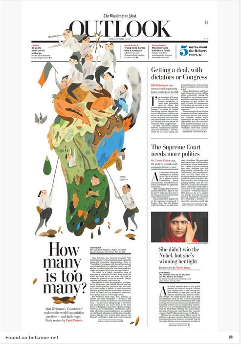
FURTHER READING
- Thinking With Type — A Modular Grid
- Designing With Grid-Based Approach
- Making Modular Layout Systems
- The Grid System
- >Typography is a grid
- Responsive Typographic Scales
- The Golden Grid System
References
- Andrew Haslam, Book Design,Laurence King Publishing, 2006
- Richard Hendel, On Book Design, Yale University Press, 1998
- Robert Bringhurst, Title The Elements of Typographic Style, Hartley & Marks, 1996
- Alexander S. Lawson, Anatomy Of A Typeface, David R. Godine Publisher, 1990
- Richard Hollis, Swiss Graphic Design: The Origins and Growth of an International Style, 1920-1965, Yale University Press, 2006
- Reflections on the joyous elegance of graphic design & creative thought
- Canons of Layout, 51 Elliot, Notes from Silicon Valley North, 2009


Awesome, I am really many thanksfull for this great Post.
ReplyDeleteWow
ReplyDeleteThis information has quite a lot that any graphics designer should not overlook
I'm grateful