"When I joined Google as its first visual designer, the company was already seven years old. Seven years is a long time to run a company without a classically trained designer. Google had plenty of designers on staff then, but most of them had backgrounds in CS or HCI. And none of them were in high-up, respected leadership positions. Without a person at (or near) the helm who thoroughly understands the principles and elements of Design, a company eventually runs out of reasons for design decisions. With every new design decision, critics cry foul. Without conviction, doubt creeps in. Instincts fail. "Is this the right move?" When a company is filled with engineers, it turns to engineering to solve problems. Reduce each decision to a simple logic problem. Remove all subjectivity and just look at the data. Data in your favor? Ok, launch it. Data shows negative effects? Back to the drawing board. And that data eventually becomes a crutch for every decision, paralyzing the company and preventing it from making any daring design decisions." -Doug Bowman. Former Design Lead at Google.
User Interface Design is not different from any other design manifestations such as book covers posters, film title sequences, and so on. At its best, it is a balanced and uncluttered arrangement of various design elements such as colors, lines, white space, typography and so on that tries to transmit visual information in an efficient clean, and agreeable style. A fine design is a disciplined design. But, its discipline is not imposed, it is an organic constituent of the whole design. No designer can use a checklist of various criteria in order to create a good design. The final outcome in such a process, at best, will be an artificial "something".
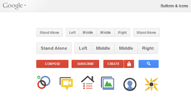 |
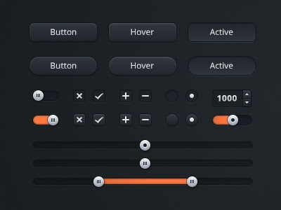
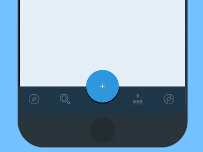
Google buttons are designed efficiently without compromising the artistic element. A combination of HTML5 and CSS3 is used to create them. A subtle drop shadow to the bottom from CSS3 gradients has created an agreeable degree of "virtual realism." |
 |
| Delightfully tacky with a good sense of humor |
 |
"I feel like [Apple] has concentrated too much on mimicking the visual skeuomorphic approach rather than concentrating on the actual functionality," says the former senior UI designer at Apple.
|
An artistic design is an act of creation of a balanced composition with its own set of meticulously defined aesthetic criteria, which stimulate intellect and intuition. The power of its magic is revealed when somebody copies that act,. No matter how brilliant the copy is, all those disciplinary criteria in the original will be completely annihilated -- the copy wouldn't be a piece of art.
There is always tension between artists and technical teams, engineers, or developers. Authentic art doesn't care about technical aspects, and that is how it should be. The best art forces all to bow; the technicians should be at the service of the artists. They have to make everything possible to adhere to the wishes of the artists -- no compromise is allowed. That is the art's command. Compromise corrupts and contaminates the art. If the technicians and developers find they cannot execute the command of an artist they have to walk away and let more competent technicians replace them. Unfortunately, in today's organization of the industry, they are technicians who are supposed to know best; after all, they’re the ones bringing an application into the market on time, and if it sells, who cares what it looks like. And this is how art has been marginalized in today's digital world.
There are always those apologists who argue design is not completely an aesthetic concern, nor is developing an entirely technical one; designers must consider how functionality affects form, and developers must be creative in building out functionality. A typical argument is:
"Unfortunately, current design discourse is not very supportive of its community. One reason is the largely (auto)biographical artifact of the designer as a lone, artistically creative and publicly visible genius who is far ahead of his or her time. In fact, such designers, rare as they may be, usually derive their visibility and aesthetic influence from being promoted by influential producers or corporations who need them, much like medieval court artists were adopted by rulers to hide their power behind cultural concerns. This ideal, pursued by many but achieved by few, is hardly supportive of a viable design community. It conceals both the hard work that goes into design research and practice and the actual failures that could enter the stock of professional knowledge and be instructive to other designers. Its individualism marginalizes the collaborative or dialogical nature of most design accomplishments and retards knowledge of successful team methods in design. It also sidesteps the political and managerial skills by which good designers become who they are. The self-serving fiction of the ingenious designer seems almost parasitical on the very discourse community without which he or she can hardly be." An Invitation to a Responsible Future.
This is of course the root cause of mediocrity in today's digital art. Design is absolutely an aesthetic concern, created by an individual artist and not by the conveyor belt of a viable design community. Development is an entirely technical issue, it is done in a cooperative framework -- that tries to homogenize and standardize. If a designer creates a new form the functionality must be redefined, reparametrized, and reevaluated by technicians. Dada design could not have come about if printers of the early 20th century had the power to impose on them their definition of functionality.
In this context, it was Apple's push toward skeuomorphic interfaces in its iOS and OS X platforms that reportedly started a polarizing non-topic within the IT industry and among User Interface designers. There are reports that Steve Jobs, who had undeniable artistic taste, was one of the first proponents of the controversial design scheme. Of course, such reports may just be the interpretation of those who do not have any clue about how to comprehend an artistic taste and assume that it can be summarized in a set of characteristics under the label of skeuomorphism. Skeuomorph is defined as "an ornament or design on an object copied from a form of the object when made from another material or by other techniques, as an imitation metal rivet mark found on handles of prehistoric pottery". Some designers have used the term to describe representational designs.
 |
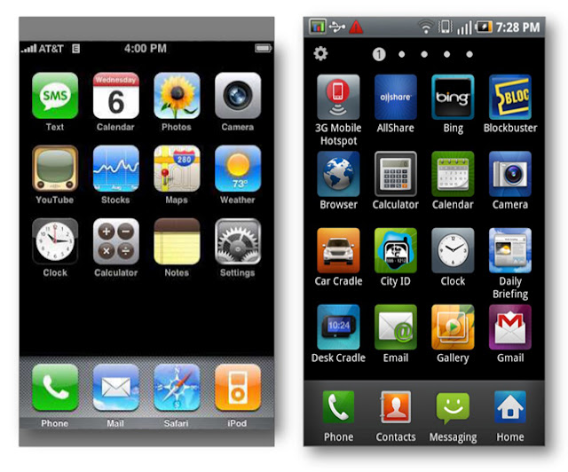
A classic skeuomorphic design by Apple,
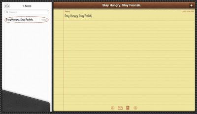
As designer Tobias Bjerrome Ahlin points out, when it’s used appropriately, skeuomorphic design can give users a quick sense of what an app does. This is especially true for non-experts. How do you convey to someone that Notes is where you jot down a grocery list but Pages is where you type up a book report? If both apps showed you nothing but a blank screen, a novice wouldn’t know what to do. But since it looks like a notebook, Notes doesn’t even need a help screen. Hokey as it is, the legal pad and ugly handwriting font tell the whole story in a split second: Notes is for jotting things down.
|
In fact, as we discussed in Chapter 43, in 1926 Magritte in his "Ceci N'est Pas Une Pipe" had already exposed the contradictions that exist between the visual and textual representations. However, that philosophical inquiry about the authenticity of representation, as developed for example by Foucault in his book The Order of Things in which his thesis that the law of nature is constituted by the difference between Man's language and his observations appears to be absent in the recent UI controversy regarding the virtues of Flat Design relative to Skeuomorphism.
 |
| A skeuomorphic design may not be artistic, but still tasteful... |
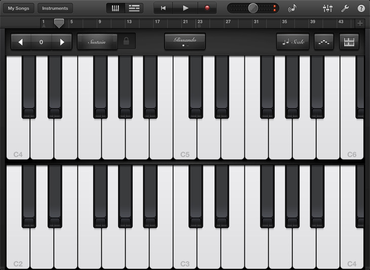
... or cute like this iPhone app Metronome by MarketWall. But as Swedish designer Tobias Ahlin has argued: ... |
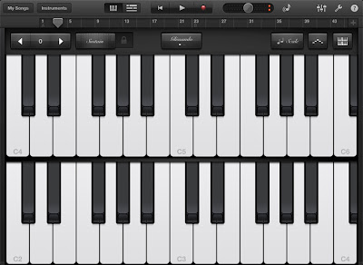 |
| ... "There’s a very good reason Garageband for iPad looks like this: |
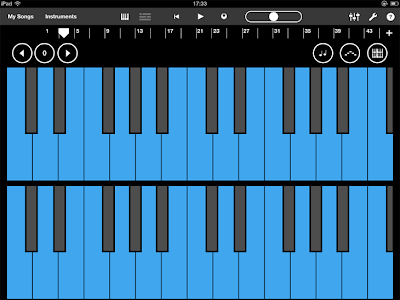 |
| ... and not like this. And that is just taking away the realism. Removing skeuomorphism would leave us with something like this: |
 |
| While this may be more functional, cleaner, and more “true to the functions of the interface”, it’s not fun. I could as well be creating music in Excel. Apple’s Garageband interface not only presents features in a clear and understandable way, but it also adds to a beautiful, fun, and memorable experience." |
In this context, UI designers were mostly talking about Apple's aesthetics of skeuomorphic interfaces such as calendars with faux leather stitching, bookshelves with wood veneers, fake glass, and paper, and brushed chrome. Some have reported that this visual representation style was first implemented by software designers to help ease users into the unfamiliar world of computing. Apparently, the style has became unpopular, or as a New York Times article reports:
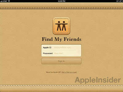
But Apple causes conniptions among designers when its visual metaphors seem outdated or downright archaic. (...) Apple’s use of textures representing physical materials is also often ridiculed. In addition to linen, Apple has found opportunities to decorate the borders of its software, including the Calendar app on the iPad and the Find My Friends app on the iPhone, with a tan faux-animal skin that some critics have sarcastically called Corinthian leather, after the upholstery used in Chrysler cars in the 1970s.
Apple design chief (Sir) Jonathan Ive, who has been named one of the most influential people in the world in 2013's TIME 100, is reported that has made his distaste for the visual ornamentation in Apple’s mobile software known within the company. It is expected that he would move the company toward a less skeuomorphic aesthetic after the departure of Scott Forstall in 2012.
On the other end of the spectrum, Windows 8 has adopted the Swiss Grid Style under the banner of Flat Design which is becoming a new trend. Recall from Chapter 42 that the Swiss Grid Style asymmetrically organized the design elements on a mathematically-constructed grid in order to create visual unity in a composition in the most legible and harmonious means for structuring information. It presented visual and textual information in a clear minimal and factual manner with sans-serif typography. Flat design also uses a minimalistic approach that emphasizes usability, with clean, open space, crisp edges, bright colors, and two-dimensional/flat illustrations.
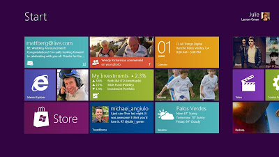 |
Microsoft’s Window 8's operating system, " Metro", offers flat squares with large typography and can be traced back to Swiss design. It has received many accolades from the software design community as the new canonical criteria for good design.
|
 |
| ... But it also can be ugly |
 |
Skeuomorphic design can also be minimalistic, and ...
|
 |
| ... elegant, or ... |
 |
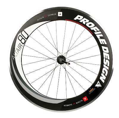
| ...it can be imaginative, |
 |
| ... powerful,... |
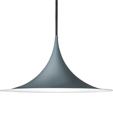 |
| ..., sophisticated, ... |
 |
| ... or expressive. |
 |
| It can appear quite modern,... |
 |
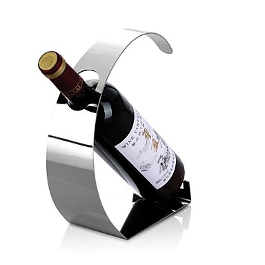
| ... intriguing ... |
 |
| ... intricate and... |
 |
| ... avant-garde! |
 |
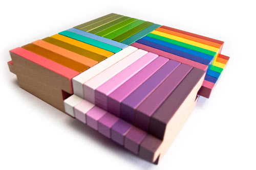
| An artistic design is ... well artistic. It introduces its own organic discipline, ... |
 |
| ... and its enthralling balance is uplifting. |
 |
| A minimalist flat design may be intelligent and inspiring... |
 |
| ... and punchy! |
 |
| or it can be boring ... |
.
 |
| ... mediocre. |
 |
| ... and ! |
 |
The image on the right is Apple’s intellectual property and the other is a competitor’s product. Under the law as set forth by the U.S. Court of Appeals for the Federal Circuit in Egyptian Goddess, Inc. v. Swisa, Inc., 543 F.3d 665 (Fed. Cir. 2008), the test for design patent infringement is “whether an ordinary observer, familiar with the prior art, would be deceived into thinking that the accused design was the same as the patented design.”
|
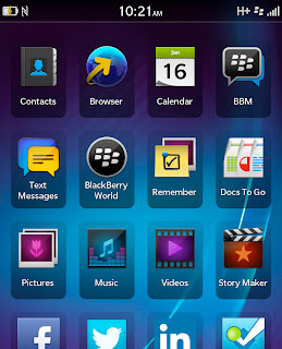 |
BlackBerry
|
 |
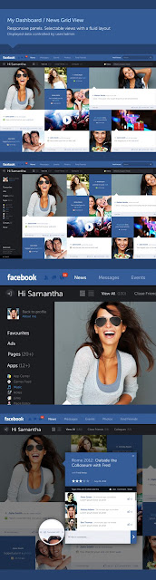
| Systematic but Uninspiring design of Facebook |
 |
| Window 8 |
Material Design
In 2015 Google unveiled Material Design. “Material,” was used as a metaphor, as Google explained:
A material metaphor is the unifying theory of rationalized space and a system of motion. Our material is grounded in tactile reality, inspired by our study of paper and ink, yet open to imagination and magic.
Critics of flat design argue that it’s gone too far; that it was too radical in removing all skeuomorphs, even the useful ones. Material Design appears as a synthetic approach to flat design, using harmonic gradients, layering, and animation to simulate a sense of reality while still retaining all the aesthetics of flat design.
One of the main principles of material design is to mimic effectively the real world but to adhere to aesthetic principles. Avoiding overly realistic looks at the expense of visual balance.
 |
| Material button by Mauro Marini on Behance |
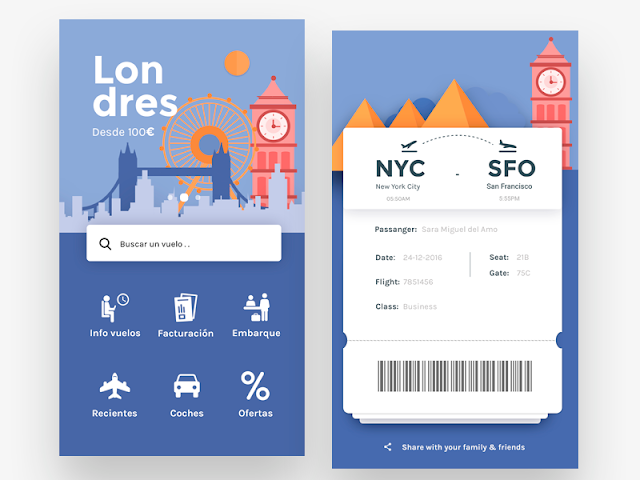 |
| Flights App, Home & Boarding pass by Sara Miguel del Amo |
It’s not easy to prejudge the artistic merits of a skeuomorphic or a flat design solely based on a set of rigid criteria. The artistic merits of a design are not related to the style of execution.
Material is in fact a synthesis of skeuomorphic and flat design as some elements of the two styles are combined to provide a clean and attractive layout. Incorporating a number of the Swiss grid system's principles. Material Design has a set of theoretical principles:
Material is the metaphor
- Material as a metaphor aims at a unifying theory of a rationalized space and a system of motion. It is inspired by the study of paper and ink.
- The surfaces and edges of the material provide visual cues in the physical world, using realistic light.
Bold, graphic, intentional
.
- The foundational elements of print-based design – typography, grids, space, scale, color, and use of imagery – guide visual treatments.
Motion provides meaning
- All action takes place in a single environment. Objects are presented to the user without breaking the continuity of experience.
- Motion is meaningful and appropriate, serving to focus attention and maintain continuity.
However, Material design at present is not that different from flat design. Unfortunately, there has been too much emphasis on its theoretical justification and not much on creativity and imagination. It may encourage the mass production of cookie-cutter designs. As flat and Material designs expand their domination over the internet, they inevitably become boring and uninspiring. Everything then would be ready for a new paradigm shift.
UI is involved in all things design and what the eye sees. This includes everything from icons, typography, imagery, and layout, to even negative space. It prioritizes the ease of getting a user from point A to B with minimal effort and thinking involved. It’s important to keep the design aesthetically pleasing to the user as it is perceived to be more user-friendly.
 |
The grid systems can be used as a framework for creativity, but it should not act as a trap. Even a simple grid can provide many options for any juxtaposition of content in a flexible and thoughtful approach.
|
Some Grid programming examples by Rune Madsen
 |
| The simplest possible grid to make is a manuscript grid that only requires 4 variables: x,y, width, and height to define the rectangle in which we place content. Example on Github |
Window 10


Thank you, very refreshing. The "flat" UI era also has an implicit neo-futuristic approach which I would love you to mention more.
ReplyDeleteA
Brilliant and thorough examples.
ReplyDeleteEvery take on flat design is a huge disappointment to me. When I was young, I used to be captivated by simple aesthetics, like toolbar buttons in Windows 98; I'd click & hold a toolbar button, and casually move the mouse on & off the button, just to watch it move in & out of the screen, it looked like a virtual push button, and I loved it. When I was a teen, I wrote applications for Windows, as a hobby, and I was so proud of myself for programming my own button animations in my apps, that looked just like the standard buttons in the Windows interface.
ReplyDeleteI like a textured GUI with depth, and I don't mean leather, wood grain, or machined metal skeuomorphic design, like Apple got carried away with. I mean beveled edges on buttons, text boxes, and window frames that create the illusion of thickness, of substance. If fact, before the introduction of Windows, Macintosh introduced it's GUI with a black & white flat design, and some DOS applications tried to make the appearance of 3D buttons & menus by utilizing various extended ASCII characters, but for all intents & purposes, it appeared more 2D than 3D.
So now, all graphical interface designers have, ostensibly, reverted UI design standards back to what we had in the '80s. Moreover, icons were rich, detailed representations of their functions, now they're two-tone, uninspired, unprofessional looking travesties.
Contrary to everything I've said, I DO like this article, it's actually unbiased. I get really frustrated seeing thousands of people praising Microsoft's Metro UI, and Google's Material UI, because I just don't see what's so "brilliant" about it. I also don't understand this: flat web page design doesn't bother, but flat software design does. So surfing the web is no big thing, yet I'm appalled I can't get a copy of Windows, or an Android device, with a graphic aesthetic I can at least be content with.
Thanks for this post.
ReplyDelete