Introduction
Magazine cover design has become a complex creative art in the United States since the late 19th century due to its great wealth, allowing publishers to spend large sums of money to create works of art using sophisticated printing techniques. Informed by the Golden Age of American Illustration between 1880 and 1960, it stemmed from advances in printing technology, an abundant supply of inexpensive pulp-based paper, and mass mailing that acted as impetus to a meteoric rise of new magazines. In this era, publishers and advertisers capaciously demanded from artists to create artworks that would visually communicate with their audiences in exquisite styles that would appeal to aesthetic tastes of the modern-age public, and they were able to pay high fees for the work of first-rate artists.
The art of visual communication is more difficult to create than conventional art objects that draw inspiration from abstract thoughts or the aesthetic exploration of images. A magazine cover is the response to a precise order, limited by deadlines and confined by the restrictions of an editorial directive to the artists, such as R.K, Ryland, Dean Cornwell, Harvey Dunn, James Montgomery Flagg,Charles Dana Gibson, Maxfield Parrish, Howard Pyle, John Cecil Clay, Porter Woodruff, Frank Xavier Leyendecker, James Preston, Leslie thrasher, Ruth Ford Harper, Helen Dryden, George W Plank, Cushman Parker, Norman Rockwell, C. Coles Phillips, Mead Schaeffer, Georges Lepape, A.H. Fish, Jessie Willcox Smith, Stanley W. Reynolds, John Rawlings, and N.C. Wyeth, as well as many other lesser-known but talented artists created works of extraordinary caliber.

For the cover of the March 16, 2026, issue, the cartoonist Barry Blitt portrays President Donald Trump in his latest guise, as a general heading to war in the Middle East. This all comes after years of promising his voters “America First!” and “no more Forever Wars.” Blitt’s cover image shows the President at his Florida golf resort standing in his martial golf cart alongside his caddy and Secretary of War, Pete Hegseth.
Ringing Liberty Bell by J.C. Leyendecker, 1935-07-06:

“Queen of Spring” by J.C. Leyendecker from May 23, 1931
Embodying the mellow majesty and vivacious energy of the Jazz Age, Leyendecker, who studied in Paris at the Académie Julian, created magnificent cover-arts in the 1920's. He represented idealized beauties placed in chimerical settings, using undulating contour lines of great simplicity and subtlety with sharp contrasts of darks and lights. Howard Pyle, regarded as the father of American visual communication, invented the quintessential pirate character that still inspires movies over a century later. His student N.C. Wyeth gained national fame for his paintings done for the Scribner's Illustrated Classics series of novels. The iconic imagery he created for books such as Treasure Island and Kidnapped helped establish the era's vogue for adventure stories. Easel-painter artists, such as John Sloan and William Glackens, also created cover-art in this era. James Montgomery Flagg’s noted self-portrait representing ‘Uncle Sam’ exclaiming ‘I Want You!’ became a national icon. Charles Dana Gibson's portraiture of smart, athletic, and elegant all-American woman epitomized by his ‘Gibson's Girl’
Cover-artwork was recognized to be a democratic art form. The profusion and prominence of imaginative design of magazine covers incorporated a vast body of artwork which furnished the humanity's visual culture with an enlightening source of socio-historical intelligence and delight. The cover-artwork was a source of inspiration for the Abstract Expressionists. When one reflects on these cover-artworks, particularly those of the 1900-80 era, it becomes immediately obvious that these covers contain important messages about their times. They are inspired by a specific aura of socio-cultural tensions, informed by shared convictions, experiences, events, and outlooks, and spoken to aspirations and anxieties of the modern age. A juxtaposition of certain pictures which graced these covers with an exploration into the social history that served as the background to those pictures, can tell us a great deal about how Visual Communications dealt with and represented such issues as race, class, religion, and political conflicts. A look at this history can help us to place these covers back into their cultural context and, combined with a knowledge of the style, audience, and biases of the magazine itself, can in turn tell us a great deal about how the American people in the first eight decades of the 20th century, before entering into the digital age of internet, understood the global issues, and how this understanding shaped the world at large, because of the immense economic and military power of the United States.
Review, was the first magazine type publication, published in London in 1704, by Daniel Defore, the author of Robinson Crusoe. Taking full advantage of the liberal policies of print in Queen Anne‘s reign, Defore wrote about the issues as he liked and published them. However, it was Edward Cave's Gentleman's Magazine, published in January 1731, and printed at St. John's Gate in London, which was the first 'magazine' in the modern sense. As a 'repository of all things worth mentioning' it was the most important periodical in 18th century England, reflecting in its pages the diversity of Georgian life, politics and culture. It ceased publication in 1907.
 |
| Christian History magazine , the very first successful magazine in America |
In 1741, the idea of magazines was introduced by Benjamin Franklin and Andrew Bradford into America. Published in 1743, The Christian History magazine was the very first successful magazine in America, which unlike its short-lived predecessors lasted a few short years. Non of these magazines had a familiar cover page.
The Royal American Magazine was established by Isaiah Thomas with the issue of January, 1774, and continued by him through the issue of June, 1774. It was immediately followed by Joseph Greenleaf, who published the magazine from July, 1774 to its final issue in March, 1775. The fifteen numbers contained twenty-two full-page engraved plates, thirteen signed by Revere, and three by Callender. In common with the practice of the times, the text was largely taken from London magazines, and the plates were nearly all based on English originals.
In 1833, Samuel Goodrich created Peter Parley's Magazine to help him teach children about the world; which kept up a mixture of fact and entertainment.
The covers of the early magazines were very much like those of the books. Most were highly decorative, and some incorporated a table of content.
In 1819,Eliakim Littell moved to Philadelphia and established the National Recorder, a weekly literary paper. The paper went through a series of name changes from the National Recorder, to the Saturday Magazine, and then to the Museum of Foreign Literature and Science. He then moved to Boston, Massachusetts and in April 1844 began publishing Littell's Living Age, a weekly literary periodical, which was a selection of various articles from different publications. The cover page of Littell's Living Age, was innovative and groundbreaking for its time.

The "dime novels", which were aimed at a less literate and poorer mass audience, created prototype for magazines. Because they were made of the newly available, cheap wood pulp paper (the original "pulp fiction"), using flimsy paper covers, they could offer titles as cheap as a dime.
The first American "dime novel" was created in June of 1860 when Irwin Beadle and his brother Erastus published a story called "Malaeska". The first edition of "Malaeska" was published without a cover illustration. In an early reprint of the story, however, a dark-skinned Malaeska appears on the cover in a feathered headdress holding her dying husband as he reaches out for their young (very light-skinned) son. Early dime novels, first printed in orange wrapper papers, were patriotic, often nationalistic tales of encounters between Indians and backwoods settlers. Beadles' company (later to become Beadle and Adams) soon faced competition from the likes of publishers such as Street and Smith and Frank Tousey.
 |
|
The New York Weekly, Log Cabin Library published in 1840-41, featuring the best of Street and Smith's Far West adventure stories, introduced a more dynamic sense of visual communications. By the mid-1890s, bold color covers depicting scenes of bloodshed and courage appealed to a mostly adolescent audience. Such illustrations rendered the sensationalism of the text in bold pictorial form and quickly became an indispensable means of attracting readers and increasing dime novel sales.
The more conservative magazines such as Godey's Lady's Book, of Philadelphia of 1830 and Peterson's women's magazine of 1872, stoked to traditional decorative covers with some emphases on typography. Nevertheless, they also gradually began to incorporate some illustrations of women.
The New York Fashion Bazaar

George Munro was a successful publisher of cheap fiction whose firm operated from 1865 to 1893. Munro was born in Nova Scotia, Canada, on November 12, 1825. Though trained as a minister, he never served as one. Instead, in 1856 he moved to New York City where he was employed by the American News Company and next by Beadle and Adams. In 1863, he left Beadle and Adams with Irwin Beadle to create Irwin Beadle and Company. Irwin, who had a history of irregular employment, left the firm in 1864 and the firm was renamed George Munro and Company. In 1868 the firm was renamed again, this time to simply George Munro and it would so remain until Munro retired in 1893.
The first volume of George Munro's New York Fashion Bazaar appeared November 8, 1879 and featured the story, The Romance of Darkecliffe Hall; or, The Story of My Life on the front cover. The front cover was always illustrated, though the content of the illustration varied. It was most often a scene from the main story, but fashion plates and pictures of personalities, such as Sarah Bernhardt and Marie Christine, the Queen of Spain were also featured. On several occasions color illustration of fashions and fancywork were included inside.
Cosmopolitan Magazine published 1886 and was billed as a woman’s fashion magazine that was also interested in “Some Examples of Recent Art” and “The Progress of Science.” It gradually became a showcase for new fiction, publishing works by authors like Upton Sinclair, Sinclair Lewis, Kurt Vonnegut, Willa Cather, and H. G. Wells. Cosmopolitan was known for it's beautiful covers portraying Hollywood's most popular and attractive movie stars. It was imperative that these depictions not only be recognizable, but more beautiful and glamorous than the camera or "real life" could present. However, in recent years its content deteriorated, and in the words of the late Kurt Vonnegut: “One monthly that bought several of my stories, Cosmopolitan, now survives as a harrowingly explicit sex manual.”
The magazine's covers, once artistic and creative, have now adopted the banal commercial culture of presenting a youthful celebrity in a hackneyed, vulgar, and feckless style which appears as the accepted norm for nearly all the magazines.
 |
June 1911, by Harrison Fisher
Harrison Fisher (1877 - 1934) was born in Brooklyn, the son of Hugo Antoine Fischer (sic), and the grandson of Felix Xiver Fisher, both artist immigrants from Bohemia. In 1886, the family left New York and moved to Alameda, California near San Francisco, and two years later Harrison’s mother died. In 1893, his father art was exhibited at the World’s Columbia Exposition in Chicago. With father’s training Harrison revealed his talent at the early childhood, being extremely skilled at drawing at six years of age. He was admitted at the Mark Hopkins Institute of Art, and as a teenager sold artworks to local newspapers, and soon was able to publish them at "Judge", a national magazine. Soon he was hired as a staff artist; drawing society functions, sporting events, and illustrating news items, at "San Francisco Call". Few years later he joined the "San Francisco Examiner", one of William Randolph Hearst’s prominent papers.
In 1897, he landed a job as in-house cartoonist and illustrator with the prestigious "Puck" magazine. He became a celebrated visual artist, who in the early 1900s was doing freelance assignments for the "Saturday Evening Post" and as well as other respected journals including McClure’s Magazine, Life, Scribner’s, The Ladies’ Home Journal, and Cosmopolitan. Hearst tried devilishly to keep him busy to deter others from commissioning this now famous illustrator. Hearst’s newly renamed magazine, The American Weekly, gave him more assignments than any normal illustrator could possibly complete, yet he was able to continue to accept freelance work in advertising from Armour’s Beef, Warren Featherbone Co., Pond’s Soap, but the Saturday Evening Post kept him busiest with more work.
In March, 1908, Success magazine published an important piece by Fisher illustrating an article by Oliver Opp entitled, ‘The American Girl.’ The article created a pandemonium and the demands for Harrison Fisher’s beautiful girls surged. According to the article “since Charles Dana Gibson has given up his pen and ink work for oil paintings, Mr. Fisher has become his natural and popular successor.” ‘The Fisher Girl’ began to eclipse ‘The Gibson Girl,’ as she became the epitome of feminine beauty with her elegance, athleticism, independence, and intelligence. Between 1907-1914, the ‘Fisher American Belles’ was published in many forms in various publication and even once simultaneously in both The Ladies’ Home Journal and Scribner’s Magazine. Harrison Fisher created over eighty covers for the Saturday Evening Post. From 1913 until his death in 1934, Fisher created almost every cover for Cosmopolitan magazine.
|
 |
| February 1912, by Harrison Fisher |
 |
| March 1913,;by Harrison Fisher |
 |
| April 1913, by Harrison Fisher |
 |
| November 1925, by Harrison Fisher |
 |
January 1930, by Harrison Fisher
|
 |
April 1932, by Harrison Fisher
|
 |
April 1935, by Bradshaw Crandell
John Bradshaw Crandell, was born in Glen Falls, New York. "Brad" as friends knew him, became interested with art through the Magazine covers like Colliers; Saturday Evening Post; Century, and others. After graduation from high school, Crandell moved to Chicago and after a brief period attending classes at the Art Institute, was admitted at Weslyan University. Soonafter World War I erupted in Europe, he "interrupted" his education and enlisted in the Navy serving as a machinists 1st mate. However, he was discharged and returned to New York and worked in the canteen at the Bryant Park YMCA as a cashier, when he met, and married the former Myra Clarke. After attending the Art Students League for a short period, he had to drop out because of time constraint in executing various commercial commissions he was receiving. A mere four years after graduating from high school, Crandell signed his first major contract to produce a cover- artwork for Judge magazine, in 1921, at the same time he had been producing advertising illustration for various clients.
In 1925, Crandell opened "John Bradshaw Crandell Studios" at 405 Lexington Avenue where he recalled producing one editorial artwork for Redbook magazine "early in his career." By 1930, he was producing covers for many of the magazines like The Saturday Evening Post, Colliers and American. His studio produced countless advertising illustrations for a variety of "elite" clients and products, depicting an attractive woman or couple engaged in some glamorous or exciting activity. Crandell's Palmolive skin soap advertising poster during the early 1930's was a sensation. However, it was his twelve years of Cosmopolitan magazine covers that made his name a household name. He also produced covers for Ladies' Home Journal and various other "Curtis" publications. During WWII he produced a variety of war effort illustration art, and in 1939 he provided the artwork for the Salvation Army fund drive, also producing numerous illustrations for General Motors Pontiac Division.Sadly, by 1965 Bradshaw Crandell had contracted cancer. Reviewing letters written by him at this time, one finds no remorse or bitterness as a result of his condition. There is merely grateful appreciation for the innumerable admirers of his work. He passed away in the comfort of his home January 25, 1966 at the age of 69.
|
 |
| August 1935, by Bradshaw Crandel |
Francis Attwood, Dean Cornwell, James Montgomery Flagg, and Harrison Fisher.
.
 |
| October 1939, by Bradshaw Crandell |
 |
| Lana Turner on the cover of the March 1942 Cosmopolitan, illustration by Bradshaw Crandall. |
 |
In 1886, F. M. Lupton, a New York publisher specializing in domestic and agricultural subjects published People's Home Journal, that was lasted until 1929. According to Frank Mott it " eventually became a competitor of the greater women's magazines. (...) When M. B. Gates became president of the publishing company after Lupton's death, there were better contributors, better format, and better paper. The price was raised to 10 cents in 1917 and 15 cents in 1920. Ben Ames Williams, Zoe Beckley, George Madden Martin, and Ellis Parker Butler were among the contributors. [Mott, Frank Luther. A History of American Magazines, 1741-1930. Cambridge, MA: Harvard UP, 1930-68.Vol. IV, page 366] " Its best cover art was toward the end of its life.
|
 |
| November 1919, Helen Dryden |
For over a hundred years Vogue magazine has represented modern American women. Vogue started as a high society paper in 1892 by Arthur Baldwin Turnure. The original investors for Vogue included the Vanderbilts, A.M Dodge, William Jay, and Marion Stuyvesant Fish. Turnure hired the socialite Josephine Redding as the magazine’s first editor.
Vogue was not focused on advertising sales and revenues were decreasing for its wealthy stockholders. This soon changed when Conde Nast bought Vogue in 1909. Conde Nast graduated from Georgetown where he became close friends with Robert Collier. Robert Collier soon inherited Collier’s Weekly from his father and gave Nast a job as an advertising manager. Under Nast’s management, Collier’s Weekly became first place in advertising revenue for magazines. His salary grew to forty thousand dollars a year at Collier’s Weekly. Nast then left the magazine to build the Home Pattern Company. He wanted to expand his business into fashion news and set his sights on Vogue.
Conde Nast pushed for the covers of Vogue to be done by the best illustrators and photographers. Thus, the covers of Vogue became notable and reflected the art movements of each decade of the twentieth century. Conde Nast died in 1942. Time Magazine said that, “for a generation he was the man from whom millions of American women got most of their ideas, directly or indirectly, about the desirable standard of living.” The Conde Nast Corporation still lives on today.
 |
| May 1918, Porter Woodruff |
 |
| November 1920, Helen Dryden |
 |
| January 1923, George W Plank |
 |
| January 1925, Georges Lepape |
 |
| May 1929 |
 |
| July 1929, Eduardo Benito |
 |
July 1932, Edward Steichen,
This is the first ever photographic cover shot by Edward Steichen, though he is not credited within.
|
 |
May 1939, René Bouché
"Bouché sketched this gay corner of Suzy's salon for our cover," explains Vogue. "The two cartwheels in the foreground – perfect for Ascot – are at Fortnum and Mason."
|
 |
| September 1945, John Rawlings |
 |
November 1962, Gladys Perrint
Gladys Perrint's cover illustration was a desperate attempt to revive the artistic style of the magazine's cover, which has been deteriorating fast during 1950's. But, the corruption of style resumed in force soon afterward.
|
 |
December 1975, David Bailey
Thirteen years after Gladys Perrint's cover David Bailey tried once more to reintroduce an artistic element into the design of Vogue's cover. This was perhaps the last attempt,
|
On May 2, 1885, an established journalist and businessman, Clark W. Bryan published Good Housekeeping in Holyoke, Massachusetts. He promised readers that he aimed to "produce and perpetuate perfection - or as near unto perfection as may be attained in the Household". Bryan died in 1898 by suicide and after his death, James Eaton Tower assumed the role of editor over the 1899-1913 period. The magazine was bought by John Pettigrew, and in 1900 Phelps Publishing Company acquired it and moved its publication to Springfield, Massachusetts.
The early covers of Good Housekeeping were created by celebrated artists such as Robert Knight Ryland (1873-1951) and James Moore Preston (1873-1962). R. K. Ryland work was published on the March issue of 1902, he was a renowned New York based illustrator and fine artist, who worked extensively creating modernist murals and posters. James Preston created a number covers of for Good Housekeeping in 1904, he also produced a cover for the April 1905 issue of Saturday Evening Post. He became more active in illustration during the 1920s. Preston who studied with Thomas Anshutz at the Pennsylvania Academy of the Fine Arts, in Philadelphia married artist Mary Wilson Preston. Both Preston and his wife were associated with Robert Henri and the Ashcan School of painters.
 |
| November 1901 |
 |
| March 1902, R.K, Ryland |
 |
| July 1904, by James Preston |
 |
| August 1904, by James Preston |
 |
| December 1904, by James Preston |
Cushman Parker (1841- 1940), born in Boston, created the covers of the magazine during the 1906-07 period. He had a long career in which he also produced covers and illustration for many other magazines such as the covers for September 1916, and May 18, 1935 issues of Saturday Evening Post. John Cecil Clay (1875-1930), born in Ronceverte, West Virginia designed the covers during 1908-09 period . He was a student of Henry Siddons Mowbray at the Art Students League of New York. His graphic style emphasized on dynamic patterning of lines and natural shapes and was more dynamic than Cushman's style. Clay ornamental portraying of a single woman as the focus of his powerful compositions, always alive, restless, and at the same time balanced, created a visual representation of a mythical grace, defined by asymmetrically undulating lines.
 |
| June 1906, by Cushman Parker |
 |
| December 1906, by Cushman Parker |
 |
| February 1907, by Cushman Parker |
 |
| April 1907, by Cushman Parker |
 |
| August 1908, by John Cecil Clay. |
 |
| August 1909, by John Cecil Clay |
In 1910-11, Ruth Ford Harper (1883-1922), created the covers of various issues of Good Housekeeping, Harper's weekly and Sunday Magazine of the New York Tribune under her pseudonym of R. Ford Harper. Ruth who after marrying Alexander Hammerslough in 1906 had became Ruth Heilprin Hammerslough, and lived in New York never became a widely recognized artist because she was working under a pseudonym in such a large city. Born in Washington, DC, Ruth Ford Harper traveled to Europe for three months twice, first when she was 19, and again three years later in 1905. She was a student of William Merritt Chase. In November 1918, she exhibited her art at the Dowell Club 108 W. 55th St, under her real name Ruth H. Hammerslough, and in August 1920 she traveled to Paris to study. In Paris she lived at 31 rue Campagne-Première in the heart of Montparnasse, neighboring artists like Man Ray, Marcel Duchamp, Picabia, Kiki de Montparnasse, Rilke, Tristan Tzara, Éric Satie and Vladimir Maïakovski.
 |
| November 1910, by R. Ford Harper |
 |
| April 1911, by R. Ford Harper |
In 1911, Hearst Publishing Company bought the magazine and moved it to New York where it is still published today by the same company. Over the 1914-17 period, C. Coles Phillips (1880- 1927) joined the Good Housekeeping. Phillips is one of the most prominent artists in the "Golden Age of American Illustration", whose masterly use of the "fade-away" technique, that became the hallmark his style. .
C. Coles Phillips was born in Springfield, Ohio, , and enrolled in Kenyon College, where some of his earliest illustrations appeared in the school's yearbook. He dropped out of school and moved to New York, and for a short while took night classes at the Chase School of Art while working as clerck. Soon he landed a job in an advertising studio that used an "assembly-line" approach to produce advertising posters, where one worker did the heads and passing the work down to the next, who painted the dress; and passing it to the next to paint the limbs. Phillips was the artist who was assigned to paint the feet, in which he got a chance to demonstrate his skills in painting gracefully shaped legs and ankles for hosiery advertising posters. Later he joined an advertising agency, for awhile before establishing his own "C. C. Phillips & Co. Agency" in 1906, employing two other artists. But he was an artist and managing a business was not his cup of tea.
He closed down his company and rented a studio, promising the landlord that he could soon sell his works and pay the rent by the end of the month. He submitted his work to "Life", a humor magazine, and it was accepted as a black-and-white centerfold on April 1907, based on poem by Omar Khayam's Rubiyat. He created several more of his black-and-white illustration for Life, and by the spring 1908, when Life decided to use color covers, he was asked to produce a bold and distinctive design. On February 20, 1908, Phillips' first cover appeared on the Life issue in which he introduced his "fade-away" technique,that was inspired by a violinist friend's suggested outlines of his figure, represented by just the highlights of his violin, the shine on his shoes, and the small impression of his white shirt. This first cover in color depicted a young girl in a polka-dot dress, feeding corn to a flock of chickens. It was so successful that Phillips was commissioned for fifty-four more covers until 1912. His use of negative space which allowed the viewer to "fill-in" the image; also reduced printing costs for the magazine, since instead of using the high-cost full-color printing Life was getting the same impact by just one or two colors. In 1912, Phillips signed a five-year contract with Good Housekeeping, agreeing to paint a cover image every month. He became a celebrated artist, and greatly in demand throughout the world.
 |
| August 1912, C. Coles Phillips |
 |
| March 1914, C. Coles Phillips |
 |
| August 1915, C. Coles Phillips |
 |
| August 1914, by C. Coles Phillips |
 |
| February 1915, by C. Coles Phillips |
 |
| January 1916, by C. Coles Phillips |
 |
| May 1917, by C. Coles Phillips |
 |
| February 1917, by C. Coles Phillips |
 |
| April 1917, by C. Coles Phillips |
In 1918 Jessie Willcox Smith (1863-1935), a popular children’s illustrator, illustrated every cover of Good Housekeeping from 1918 to 1932. Whereas the magazine’s previous artists had represented women participating in various activities such as skiing, playing guitar, serving food, or making a bed, Smith’s covers all depicted children at play, often with their mothers. Throughout her career, she illustrated over 40 children's books, illustrations for two of George MacDonald's fantasy works At The Back of The North Wind (1919) and The Princess and the Goblin (1920). She illustrated Charles Kingsley's ;The Water-Babies ;(1916), and thirteen color drawings of the water-babies in charcoal, watercolor and oil. Her artistic style was conventional "Japanesque" compositions of planes and broad flat masses, with a heavy use the defining line, flattened tones and colors, in conventional lighting. Working in a variety of mediums including gouache, oil, charcoal, and watercolor.
Jessie Smith was born in Philadelphia on to Charles Henry Smith and Katherine Dewitt Smith, who had just moved to Philadelphia from New York. As the youngest daughter of a reasonably well-off investment banker, Smith attended private schools in Philadelphia prior to being sent to Cincinnati as a teenager to finish her studies. She started her career as a kindergarten teacher but after one year she gave it up due health issues. As a tall woman her back gave her trouble to deal with children. Unaware of her artistic talent, when was asked to participate in an art lesson given by her cousin she completed her assignment admirably. The lamp she drew for that assignment, according to her own account " was the turning point in my life, and has shed its light before me ever since. I feel profoundly grateful to it still" (Miller and Whitney 1930, 69). In 1885, Smith entered the School of Design for Women in Philadelphia, and after while applied to the Pennsylvania Academy of the Fine Arts, studiying with Thomas Anshute and Thomas Eakins. She graduated from the Academy in 1888; the same year which her first published work, Three Little Maidens All in a Row, appeared in the May issue of the children's magazine, St. Nicholas. After graduation she was offered a position in the advertising department of the Ladies Home Journal. In 1894 she enrolled in Saturday afternoon classes at the Drexel Institute, and was taught by Howard Pyle, and "with his inspiration and practical help," She was soon "in the full tide of book illustration" (Mitchell 1979, 4).
 |
| March 1930, by Jessie Willcox Smith |
 |
| June 1930, by Jessie Willcox Smith |
 |
| July 1948, Flix Ross |
McClure's Magazine
Samuel McClure established McClure's Magazine, an American literary and political magazine, in June 1893. Selling at the low price of 15 cents, this illustrated magazine published the work of leading popular writers such as Rudyard Kipling, Robert Louis Stevenson and Arthur Conan Doyle. He also promoted the work of educationalist, Maria Montessori.
 |
| November 1896 |
 |
| July 1904 |
 |
| Maxfield Parrish (1870-1966) is arguably one of America's most successful and beloved artists. His brightly colored images of nymphets and idyllic landscapes produced for the Edison Mazda calendars have maintained their appeal for nearly a century. His drawings and paintings graced the covers of Harper's Weekly, Scibners, Life, and Century and many more.. |
 |
| May 1898 |
 |
August 1904, by Jessie Willcox Smith (1863-1935),
Jessie Smith was called a “painter of children” by periodicals of the early 1900s. She became one of the highest-paid women illustraors of all time. Born in Philadelphia, Pennsylvania, Smith attended the School of Design for Women and the Pennsylvania Academy of the Fine Arts. After graduation in 1888 she worked in the advertising and production department of the Ladies' Home Journal magazine. After five years she left to study under Howard Pyle at the Drexel Institute.
|
 |
January 1904, August 1904, by Jessie Willcox Smith (1863-1935),
Smith created magazine covers, posters, calendars, and portraits, and produced hundreds of story illustrations for books and magazines. Although she had no children of her own, children became the focus of her art. She became famous for her sensitive and much loved portrayal of small children in family settings. With her eyesight declining in the early 1930s, she retired from active painting and died in 1935.
|
 |
March 1910, by Frank Xavier Leyendecker
(1876 - 1924)
Considered "the second" or "lesser" Leyendecker, as F X Leyendecker was the younger brother of the longer lived and more prolific JC Leyendecker. Leyendecker parents brought Joseph and Frank to America as young boys (1882). From an early age they both demonstrated a prodigious talent. Their parents did their best to encourage their sons' talent, but as immigrants, they were of limited means.In reality, FX paved the way for JC in almost every periodical and in every style that JC would master. Dozens of pieces show he was every bit as colorful, creative, entertaining and flamboyant as his older brother, with an impressive catalog including posters, cover art, book plates, advertising, and more.
|
 |
September 1911, by Frank Xavier Leyendecker (1876 - 1924)
Frank Leyendecker was equally at home working in either oils or gouache, with strong designs that could be taken in at a glance. His covers for Vanity Fair, the humor Life, and Vogue are stand-outs. Other covers and story work for Collier's, Saturday Evening Post, Leslie's, McClure's. Ads for Durham Hosiery, Remington Guns, Palmolive, Howard Watches, Willy's Motors.
|
 |
| December 1907, by Campbell, Blendon |
On January 4, 1883, John Ames Mitchell, a 37-year old illustrator, founded the Life magazine in a New York City, with a logo that depicted cupids on its nameplate, with the motto “While there’s Life, there’s hope". The magazine faced stiff competition from the bestselling humor magazines rivals The Judge and Puck, which were already established and successful. Mitchell hired Edward Sandford Martin, a Harvard graduate and a founder of the Harvard Lampoon, as Life's first literary editor. The first issue's editorial read:
We wish to have some fun in this paper... We shall try to domesticate as much as possible of the casual cheerfulness that is drifting about in an unfriendly world... We shall have something to say about religion, about politics, fashion, society, literature, the stage, the stock exchange, and the police station, and we will speak out what is in our mind as fairly, as truthfully, and as decently as we know how.
Two years later, in 1885, they hired Charles Dana Gibson (1867-1944) an eighteen years old talented artist and the magazine became asuccess.
Gibson was born into a wealthy New England family in Roxbury, Massachusetts. His artistic talent was revealed to his parents Charles DeWolf Gibson and Josephine Elizabeth Lovett, who at his early childhood enrolled him at the Art Students League in New York City.
A talented artist, Gibson's early influences include Howard Pyle, Charles Keene and Phil May. Life's readers enjoyed the style in which he ridiculed at high society pomposity. His monthly salary taht was started at $33, increased 600 per cent just in three months to $185. Tid-Bits, which was later re-named Time magazine, also bought his illustrations. His works were also were commissioned by Scribner’s Magazine, Century,
Harper's Weekly, and Collier's Weekly. The young women in his drawings became known as Gibson Girls, who he began to draw in 1890. His wife, Irene Langhorne Gibson, an ideal all-American femininity, was the model for ‘The Gibson Girl’ representing the modern, athletic, smart, stylish, and desirable woman.
Among other Life's well-known illustrators were Palmer Cox, A. B. Frost, Oliver Herford, and E. W. Kemble. The magazine discovered many new talened illustrators such Robert LeRoy Ripley who published his first cartoon in Life in 1908. Norman Rockwell’s first cover for Life, "Tain’t You," was published May 10, 1917. Rockwell’s paintings were featured on Life’s cover 28 times between 1917 and 1924. Rea Irvin, the first art director of The New Yorker and creator of Eustace Tilley, got his start drawing covers for Life.
In 1914, when Germany attacked Belgium, Mitchell and Gibson started a fierce campaign to push America into the war. Mitchell who had spent seven years at Paris art schools was a Francophile. Gibson depicted the German Kaiser as a bloody madman, insulting Uncle Sam, sneering at crippled soldiers, and even shooting Red Cross nurses. Mitchell lived just long enough to see Life’s crusade result in the U. S. declaration of war in 1917.
Following Mitchell’s death in 1918, it was Irene Langhorne's wealth which enabled her husband, Gibson, to acquire the magazine for $1 million. But the world was a different place for Gibson’s publication. It was not the "Gay Nineties" where family-style humor prevailed and the chaste Gibson Girls wore floor-length dresses. World War I had spurred changing tastes among the magazine-reading public. Life’s brand of fun, clean, cultivated, humor began to pale before the new variety: crude, sexy, and cynical. Life struggled to compete on newsstands with such risqué rivals.
Despite its all-star talents, Life had passed its prime, and was sliding toward financial ruin. The New Yorker, debuting in February 1925, copied many of the features and styles of Life; it even raided its editorial and art departments. Another blow to Life’s circulation came from raunchy humor periodicals such as Ballyhoo and Hooey, which ran what can be termed outhouse gags. Esquire joined Life’s competitors in 1933. A little more than three years after purchasing Life, Gibson quit and turned the decaying property over to publisher Clair Maxwell and treasurer Henry Richter. Gibson retired to Maine to paint and lost active interest in the magazine, which he left deeply in the red.
 |
| January, 1883 |
 |
| January 1887 |
 |
| February 1887 |
 |
| November 1896 |
 |
| January 1898 |
 |
| April 1898 |
 |
November 1900, by Albert D. Blashfield (1860-1920)
</
Albert D. Blashfield was a personal favorite of John Ames Mitchell. He joined the staff of LIFE in the early 1890's and remained an important illustrator until his death. His major contribution was LIFE's cupid which floats through the pages. His style was striking and handsome but never frilly. He decorated title pages as well as in-house advertisements. He also illustrated several of John Ames Mitchell's books.
|
 |
December 1900, by Maxfield Parrish (1870-1966)
Maxfield Parrish was a unique figure in American art, not belonging to any school, part traditionalist, part inventor, sometime illustrator of gnomes and dragons. Parrish was born in Philadelphia, Pennsylvania. He grew up in an elite Quaker environment while attending the finest universities, such as Haverford College and the Pennsylvania Academy of Fine Arts, which gave Parrish opportunities to explore his artistic potential. Parrish’s artistic talents were quickly recognized by his professors, and soon after graduating, the public began to adore his art as well. Some famous and publicly acclaimed illustrations and artworks are Sage of the Seas, The Florentine Fete, Dream Days, School Days, The Idiot, Daybreak, and Landing of the Brazen Boatman, which won the Beck Prize in the Pennsylvania Academy’s 1908 watercolor annual.
From the late 1800s until the 1920s, Parrish’s style was generated from his view of commercial art and fine art as assets of each other. He accepted many commissions in commercial art, which gained national attention for him and provided his livelihood during this time. For instance, Parrish won his first magazine cover design for the 1895 Easter number of Harper’s Bazaar, which was adored by the public and marked national attention of his work. A mixture of lithographic crayon, wash, and ink on Steinback paper was the technique Parrish used in several of his paintings during this time. Sylvia Yount explains in his book on Maxfield Parrish, “the boom in illustrated mass-market periodicals and newspapers, in turn, generated a growing respect for the skills of the artist-illustrator.” This can explain why other magazines such as Scribner’s Magazine, Century Life, and St. Nickolas continuously employed Parrish as an illustrator during this time period. In addition, Parrish illustrated his first children’s book, Mother Goose in Prose, for L. Frank Baum in 1897. Soon Collier’s Magazine cut a deal with Parrish, granting them exclusive rights to Parrish’s magazine illustrations for six years. This put a limit on the income Parrish would receive by denying competition from other commissioners. However, it allowed him to have more creative freedom and financial security.
Maxfield Parrish is known for his unique ability to appeal to the masses without compromising his own creative intuition. Time Magazine, in 1936, declared, “As far as the sale of expensive reproductions is concerned, the three most popular artists in the world are Vincent Van Gogh, Paul Cezanne and Maxfield Parrish.” Maxfield Parrish died in his home in New Hampshire on March 30, 1966.
|
 |
| June 1901, by Albert Levering(1906 -1973) |
 |
| July 1903, by Charles D. Gibson |
 |
| April 1905, by Henry Hutt |
 |
| February 1907 |
 |
March 1907, Devil welcoming falling sinners, people from a dance, by Henry Hutt
Henry Hutt (1875-1950) sold his first picture to LIFE magazine at the age of 16. . He studied at the Chicago Art Institute. |
 |
| February 1908, by C. Coles Phillips |
 |
July 1908, by James Montgomery Flagg (1877-1960). Conquest of Good and Evil
James Montgomery Flagg was born in New York City in a dysfunctional family. He later wrote: "Loyalty to family as such doesn't seem to me pertinent. Family isn't sacrosanct to me. To hell with the snobbery of inheritance." He was a talented child who at twelve years of age sold his first illustration to St. Nicholas for $10. At fourteen he was accepted as a staff member of the Life Magazine. In 1897 he visited London with his friend, Richmond Kimbrough, and attended the art school run by Hubert von Herkomer. He later recalled: "There are no art teachers. Art cannot be taught. Artists are born that way. They educate themselves, or else they do not become educated... I happen to have been born an artist. Ask anyone who doesn't know. I wasted six years of my young life in art schools. As far as any benefit accruing to me from them - I was working on the outside all the time, anyway. Nothing but total disability or death could have stopped me. I had to be an artist - I was born that way... You can't breed an artist. You can only breed mediocrity." He married Nellie McCormick, who was eleven years senior. About her he wrote: "Here was the beautiful woman who had turned down a number of rich suitors to marry a poor but promising artist who was madly in love with her.... Nellie was a St. Louis socialite and knew all the richest people in all the big cities; up to then a realm of society entirely beyond my knowledge. In the early days of our marriage when I was short of cash, she put her allowance at my disposal in an utterly generous and unselfish way." Flagg's work appeared in all the major publications, including Scribner's Magazine, Judge, McClure's Magazine, Collier's Weekly, Ladies' Home Journal, Cosmopolitan, Saturday Evening Post and Harper's Weekly.
|
 |
| January 1909 |
 |
| July 1909, "Sand Witch", by Cole Phillips |
 |
August 1909, , by Coles Phillips.
Giantess Shrine -- Phillips used the size metaphor on several occasions in his illustrations for magazines. |
 |
| December 1909,by Coles Phillips - 'Between You, Me and the Lamp Post' |
 |
| March 1910, by Coles Phillips |
 |
| December 1912, by Cole Phillips |
 |
| March 1913, A futurist depicts "The Light that lies in woman's eyes", by Power O'Malley. |
 |
September 1913, Robert K. Ryland (1873 - 1951)
Robert Ryland was born in Grenada, Mississippi on February 10, 1873. He studied at the Bethel College in Kentucky, as well as at the Art Students League, the National Academy of Design in New York, and the American Academy in Rome. He lived in Brooklyn and in Russellville, Kentucky.
Ryland was a muralist, painter and illustrator, he was known for his work as a New York World's Fair Artist, 1939-40. He exhibited at the Salon des Independents in 1917, the National Academy of Design in 1924, where he was awarded a prize, the Corcoran Gallery biennials in 1926 and 1937, City Art Museum of St. Louis, Art Institute of Chicago in 1926, the Pennsylvania Academy of Fine Art in 1927 and 1935, and the Brooklyn Museum.
As an illustrator, he contributed to McCall's magazine, Delineator, and Everybody's magazine in 1922, 1923. Ryland also worked for the Tiffany studios.
Ryland was a member of the Salmagundi Club, the National Society of Mural Painters, the Artists Guild of the Authors League of America. His various awards include: the Lazarus European Scholarship, the Altman Prize, the National Academy of Design, and an honorable mention form the Art Institute of Chicago.
Ryland’s work is represented in the collections of the Newark Museum, the Syracuse Museum of Fine Art, the Strong Museum in Rochester and the Supreme Court of New York.
He died in 1951 in Washington, DC.
|
 |
November 1917, The Lord Loveth A Cheerful Giver, by Norman Rockwell (1894-1978)
Norman Rockwell, was born in New York City and enrolled at age fourteen in art classes at The New York School of Art, and was soon commissioned to do four Christmas cards before his sixteenth birthday in 1910,when he left high school to study art at The National Academy of Design. A short while later he was transferred to The Art Students League, where he studied with Thomas Fogarty and George Bridgman. In 1915 Rockwell’s family moved to New Rochelle, New York, where he set up a studio with the cartoonist Clyde Forsythe and produced work Life, as well as other magazines like Literary Digest, and Country Gentleman. In 1916, he was commissioned to do his first cover for The Saturday Evening Post, where he created 322 covers for in 47 years.
In 1916, Rockwell married Irene O’Connor; but they separated in 1930. Rockwell’s career reached its zenith over the two decades spanning the 1930s and 1940s. In 1930 he married Mary Barstow, a schoolteacher, and the couple had three sons. The family moved to Arlington, Vermont, in 1939, and Rockwell’s work began to reflect small-town American life.
In 1953, the Rockwell family moved to Stockbridge, Massachusetts. In 1959, Mary Barstow Rockwell died unexpectedly and in 1961, Rockwell married Molly Punderson, a retired teacher. Two years later, he ended his 47-year association with The Saturday Evening Post and began to work for Look magazine. During his 10-year association with Look, Rockwell painted pictures illustrating some of his deepest concerns and interests, including civil rights, America’s war on poverty, and the exploration of space.
|
 |
| October 1920, by Cole Phillips |
 |
| May 1922, by Cole Phillips |
 |
August 1925, by Garrett Price (1896-1972)
Garrett Price was born in Kansas and studied at the University of Wyoming and the Art Institute of Chicago. He continued his studies in France and became an illustrator for The New Yorker in the 1930s. According to Garrett Price: “We all thought a great deal of Gruger. In art school most of us imitated him or tried to.” In 1933 he developed the half-page Sunday strip 'White Boy', about the adventures of a young boy who is captured by a tribe of Native Americans, eventually living peacefully with them and learning their ways. |
 |
February 1926, by John Held Jr. (1889-1958)
A child prodigy, Held sold his his first drawing to Life at fifteen and was hired as the sports cartoonist for the Salt Lake City Tribune when he was sixteen. His early medium of choice was the wood block. In 1912 he went East and relocated in New York. Those early days in New York were spent doing ads and trying to break into the magazine market. In 1915, he was appearing in Vanity Fair, but was signing the work with his wife, Myrtle's, name.
In his memoirs, magazine humorist Corey Ford remembered the 1920s in terms of its popular culture: "Fitzgerald christened it the Jazz Age, but John Held, Jr. set its styles and manners. His angular and scantily clad flapper was . . . the symbol of our moral revolution . . . . So sedulously did we ape his caricatures that they lost their satiric point and came to be a documentary record of our times."
Held used the tall, thin body type flapper girl of the American popular culture of the 1920s, and transformed her from chic
to ridiculous. Held's flapper was a caricature of the New Woman who was neither sophisticated nor smart; instead, she was self-absorbed and silly. The early 30's proved more difficult. The demand for the flapper art was diminishing. Times changed. Held lost a lot of money in a swindle and had a nervous breakdown. His second marriage also ended in divorce. He turned more to writing and illustrating books. Dog Stories, I'll Tell My Big Brother, and Grim Youth were all published in 1930, The Flesh is Weak in 1931, Crosstown in 1933. His work continued in magazines, notably Cosmopolitan, until at least 1934. In 1937 he did the sets for Hellzapoppin, a very successful Broadway show.
|
 |
| February 1927, by John Held Jr. |
 |
March 1928, Russell Patterson (1893-1977 )
Patterson was born in Omaha, Nebraska. Although he claimed he knew at age 17 that he wanted to be a magazine cover artist, he took a circuitous route to his ultimate success in that field. His family left his hometown of Omaha and settled in Montreal when he was still a boy. He studied architecture briefly at college, then became an undistinguished cartoonist for some newspapers in Montreal, contributing Pierre et Pierrette to La Patrie. Rejected by the Canadian army at the start of World War I, he moved to Chicago to become a catalog illustrator.
A trip to Paris gave him the opportunity to paint and attend life-drawing classes. However, it also left him in debt, and so he reluctantly returned to the dull work of advertising art in Chicago.
From 1916 to 1919, he intermittently attended the Art Institute of Chicago. From 1922 to 1925, Patterson, as Charles N. Landon had done before, distributed a mail-order art instruction course. Consisting of 20 lessons, it was called "The Last Word in Humorous Illustrations" (despite the finality of that title, he also later contributed to the instruction books of the Art Instruction Schools).
In 1924, Patterson made an attempt to carve out a living as a fine artist. Traveling to the Southwest with his paintings, however, he found the art galleries indifferent to his work. |
 |
March 1927, Russell Patterson
In 1925, having arrived in New York City, Patterson suddenly found his direction. He put aside his fine arts ambitions and turned his talents toward illustration. Drawing on his experience sketching beautiful women in Paris, he began adorning covers and interiors for magazines like College Humor and Judge, and later Lifeand Ballyhoo with his vivacious flappers. Within a couple of years, Russell Patterson the illustrator went from obscurity to celebrity, at a time when the leading graphic artists were as famous as movie stars. As his career blossomed, his ubiquitous version of the modern Jazz Age woman graced the covers and interior pages of The Saturday Evening Post, Vogue, Vanity Fair,Cosmopolitan, Redbook and Photoplay, among many other magazines. As celebrated at that time as the "Gibson Girl" had been years before,[3] his "Patterson Girl" was, in the words of Armando Mendez, "simultaneously brazen and innocent."[1] Martha H. Kennedy cites Patterson's dependence on the "graphic power of elegant, outlined forms, linear patterns of clothing and trailing smoke to compose strongly decorative, eye-catching designs." Women of the time turned to Patterson's work to follow trends in clothing, jewelry and cosmetics.
|
 |
January 1929,John La Gatta (1894-1977)
At a young age, John LaGatta (1894-1977) came to the United States from Naples, Italy. He moved to Cleveland and joined the art studios there. He soon discovered that his true skill and passion involved painting glamour and beauty, and earned an early reputation for drawing beautiful women. He illustrated many magazine covers during the 1920's and 30's. According to Clarence Budington Kelland:
“John LaGatta is a Long Island neighbor of mine who is so busy drawing pictures that I have to break into his studio to see him. He is darn near perfect, or will be as soon as he discovers how dandy it is to waste time.”
The chances of that happening were slim, as LaGatta’s work was found all in or on virtually all major periodicals, such as Life and Cosmopolitan, not to mention his ad work for major clients such as Kellogg’s, Ivory Soap and Johnson & Johnson. The artist with a passion for beauty was one busy man.
In his later years he moved to Los Angeles and taught at the Art Center Collegeof Design.
|
 |
April 1929, Ruth Eastman Rodgers (1824 - ?),
Ruth Eastman Rodgers created many poweful, and elegant cover artworks for various magazines such as judge, Today's Housewife, Librty, Today's Magazine for Women, American Magazine, The People's Home Journal, McCall's Magazine, during 1915-1930 period. She also created a number of posters and catalogs for United Cigar Stores, Murad the Turkish Cigarette, and Gantzen Swimming Suits. She stopped to work in the early 1930s, for an unknown reason. |
 |
May 1929
R. John Holmgren (1897 - 1963),
John Holmgren's artwork was published in many of the national magazines such as Judge, and Life and for many advertisers, including Chevrolet, Ford, Alcoa, White Rock and Cunard Lines. In 1941, Holmgren was elected as the president of Society Of Illustrators, after Harold Von Schmidt and served until 1944. As a Society member during World War II he participated in its massive poster campaigns, and created the Loose Talk Can Cost Lives, a poster in which a man resembling Hitler reading a newspaper with headline War Moves and with a big ear is listening to a serviceman, bragging about his mission to girlfriend. His artwork was quite exquisite with a mixture of art deco, flapper, and Japonisme.
|
 |
April 1930, by Howard Chandler Christy (1873-1952)
Christy Was born in Morgan County, Ohio, the son of Francis and Chandler Christy. Grwing up on a family farm, he quickly revealed his artistic talent, when was hired to paint the sign of a local butcher shop, when he was just ten years old. Three years later, in 1886, he published a sketch at Toledo Blade. At sixteen he moved to New York and attended the Art Students League, hoping that he can finance his training by selling his artwork such did not come to pass and he had to return to Ohio. In 1892, he had saved enough to enroll at the National Academy of Design. Studying privately with William Merritt Chase, a portraitist, he started to create his graphic artworks.
In 1898, Christy married artist’s model Maybelle Thompson. He made his early reputation in accompanying the US troops to Cuba during the Spanish-American War when articles illustrated by his drawings and paintings were published by Scribner’s and Leslie’s Weekly. The famous Christy Girl resulted from his picture, the "Soldier’s Dream," in Scribner’s, and was later featured in McClure’s, Harper’s Magazine, Cosmopolitan, and Collier’s Weekly. Christy described her as “Highbred, aristocratic and dainty though not always silken-skirted; a woman with tremendous self-respect.”
During World War I, Christy designed posters encouraging Americans to join the War effort; not surprisingly, the “Christy girl” emerged in his illustrations. The illustrations were charming, seductive, and appealing. His women casually and gently invited men into the army, though also demanding to make war bonds or fight. His marriage with Maybelle ended in 1910, and he soon after married a young model, Nancy Palmer. Her image appeared in some of his most famous recruitment posters such as Gee, I Wish I Were a Man…I’d Join the Navy and I Want You…For the Navy. |
 |
October 1936,by George T. Eggleston (1906-1990)
Eggleston was born in Oakland, California, and graduated from the University of California at Berkeley. He became editor of Life, until its last issue in November 1936, when its name was bought by Henry Luce so that he could use it for a new pictorial magazine.
A cartoonist, yachtsman, author, editor and isolationist who became embroiled in a national controversy in the 1940's; Eggleston became editor of Scribner's Commentator, a magazine published in New York that helped lead the opposition to the United States' entrance into World War II in 1940 and 1941. He changed his position after the Japanese attacked Pearl Harbor and enlisted in the Navy, but charges of disloyalty dogged him for years. He was an editor at Reader's Digest after the war. In 1957 he and his wife moved to St. Lucia in the West Indies. Twenty-two years later, they moved to Sarasota.
|
New York Sunday Journal and The New York Sunday Press
 |
| 1895 |
 |
| March 1896 |
 |
| March 1896 |
 |
| August 1896 |
 |
| December 1896 |
 |
| March 1896 |
 |
| January 1896 |
 |
| December 1895 |
 |
| December 1895 |
 |
| December 1895 |
 |
Artist Coles Phillips
Liberty Magazine, was published by Col. Robert Rutherford McCormick of the Chicago Tribune and his cousin Capt. Joseph Medill Patterson of the New York Daily News. It first hit the newsstands in 1924 intending to make it's dent with what TIME Magazine referred to as the "more jazz-loving level of the public" than what the Saturday Evening Post targeted. Liberty was originally edited by Patterson in New York and published out of Chicago.
Phillips pictured fashionable young women, using the device of tying the figure into the background by either color, value or pattern. This approach produced an intriguing poster-like effect of great simplicity, yet it was based on the most careful preliminary planning of shapes to carry out the illusion of the full figure.
The idea of the fade-away leaves the viewer to fill in the extra information toward completion of the picture. Fade-away also had the effect of placing beauty in the imagination. The filling-in of Phillips's flattened outlines meant the viewer was allowed to think and imagine, rather than simply to look.
In April 1928, ten months after Phillips died, The Saturday Evening Post published "The Making of an Illustrator" by his widow, Teresa Hyde Phillips. Of the artist's inspiration Teresa wrote, 'His arrangements of the masses, small and large, were to him much more exciting than the color or the idea, or whether the girl was pretty. Pure design, in other words, was his real love, and the fact that he made his reputation as a painter of pretty girls was more an accident than anything else.'"
|
 |
By Leslie thrasher
Thrasher's career had an auspicious beginning. He studied at the Pennsylvania Academy of the Fine Arts and won a years scholarship to attend the Ecole de Grande Chaumiere in Paris. After his return in 1910, he studied briefly with Howard Pyle, and developed a close friendship with fellow-student Douglas Duer. They both served oversees during World War I, where they were assigned to camouflage with the Fortieth Engineers.
He resumed his illustration career after returning to the U.S, working for various magazines such as Redbook, Collier's, Popular Magazine, and Everybody's, prior to the Liberty contract.
Thrasher's career came to an early tragic end when his summer home burned and he developed pneumonia from smoke inhalation.
|
 |
| By Leslie thrasher |
Charles Leslie Thrasher was made famous by signing on for a long-term contract to paint every single weeks cover for Liberty Magazine. It was a back-breaking commitment to work at such a pace and an even greater challenge to come up with enough original cover ideas. The latter problem was partially solved by settling on a continuing story line, which followed a couple's courtship, marriage and children. It was a popular series, later made into a movie called "For the Love of Lil." His marriage provided the ingredients for it, and he served as his own model for the hero. As the presentation was humorous and light, the artwork tended to be lightweight, below the standards of his earlier cover work for The Saturday Evening Post, Collier's, and his advertising illustrations Cream of Wheat, Fisk Tires and Spaulding.
 |
| During it's heyday Liberty Magazine was noted for outstanding cover illustrations by Leslie Thrasher, Coles Phillips, Addison Burbank, Neysa McMein, Guernsey Moore and James Montgomery Flagg's work to accompany fiction found inside the magazine. |
Collier's: The National Weekly
 |
Collier's Weekly, October 10, 1899.
Collier's: The National Weekly was originally established in 1888 by Peter Fenelon Collier in New York. The magazine achieved success due to its reputation of vivid color illustrations and notable photographers. The magazine was also on the vanguard of muckraking journalism during the Progressive Era. Under the editorship of Norman Hapgood, Collier's emerged as one of the most popular and influential magazines in the country. However, following his departure, Collier's began to wane and Crowell Publishing acquired the publication in 1919.
|
 |
|

 |
Thanksgiving Turkey Raffle
Thanksgiving Issue: November 25, 1939.
Circulation of the magazine declined steadily after 1950 as radio, television and the rise of a new generation of national news weekly’s – including Time, Life and Newsweek – adapted to the changing national tastes. Compounding Collier's problems was the television industry which provided less expensive advertising then the magazine could afford. Collier's Magazine ceased publication on December 16, 1956.
|
The Saturday Evening Post
 |
In 1728, Benjamin Franklin published Pennsylvania Gazette. In 1821. it became known as The Saturday Evening Post. At first it was a four-page political newspaper without any illustrations. In 1839, George Rex Graham was employed as editor of the Saturday Evening Post. With the help of Charles J. Peterson, Graham turned it into one of the country's most interesting papers. It now advertised itself as "A Family Newspaper, Neutral in Politics, Devoted to Morality, Pure Literature, Foreign and Domestic News, Agriculture, the Commercial Interests, Science, Art, and Amusement". |
 |
The modern era of The Saturday Evening Post began in 1897 when famed magazine publisher, Cyrus H. K. Curtis, purchased the magazine for one thousand dollars. Curtis, who also founded The Ladies Home Journal, was well aware of the distinguished legacy of the publication. The legendary George Horace Lorimer, who served as editor from 1899-1936, grew The Saturday Evening Post from 2,000 copies sold per year to over three million by the end of his tenure. Under his leadership, The Saturday Evening Post became the first magazine ever to reach 1,000,000 copies sold. It was Lorimer who conceived of changing the cover from appearing as page one of the magazine to a distinct cover featuring artwork or illustrations. His innovation fueled the popularity of magazine advertising as well as the success of The Saturday Evening Post.
|
 |
| In March 1916 Lorimer agreed to meet Norman Rockwell, a 22 year old artist from New York. When Lorimer saw his work he immediately accepted two front covers he had produced and commissioned three more. This was the start of his long-term relationship with the magazine that was to last over 45 years. Other illustrators who produced front covers during this period included Joseph Leyendecker, Charles Marion Russell and Walter Everett. |
 |
October 1906, by F. R. Gruger (1871-1953)
Frederic Rodrigo Gruger was born in Philadelphia on August 2, 1871. He attended the Pennsylvania Academy where he studied drawing with Thomas Anshutz and composition under Henry Thouron. Like many of his contemporaries, Gruger became enamored with the pen-and-ink drawings of Edwin Austin Abbey, Charles Reinhart and Charles Keene, and it was with this medium that he began his career as a newspaper artist. When George Horace Lorimer reorganized the faltering Saturday Evening Post in 1898, he sought out the talents of such Philadelphia illustrators as F.R. Gruger. During the next forty-five years Gruger produced over 2,700 illustrations for the Post alone. Between 1914 and 1920 he created more than six hundred Post drawings. By the early 1920’s, at the peak of his production, Gruger was simultaneously illustrating serialized stories for the Post, Cosmopolitan, Harper’s, Harper’s Bazaar, McCall’s, Hearst’s International and Redbook.
|
 |
| President William Howard Taft in this cover portrait by J.C. Leyendecker for the March 6, 1909 is described by the Post article as “the heaviest President, the most traveled President, the best-natured President and the first golf player to occupy the White House. He is a three-hundred-pounder with a built-in smile. When Mr. Roosevelt took him though the White House and showed him how the furnace draws best and how to keep the window in the Red Room from rattling, it was a labor of love, for the two are chums. It was the first time a President had bequeathed a close, personal friend to the country as his successor.” |
 |
| January, 1934, “Women in Riding Habits” by John LaGatta |
 |
| The illustration, by A.H. Fish, appeared on the November 1916 cover. |
 |
Fashion illustration by Georges Lepape
Vanity Fair, published in New York by Condé Nast from 1913 to 1936, and edited by Frank Crowinshield, defies easy classification. Dedicated to the pursuit of good taste in all realms of activity, the magazine ranged freely among various levels of culture from "high" to "low."
The period of the magazine's publication marked a shift in literary patronage in America from the genteel Four Hundred to a more explorative and stimulation-seeking audience of the newly-rich, characterized at the time as the "Smart Set." Furthermore, the horizons of aesthetic concerns were being expanded by an increase in the reading public, and by new media such as radio and film created through technological developments. This led, in addition to an expansion of cultural possibilities, to a crisis in critical standards.
A magazine like Vanity Fair, aiming to be an aribiter of taste, was therefore concerned with the problem of levels of taste.
Vanity Fair was directed at a small audience of taste-makers and was never a commercial success. Its prestige and influence were great, however, and most of the talented writers of the day were staff members or contributors. Among those who started their careers at Vanity Fair were Edmund Wilson, John Peale Bishop, Robert Benchley, and Dorothy Parker, and regular contributors included P.G. Wodehouse, George Jean Nathan, Aldous Huxley, Gilbert Seldes, H.L. Mencken, and Alexander Woollcott. See: Kitty Hoffman, A History of Vanity Fair: A Modernist Journal in America
|
 |
In Stanley W. Reynolds's cover for the October 1925 issue of Vanity Fair magazine, a women in green formal gown, traveling stylishly and ostentatiously in a hot-air balloon, tosses a rose to her hapless male companion, who is left to parachute to safety.
|
 |
Crowninshield, nationally known as a supporter of the 1913 Armory Show in New York, would bring his ideas about art and culture to the new publication. Crowninshield explains his personality, which was also the personality of Vanity Fair: "My interest in society--at times so pronounced that the word 'snob' comes a little to mind--derives from the fact that I like an immense number of things which society, money, and position bring in their train: paintings, tapestries, rare books, smart dresses, dances, gardens, country houses, correct cuisine, and pretty women" (Tebbel 257). |
 |
| Fashion illustration by Eduardo Garcia Benito, June 1930 |
 |
Eustace Tilley, the top-hatted imaginary character, invariably described as a “Regency dandy,” appeared on the cover of the first issue of The New Yorker, dated February 21, 1925. Corey Ford, a writer and a friend of Harold Ross, the editor, gave him his name. Ross himself promoted him relentlessly in the magazine. But Eustace’s main creator was Rea Irvin.
Eustace Tilley appeared on the cover of every late-February “anniversary” issue from 1926 through 1993, and has appeared on anniversary covers intermittently since then, albeit sometimes as a burlesque of himself; the peerless underground cartoonist R. Crumb drew him as a pimply teen-ager in 1994, and the canine portraitist William Wegman rendered him as a fop dog in 2000.
 |
| November 1925 |
|
 |
| April, 1926 |
 |
| October 1925 |
"The New Yorker" was first published by Harold Ross on February 17, 1925, and fast become an important part of American culture. According to Ross' biographer, Thomas Kunkel, he was "a mind so keen, a curiosity so expansive, and a humor so droll" that it was impossible to imagine anyone else editing his magazine. Ross performed that role for The New Yorker from its unimpressive inaugural issue on Feb. 17, 1925-"Traffic did not stop, crowds did not gather, attention generally was not paid," Kunkel notes with characteristic wit-to his death in December 1951, by which time the magazine had established itself as a weekly repository of significant reporting, brilliant fiction, intelligent comment and amusing cartoons.
 |
| September, 1926 |
 |
| July 1927 |
Rea Irvin was The New Yorker’s first art editor, who gave The New Yorker its distinctive and successful look. When Ross hired Irvin, he had just been fired as art director of the humor magazine Life. Not only did Irvin draw Eustace (who did not yet have a name) for the first cover; he chose the magazine’s text type, and designed the typeface which is used for the magazine’s logo and for its principal headlines. Irvin also designed the three-column layout of the magazine. As the art director, Irvin commissioned the covers by other artists, and was instrumental in inventing the one-line gag cartoon. The clean, all-caps, Art Deco typeface— Irvin is his creation.
 |
| April 1927 |
 |
| December 1925 |
 |
| September 1927 |
 |
| 1894: The Thanksgiving-themed issue is one of the first to feature a color cover illustration. |
 |
| September 1916 |
Harper's Bazaar was launched as a weekly journal in 1867, it was the first version of the modern fashion magazine in America and possibly the world. The early issues of Harper's Bazaar was illustrated and contained information not just on fashion, but also "women's interest" subjects like etiquette and gardening.
Erté (Romain de Tirtoff)who had moved to Monte Carlo, to escape wartime Paris and recuperate from an illness, to support himself, decided to submit some original dress designs with an American magazine. His first choices were Vogue and Harper’s Bazaar—he tossed a coin, and Harper’s Bazaar it was. They received his submission, sent him a check, and asked him to send a set of drawings every month. His first cover design was published in January,1915, and thus a 22 year collaboration had begun. Soon William Randolph Hearst, who owned Harper’s Bazaar, signed Erté for an exclusive ten year contract. Under this arrangement, each issue of the magazine featured his cover design, which turned out to be a great boost at the newsstands. The magazine also included many of his drawings for interior decoration, fashion accessories, and head pieces. He made over 2,500 drawings for the interior pages.
Carmel Snow (1887-1961), the pioneering Editor-in-Chief of Harpers Bazaar, was considered the most powerful fashion arbiter in America from the 1930s to the 1950s. Born Carmel White in Dalkey, Dublin in 1887, she moved to New York with her parents as a child. She was considered the ‘eagle eye’ and a rising star at Vogue. In 1926, at the age of 39, she was appointed fashion editor and also married her husband George Palen Snow. One of Carmel’s brothers, Tom White, had become general manager of the Hearst publishing organisation in 1929. While Carmel had promised Nast she would not take a job at the rival house, her career at Vogue had stalled and she took a position of Fashion Editor at the stale and dowdy Harper’s Bazaar magazine. Here, she wasted no time rejuvenating the art department and became Editor-in-Chief in 1934. Among the talents she discovered and nurtured was a Hungarian sports and news photographer called Martin Munkacsi. In 1933 she convinced him to shoot the December edition’s ‘Palm Beach’ bathing suit editorial. Speaking no English, he managed to instruct the model to run towards the camera while he captured the image. Up until then, no model had been shown in motion; fashion photography was irrevocably changed. Another discovery was the Russian art director Alexey Brodovitch who pioneered a new look for American magazines and turned Harpers into an admired and influential publication.
 |
| January 1915, Erté's first cover, for the January issue. |
 |
| February 1928 |
 |
| November 1929 |
 |
| November 1933, by Erte |
 |
| June 1933 |
 |
| February 1933, Erte |
 |
| June 1932 |
 |
| August 1940 |
 |
| May 1948 |
 |
| July 1948 |
 |
| December 1952, One of Avedon's most memorable covers
December 1952 |
 |
| June 1963 |
 |
| January 2010 |
Time became incorporated on November 28, 1922, when two young friends studying journalism at Yale, Henry Luce and Briton Hadden, resigned their jobs at the Baltimore News and moved to New York to begin work on the prospectus for TIME magazine.In fact, after World War I Luce and Hadden had been separated for a while, working as reporters at different newspapers, but then by a remarkable coincidence they both hired at the Baltimore News, which made them realize how their journalistic ideas are similar and thus they would leave after only three months to go to New York and work on their dream publication, a magazine called Facts. Seventy stockholders invested $85,675 to launch the magazine that instead of Facts was now named Time; The weekly news magazine.
Luce and Hadden figured that their main competition is The Literary Digest, and they knew that what they want to offer to their readers would be correcting all of the weaknesses of the Literary Digest, which according to John Tebbel's "The Magazine in America: 1741-1990" was based on an ad hoc selection of subjects, which were then treated somewhat subjectively at length. "Time, by contrast, would cover all the news, briefly and in its own organized way." Luce and Hadden wanted to organize the news down into a logical categorical scheme in which every story would be delivered by a sharp and focused statement that would make it easy for the readers to comprehend and absorb. Time offered its cover as a canvas, and commissioned renowned artists to illustrate the top stories of the day, these included the striking Salvador Dali's photograph by Man Ray on December 14, 1936 issue, Boris Artzybashef, Boris Chaliapin & Ernest Hamlin Baker's expressionist studies of various WWII generals' portraits, and politicians like Dr. Mohammed Mossadeq of Iran, on June 4, 1951 & Jan. 7, 1952 issues, J. Bouche's iconoic Sophia Loren's portrait of April 6, 1962, Marc Chagall’s self-portrait that began the July 30, 1965 issue, Robert Rauschenberg's Pop art collage of Bonnie and Clyde on December 8, 1967 issue, Roy Lichtenstein pop art that accompanied a June 21, 1968 cover story on “The Gun in America”, and Romare Bearden's collage of Mayor John Lindsay on Nov. 1, 1968 cover.
In the beginning years, Hadden was TIME'S editor, Luce its business manager; later, by agreement, they switched jobs. Editor Hadden liked to liven things up by scoffing in print at advertisers' wares....The double-jointed adjectives and inverted sentences of the early days of TIME were tricks that he and Luce, both Greek scholars, had learned from Homer. Hadden applied them so brilliantly that the double-distilled result was hailed as a "new" style, and became TIME'S prose pattern, changing gradually as the magazine matured. In 1929 Hadden died unexpectedly of a blood infection. Luce, though stunned, took the magazine in his strong hands. From then on, Time Inc. was his company and reflected his view of its mission--a view that intersected, much more successfully than Hadden's probably would have, with the character of the age.
According to Isaiah Wilner in his book “The Man Time Forgot: A Tale of Genius, Betrayal, and the Creation of Time Magazine ” the complex relationship between two young men who were, on their face, near polar opposites—Hadden, gregarious, outgoing, a born editor; Luce, introverted, contemplative, a slower study provided the spark that would birth the US' first newsweekly magazine—and with it, the start of a national news media. According to Wilner "Luce had finished so close behind Hadden for so long—they were rivals ever since Hotchkiss [prep school], where they had competed to be the editor of the newspaper, and Luce had finished behind Hadden. Then what really hurt Luce was losing the chairmanship of the Yale Daily News to Hadden by just one vote. It’s clear from reading his letters that Luce never really got over that loss: Those letters display the rawest emotions he ever wrote.
But the thing was, Hadden really picked Luce up after that and offered him the chance to write half the editorials, and told him they were a team—50/50. Hadden really inspired Luce and helped him to become a stronger person than he was. So Luce’s love for Hadden and his admiration for Hadden were always bound up with a sense of envy and a strong desire to beat Hadden in the end.
And that was amplified during the founding years of Time. Hadden insisted on remaining the editor for the vast majority of the time, and Luce badly wished to edit, but he was forced to basically balance the budget. Luce was balancing the budget for four and a half of the first six years, and didn’t get an extended crack at editing until 1928. So there was a lot of bound-up hostility, and in fact, they weren’t speaking during the last year before Hadden’s death.
 |
| Joseph G. Cannon | Mar. 3, 1923, The very first Issue. |
 |
Oliver Wendell Holmes, Mar. 15, 1926,
The first introduction of colour.
|
 |
Raquel Meller, Apr. 26, 1926,
Second experiment with the use of colour. |
 |
Leopold C. Amery , Jan. 3, 1927,
First trial of the red box |
 |
Walter P. Chrysler, Man of the Year,Jan. 7, 1929,
First use of colour picture
|
 |
King Alexander, Feb. 11, 1929,
After four B&W issues in between, the second use of color picture |
 |
Billy Barton | Mar. 18, 1929,
The first color action picture |
 |
Helen Wills | July 1, 1929,
Becoming more bold and taking risk in visual design |
 |
Alois Lang | May 12, 1930.
Experimenting with bold color accent |
 |
Lucrezia Bori | June 30, 1930,
Bolder Experiment with accent color |
 |
Bobby Jones | Sep. 22, 1930,
"Boys! Maybe color should be used in this less radical way." |
 |
King George V & Queen Mary | Oct. 27, 1930
A good excuse for another attempt at introduction of color in a more conservative way |
 |
Mahatma Gandhi, Man of the Year | Jan. 5, 1931
A good excuse for a bit of a sneak peek at modernism |
 |
Adolf Hitler | Dec. 21, 1931
Experimenting with a little bit of theatrics |
 |
Emperor Hirohito | June 6, 1932
One more attempt at introduction of color and drama |
 |
Ben Eastman | July 11, 1932,
... and trying once again to become less stuffy |
 |
Adolf Hitler | Mar. 13, 1933
Using Hitler's dog, |
 |
Emperor Henry Pu Yi | Mar. 5, 1934
... Or emperor Yi's decorative motifs cannot break the grayish tradition of Time's cover design |
 |
General Lázaro Cárdenas | Dec. 3, 1934
Using the general to beak the mold, but to no avail |
 |
Ernest Hemingway | Oct. 18, 1937
Waldo Peirce cover design shows the possibilities of color |
 |
Joseph Stalin | Dec. 20, 1937
By the final months of 1937, the use of color becomes more frequent, and a bold designer once again take the advantage of the colorful personality of Stalin to experiment with the Fauve colors in the background. However, this is a very unique case, and most of the covers until May 1939 are just the color portraits of various personalities in a conservative style.
|
 |
Grover A. Whalen | May 1, 1939
The cover-design artist raising to the occasion for the up-to-then biggest world's fair in history to create this powerful image.
|
 |
Karl von Rundstedt | Aug. 31, 1942.
During the war years cover designers like Boris Artzybashef used their expressionist style in order to penetrate and study the psychic expression of war personalities. |
 |
| General Sir Harold Alexander | Sep. 14, 1942. By Boris Chaliapin
|
 |
| Field Marshal von Bock | Sep. 21, 1942. By Boris Artzybashef
|
 |
| General Vandegrift | Nov. 2, 1942. By Boris Chaliapin |
 |
| Lt. General Dwight Eisenhower | Nov. 16, 1942. By Ernest Hamlin Baker |
 |
| General Zhukov | Dec. 14, 1942, By Ernest Hamlin Baker |
 |
| Osami Nagano | Feb. 15, 1943. By Boris Artzybashef |
 |
Soekarno | Dec. 23, 1946. By Boris Chaliapin
After the War designers like Boris Chaliapin applied the same expressionist style of the war years to depict the emerging nationalist leaders like Soekarno of Indonesia or the comedian Milton Berle, as well as other personalities
|
 |
| Milton Berle | May 16, 1949. By Boris Artzybashef |
 |
Coca Cola, May 15, 1950. By Boris Artzybashef
Artzybashef was now confident enough to design a critical cover like this of Coke -- Visual communication finally arrived at Time's covers.
|
 |
| Dr. Mohammed Mossadeq of Iran | June 4, 1951. By Ernest Hamlin Baker |
 |
| Dr. Mohammed Mossadeq of Iran, Man of the Year | Jan. 7, 1952. By Boris Chaliapin
|
 |
| Maria Callas | Oct. 29, 1956.By Henry Koerner |
 |
| Charles DeGaulle, Man of the Year | Jan. 5, 1959. By Bernard Buffet
|
 |
| Che Guevara | Aug. 8, 1960. By Bernard Safran |
From 1962 Times began a sporadic experimentation with various artistic styles of cover designs.
 |
| Sophia Loren | Apr. 6, 1962, By J. Bouche |
 |
| Adlai E. Stevenson | Dec. 14, 1962 |
 |
Adlai E. Stevenson | Dec. 14, 1962, By Ben Shahn
Born in Lithuania in 1898, Ben Shahn immigrated to New York with his family at the age of six.3 He was apprenticed to a commercial lithographer in 1911, and earned his living in the trade until the early 1930s, when he began to receive recognition as a fine artist. In 1934, after exhibitions of his series of paintings about the Dreyfus and Sacco-Vanzetti affairs, he was commissioned to produce a mural by the Federal Emergency Relief Administration. The following year, Rexford Tugwell invited Shahn to join the Resettlement Administration. He worked as an artist in the agency's Special Skills Division and was an unofficial, part-time member of Stryker's photographic section. Shahn later told biographer Selden Rodman that his chief duty was "to explain in posters to the people who need it what is being done for them and to the others what they are paying for."
|
 |
| January 29, 1965, Today’s Teenagers. By Andy Warhol |
 |
| Marc Chagall | July 30, 1965. By Chagall |
 |
| The Hippies | July 7, 1967. By a group of New York City hippies calling themselves Group Image |
 |
| Inside the Viet Cong | Aug. 25, 1967. By David Stone Martin /td> |
 |
| William F. Buckley Jr. | Nov. 3, 1967. By David Levine |
 |
Bob Hope | Dec. 22, 1967. by Marisol
Marisol, born Maria Sol Escobar to Venzuelan parents in Paris, often traveled throughout Europe, Venezuela, and United States with her family as a child. Following the untimely death of her mother in 1941 in New York, near the end of World War II at age sixteen Marisol, along with her father and brother, moved to Los Angeles, California. During this time her interest in art was ignited, and she often drew and painted throughout her teenage years. Encouraged by her father, Marisol moved to Paris in 1949 to study art at the École des Beaux-Arts, and then to New York in 1950 to pursue her desire to become a painter. That same year she began studying at the Art Students League, and later, from 1951 to 1954, she studied with the Abstract Expressionist painter Hans Hofmann. In these years she also became acquainted with the scene at New York’s Cedar Tavern, a local watering hole whose prominent patrons included Beat Generation writers and many of the leading Abstract Expressionist painters of the era—Jackson Pollock, Mark Rothko, Franz Kline, and, most notably, Willem de Kooning, with whom Marisol forged a close friendship. During the 1960s, Marisol became increasingly influenced by the front-runners of the Pop art movement, such as Roy Lichtenstein and Andy Warhol, even making appearances in two of Warhol’s movies—Kiss (1963) and 13 Most Beautiful Women (1964).
|
 |
Bonnie and Clyde, December 8, 1967: By Robert Rauschenberg
Rauschenberg’s enthusiasm for popular culture and his rejection of the angst and seriousness of the Abstract Expressionists led him to search for a new way of painting. He found his signature mode by embracing materials traditionally outside of the artist’s reach. He would cover a canvas with house paint, or ink the wheel of a car and run it over paper to create a drawing, while demonstrating rigor and concern for formal painting. hHe acted as an important bridge between Abstract Expressionism and Pop art and can be credited as one of the major influences in the return to favour of representational art in the USA. As iconoclastic in his invention of new techniques as in his wide-ranging iconography of modern life, he suggested new possibilities that continued to be exploited by younger artists throughout the latter decades of the 20th century.
|
In 1968, experimentation with bold visual design of various American Pop artists, including Frank Lerner, Roy Lichtenstein, Jacob Lawrence, Romare Bearden, Peter Max and others became a more frequent feature of Time's Covers.
 |
| John Galbraith | Feb. 16, 1968. By Frank Lerner |
 |
| Robert F. Kennedy | May 24, 1968. By Roy Lichtenstein |
 |
| The Gun in America | June 21, 1968. By Roy Lichtenstein
|
 |
| Lt. Col. Ojukwu | Aug. 23, 1968. By Jacob Lawrence |
 |
| Alexander Solzhenitsyn | Sep. 27, 1968, |
 |
Mayor John Lindsay | Nov. 1, 1968, By Romare Bearden
Bearden who started working as a political cartoonist soon became interested in collage style of German Dadaists like Hannah Hoch, which he used as a form of social and political critique. In July 1963, Bearden met with a group of other black artists in his studio on Canal Street to talk about what they should do for civil rights. ''Western society, and particularly that of America, is gravely ill, and a major symptom is the American treatment of the Negro,'' Bearden said. ''The artistic expression of this culture concentrates on themes of 'absurdity' and 'anti-art,' which provide further evidence of its ill-health.''
|
 |
Henry Kissinger | Feb. 14, 1969. By Louis Glanzman
Glanzman was born in 1922, raised in the farmlands of Virginia; he was a self educated artist. He began his career at the age of sixteen as a comic book illustrator. In the 40's he served as an illustrator on the Air Force magazine for the US Air Forces.' Always working as a free-lance illustrator, his paintings have appeared in Readers Digest, True, Argosy, Colliers, Boys Life, New Yorker, National Lampoon, Saturday Evening Post, etc.
|
 |
Prince Charles | June 27, 1969. By Peter Max
Peter Max, the darling of the psychedelic 1960's, whose distinctive Pop Art was splashed on coffee mugs, T-shirts, postage stamps and Super Bowl posters, have designed the June, 1969 cover.
|
 |
The Nixon Presidency | Aug. 15, 1969, Designed by Pat Oliphant
The cartoon by Pat Oliphant, considered as one of the most influential cartoonist of the era has given this cover issue a taste of what he considered as confrontational art.
|
 |
| The Homosexual | Oct. 31, 1969, By Fred Burrell |
 |
| Jane, Henry and Peter: The Flying Fondas, February 16, 1970, By Andy Warhol |
 |
| Black America 1970 Artist, April 6, 1970. By Romare Bearden |
 |
John Updike Artist, October 18, 1982. By Alex Katz
According to New York Times "Alex Katz is one of those artists who have enjoyed tremendous commercial and museum success but whose art historical importance remains an open question. He is not a bad painter, just not original enough — or even good enough — to suggest that his will be a lasting contribution to American art. "
Katz usually began with a rapid pen or pencil drawing or sometimes even an oil sketch that defines a subject or motif, commonly a lone figure or object in the landscape. He then built on the initial idea with successive drawings and large-format cartoons that he affixed to a primed canvas and punctured with a tool (a Renaissance technique called pouncing, invented for frescoes) to map the basic outline of the motif on the surface. Then he begins to paint.
|
 |
| Michael Jackson, March 19, 1984, By Andy Warhol |
 |
| Crime Boss John Gotti Artist, September 29, 1986, By Andy Warhol |
 |
| Women: The Road Ahead Artist, November 1, 1990, By Susan Moore |
Esquire was founded in 1933, as a men’s apparel trade magazine with exclusive distribution through haberdashery stores. By the 1940s, the magazine had broadened its focus and increased in popularity, due in large part to the famous “Varga Girl” covers.
As the only general-interest lifestyle magazine for so-called sophisticated men, Esquire defines, reflects and celebrates what it means to be a man in contemporary American culture. Considered required reading for the man who is supposed to be intellectually curious and socially aware, Esquire speaks to the scope and diversity of his passions with spirited storytelling, superb style and a tonic splash of irreverent humor.
Esquire, celebrated for its strong literary tradition, offers pieces on diverse topics—from politics and health to fashion and the arts—by the finest journalists and authors working today. The magazine has always been a showcase for writers, beginning in the '30s with Ernest Hemingway and F. Scott Fitzgerald. Today, it continues to publish such writers as Tom Wolfe, Norman Mailer and Gay Talese, who pioneered the so-called New Journalism in the pages of Esquire in the '60s.
 |
| July 1953 |
 |
| July 1955 |
 |
| The Passion of Muhammad Ali: April 1968 |
George Lois, a pioneering advertising executive and designer best known for this series of covers he created for Esquire magazine between 1962 and 1972, wholly or partially created some of the most exceptional and memorable ads in history. For better or worse, behemoths of consumerism such as Tommy Hilfiger, Jiffy Lube, ESPN, MTV, and many others have ingrained themselves in American culture because of his indelible campaigns.Lois was born in New York City on June 26, 1931, the son of Greek immigrants. Lois attended the High School of Music and Art.
After the war, Lois went to work for the advertising and promotions department at CBS where he designed print and media projects. In 1959 he was hired by the advertising agency Doyle Dane Bernbach. After one year there, Lois was recruited by Fred Papert and Julian Koenig to form Papert Koenig Lois in 1960. PKL, as it was known, was also the first advertising agency to ever go public. In 1967 he left to form Lois, Holland, Callaway. His last agency, Lois/USA, which created memorable campaigns for clients such as Minolta, Tourneau and The Four Seasons, ended its run in 1999.
 |
| Kennedy Without Tears: June 1964 |
 |
| The Masculinization of the American Woman, March 1965 |
 |
Andy Warhol: May 1969
As Lois recalls: Harold Hayes and I would have lunch once a month at the Four Seasons. He would run down what was in the issue. In this case, he started off with a title: "The final decline and total collapse of the American avant-garde." Almost immediately I said I got it: I'll have Andy Warhol drowning in a can of tomato soup. He said, "You think he'll do it? And I said, "Yeah, sure he'll do it." Andy was a big fan of the covers. I knew him pretty well. I met him when I was 19 years old—that was in 1950. At that time his name was Andy Warhola. He was a quiet kid. Did great drawings. Saturdays, after I played basketball, I used to go up to Madison Avenue to look at the art galleries. Andy used to be a scavenger walking up and down Madison Avenue looking for art. He had terrible taste. He used to buy things made yesterday morning being passed off as African art.
I called Andy and said, "I'm going to put you on the cover of Esquire magazine." And he said, "Wait a minute, George, I know you. What's the idea?" I said, "Andy, I'm going to have you drowning in a giant can of Campbell's soup." And he laughed and went, "Oh, I love it." Then he said, "George, won't you have to build a gigantic can?" And I said, "Andy, what are you, a schmuck?" This was before computers. I said, "Andy, we take a photo of a can, and photos of you looking like you're drowning, and I take black and white stats and paste them together, and have it printed on one surface—the C-print, it was called in those days—as neatly as possible, and I re-touch it, and it looks like you're drowning." He was amazed you could do that. He got to the studio, and did those funny poses. They're a scream, aren't they? I sent you three rejects, and the one I used is not one of them. There are probably 12 or 13 all together, all crazy. He worked his ass off. I said, "Andy, you're drowning." "Andy, yell this time." He loved it. He had a lot of fun. He was a good guy. I sound critical of him, but I liked him a lot. He was a sweet kid. I used five or six photographers over the years. The guy who did this was Carl Fischer. When he took the photographs of him, I had to get this crazy, frightened, psychotic look. I didn't have him going down easily.
|
 |
| November 1974 |
Cicero, Magazin für politische Kultur
This work is licensed under a Creative Commons Attribution-No Derivative Works 3.0 Unported License.

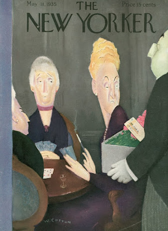


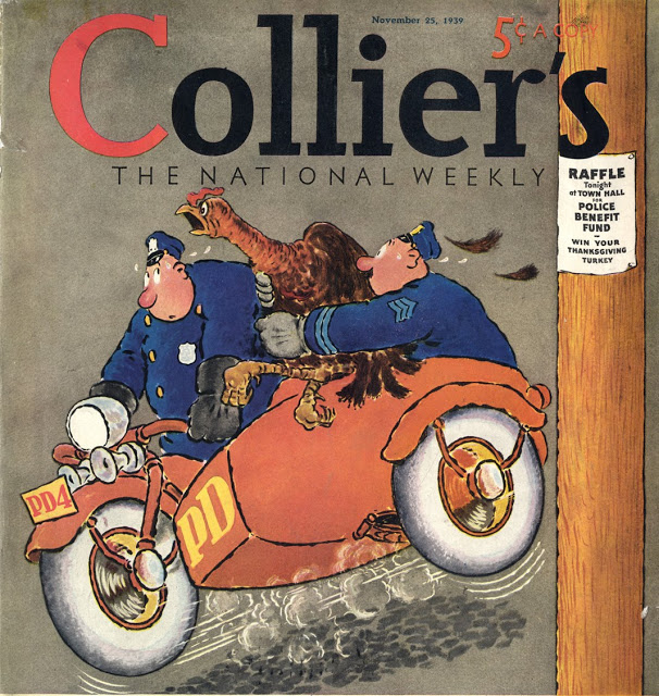


Beautifully compiled article!
ReplyDelete