Translate - برگردان به پارسی

Chapter 66: The Geometry of Design: Bézier Curves for digital Typography and CAGD


In designing a typeface, there is a need to represent a smooth curve. However, curves and surfaces must be agreeable to the eye of observer aesthetically and not mathematically. Nevertheless, the ability to represent and transform complex curvilinear shapes has improved markedly with the advent of computer graphics. Progress in the area of curve representation stemmed from the need of mechanical engineers in the 1950’s and 60’s in the automobile and aircraft industries to accurately define freeform shapes. Transferring curves from the drawing board to the pattern shop was inefficient and inaccurate when designs contained anything other than basic lines, circles and parabolas. Although they possessed the hardware that allowed machining of complex three-dimensional shapes, software to communicate the particular specifications was lacking. (Farin, 1988).

Pierre Bézier


To solve this problem, Pierre Bezier, a French engineer working for the automobile company, Renault, used parametrically defined surfaces, expressed with polynomials exhibiting special characteristics, to develop what is now viewed as the beginnings of Computer Aided Geometric Design (CAGD). Unbeknownst to Bezier, Paul De Casteljau had just finished similar work, but because De Casteljau’s work wasn’t published until later, Bezier’s name is associated with these surfaces and curves. Bezier and de Casteljau’s insight into how to use these special polynomials to represent curves has had an important impact on the computer graphics field. The Bezier Curve representation is a method to represent a curve between 2 given points, by a polynomial parametric formula, with the additional idea of using a few “control points” that specifies the tangency of the given points.

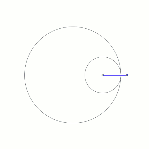
A Bezier curve has two points (the context point and ending point) and two control ones (CP) that determine its shape.


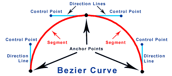
A Bezier curve is defined by the current context point, two control points, and an ending point. The first part of the curve is tangential to the imaginary line that is defined by the context point and the first control point. The second part of the curve is tangential to the imaginary line that is defined by the second control point and the ending point.


De Casteljau Algorithm


Paul de Faget de Casteljau 


Citroën’s DS 19 was introduced at the 1955 at the Paris Motor Show. Within the first 15 minutes of the show, 743 orders were received.


Paul de Faget de Casteljau was born in Besançon, France on November 19, 1930. After his studies he did his military service in the war in Algeria. Having returned toFrance, he applied for a job position as a physicist at Citroën in Paris in 1958. Already during the same year he developed significant ideas within the local research group Fraisage Numérique of the department Service Outillage which would revolutionize the modelling of car bodies. His first theoretical results were filed with the French Patent Office INPI (Institut National de la Propriété Industrielle, Paris). For quite some time, the circle of specialists never learnt anything about them. During the mid-sixties, Pierre Bézier at Renault, , came up with similar approaches and was able to publish them shortly after. This is why the curve class found by Paul de Casteljau is now called Bézier curves. Thanks to Prof. Wolfgang Boehm of the Technical University of Braunschweig, the fundamental work of Paul de Casteljau finally became known in the mid-seventies. Since then, the algorithm containing its central idea is rightly called algorithm of de Casteljau, which plays a central role in the area of modelling and representing geometric objects.

Here is a control polygon


Each polygon segment is now divided in the ratio of t ( for example: t=1/2) . By doing so a next polygon level is created.

Each segment between the new points is divided in the ratio of t.


Here is the solution for the point t=1/4


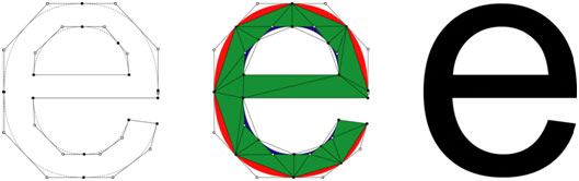
The outline of a glyph is a mathematical description of the glyph's shape using lines and Bézier curves. The control points are needed to scale the glyph to the desired type size and resolution.


Glyphs are drawn using Bézier curves, but human intervention is necessary to make a precise mathematical design looks right. There are  a number of facts to take into account during the design process. A square appears to be square only if it is drawn 1% wider and the same is true for circular forms. To make a circular form appear the same size as a square, it should extend an extra 2% to 3% on each side. The point of a triangle appears to line up with a square only if it extends 3% further.

The definite measurements are completely dependent on the design and the designer’s eye. In this example of FF Nexus Serif by Martin Majoor, apparently similar shapes can sometimes be quite different from each other. The top row shows the correct glyphs for the ‘b’, ‘d’, ‘p’ and ‘q’. In the bottom row the first three were rotated and/or flipped to look like the ‘q’.


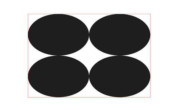
A number of corrections have been applied to the oval and rectangular shapes above. The first oval has the same width and height as the rectangle next to it, yet the oval seems smaller and appears out of line with the rectangle (even though it actually lines up perfectly). The second oval has been visually corrected, both in width and height. The diagram on the second line shows that equal white space between the shapes in the middle does not appear the same. A visual correction has been applied to the bottom example.


When making the strokes and bowl of the characters of a geometric typeface perfectly parallel and geometric the optical adjustments become apparent.


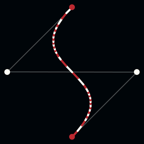
In more complicated curvatures it is recommended to use as few control points as possible. Too many points makes it hard to get a smooth, flowing line on a long curve. Too few points restricts the possible path the curve can follow. In designing a typeface it's good to get into the habit of placing the extreme left, right, top, and bottom points of a curve at the anchor locations with respect a rectangle enveloping the curve. For instance, on a circle, these would be at clock points 12, 3, 6, and 9. Of course, if the anchor points are on the extremes, the control handles will be either perfectly vertical or perfectly horizontal (assuming it's not a corner). 


 Of course, a slavish conformity with these rules will not guarantee the creation of a good art, or even a convincing copy. In fact, the designers' who follow the analog artwork with a fair degree of accuracy usually discover that the results are less than ideal. It may be what the analog artwork actually looks like, but in the realm of digital outlines, it disappoints. As one designer has pu it " There is a difference between digital and analog art, and slavishly following an analog original, will not give you what you want."

Vector art is represented by collections of strokes and paths containing quadratic and cubic Bézier curves. Unlike conventional bitmaps, vector representations are resolution-independent and can be transformed arbitrarily without pixilation artifacts.


Microsoft has a developed a technique for rendering Bézier curves directly in terms of their mathematical equations using the Graphics Processing Unit. The idea is to render the triangles of each Bézier convex hull and apply a special pixel shader program to determine if a pixel is inside or outside a bounding curve. The pixel is then shaded accordingly, including anti-aliasing if a pixel is near a boundary. This approach is highly efficient allowing real-time translation, scaling, rotation, or arbitrary perspective transformation. These curves can also be animated in real-time with very little CPU intervention.


The geometry of Adidas logo


 What does the Adidas logo mean? In 1967, the first design concepts included three stripes on each shoe, allowing Adolf Dassler to call Adidas a “three stripe company”. The meaning of the stripes of the Adidas logo was not associated with a specific symbol. In fact, the three-bar brand was purchased from Finnish sports brand Karhu Sports.

Little is known about the company, which is experiencing public controversy over the history of brand  (Adolf Dassler was attracted by Nazi ideology during WWII). Equipped with a desire to showcase diversity, the Adidas  trefoil  has come to life. It is a tri-leaf adidas logo representing North America, Europe, and Asia - the top three countries where Adidas shoes have been sold. As you can see, the original  three stripes  are still there. Adidas trefoil has reserved its place for the original Adidas collection.


The geometry of Apple  logo


According to Rob Janoff,  who designed the original Apple logo:


The apple shape changed slightly from my original design in the early 80's. The design firm Landor & Associates made the changes. They brightened the colors, they made the shapes much more symmetrical, much more geometric. When I designed it I pretty much did it freehand.


A mathematician, however, has shown that the Apple logo is broadly consistent with the Golden Ratio principle.  


Interestingly, this sparked a bit of controversy, as one designer on May 17, 2013, went to great lengths in Forbes magazine to argue that:  "So in a funny way, the Apple logo feels like it adheres to some system because it doesn't." 


The geometry of Apple  logo


Marva Warnock, the wife of co-founder John Warnock, designed the Adobe first logo  in 1982.. She employed two geometric design elements–a rectangle and an styized typeface for the letter A .  The logo consisted of “Adobe” written in caps on a slate gray quadrangle with “Systems incorporated” underneath. The current logo is the white “A” derived from the original 1982 logo on a red background and “Adobe” written below in black.


The geometry of Nike  logo


On May 30, 1971,  Nike changed its brand from "BRS"  and changed its logo to the current swoosh logo, mainly because it produced and marketed shoes instead of importing.

Nike co-founder Phil Knight paid his student Caroline Davidson (at Portland State University) $ 35 to design the first Nike logo. Interestingly, Knight wasn't very happy with the first Nike logo at first glance, but Caroline's design met the need for the Knight shoe logo to be “simple with stripes”.


The geometry of Under Armour logo


The original Under Armour logo was introduced in 1996 and was composed of the  emblem in monochrome, where two vertically mirrored and overlapping arches, standing for “U” and “A”, were accompanied by lettering above and under it. The upper level featured “Under”, and the bottom “Armour” .  The classic simplicity of black and white colour is a powerful feature  of the Under Armor brand. 


The geometry McDonald logo


The logo of the Golden Arches, the emblem of McDonald’s , has been revamped several times before it went through the final iteration in 2003. After Ray Kroc took over the business in 1961, he incorporated the two arches to form the new McDonald’s logo that looked like the letter “M”.  


The geometry of Tweeter  logo


 The initial in-house bird logo design was created by Biz Stone, a founder of the company. The logo was tweaked in 2009 with the help of designer Philip Pascuzzo. A year later, they created the silhouette version, which was ultimately streamlined by Doug Bowman, the company's former Creative Director, in its current form.

According to Doug Bowman, “Twitter is the bird, the bird is Twitter,” . Resembling a mountain blue bird with a hint of a hummingbird thrown into it, the Twitter bird  flies skyward in what Bowman has called "the ultimate representation of freedom, hope and desires. unlimited possibilities ”.


De Casteljau's Algorithm and Bézier Curves 

From: malinchristersson.tumblr.com

De Casteljau’s algorithm can be used to split a Beziér curve in two halves. By splitting the curve, it can be drawn using a divide-and-conquer-algorithm:
If the curve is flat enough, draw a line segment between the starting point and endpoint;...


Hypotrochoid
http://www.malinc.se/math/trigonometry/spirographen.php
Golden rectangle


Polar Coordinates
http://www.malinc.se/math/geogebra/curvesen.php


Creative Commons License
This work is licensed under a Creative Commons Attribution-No Derivative Works 3.0 Unported License.
De Casteljau's Algorithm and Bézier Curves


Chapter 65: User Interface Design: Skeuomorphic, Flat and Material design , ...or Good Design?

 "When I joined Google as its first visual designer, the company was already seven years old. Seven years is a long time to run a company without a classically trained designer. Google had plenty of designers on staff then, but most of them had backgrounds in CS or HCI. And none of them were in high-up, respected leadership positions. Without a person at (or near) the helm who thoroughly understands the principles and elements of Design, a company eventually runs out of reasons for design decisions. With every new design decision, critics cry foul. Without conviction, doubt creeps in. Instincts fail. "Is this the right move?" When a company is filled with engineers, it turns to engineering to solve problems. Reduce each decision to a simple logic problem. Remove all subjectivity and just look at the data. Data in your favor? Ok, launch it. Data shows negative effects? Back to the drawing board. And that data eventually becomes a crutch for every decision, paralyzing the company and preventing it from making any daring design decisions." -Doug Bowman. Former Design Lead at Google.


User Interface Design is not different from any other design manifestations such as book covers posters, film title sequences, and so on. At its best, it is a balanced and uncluttered arrangement of various design elements such as colors, lines, white space, typography and so on that tries to transmit visual information in an efficient clean, and agreeable style. A fine design is a disciplined design. But, its discipline is not imposed, it is an organic constituent of the whole design. No designer can use a checklist of various criteria in order to create a good design. The final outcome in such a process, at best, will be an artificial "something".


Google buttons are designed efficiently without compromising the artistic element. A combination of HTML5 and CSS3 is used to create them. A subtle drop shadow to the bottom from CSS3 gradients has created an agreeable degree of "virtual realism."


Delightfully tacky with a good sense of humor


"I feel like [Apple] has concentrated too much on mimicking the visual skeuomorphic approach rather than concentrating on the actual functionality," says the former senior UI designer at Apple. 

 An artistic design is an act of creation of a balanced composition with its own set of meticulously defined aesthetic criteria, which stimulate intellect and intuition. The power of its magic is revealed when somebody copies that act,. No matter how brilliant the copy is, all those disciplinary criteria in the original will be completely annihilated -- the copy wouldn't be a piece of art.

There is always tension between artists and technical teams, engineers, or developers. Authentic art doesn't care about technical aspects, and that is how it should be. The best art forces all to bow; the technicians should be at the service of the artists. They have to make everything possible to adhere to the wishes of the artists -- no compromise is allowed. That is the art's command. Compromise corrupts and contaminates the art. If the technicians and developers find they cannot execute the command of an artist they have to walk away and let more competent technicians replace them. Unfortunately, in today's organization of the industry, they are technicians who are supposed to know best; after all, they’re the ones bringing an application into the market on time, and if it sells, who cares what it looks like. And this is how art has been marginalized in today's digital world.


There are always those apologists who argue design is not completely an aesthetic concern, nor is developing an entirely technical one; designers must consider how functionality affects form, and developers must be creative in building out functionality. A typical argument is:
"Unfortunately, current design discourse is not very supportive of its community. One reason is the largely (auto)biographical artifact of the designer as a lone, artistically creative and publicly visible genius who is far ahead of his or her time. In fact, such designers, rare as they may be, usually derive their visibility and aesthetic influence from being promoted by influential producers or corporations who need them, much like medieval court artists were adopted by rulers to hide their power behind cultural concerns. This ideal, pursued by many but achieved by few, is hardly supportive of a viable design community. It conceals both the hard work that goes into design research and practice and the actual failures that could enter the stock of professional knowledge and be instructive to other designers. Its individualism marginalizes the collaborative or dialogical nature of most design accomplishments and retards knowledge of successful team methods in design. It also sidesteps the political and managerial skills by which good designers become who they are. The self-serving fiction of the ingenious designer seems almost parasitical on the very discourse community without which he or she can hardly be." An Invitation to a Responsible Future.
This is of course the root cause of mediocrity in today's digital art. Design is absolutely an aesthetic concern, created by an individual artist and not by the conveyor belt of a viable design community. Development is an entirely technical issue, it is done in a cooperative framework -- that tries to homogenize and standardize. If a designer creates a new form the functionality must be redefined, reparametrized, and reevaluated by technicians. Dada design could not have come about if printers of the early 20th century had the power to impose on them their definition of functionality.


In this context, it was Apple's push toward skeuomorphic interfaces in its iOS and OS X platforms that reportedly started a polarizing non-topic within the IT industry and among User Interface designers. There are reports that Steve Jobs, who had undeniable artistic taste, was one of the first proponents of the controversial design scheme. Of course, such reports may just be the interpretation of those who do not have any clue about how to comprehend an artistic taste and assume that it can be summarized in a set of characteristics under the label of skeuomorphism. Skeuomorph is defined as "an ornament or design on an object copied from a form of the object when made from another material or by other techniques, as an imitation metal rivet mark found on handles of prehistoric pottery". Some designers have used the term to describe representational designs.


A classic skeuomorphic design by Apple,

As designer Tobias Bjerrome Ahlin points out, when it’s used appropriately, skeuomorphic design can give users a quick sense of what an app does. This is especially true for non-experts. How do you convey to someone that Notes is where you jot down a grocery list but Pages is where you type up a book report? If both apps showed you nothing but a blank screen, a novice wouldn’t know what to do. But since it looks like a notebook, Notes doesn’t even need a help screen. Hokey as it is, the legal pad and ugly handwriting font tell the whole story in a split second: Notes is for jotting things down.


In fact, as we discussed in Chapter 43, in 1926 Magritte in his "Ceci N'est Pas Une Pipe" had already exposed the contradictions that exist between the visual and textual representations. However, that philosophical inquiry about the authenticity of representation, as developed for example by Foucault in his book The Order of Things in which his thesis that the law of nature is constituted by the difference between Man's language and his observations appears to be absent in the recent UI controversy regarding the virtues of Flat Design relative to Skeuomorphism.


A skeuomorphic design may not be artistic, but still tasteful...


... or cute like this iPhone app Metronome by MarketWall. But as Swedish designer Tobias Ahlin has argued: ...


... "There’s a very good reason Garageband for iPad looks like this:


... and not like this. And that is just taking away the realism. Removing skeuomorphism would leave us with something like this:


While this may be more functional, cleaner, and more “true to the functions of the interface”, it’s not fun. I could as well be creating music in Excel. Apple’s Garageband interface not only presents features in a clear and understandable way, but it also adds to a beautiful, fun, and memorable experience."


In this context, UI designers were mostly talking about Apple's aesthetics of skeuomorphic interfaces such as calendars with faux leather stitching, bookshelves with wood veneers, fake glass, and paper, and brushed chrome. Some have reported that this visual representation style was first implemented by software designers to help ease users into the unfamiliar world of computing. Apparently, the style has became unpopular, or as a New York Times article reports:
But Apple causes conniptions among designers when its visual metaphors seem outdated or downright archaic. (...) Apple’s use of textures representing physical materials is also often ridiculed. In addition to linen, Apple has found opportunities to decorate the borders of its software, including the Calendar app on the iPad and the Find My Friends app on the iPhone, with a tan faux-animal skin that some critics have sarcastically called Corinthian leather, after the upholstery used in Chrysler cars in the 1970s.
Apple design chief (Sir) Jonathan Ive, who has been named one of the most influential people in the world in 2013's TIME 100, is reported that has made his distaste for the visual ornamentation in Apple’s mobile software known within the company. It is expected that he would move the company toward a less skeuomorphic aesthetic after the departure of Scott Forstall in 2012.


On the other end of the spectrum,  Windows 8 has adopted the Swiss Grid Style under the banner of Flat Design which is becoming a new trend. Recall from Chapter 42 that the Swiss Grid Style asymmetrically organized the design elements on a mathematically-constructed grid in order to create visual unity in a composition in the most legible and harmonious means for structuring information. It presented visual and textual information in a clear minimal and factual manner with sans-serif typography. Flat design also uses a minimalistic approach that emphasizes usability, with clean, open space, crisp edges, bright colors, and two-dimensional/flat illustrations.


Microsoft’s Window 8's operating system, " Metro", offers flat squares with large typography and can be traced back to Swiss design. It has received many accolades from the software design community as the new canonical criteria for good design.


... But it also can be ugly


Skeuomorphic design can also be minimalistic, and ...


... elegant, or ...


...it can be imaginative,


... powerful,...


..., sophisticated,  ...
... or expressive.


It can appear quite modern,...


... intriguing ...


... intricate and...


... avant-garde!


An artistic design is ... well artistic. It introduces its own organic discipline, ...


... and its enthralling balance is uplifting.


A minimalist flat design may be intelligent and inspiring...


... and punchy!


 or it  can be boring ...


 .


...   mediocre.


... and !


The image on the right is Apple’s intellectual property and the other is a competitor’s product.  Under the law as set forth by the U.S. Court of Appeals for the Federal Circuit in Egyptian Goddess, Inc. v. Swisa, Inc., 543 F.3d 665 (Fed. Cir. 2008), the test for design patent infringement is “whether an ordinary observer, familiar with the prior art, would be deceived into thinking that the accused design was the same as the patented design.”


BlackBerry


Systematic but Uninspiring design of Facebook


Window 8


Material Design


In 2015 Google unveiled Material Design. “Material,”  was used as a metaphor, as Google explained:
A material metaphor is the unifying theory of rationalized space and a system of motion. Our material is grounded in tactile reality, inspired by our study of paper and ink, yet open to imagination and magic.  
Critics of flat design argue that it’s gone too far; that it was too radical in removing all skeuomorphs, even the useful ones. Material Design appears as a synthetic approach to flat design, using harmonic gradients, layering, and animation to simulate a sense of reality while still retaining all the aesthetics of flat design.


One of the main principles of material design is to mimic effectively the real world but to adhere to aesthetic principles. Avoiding overly realistic looks at the expense of visual balance.


Material button by Mauro Marini on Behance


Flights App, Home & Boarding pass by Sara Miguel del Amo


It’s not easy to prejudge the artistic merits of a skeuomorphic or a flat design solely based on a set of rigid criteria. The artistic merits of a design are not related to the style of execution.


Material is in fact a synthesis of skeuomorphic and flat design as some elements of the two styles are combined to provide a clean and attractive layout. Incorporating a number of the Swiss grid system's principles. Material Design has a set of theoretical principles:

Material is the metaphor


  • Material as a metaphor aims at a unifying theory of a rationalized space and a system of motion. It is inspired by the study of paper and ink.
  • The surfaces and edges of the material provide visual cues in the physical world, using realistic light.


Bold, graphic, intentional

.


  • The foundational elements of print-based design – typography, grids, space, scale, color, and use of imagery – guide visual treatments.

Motion provides meaning


  • All action takes place in a single environment. Objects are presented to the user without breaking the continuity of experience.
  •  Motion is meaningful and appropriate, serving to focus attention and maintain continuity.


However, Material design at present is not that different from flat design.  Unfortunately, there has been too much emphasis on its theoretical justification and not much on creativity and imagination. It may encourage the mass production of cookie-cutter designs. As flat and Material designs expand their domination over the internet, they inevitably become boring and uninspiring. Everything then would be ready for a  new paradigm shift.   


UI is involved in all things design and what the eye sees. This includes everything from icons, typography, imagery, and layout, to even negative space. It prioritizes the ease of getting a user from point A to B with minimal effort and thinking involved. It’s important to keep the design aesthetically pleasing to the user as it is perceived to be more user-friendly.


The grid systems can be used as a framework for creativity, but it should not act as a trap. Even a simple grid can provide many options for any juxtaposition of content in a flexible and thoughtful approach.


Some Grid programming examples by Rune Madsen


The simplest possible grid to make is a manuscript grid that only requires 4 variables: x,y, width, and height to define the rectangle in which we place content. Example on Github


Example on Github


Window 10


In Windows 10, introduced in 2015, Microsoft has introduced a different approach to flatness, while abandoning all gradients, it has adopted some of the elements of Material Design. It offers more detail in blue and maximizes the potential of modern displays. Empty space has been rationalized using, more effective icons in high contrast.


The Microsoft Fluent Design System

Fluent Design ( known previously as Project NEON) is a new Microsoft system that tries to overcome the increasingly boring look of flat design, using new multi-dimensional design techniques, such as transparency and blur, three-dimensional perspective and motions, and a system that works across the full range of devices.

Microsoft is planning to push the new system in different waves.

Fluent Design principles


The grammar of Microsoft Fluent Design System has five primary components: light, depth, motion, material, and scale.


  • Light:  Incorporating the element of illumination draws focus to the information as a visual queue (or pointer) to an object.
  • Depth:  Adding visual depth by creating a sense of three-dimensional perspective and motions.
  • Motion: Creating new animation effects to bring a feeling of continuity
  • Material: Adding flexibility so that elements  can bend, stretch, shatter, bounce, and slide
  • Scale: Allows apps to adapt across the full range of devices, including desktops, laptops, tablets, phones, and headsets.
 The focus on aesthetics as long as the products function smoothly would be a positive development.


Microsoft is touting this as "an eloquent design system for a complex world,", a design language for a multi-sensory, immersive experience, and it's clearly driven to a large degree by the need to create a new experience for HoloLens and other augmented reality scenarios. Augmented, or mixed, reality experiences are -- by their very nature -- three dimensional in nature, and Fluent Design System is Microsoft's attempt to translate this idea onto the 2D screen of the average Windows 10 user, as well as the touchy-feely world of Microsoft apps on iOS and Android.

------------------------------------------------------------------------------------ 
Creative Commons License
This work is licensed under a Creative Commons Attribution-No Derivative Works 3.0 Unported License.