
 |
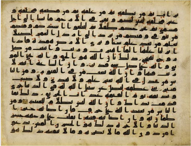
| The Quranic script from North Africa or Near East, ca. 750-800 AD is a unique combination of several aspects of early Kufic calligraphy style. Most striking of these is its Mashq, or extension of the horizontal axis of the letters. This was a common feature of the Kufic style, but rarely practiced to such an extent as here. |
The earliest Islamic calligraphy is found in highly decorated manuscripts of Qur'an. Using black ink and gold leaves to write on parchment or paper, scribes employed an angled alphabet, called Kuffi and created stunning masterpieces that appeared in 8th century, and reached their apex in 10th century. Gradually, decoration of margin, page and other ornamentation techniques were introduced to beautify the book. In the 12th century, the Naskh alphabet was invented, which instead of angled lines used curved alphabet . Elaborations, such as foliation, interfacing, and other complexities were added later to ornate the manuscript. Many calligraphers created various cursive scripts in their artistic pursuit of excellence.
 |
The Eastern Kufi style of this 11th century Iranian Quran is perhaps the oldest calligraphic style of the city of Kufa in Iraq. The style is characterized by its exaggerated angularity and flattened geometrical composition. This style was highly flexible for decorative use in architecture of mosques and various vessels.
|
 |
| This page of a 12th century Quran written in the Andalusi script is an elegant expression of the representational art of the spiritual world of Islam.The geometric interlaces of golden patterns with a black border are scattered throughout the text with decorated Arabic alphabet letters and the triple golden acorns which serve to mark the end of each sentence. |
 |
| This Andalusian manuscript on pink paper, early 13th century was made for a member of an oligarchic family , probably from Granada or Valencia. The pink paper was produced in the town of Jativa, south-west of Valencia (al-waraq al-Shatibi). |
 |
| Koran manuscript, 13th century. Sura 200: "O ye who believe, persevere in patience and constancy; in such perseverance strengthen each other and fear God that ye may prosper!" Ben Yussuf Library, Marrakesh, Morocco. |
 |
| Page from a Qur'an in maghribi script |
Introduction
Islamic calligraphy as the most important representation of Islam's cultural heritage relies on the aesthetic expression of spiritual-imagery that transcend the word form, rendering it a highly cherished art object. In a profound sense of its poetical quality, Qura'nic inspiration is deeply rooted in the humanistic spirituality, it bridges between the enigma of human existence and the pathos with which Deity looks at humanity. The aesthetic value associated with Islamic calligraphy's spiritual quality is clearly on the side of artistic creativity. Its script is applied on all kinds of objects to remind the observer of the mystical power of divine .
As Anthony Welch has observed; the primary reason for the chronological, social, and geographic persuasiveness of the calligraphic arts in the Islamic world is found in the Holy Qur'an;
Thy Lord is the Most Bounteous,
Who teacheth by the pen,
Teacheth man that which he knew not. -- (Surah al-Alaq, 96:3-5)
Al-Nam ā rah, the oldest Arabic document on record, inscribed on a stone discovered near Damascus by Dussaud, a French archaeologist, is dated 328 AD. It is written in clear cursive forms and hailed by many scholars as a definite evidence that the modern Arabic script had evolved from the late Nabataean script.
Arabic script, that encompasses 28 letters and uses long but not short vowels is derived from Nabataeans, who were of north-west Arabian origin (whence came their attachment to deities like Dushara and al-‘Uzza, as well as Arabian-type personal names). They modified Aramaic for writing. T. Nöldeke was the first to establish the link between the Nabataean and Arabic scripts in 1865, which later confirmed against J. Starcky’s Syriac thesis by Grohmann. The affiliation between Nabataean and Arabic scripts has now been fully documented by J. Healey with almost a complete consensus among scholars on the Nabatean origin of the Arabic script (Healy, J. 1990).
 |
| Chinese Quran Ming/Qing Dynasty ( 18th Century) |
 |
| Niujie Mosque (simplified Chinese: 牛街礼拜寺; traditional Chinese: 牛街禮拜寺; pinyin: Niújiē lǐbàisì; literally “Cow Street Mosque”) is the oldest mosque in Beijing, China. It was first built in 996 during the Liao Dynasty and was reconstructed as well as enlarged under the Kangxi Emperor (r. 1661-1722) of the Qing Dynasty. |
During the 5th century, Arabian nomadic tribes who dwelled in the areas of Hirah and Anbar used the Nabatean script extensively. According to Muslim historians in the early part of the 6th century, the North Arabic script version was introduced to Makkah by Ibn Umayyah ibn' abd' Shams, who studied it by travelling in various regions. In particular, he met Bishar ibn ' Abd al-Malik, the brother of al-Ukaydir, the ruler of Dumat al-Jandal, who introduced and popularized the use of this script among the tribe of the Prophet Muhammad, Quraysh. Other tribes in nearby cities adopted with enthusiasm the art of writing.
 |
| Mosaic calligraphy, Jameh Mosque, Isfahan |
The script used in the earliest written Qura'an was Jazm, which may have been scribed by Zaid ibn Thabit and released during the caliphate of Uthman ibn Affan (644-656). The stiff, angular, and well-proportioned letters of the Jazm script came in different styles representing different regions such as the Hiri, Anbari, Makki, and Madani and would later influence the development of the famous Kufi script. In addition to the Jazm, many other scripts were developed. Some became quite popular gradually evolving in sophistication, for instance first into unwieldy scripts such as the Ma'il and then with further elaboration to the elegant Kufi script, while other less popular scripts such as the Mukawwar, Mubsoott, and Mashq discontinued after a while.
 |
| The Jazm script |
 |
| The Ma'il script of this one of the very earliest Qur'ans in the British Museum is written on parchment dating back to the eighth century AD .
Ma'il, one of a number of early Arabic scripts collectively named Hijazi after the region in which they were developed. is the precursor to the elegant Kufi script. The word ma'il itself means 'sloping', in this case to the right. Ma'il is also notable for its lack of diacritical marks, the spelling symbols that distinguish between letters of similar shape. In this Qur'an, as in other ancient fragments, there are no vowel signs or other aids to pronunciation, and the end of each verse is indicated by six small dashes in two stacks of three. The chapter heading in red ink has been added later in nashki script, and differs from the rest of the text.
|
 |
| Kufic script in an Ottoman Koran |
The forms Arabic letters are limited to seventeen distinct shapes, whereby different sounds are created by placing one to three dots above or below these shapes. Short vowels are indicated by small diagonal strokes above or below letters. Calligraphers use dots and diacritical points in their creative styles to beautify and decorate the text, adding a transcendental dimension.
As Welch explains:
Written from right to left, the Arabic script at its best can be a flowing continuum of ascending verticals, descending curves, and temperate horizontals, achieving a measured balance between static perfection of individual form and paced and rhythmic movement. There is great variability in form: words and letters can be compacted to a dense knot or drawn out to great length; they can be angular or curving; they can be small or large. The range of possibilities is almost infinite, and the scribes of Islam labored with passion to unfold the promise of the script. Moreover, technical aspects were not separated from aesthetic and even personal criteria. Inscriptions are found incorporated in the decoration of almost every Islamic work, and in that of a large number of objects as well.

Early Calligraphic Development
After the death Prophet Mohammed in 632 AD, it was incumbent on the community to collect the dispersed sheets of the Quran in various regions and to verify their authenticity, as there were numerous huffaz who memorized and recited all the verses of the Qur'an by heart. Zayd bin Thabit, who served as a secretary for the Prophet, narrates:
Abu Bakr sent for me after the heavy casualties among the warriors of the Battle of Yamama. Umar was present with Abu Bakr who said, 'Umar has come to me and said, The huffaz suffered heavy casualties on the day of Yamama, and I am afraid that there will be more casualties among the huffaz at other battle-fields, whereby a large part of the Qur'an may be lost. And I am of the opinion that you should collect the Qur'an."
Abu Bakr added, "I said to 'Umar, 'How can I do something which God's Messenger has not done?' 'Umar replied, 'By God, this is the most excellent idea.' So 'Umar kept on pressing, trying to persuade me to accept his proposal, till God opened my heart for it and I had the same opinion as 'Umar." Zayd added: Abu Bakr turned to me and said: "You are a wise young man and we do not suspect you of telling lies or of forgetfulness: and you used to write the Divine Inspiration for God's Messenger. Therefore, look for the Qur'an and collect it. "By God, if he had ordered me to shift one of the mountains from its place, it would not have been harder for me than what he had ordered me concerning the collection of the Qur'an. So I started locating Quranic material and collecting it from parchments, scapula, leaf-stalks of date palms and from the memories of men who knew it by heart.” (Bukhari)
The first Arabic script, Arabic Musnad, originated from Aramaic Nabataean, is discovered in the south of the Arabian Peninsula, in Yemen. This angular script reached its final form around 500 BC and was used until the 6th century.
 |
| Nebataean tomb inscription from Madeba, First century AD. Louvre |
 |
| Musnad script |
Franz Rosenthal correctly states that ”the earliest Arabic documents of writing exhibit, to say the least, a most ungainly type of script.” One of the true miracles of Islam is how this script developed in a comparatively brief span of time into a well-proportioned, highly refined calligraphy of superb beauty. As used for early Korans, Kufi is the liturgic script par excellence, as Martin Lings has shown with great clarity. However, it is more than doubtful whether any of the fragments preserved in the museums date back to the time of the first caliphs, as is claimed by their proud owners. As early as in the ninth century the great mosque in Damascus boasted of possessing a copy of cOthman’s Koran, and so did the mosque in Cordova; this latter copy was so heavy that it had to be carried by two men. The terminus ante quem for a fragment or a copy of the Koran can be established only when the piece has a waqf note, showing the date of its accession in a certain library. The earliest datable fragments go back to the first quarter of the eighth century; but it is possible that the recently discovered Korans in Sanaa, which are at present being inventoried and analyzed by a German team, may offer a further clue to the early development of writing. Annemarie Schimmel, SI, HI, (1922 – 2003)
The first written copies of the Qur'an were written in the Jazm script that came in different styles associated with different regions such as the Hiri, Anbari, Makki, and Madani. The last two, which were named for two cities--Makki for Mekka, and Madani for Medina were the most prominent ones. They were written in two different styles; Muqawwar which was cursive and easy to write, and Mabsut which was elongated and straight-lined.
Gradually, many other scripts were developed, such as those that after considerable technical improvements have survived like Mashq (extended) and Naskh (inscriptional), and those like Ma'il (slanting), a kind of primitive Kufic script that proved too barren and were abandoned.
| Hijazi script . Developed in the Hijaz area, that includes the Holy city of Mecca and Medina, hence the name. It is an Arabic script style that is angular and squarish, but still have some slight curves to it. It is the earliest form of Arabic calligraphy, already being used in the emergence of Islam. It is also known as the Ma’il Script (sloping) |
 |
| A Mamluk Qur'an, Attributed to Ibn Al_Wahid with illumination by Sandal, Egypyt Circa 1306-1311 AD Bold black thuluth, gold and blue rosette verse roundels, drop-shaped gold and blue khamsa and 'ashr markers |
The Reform of Arabic Writing
The expansion of Islamic culture into the Persian and Byzantine empires resulted in development of regional calligraphic schools and styles, interpreting the art of writing as an abstract expression of Islam, resulting in development of styles such as Ta'liq in Persia and Deewani in Turkey. The vast Islamic territory required a more efficient system of writing. The intense and dramatic early development of writing matured during the Umayyad dynasty (661-755), when two new scripts Tumar and Jali were appeared. These were created by the renowned calligrapher Qutbah al-Mihrr. Tumar that was formulated and extensively used during the reign of Muawieyah Ibn Abi Sufyan (660-679), the founder of the Umayyad dynasty, became the royal script of the succeeding Umayyad caliphs.
Caliph Abd-Al-Malik Ibn Marwan (685-705) legislated the compulsory use of Arabic script for all official and state registers, and on the behest of al-Hajjaj Ibn Yousuf al-Thaqafi (694-714), Nasr and Yehya refined the Tashkil system, and they introduced the use of dots and certain vowel signs as differentiating marks. The dots were placed either above or beneath the letter, either single or in groups of two or three.
Abul Aswad ad-Du'ali is credited with the invention of placing diacritical points to distinguish between certain identical consonants such as the 'gaf' and 'fa' in the Arabic alphabet. This system of diacritical marks is known as Tashkil (vocalization). Different colors also were introduced to differentiate between these marks--black for the diacriticals and red or yellow for the vocalics.
Later, during the Abbasid dynasty (750-1258), Ibn Jlan and Ibn Hama developed and improved the Tumar and Jali scripts. Calligraphy entered a phase of glory under the influence of Abbasid vizier and calligrapher Ibn Muqlah. According to Welch (1979), Ibn Muqlah is regarded as a figure of heroic stature who laid the basis for a great art upon firm principles and who created the Six Styles of writing: Kufi, Thuluth, Naskh, Riq'a, Deewani, and Ta'liq. Unfortunately, for many people and scribes the system was unclear and confusing. A more sophisticated system was needed.
 |
| Taj Mahal calligraphy, Qura'nic verses made of jasper or black marble, inlaid in white marble panels |
Al-Khalil Ibn Ahmad al-Farahidi (718-786) introduced vowel signs that was inspired by the basic shapes or parts of certain letters; like the sign 'hamza,' which is adopted from the letter 'ayn' (without its end-tail). The new system gained wide popularity throughout the Islamic world, and its calligraphy acquired the characteristics of beauty, sanctity, and versatility. The calligrapher Ibn Muqlah (886-940) was followed by Ibn al-Bawwab in the 11th century and Yaqut al-Musta'simi in the late 13th century who built upon Ibn Muqlah's achievements and raised its standards of harmony and elegance to new heights.

The Abbasid dynasty, the last of the Islamic caliphates, ended in 1258 when Baghdad was sacked by Chengiz Khan, his son Hulagu, and their Mongol armies. That was a major turning point in the history of Islamic culture, especially in the fields of arts and architecture. Abaqa (1265-1282), the son of Hulagu, established the Ilkhanid dynasty in Persia. Ghazan, taking the Muslim name of Mahmud, dedicated himself to the revival of Islamic culture, arts, and traditions. The impact of Ghazan's reforms continued through the reigns of his two successors, his brother Uljaytu (1304-1316) and his nephew Abu Sa'id (1317-1335).
 |
| A verse from the Al-An'am Chapter of the Quran, written in Muhaqqaq style |
During this era, the arts of the book and calligraphy were at their zenith. Abdullah Ibn Muhammad al-Hamadani was commissioned by Uljaytu to copy and illuminate the Qur'an in Rayhani script. Ahmad al-Suhrawardi, another master calligrapher and a student of Yaqut al-Musta'simi al-Suhrawardi, copied the Qur'an in Muhaqqaq script. Many master calligraphers contributed significantly to the production of fine copies of the Qur'an in Rayhani and Thuluth scripts; these calligraphers included Abdullah al-Sayrafi, Yehya-l-Jamali al-Sufi, and Muhammad Ibn Yousuf al-Abari. By the end of the 14th century, the Timurid dynasty had succeeded the Ilkhanids in Persia.
| Kufic script - The name of the script derived from the name of the city of Kufa in Iraq, derived from the old Nabatean script. This script is used for the first copies of the Al-Quran. It was the preferred script to be used in the 8th-10th Century. As with Hijazi, the main characteristic of this script is that is is angular and squarish in shape. There are two further variants of the Kufic script – Maghribi and Andalusi. These two script still retains the angular characteristics, however it is less rigid with more curves. |
 |
| Calligraphy inside the dome of Selimiye Mosque, an Ottoman imperial mosque, in Edirne, Turkey. |
The arts and architecture under the Timurids and their contemporaries set a standard of excellence and elegance for generations in Iran, Turkey, and India. During this era, special attention was given to the arts of the book -- elaborate arts involving transcription, illumination, illustration, and binding. Safadi (1979) notes in Islamic Calligraphy that the Timurid style aimed to create a balance between beauty and grandeur by combining clearly written scripts in large Qur'ans and extremely fine, intricate, softly-colored illumination of floral patterns integrated with ornamental eastern Kufic script so fine as to be almost invisible. The calligraphers of this era were the first to use various styles with different sizes of scripts on the same page when copying the Holy Qur'an. Under Timurid patronage, the most impressive and largest copies ever of the Qur'an were produced.
 |
| Single-volume Qur’an Iran, probably Isfahan dated 1101 AH (1689–90 AD) copied by Muhammad Riza al-Shirazi (main text) and Ibn Muhammad Amin Muhammad Hadi Shirazi (supplementary texts) possibly for the Safavid ruler, Shah Sulayman ink, gold and opaque watercolour on paper; Khalili Collections |
The Mamluks founded their dynasty (1260-1389) mainly in Egypt and Syria. During the Mamluk era, architecture was the pre-eminent art, and the Mamluks' patronage defined many Islamic arts. There were many master Mamluk calligraphers whose works exhibit superb artistic skills including Muhammad Ibn al-Wahid, Muhammad Ibn Sulayman al-Muhsini, Ahmad Ibn Muhammad al-Ansari, and Ibrahim Ibn Muhammad al-Khabbaz. Abd al-Rahman al-Sayigh is very well-known for copying the largest-size Qur'an in Muhaqqa script.
The Safavid dynasty (1502-1736) in Iran also produced alluring and attractive masterpieces of Islamic art. During the reigns of Shah Isma'il and his successor Shah Tahmasp (1524-1576), the Ta'liq script was formulated and developed into a widely used native script which led to the invention of a lighter and more elegant version called Nasta'liq. These two relatively young scripts soon were elevated to the status of major scripts.
Baba Shah Isfahani was famed as a master of the Nasta`liq style of calligraphy, the beautiful Persian hand developed primarily at the Timuri and Uzbek ateliers in Herat and Bukhara. A modern authority on calligraphy has remarked,
"By general agreement of historians contemporary with and later than Baba Shah, no calligrapher had reached his level in writing Nasta`liq before Baba Shah appeared. He was adorned with an elegant style and a sweet hand, and even the great calligraphers recognized his mastery."
The dates and details of his life have been subject to some dispute. According to modern authorities like the Turkish scholar Habib Effendi, Baba Shah Isfahani had begun the study of calligraphy from the age of eight, and studied night and day for eight years with the celebrated Mir `Ali Haravi (d. 951/1544-5), who perfected the Nasta`liq style in Herat and Bukhara. Habib Effendi further states that Mir `Imad (d. 1012/1603), perhaps the most admired master of Nasta`liq, derived his style from Baba Shah. If correct, this information would put Baba Shah's birth at least sixteen years before Mir `Ali's death, or no later than 940/1533-4. On the other hand, Muhammad Qutb al-Din Yazdi wrote that he had met Baba Shah Isfahani in 995/1586-7, when the latter was still a young man, and he was amazed to see that he already excelled most of the calligraphers of the day. Qutb al-Din said that if he had lived longer, Baba Shah would have surpassed Sultan `Ali Mashhadi and Mir `Ali Haravi, and to achieve so much he must have had a divine gift.
 |
| Baba Shah Isfahani |
Although Nasta'liq was a beautiful and appealing script, Turkish calligraphers continued to use Ta'liq as a monumental script for important occasions.
 |
| Ayat al-Kursi (Quran 2:255) Calligraphy in Nasta`liq Script |
The word Nasta'liq is a compound word derived from Naskh and Ta'liq. The Persian calligrapher Mir Ali Sultan al-Tabrizi invented this script and devised the rules to govern it. Ta'liq and Nasta'liq scripts were used extensively for copying Persian anthologies, epics, miniatures, and other literary works -- but not for the Qur'an. There is only one copy of the Qur'an written in Nasta'liq. It was done by a Persian master calligrapher, Shah Muhammad al-Nishaburi, in 1539. The reign of Shah Abbas (1588-1629) was the golden era for this script and for many master calligraphers, including Kamal ad-Din Hirati, Ghiyath ad-Din al-Isfahani, and Imad ad-Din al-Husayni who was the last and greatest of this generation.
 |
| Taj Mahal's calligraphy in the 'thuluth' script, in a style associated particularly with the Persian calligrapher, Amanat Khan, who was resident at the Mughal court. |
The Mughals lived and reigned in India from 1526 to 1858. This dynasty was the greatest, richest, and longest-lasting Muslim dynasty to rule India. The dynasty produced some of the finest and most elegant arts and architecture in the history of Muslim dynasties. A minor script appeared in India called Behari but was not very popular. Nasta'liq, Naskh, and Thuluth were adopted by the Muslim calligraphers during this era. The intense development of calligraphy in India led to the creation of new versions of Naskh and Thuluth. These Mughal scripts are thicker and bolder, the letters are widely spaced, and the curves are more rounded.
 |
| A complete Chinese Qur'an from Khanfu (Canton) Copied and illuminated by Abdul-Hayy Ibn Mahmud China, Khanfu (Guangzhou, formerly Canton) Dated AH 1000/ 1591 AD 276 folios |
During the Mughal reign of Shah Jahan (1628-1658), calligraphy reached new heights of excellence, especially when the Taj Mahal was built. One name remains closely associated with the Taj Mahal, -- in particular with the superb calligraphic inscriptions displayed in the geometric friezes on the white marble -- that is the name of the ingenious calligrapher Amanat Khan, whose real name was Abd ul-Haq.
 |
| The Bibi Khanum Mosque, built in Samarkand between 1399 and 1404, commemorates Timur's wife. She was buried in a tomb located in a madrasa complex |
This incomparable calligrapher came to India from Shiraz, Iran, in 1609. According to Okada and Joshi in Taj Mahal (1993) , Shah Jahan conferred the title of Amanat Khan upon this Iranian as a reward for the calligrapher's dazzling virtuosity. In all probability, Amanat Khan was entrusted with the entire calligraphic decoration of the Taj Mahal. During Jahangir's reign, Amanat Kahn had been responsible for the calligraphic work of the Akbar mausoleum at Sikandra and for that of the Madrasah Shahi Mosque at Agra.
| Flowering Kufic, where the script is merged with vegetal and floral motifs. |
It is quite possible that Amanat Khan was responsible for the choice of the epigraphs of the Taj Mahal -- that is, the Qur'anic verses and other religious quotations appearing on the mausoleum. He signed his work inside the calligraphic inscription on the left side of the southern iwan -- Amant Khan al-Shirazi, followed by the date (1638-39). The calligrapher's signature bears witness to his status and renown at the court, since many of his peers remained anonymous.
Muslims in China who used the Arabic scripts for liturgical purposes adopted the calligraphic styles of Afghanistan with slight modifications. Muslim Chinese calligraphers invented a unique script called Sini (Chinese). The features of this script are extremely rounded letters and very fine lines. Another style was derived from Sini for ornamental purposes and was used on ceramics and chinaware. This ornamental style is characterized by thick, triangular verticals and thin horizontals.
 |
| Fan tasmiya (invocation) by Liu Shengguo. "In the name of God, the Most Gracious, the Most Merciful." Original at the West Mosque, Cangzhou, Hebei. [AHG] |
 |
| Placard in Sini script by Riyaduddin (Ma Yuanzhang), Zhangjiachuan, Gansu, c.1919. [AHG] The placard begins, "Why holdest thou to be forbidden that which God has made lawful to thee?" (Quran 66:1)
Of the many forms of Islamic calligraphy in China, there is one that can be properly described as a formal style. This is referred to by Chinese Muslim calligraphers as simply the Chinese or Sini script. Although this word can be used for any distinctly Chinese forms of Islamic calligraphy, Sini specifically refers to a rounded, flowing script, whose letters are distinguished by the use of thick and tapered effects. This is the script used for the placards bearing the tasmiya or invocation that almost invariably hangs above the main entrance or from a roof beam of the prayer hall in mosques in eastern China.
|
 |
| "Ya Mustafa" ("O Chosen One!", a favourite name for the Prophet Muhammad). Calligraphic painting in the form of a Chinese "grass script" or cao shu character, by Ma Donghua. Original at the West Mosque, Cangzhou, Hebei. [AHG] |
The Osmanli or Ottoman dynasty reigned in Anatolia from 1444 until 1923. Under Ottoman patronage, a new and glorious chapter of Islamic arts and architecture was opened, especially the arts of the book and Arabic calligraphy. The Ottomans not only adopted the most popular calligraphic scripts of the time, but also invented a few new and purely indigenous styles such as Tughra. Arabic calligraphy was highly esteemed and incorporated into such artistic objects as mosques, madrassahs, palaces, miniatures, and other literary works. The most accomplished Ottoman calligrapher of all time was Shaykh Hamdullah al-Amsani who taught calligraphy to the Sultan Bayazid II (1481-1520). Uthman Ibn Ali, better known as Hafiz Uthman (1698), was another figure in a line of famous calligraphers.
 |
| The detail from Tugra from Bosniak Institut in Sarajevo, Bosnia and Herzegovina
Diwani style was a formal calligraphy style of the Ottoman court and used for the most significant documents such as the diplomatic decree (Ferman) and legal documents (Berat).
|
The most celebrated derivative scripts, from the Persian scripts Ta'liq and Nasta'liq, were Shikasteh, Deewani, and Jali. The Shikasteh style is characterized by extreme density resulting from tightly connected ligatures, very low and inclined verticals, and no marks.
Ibrahim Munif was a master calligrapher who is credited with the invention of Deewani script which was later refined by the Shaykh Hamdullah. Deewani is excessively cursive and structured. Its letters are undotted and joined together unconventionally. Jali script is attributed to Hafiz Uthman and his students. The major features of Jali are its profuse embellishments, making the script perfect for ornamental purposes. Arabic calligraphy acquired a sublime reputation for being the divine, moral, and artistic representation of Islamic faith and arts. The contributions of calligraphers and their legacies still remain today. The rules governing the use of scripts, the writing techniques, and the entire calligraphic culture the scripts generated are a valued part of the heritage of the Islamic world.
Calligrapher's Tool
The typical tools of the trade for a calligrapher included reed and brush pens, scissors, a knife for cutting the pens, an ink pot, and a sharpening tool. The reed pen, writes Safadi (1978), was the preferred pen of Islamic calligraphers. According to Safadi, the reed pen -- called a qalam -- remains an essential tool for a true calligrapher. "The traditional way to hold the pen," writes Safadi, "is with middle finger, forefinger, and thumb well spaced out along the (pen's) shaft. Only the lightest possible pressure is applied."
The the most sought after reeds to make qalams were those harvested from the coastal lands of the Persian Gulf. Qalams were valued objects and were traded across the entire Muslim world. An accomplished and versatile scribe would require different qalams in order to achieve different degrees of fineness. Franz Rosenthal notes in Abu Haiyan al-Tawhidi on Penmanship (1948) that shaping the reed was one of the significant skills acquired by the scribe:
"Make your knife sharper than a razor; do not cut any thing else with it but the calamus (qalam), and take very good care of it. Let your miqatt be the toughest wood available, so that the point may come out evenly."
 |
| The tools of an Ottoman scribe: a pen-rest, a pen-sharpener, scissors, and a reed-pen (qalam); from the late 1700's and early 1800's |
 |
| Calligrapher's Qalams |
The standard length of a qalam ranged from 9.5 to 12 inches with a diameter of about a half-inch. David James notes in Sacred and Secular Writings (1988) that these reeds were cut in the marshes and left to lie there for weeks until they had become supple. Then they were gathered, sorted, cut, and trimmed.
Calligraphers had thorough knowledge on how to identify the best cane suitable for a good pen, how to trim the nib and cut the point, and how to split the cane exactly in the center so that the nib had equal halves. A good pen was cherished and, sometimes, was even handed down to another generation. Other times, it was buried with the calligrapher when he died.
Ink was of many colors including black, brown, yellow, red, blue, white, silver, and gold. Black and brown inks were often used, since their intensities and consistencies could vary greatly. Many calligraphers provided instructions on how to prepare ink, while others implied that their recipes were guarded secrets. The ink made by the Persians, Indians, and the Turks would stay fresh for a considerable amount of time. Ink preparation could take several days and involve many complex chemical processes.
| A verse from the Ali Imran Chapter from the Quran written in Tawqi' script |
| The Al-fatihah, first chapter of the Al-Quran, written in the Nasakh script |
Paper would play a major role in development of Arabic calligraphy. It was introduced in 751 from China via Samarqand, and this was a defining moment in the art of writing, affecting markedly the stylistic aspect of the Islamic calligraphy.
Unlike today's paper that is made of wood pulp, the main ingredient of early papers was cotton, silk or other fibers. The fiber-based paper was polished with a smooth stone like agate or jade to prepare it for calligrapher who drew guidelines with a reference dot. The script stood on these barely visible lines or sometimes was suspended from them.
As Welsh (1980) writes:
To Muslims the foremost instrument for transmission of knowledge has always been the qalam or pen, according to Islamic culture the qalam and letters that flowed from it have been incisive symbols and have occupied the primary position in the visual culture of the faith. Human beings in fulfilling the destiny ordained for them have often been likened to so many pens writing what Allah wills. The slender form of reed pen - the qalam has frequently been compared to the thin, vertical stroke of the alif, the first letter of the Arabic alphabet a and therefore the beginning of transmitted knowledge.
With its power to preserve knowledge and extend thought over time and space, ink was compared to the water of life that gives immortality, while human beings were likened to so many pens in Allah's hand.
 |
| Calligraphy of Sultan Salahuddin Abdul Aziz Shah Mosque in Malaysia |
 |
| Islamic calligraphy reached a new height under the artistic creativity of Indonesian carvers . |
The Alif as calligraphy's unit of proportion
Geometric harmony of proportions play an essential role in Arabic calligraphy. According to Khatibi and Sijelmassi, the legibility of a text and the beauty of its line require rules of proportion. These rules of proportion are based upon the size of the alif; the first letter of the Arabic alphabet.
The alif is a straight, vertical stroke, which depending on the calligrapher and the style of script, its height is between three to twelve dots and its width is equivalent to one dot. According to Khatibi and Sijelmassi that the Arabic dot is the unit of measurement in calligraphy. The Arabic dot is a square impression formed by pressing the tip of the calligrapher's pen to paper. The dimensions of each side of the square dot depend on the way the pen has been cut and on the pressure exerted by the fingers. Khatibi and Sijelmassi state that the pressure had to be sufficiently delicate and precise to separate the two sides of the nib, or point, of the pen. The calligrapher's reed pen, known as a Tomar, consisted of 24 hairs of a donkey. How the pen was cut depended upon considerations like the calligrapher's usage, the traditions of his native land, and the type of text being transcribed.

 |
| Mohammed, according to Welsh (1980) "Mslims perceived in the form of the prophet Muhammad's name the shape of aworshiper's body bent in prayer." Note the harmonizing measurements based on the number of Arabic dots. |
"The important thing," write Khatibi and Sijelmassi, "was to establish the height for each text. Once the calligrapher had his alif module, he would draw it in the same way throughout the text. This was the general geometric principle, although in practice the calligrapher introduced variations. The arrangement of these variations is of great interest." The alif also was used as the diameter of an imaginary circle within which all Arabic letters could be written. Thus, three elements -- that were chosen by the calligrapher -- became the basis of proportion. These elements were the height of the alif, the width of the alif, and the imaginary circle.
In Naskh script, for example, the alif is five dots high. In Thuluth script, the alif is nine dots high with a crochet or hook of three dots at the top. A single character, which is the fundamental element in calligraphic writing, has a head, body and tail. The characters of calligraphic script also are interrelated with relationships of position, direction and interval. An interplay of curves and uprights, write Khatibi and Sijelmassi, articulate the words, vowels and points.


 |
| Light upon light |

Calligraphic Ornamental Styles
The development of Arabic calligraphy led to the creation of several decorative styles that were designed to accommodate special needs or tastes and to please or impress others.


 |
Noon. By the pen and what they inscribe, Koran 68:1 |

| An example of the Thuluth script, attributed to Yaqut Al-Mustacimi |
| A Ruba'ie (Quartrain) written in Nastaliq. from the Library of Congress. |
| An example of the Geometric Kufic, decorating the walls of the Jame Mosque in Isfahan, Iran |
The most outstanding of the ornamental techniques or scripts are Gulzar, Maraya or Muthanna, Zoomorphic, Siyaqat, and al-Khat al-Hurr.
Gulzar:
Gulzar is defined by Safadi (1979) in Islamic Calligraphy as the technique of filling the area within the outlines of relatively large letters with various ornamental devices, including floral designs, geometric patterns, hunting scenes, portraits, small script, and other motifs. Gulzar is often used in composite calligraphy where it is also surrounded by other decorative units and calligraphic panels.
 |
| This Golzar calligraphy is the work Persian Mohammad Bagher, Ghajar, 19th century |
 |
| "We came this way searching for glory and power." Hafez, Iran, second half of the 19th century. Ink, gouache and varnish on cardboard. 12 1/2 x 18 1/4 in. Private collection. Falk (1985)
The script is decorated with animals, people and landscape in a griasille technique on a plain background. In his original verse, however, Hafiz wrote the opposite: "We did not come..."
The origins of Gulzar script are perhaps to be found in a technique known from the 16th century at least, whereby phrase such as the basmalah was filled with minutely written Qur'anic verses. Gulzar in the form shown here seems to have been practiced since the 17th century. There is a piece in the Chester Beatty Library, Dublin (Ms 11A:3) bearing the name of the Mughal Emperor Shah Jahan."
|
Maraya or Muthanna:
Maraya or Muthanna is the technique of mirror writing in which the composition on the left reflects the composition on the right.


Zoomorphic:

The Islamic belief that every living creature signifies the power of God has given rise to the creation of zoomorphic calligraphy. In this art the words are manipulated and structured into the shape of a human figure, a bird, an animal, or an object. Safadi notes that Thuluth, Naskh, and Nasta'liq scripts are extensively applied to create such calligraphic compositions.
Turkish calligraphers were skillful at transforming words and phrases into the shapes of animals. This was done by elongating, wrapping, and rotating letters to create the contour (outline) as well as details of the animal. Favorite animal shapes include the lion, peacock, and stork. They also created calligraphic compositions in the form of fruit, plants, and architecture. These objects hold religious meaning and were often composed of Islamic sayings.
 |
| In the name of God, most merciful, most kind! |
 |
| Calligraphic composition in the form of a lion - Ahmed Hilmi - Ink and watercolour on paper - Ottoman Turkey 1913 |
 |
| Zoomorphic Compositions Calligraphy in the form of a lion, by an unknown Sufi. Iran, sixteenth century |
 |
| Praise of Ali, in the form of a deer |
 |
Tughra:
Tughra is a unique calligraphic device that is used as a royal seal. The nishanghi or tughrakesh is the only scribe specialized in writing Tughra. The emblems became quite ornate and were particularly favored by Ottoman officialdom.
 |
| Tughra drawn on a berat dating from the reign of Suleyman II. Written in gold ink, it reads: Shah Suleyman bin Ibrahim Khan el-muzzafer daima (Shah Suleyman, son of Ibrahim Khan, the ever victorious) |
 |
This magnificent tughra was made for Sultan Suleiman the Magnificent, known as kanuni, the law giver, who ruled from 1520 to 1566, the tenth and one of the greatest sultans of the Ottoman Empire.
Dīwānī script:
Dīwānī script is a cursive style of Arabic calligraphy developed during the reign of the early Ottoman Turks (16th–early 17th century). It was invented by Housam Roumi and reached its height of popularity under Süleyman I the Magnificent (1520–66). As decorative as it was communicative, dīwānī was distinguished by the complexity of the line within the letter and the close juxtaposition of the letters within the word.
  |
Siyaqat:
Siyaqat is another style developed and favored by the Ottomans; it was used in chancelleries and courts. Siyaqat has a close affinity with Kufic script where the lines are straight and heavy and relatively angular.

Al-Khat al-Hurr:
Al-Khat al-Hurr may be the most modern calligraphic script and was developed in different parts of the Arab world in the 1980s. This free-style script does not follow a pre-set pattern but typically is elegant and highly stylized. It is excessively cursive, and the curves display marked contrast in line width. A curve might change abruptly from the heaviest possible line a pen can create to the thinnest possible line from the same pen.
 |
| A Quran manuscript done in the Shikaste style, from the Library of Congress. |
References:
- Blair Sheila (2006), Islamic Calligraphy (Edinburgh: Edinburgh University Press).
- China Heritage Project (2006) Islamic Calligraphy in China, CHINA HERITAGE NEWSLETTER , The Australian National University ISSN 1833-8461 No. 5, March
- Dimand M. S. (1947) , Ph. D. Curator of Near Eastern Art The Metropolitan Museum of Art, ''A Handbook of Muhammadan Art''. New York, HARTS
- Healey John F. (1990) The Early Alphabet , University of California Press
- James David (1992), The Master Scribes: Qur'ans of the 10th to 14th Centuries AD, The Nasser D. Khalili Collection of Islamic Art, vol. 2, ed. Julian Raby (Oxford: Nour Foundation in association with Azimuth Editions and Oxford University Press), 11.
- Khatibi Abdelkebir and Mohammed Sijelmassi (2001),The Splendour of Islamic Calligraphy Thames & Hudson
- Lings Martin (1976), The Quranic Art of Calligraphy and Illumination, Published by Tajir Trust, ISBN 10: 0905035011 ISBN 13: 9780905035017
- Miner, Dorothy E. (1965) Two-Thousand Years of Calligraphy, Published by Rowman & Littlefield Pub Inc (1980) ISBN 10: 087471091X ISBN 13: 9780874710915
- Zakariya Mohammed (1991), “Islamic Calligraphy: An Overview,” in Brocade of the Pen: The Art of Islamic Writing, ed. Carol Garrett Fisher (East Lansing: Michigan State University), 1-19. and (1979) The Calligraphy of Islam: Reflections on the State of the Art (Washington, D.C.: Georgetown University).
- Lowry Glenn and Ann Yonemura (1986), From Concept to Context: Approaches to Asian and Islamic Calligraphy (Washington D.C.: Freer Gallery of Art);
- Safadi Yasin H. (1978), Islamic Calligraphy (New York: Thames and Hudson).
- Schimmel Annemarie(1984), Calligraphy and Islamic Culture (New York: New York University Press).
- Soucek Priscilla (1979), “The Arts of Calligraphy,” in Arts of the Book in Central Asia, 14th-17th Centuries, ed. Basil Gray et al (Boulder, CO: Shambhala Publications), 7-34.
- Welch Anthony (1979), Calligraphy in the Arts of the Muslim World (Austin: University of Texas Press), and (1980) Islamic calligraphy: Meaning and symbol, in PROCESSING OF VISIBLE LANGUAGE , Ed: Paul A. Kolers,Merald E. Wrolstad, Herman Bouma, ISBN 978146841070
Go to the next Chapter; Chapter 5 - Calligraphy in East Asia
------------------------------------------------------------------------------------

This work is licensed under a Creative Commons Attribution-No Derivative Works 3.0 Unported License.
This work is licensed under a Creative Commons Attribution-No Derivative Works 3.0 Unported License.
EXCELLENT WORK!!!!!!!!!
ReplyDeleteHello, I just read your work and it is indredibly well written summary of Arabic calligraphy and I would like to have this as my source in my thesis but I need the date you published this for it urgeantly! Thank in advance!
ReplyDeletePlease see the Introduction. In brief, I started these notes in the early 1970s, but they have gone through numerous revisions and updates over the years.
ReplyDelete