
Table of Contents: |
Introduction
The word logo is rooted in the Greek word lógos meaning a word, saying, speech, discourse, thought, proportion, and ratio. In the world of graphic design a logo must represent all these concepts. Logo is associated with logotype which is defined as; a graphic representation or symbol of a company name, and trademark, which is uniquely designed for ready recognition. Any study of logos, need to look at it from the perspective of both historical evolution of graphic design and, of course, an overall marketing strategy in which a logotype would be presented as a symbol or a brand to distinguish a particular product among its many rivals in the marketplace. In economics jargon this is called Product Differentiation. Of course, many nonprofit humanitarian, cultural and political entities also use logos to convey a particular image of themselves.
Humanitarian, Cultural and Political Logos


The logo of the Socialist Party of France depicts a rose as a symbol of community (the flower’s petals), socialism (its red color), taking care of those who are less able to compete (the fragility), the struggle (the thorns), cultural life (beauty). Historically, the red rose became the party’s emblem during the nineteen-seventies. At first the party used a vertical fist as a symbol of resistance. However, François Mitterrand's Socialists rebranded the party and turned the fist into a horizontal hand holding a rose.
 |
In 1958, British artist Gerald Holtom, a professional designer and artist and a graduate of the Royal College of Arts, drew a circle with three lines inside, intending the design to be a symbol for the Direct Action Committee Against Nuclear War (DAC). He showed his preliminary sketches to a small group of people in the Peace News office in North London. He later wrote to Hugh Brock, editor of Peace News, explaining the genesis of his idea in greater, more personal depth:
I was in despair. Deep despair. I drew myself: the representative of an individual in despair, with hands palm outstretched outwards and downwards in the manner of Goya’s peasant before the firing squad. I formalised the drawing into a line and put a circle round it.Eric Austen added his own interpretation of the design: the gesture of despair had long been associated with the death of Man and the circle with the unborn child. Gerald Holtom had originally considered using the Christian cross symbol within a circle as the motif for the march but various priests he had approached with the suggestion were not happy at the idea of using the cross on a protest march. Later, ironically, Christian CND were to use the symbol with the central stroke extended upwards to form the upright of a cros. Holtom finished his design on February 21, 1958 and the design was then first introduced to the public at a DAC march on April 4. The symbol quickly spread. In Britain, the symbol became the emblem for the Campaign for Nuclear Disarmament (CND), thus causing the design to become synonymous with nuclear disarmament. In 1960, the symbol migrated to the United States and began to be used as a symbol for the peace movement. This symbol has become internationally recognized and is still used by peace activists today. |
 |
A candle in barbed wire, had been chosen for Amnesty’s first ever Christmas card because of “its simplicity and the effectiveness of its symbolism”. The logo combines two recognizable images to convey complex notions: barbed wire communicates oppression, while a burning candle evokes hope. It was inspired by the Chinese proverb, “Better to light a candle than curse the darkness”. The card was designed by Diana Redhouse(1923-2007) who was born in London to Jewish parents of Polish/Russian origin. Her education was cut short at the age of 16 when her mother withdrew her, fearing that her weakness in maths would prohibit her from passing the school certificate. She took a clerical job at Hendon town hall until the second world war disrupted her life, and in 1943 she received her call-up papers. In the 1970s she attended jewellery and enamelling classes, which led to 20 years of productive work, characterised by strong, bold designs and an eye for colour. Her creative energy was compromised by recurring episodes of bipolar disorder which first appeared following her mother's death in 1969.
The logo was redesigned in 2000 by ex-pat Kiwi Simon Endres, one half of the New York-based design company Team Pro-Am.
|

 |
| United Nations Human Rights Council |
 |
Known worldwide by its panda logo, the Switzerland-based World Wildlife Fund (WWF) participates in international efforts to protect endangered species and their habitats. The powerful image of an engendered specie like panda bring home the point both intellectually and emotionally. Gerald Watterson was the creator of the original panda.However, through the years the design has become more articulated and aesthetically more pleasing. |


 |
The symbol of Communist Russia. The emblem of the hammer and sickle is undoubtedly the most recognizable symbol of the communist revolution in Russia and the world. The color red, exemplified the tone of the revolution. The color evoked familiar cultural images that are easily identifiable to the Russian people because the color was traditionally a symbol of Easter and the resurrection of Christ. Similarly, red suggested a metaphor for the rebirth of the nation. For this reason, Bolsheviks embraced the adoption of red as a revolutionary symbol. Also, over the course of the revolution and civil war, the color had become commemorative of the blood that had been shed by the martyrs of 1905 and 1917. The hammer and sickle already had a history in provincial heraldry and first began to appear on Bolshevist propaganda around 1917. The hammer and sickle (in Russian the order is reversed, "серп и молот -- serp i molot") surrounded by a wreath of grain was selected from a competition of artists assembled by Lenin and Lunacharshy. The authoritative icon immortalizes two familiar tools which symbolize the essence of communist ideology. The working class proletariat is represented by the hammer and the rural peasant, by the sickle. Originally, the seal also featured a small sword that was meant to represent the army. Lenin adamantly opposed to the use of the sword because he wanted to portray the new nation as a peaceful one. After several weeks of argumentation, the sword was removed.
|
Branding and Logos in the world of commerce
 |
| Early logos, 1910-13 |


Product differentiation; in quality, packaging, design, color, and style - has an important impact on consumer choice. This is how branding strategies work, they create product differentiation in the minds of consumers. A well designed commercial logo would be flexible enough to represent the evolution of a company through time, they must represent universal aesthetic values that transcend any cultural, and social boundaries; and they must be simple and distinct. In fact, every time that we fill up our cars, the petrol we purchase is relatively identical whether we go to a Shell, an Esso, or any other stations. But branding strategies have to sell, and they achieves this goal by positively influencing people's perceptions of their product or service.


Many argue that a great brand name is one of the most powerful forces in marketing and advertising. A brand name, however, is not created right of the bat. The fact that Google became such a great brand was because its search engine was working much more efficiently than Altavista, Yahoo, and other competitors at the time. Once people recognized the merits of a product, then the story about what makes that company different from its competitors and the emotional tug that connects the company with its customers becomes a branding story.

Unfortunately, visual design terms are too often used inconsistently, leading to confusion for designers as well as clients. Contrary to common usage, the words “logo,” “identity,” and “brand” are not interchangeable. A tasteful, and potent graphic identity is a touchstone for any company, and logos are among the most tangible artifacts graphic designers produce. Today, anyone with a computer and Internet access can create a kind of graphic identity. Many entrepreneurs may feel satisfied by acquiring run of the mill logos, but when their products become popular and the time arrives to benefit from their many years of hard struggles, the competitors begin to enter the same markets with similar products to delve into their sources of profit. The new entrants compete with better logos on their magazine ads, delivery trucks, business cards, lobby signs, and so on, and because their logos can deliver the message more clearly, they can borrow from the credibility of the earlier products, and can connect with the target consumers more emotionally, motivate them and generate loyalty and good will.


As it should be clear form our discussion, so far, a logo by itself cannot create a brand for a company. Other elements, such as its commitments to quality controls, its ethical values, its community relationships, the design of its products, the quality of its advertisements, and even the style and color of its stationery all are very important. Most of the logos we admire more often than not are part of a well-designed system that include all these other elements.
 |
Homa, a mythological bird who lives high in the skies and never lands on the ground is the symbol of Iran Air. A very popular motif in Persian literature and art, it also represents the acronym for "Havapimayee-e Melli-e Iran, National Iranian Airline. A vision of Homa is a favorable, auspicious sign, and if the Homa lands on the head of a person, or its shadow passes over a person, it indicates the bestowing of kingship. The logo is inspired by a double-headed statue of a griffin (Homa) , one of the few that have survived, in the Palace of Persepolis. |
 |
Otto Firle (1889 - 1966) was born in Bonn and studied architecture at the Technical University in Munich . In 1918 Firle, who was a World War I pilot, designed the original Lufthansa logo, which was interpreted as a flying crane. He also designed the first emblem of Deutsche Reichsbahn in 1920. Otl Aicher, in his 1962 study for crating a new identity for Lufthansa wrote; "The origin of the logo owes a debt to heraldry; originally this was a symbol whose meaning was recognizable by the then society. Lufthansa’s logo must change if it is to retain its symbolic character. In the age of jets and supersonic flight, the meaning conveyed by the Lufthansa's logo - the bird - is outmoded. A symbol’s force increases as it approaches the arrow form". Lufthansa management did not heed Aicher's advice out of respect for tradition and continuity. However, they did allow him to add a circle around the crane. |


In today's world a brand name needs to have strong presence in Web search engines such as Google and Yahoo. This is in a context that the globalization has released an enormous competitive force from a torrent of new products which makes it enormously challenging to develop a new brand. A business needs to build its products or services with a perceived or a real unique value or unique competitive advantage. However, in a globally competitive market the competitors, usually fairly quickly, copy, or even improve upon, those unique values or advantages. Over time, most highly valued features would become common, or in technical terms they become commoditized. Commoditization occurs as a goods or services market loses differentiation across its supply base, often by the diffusion of the intellectual capital necessary to acquire or produce it efficiently. As such, goods that formerly carried premium margins for market participants have become commodities.


History of Commercial logos
The most ancient logo is Swastika that has been used for over 3,000 years, which is even older than the ancient Egyptian logo, the Ankh!. The word "swastika" is rooted in Perso-European word svastik, with "su" meaning "light," (in Persian and Sanskrit), and "asti" meaning "to be," and "ka" as a suffix. Swastika was a logo for the sun-god, Mithra, and the ancient Mithraists incorporated the logo in their gammadion; representing the divine power that can enlighten the darkness, and purify the impure. They decorated their temples and dwellings with it to bring the divine light and to protects the community from evil spirit.


The Middle Ages were extremely prolific in inventing ciphers for ecclesiastical, artistic, and commercial use.Chi and Rho are the first two letters (ΧΡ) of "Christ" in Greek ΧΡΙΣΤΟΣ. (Christos). Sometimes it is called the Monogram of Christ or Chrismon or Labarum. While it was used very early by persecuted Christians in the catacombs,
 |
| Obverse of a bronze coin issued in 353 AD by Magnentius with the Chi-Rho symbol. Alpha and Omega are also shown. |
 |
| Monogram of Christ, Museo Pio Cristiano, Vatican, undated. Notice the Alpha and Omega symbols as part of the Chi-Rho monogram. |
The use of modern logos as trademarks can be traced back to the thirteenth century. They include masons marks, goldsmiths marks, paper makers watermarks and watermarks for the nobility, and printers marks. Logo designs are usually giving the first impression about the characteristics of a company.
 |
| Stone mason's mark in a stone in the church of Sénanque abbey, Gordes, Vaucluse, France |
 |
| Stone Mason's mark on Nochty Bridge at Auchernach, 1833 |
 |
| English Goldsmiths' Marks |
 |
This logo doesn't just represent the U.S. currency. Originally — and to this day— the symbol also represents the peso. Several Spanish-speaking countries consider it their own. Peso literally means “weight” in Spanish. The origin of the dollar (or peso) sign is uncertain. However, the reigning theory is that it comes from the Spanish coat of arms, which was engraved on Spanish colonial silver coins, called Real de a Ocho, or “piece of eight.” On the coin, there were two columns, which represented the Pillars of Hercules, and an “S” shaped ribbon around them. Also represented on the coin was the motto plus ultra, which is Latin for “further beyond.” This was added after Christopher Columbus’ voyage to the Americas. The symbol first cropped up in business correspondence between British North America and Mexico in the 1770s. In 1785, the U.S. adopted the currency of Spanish-Mexico. At that time, the dollar sign and the word “dollar” gained widespread use. |

The Prudential Insurance logo- the Rock of Gibraltar is one of the earliest modern logos that was appeared in 1896. Although Prudential has modernized this logo in recent times, it still urges consumers to "depend on the strength of Gibraltar Rock".

This is the original RCA logo, which has not changed all that much over the years. The company's roots are in the broad cast industry with early product focus on the marketing of GE and Westinghouse's radio equipment. In 1929 the company made its first moves into consumer electronics products when RCA purchased the Victor Talking Machine Company, then the world's largest manufacturer of phonographs (including the famous "Victrola") and phonograph records. With Victor, RCA acquired New World rights to the Nipper trademark.


The RCA logo which made its debut in 1910, is one of the earliest logos, in which the dog Nipper is sitting in front of a phonograph and listening in amazement. The motto "His Master's Voice" clarifies the message of the logo. The logo is based on a painting by Francis Barraud, His Master’s Voice, originally painted with the dog Nipper listening to a phonograph cylinder machine. In April 1898, William Barry Owen, who had left New York to set up a syndicate for exploiting the Berliner Gramophone, formed The Gramophone Company, a Limited company in London, with his partner Trevor Williams. A year later, his Gramophone Company sent a letter to Francis Barraud, making him a formal offer for a revised painting that would show Nipper and a gramophone, instead of a phonograph cylinder machine, paying him a further £50 for the copyright to his painting after originally paying £50 in 1899 . At his visit to London in may 1900, Emile Berliner, the Germany-born and Washington-based inventor of the flat disc record and the gramophone, saw the painting hanging on the wall in Owen’s office in the gramophone company. Berliner contacted Barraud and asked him to make a copy of the painting which he brought back to the United States and immediately sought a trademark for it, granted by the patent office on july 10, 1900. Berliner passed the trademark on to his partner Eldridge R. Johnson (with whom he had worked on improving the gramophone). Johnson’s company, the Victor Talking machine, extended the trademark protection to Central and South America, the Far East and Japan.
In 1929, RCA made its first moves into consumer electronics products , and purchased the Victor Talking Machine Company, then the world's largest manufacturer of phonographs (including the famous "Victrola") and phonograph records. This included a majority ownership of the Japan Victor Company (JVC). The new subsidiary then became RCA-Victor. With Victor, RCA acquired New World rights to the Nipper trademark.

This graphic design of the Coca-Cola logo is the work of Frank Mason Robinson who created it in 1885. There is no proof as to who originally wrote it, but master Penman Louis Madarasz(1859-1910) was said to have told one of his students that the work was his. When the work was created Madarasz had a mail-order business and could easily have done it, and the writing style is similar to his. In the book "An Elegant Hand" by William E Henning, it states that Frank Mason Robinson, who was the bookkeeper of the firm originated the name Coca-Cola and specified that it be written in Spencerian script. In a 1914 court case, Robinson testified that he was "practically the originator" and that "some engraver here by the name of Frank Ridge was brought into it" This old Logotype has been around more than a century, which could be regarded as a measure of its success. A successful logotype will store a sense of loyalty for the clienteles.

The mark of a good logo is legibility and good brand recognition. Because of the diversity of products and services sold by many businesses today, the need for new, unique logos is even stronger. Probably the most famous Chrysler Imperial logo, the eagle, was designed by John Samsen. It first appeared on the 1962 hood ornament, reappearing in 1964 not only on the hood but in the middle of the rear bumper as well, and staying until 1975.

Rob Janoff , a graphic designer of corporate logos and identities, is probably most famous for his creation of the Apple logo. In 1977, he worked for Regis McKenna as an art director and was tasked to design the logo for Apple Computer, creating an apple with a bite out of it. Janoff presented Jobs with several different monochromatic logos, and Jobs immediately took a liking to the bitten apple. While Jobs liked the logo, he insisted it be in color, as a way to humanize the company. It is suggested that the bitten apple pays homage to the mathematician Alan Turing, who committed suicide by eating an apple that had been poisoned with cyanide. Turing is regarded as one of the fathers of the computer. The rainbow apple logo appears to be out of favor in the company these days.
Hoever, in response to questions that what does the bite in the apple represents? Is it a reference to a computing term byte? Is it a reference to the biblical event when Eve bit into the forbidden fruit? and so on Janoff has stated;
Well, I'm probably the least religious person, so Adam and Eve didn't have anything to do with it. The bite of knowledge sounds fabulous, but that's not it. And, there is a whole lot of other lure about it. Turing the famous supposed father of computer science who committed suicide in the early 50's was british and was accused of being homosexual, which he was. He was facing a jail sentence so he committed suicide to avoid all that. So, I heard one of the legends being that the colored logo was an homage to him. People think I did the colored stripes because of the gay flag. And, that was something really thought for a long time. The other really cool part was that apparently he killed himself with a cyanide laced apple. And, then I found out Alan Turing's favorite childhood story was Snow White where she falls asleep forever for eating a poisoned apple to be woken up by the handsome prince. Anyway, when I explain the real reason why I did the bite it's kind of a let down. But I'll tell you. I designed it with a bite for scale, so people get that it was an apple not a cherry. Also it was kind of iconic about taking a bite out of an apple. Something that everyone can experience. It goes across cultures. If anybody ever had an apple he probably bitten into it and that's what you get. It was after I designed it, that my creative director told me: "Well you know, there is a computer term called byte". And I was like: "You're kidding!" So, it was like perfect, but it was coincidental that it was also a computer term. At the time I had to be told everything about basic computer terms.
 |
The original Dell logo was designed by the Siegel and Gale company in 1984. The elegance of the slanted “E”, despite being interpreted by some as representing the founder’s drive to “turn the world on its ear”, simply adds some 3D impact, One may also see some connections to the IT industry, for example E may represent the "electronic" aspects, or digital bar-code and so on, The above version was introduced in 2010, as part of the re-branding of Dell by Lippincott branding agency. |
 |
Using the Museo typeface, designed by Dutch designer Jos Buivenga the height of E was extended and the characters were further pushed to the left on both of the “Ls” and also note that the E's bars have now sharper ascending angles.
 |

The Nike logo represents the wing of the Greek Goddess of victory, "Nike," .This simple logo is a classic case of a company gradually adopting its corporate image as its branding strategy takes hold. Niki's first logo appeared in 1971, when the word "Nike" was printed in orange over the outline of a check-mark. A s, the brand became known the check-mark survived but the company name itself became superfluous.
The Nike "Swoosh" is created in 1971 by Carolyn Davidson, a graphic design student at Portland State University. Phil Knight the owner of the Blue Ribbon Sports (BRS) was teaching an accounting class where Carolyn enrolled as a student. She began some freelance work for BRS. Phil Knight approached Davidson for design ideas for a new line of athletic footwear in 1972, and at a rate of $2 per hour, she agreed to do some designing for him. In June 1971, Carolyn presented a number of her designs to Phil and his associates. They ultimately selected the Niki's Swoosh. Davidson received a total sum of $35 for her more than 15 hours of work. This stunningly simple corporate logo was registered as a trademark in 1995.


The logotype for Google, a prominent high-tech company, is created by Ruth Kedar and reminds us of the Mondrian minimalism. Kedar has emphasized the playfulness of her design, and its simplicity that conveys an illusion of non-design. According to her " The colors evoke memories of child play, but deftly stray from the color wheel strictures so as to hint to the inherent element of serendipity creeping into any search results page ... The texture and shading of each letter is done in an unobtrusive way resulting in lifting it from the page while giving it both weight and lightness".

In the early 1980s as a Stanford graduate student, Andreas “Andy” Bechtolsheim designed a simple but powerful computer workstation that would help define the modern technology era and launch Sun Microsystems. Sun's logo was designed by professor Vaughan Pratt, of Stanford University. It is a stunning example of minimalism using symmetry and order. Pratt brilliantly uses the letters u and n which when arranged adjacent to each other give an impression of the letter S which in a new juxtaposition beside another u and n , it reads SUN. But the later u and n themselves create another S in perpendicular to the previous S, thus creating a square made of the word sun on each of its four sides. The initial version of the logo was orange and had the sides oriented horizontally and vertically, but it was subsequently redesigned so as to appear to stand on one corner and the color changed to purple.

In 1956, Paul Rand designed the first IBM‘s logo, using a retooled version of the City Medium fontface, a 1930 design by Georg Tromp. In the first design, Rand made the letters "IBM" to look solid, grounded and balanced. In 1972, he given the opportunity to redesign the logo. Keeping some elements of the old logo, he added eight (in another version thirteen) horizontal stripes to suggest "speed and dynamism," that became one of the most iconic identity designs of all time time.
Logos with hidden messages
 |
Designed by Lindon Leader, the designer who created the logo in 1994 while working as senior design director in the San Francisco office of Landor Associates, the FedEx logo has won over 40 design awards and was ranked as one of the eight best logos in the last 35 years in the 35th Anniversary American Icon issue of Rolling Stone magazine.
Yet, the logo was approved by "the global brand manager", apparently a very important corporate person, who saw the arrow and approved it because of that. Non of Leader's designer friends were able to see it. A lot of my students also have not been able to detect it. But, I've lived long enough to understand that the pundits typically love a hidden message in a logo, never mind if the ordinary observers cannot see the clandestine connection of forward direction, speed, and precision. Abstract from that ingenuity and the logo looks very much prosaic, heavy and unbalanced. Perhaps the balance can be established by adding a second arrow.
 |
 |
Google Beta appeared in 1998 with a highly colored logo, and a strong 90s vibe. The first Google logo had an entirely different scheme than the one we know today. As can be seen, the logo also included an exclamation mark in response to Yahoo!’s logo. However, the exclamation mark was eliminated in the May 1999 version, in which the text was rounded and had shadows that built a 3D effect, to stand out and promote the technology. The 3D effect shadows were eliminated in the May 2010, but the letters had still a slight suggestion of 3D effect. The Google Logo in September 2013 completely eliminated the 3D effect , with its typography that was more elegant. Google decided to officially unveil its adjustment in 2015. The new logo was supposed to mix the mathematical purity of geometric forms with a childlike visual simplicity! The latest logo typeface only has 305 bytes, away from the giant 14,000 bytes that the previous logo had. Unfortunately, once again, an unnecessary philosophizing, destroyed the elegance of design. |
 |
When Lawrence Yang, a San Francisco-based artist saw the new Pepsi logo created by the brand strategy agency Arnell Group at the cost of more than $1 million all he could see was a fat guy. He posted the above design on his website and wrote:
|
Logos of contemporary art museums
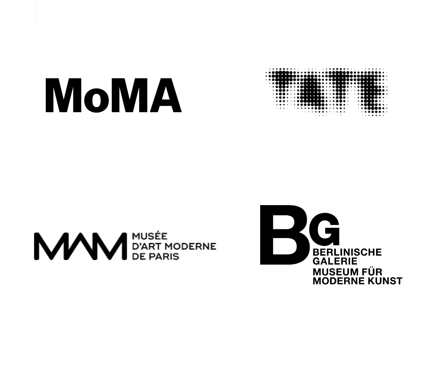
The MoMA logotype, set in Franklin Gothic # 2 and designed by Ivan Chermayeff, has been part of the New York cityscape and international museum graphic design since its inception in 1964. With changing needs and channels of communication, the MoMA logo was created as a central graphic device as part of a new visual identity launched in 2009. Created by Julia Hoffmann, Creative Director of of Graphics and Advertising, this flexible visual identity was developed to bring a systematized and coherent program to print, web and environmental applications.
Wolff Olins designed the current Tate brand as part of a rebranding of the entire Tate organization in time for the launch of Tate Modern in 2000. They created a new brand for Tate during construction. with the goal of creating something to unite all the different Tates. This notion of artistic organization as a brand was unusual (and controversial) at the time, although it has since become common practice.
After several workshops with Tate customers, Wolff Olins came up with a theme to describe the brand, which was “look again, think again”. From there, they started to work on ideas on how this could be expressed visually. The way that started to translate into visuals was to think of Tate as something constantly evolving, but it's still Tate. Because “look again, think again” was meant to be how art constantly pushes you to question yourself and see the world in a different way. Everyone has a different way of understanding art, there is never a question of being too frozen. So the whole identity had to reflect this idea of something that was not fixed, but very open, very fluid. The result was a logo that left a lot to be desired. A great example that cannot be relied on too much to convey the intent of its design philosophy.

Monograms


A monogram is a motif made by overlapping or combining two or more letters to form one symbol. They are often made by combining the initials of an individual or a company, used as recognizable symbols or logos. Historically, a monogram was used as a royal signature. Romans and Greeks used them on coins to identify their rulers. Then, in the Middle Ages, artisans began to use them to sign their work. Victorian-period high-class persons adapted the monogram for personal use as a symbol of their place in society. Logos in the form of monogram are clear and straight-forward, and don’t ask the viewer to interpret much.


A History of Car Logos
Alfa Romeo

The Alfa Romeo logo that has been modified many times is an admixture of the coat-of-arms of the city of Milan; the Red cross on a white background, and the heraldic insignia of the Visconti's family.
The Milanese red cross celebrates the heroism of the crusader Giovanni Da Rio who is reputed to have been the first to climb the walls of Jerusalem and erect a cross there during the first crusade. The badge can be seen as a shield, reversed, above the great door of the Castello Sforzesco in Milan. The Visconti insignia celebrates the killing of a Saracen warrior by Ottone Visconti, the founder of the family, at the first Crusade. The Biscione (grass snake), symbol of Visconti family comes from Longobard totem: the blue drake meaning power, loyalty, surveillance and the man in its jaws represents Visconti’s enemies that the snake is always ready to destroy.
A.L.F.A. is the Italian acronym for Anomina Lombarda Fabrica Automobili, Lombarda car making company. The original logo has Alfa written over the top and Milano underneath separated by two figure of eight knots. The logo was changed to Alfa Romeo in 1920, five years after the take over by Nicola Romeo. In 1925 a wreath was added to celebrate the marque’s numerous victories on road and track, and this has later evolved into the gold trim framing the logo . With the opening of the Alfa Romeo plant in Pomigliano d’Arcon in 1972 Milano was dropped from the Logo.

Audi

In 1909 August Horch, after a disagreement with the board of directors of his company Horch, quited the company and founded Audi. The new company name was a play on the word Horch which sounds like "hoerch", which in German means to hear, and its Latin translation is Audi. Horch's logo for the company was the word Audi inscribed on a black triangle with the number 1 on the top.
The four interlinked rings logo was introduced in 1932 after the merger of the four independent motor-vehicle manufacturers, Audi, DKW, Horch and Wanderer, that formed the Auto Union AG. After the Second World War, Auto Union AG's production plant in Saxony was expropriated and dismantled by the occupying Soviet forces. On September 3, 1949 a new company Auto Union GmbH came was founded in Ingolstadt, to uphold the tradition that the former Auto Union AG had established in Saxony.
On March 10, 1969 Auto Union GmbH merged with NSU Motorenwerke AG and changed its name to Audi NSU Auto Union AG with headquarters in Neckarsulm, The company changed its name to AUDI AG on January 1, 1985 and transferred its headquarters back to Ingolstadt. The current logo was released in 2009 and exhibits an improved minimized version of the three dimensional rings with a new and modern typeface for the Audi text. Deemed to be "more progressive and contemporary than its predecessor", the modernized logo stresses Vorsprung durch Technik , Advancement through Technology.

BMW

BMW stands for Bayerische Motoren Werke AG, Bavarian Motor Works, a military aircraft engine maker during WWI . The company's logo has its origins in the Bavarian Luftwaffe planes painted in blue and white, and its design is evolved from the circular design of a rotating aircraft propeller. The white and blue checker boxes, represent the Bavarian national colors.
However, a 1942 company leaflet, BMW Werkzeitschrift, maintained that the BMW logo originated from a the image of a shining disc of the rotating propeller, radiating like an aura from two silver cones, and appeared to one of the company's engineer while he was testing the first 320 bhp engine. In between the two cones, the blue from the sky shined that made the ‘rotating propeller into four areas of color – silver and blue’. Later the company has tried to downplay this militaristic history.

Buick

In a study commissioned by a corporate identity firm, the Schechter Group in the early 1990s, it was found that "among car marketers, GM's Buick gained an astounding 53 percent in positive image with its tri-shield symbol." The Buick Motor Company, was established on 19 May 1903 by David Dunbar Buick in Flint (Michigan) and was taken over by James Whiting who appointed William C. During the head of her new acquisition in 1904. Buick soon became the largest U.S. automaker, and taking advantage of this opportunity, Durant has acquired a dozen companies, under the new corporate entity General Motors.
The Buick logo's history includes several rebranding that occurred as the company grew bigger. Buick Motor Division's famous "tri-shield" emblem, basically three shields inside a circle, was based on research by a General Motors Styling researcher, who looked for ancestral arms of the Scottish Buick family, in an attempt to modernize the logo in the mid 1930s. The company's earliest logo was a large brass cursive "Buick" that appeared on the mesh radiator grille of early 1900s models. In 1911, a giant "B" with the "uick" inscribed inside it appeared as Buick logo, and in 1913 Buick script showed up in grille designs. In 1960, the tri-shield, representing the three Buick models; LeSabre, Invicta and Electra appeared. The Skyhawk line with a hawk perched on block letters of Buick was introduced in 1975, but it was abandoned in 1980 in favor of return to the tri-shield. Today a modernized version of tri-shield is the focus point of Buick marketing and advertising.

Cadillac

Le Sieur Antoine De La Mothe Cadillac was born in Gascony on March 5, 1658. He was of a prominent family since he earned a comission in the Royal Army. He founded Detroit in 1701, as well as the governorship of Mississippi. King Louis XIV awarded him the rank of Chevalier of the Military Order of St.Louis. The crest was adopted for Cadillac cars logo in 1905. It was registered as a trademark on August 7, 1906.

Citroën

Citroën was founded in 1919 by André Citroën. He was the first automaker outside the United States who used moving assembly lines to mass produce cars. He traveled to United States and explored the production assembly of Henry Ford, and later transformed his workshop in Paris. Collaboration with Edward Gowan Budd, an American engineer, Citroën built the first European cars using steel for their bodies.
The minimalist and elegant logo of Citroën was ahead of its time.

Ferrari

In fact, the prancing horse was originally the emblem of Francesco Baracca(1888-1918) who was Italy's leading fighter pilot during World War. His first victory came on 7 April 1916 when he successfully brought down an Austro-Hungarian aircraft. Operating exclusively on the Italian Front Baracca notched up an impressive tally of 34 enemy aircraft, becoming his country's most successful airman of the war.
Having established himself as an accredited ace Baracca painted an image of a prancing horse upon his aircraft.
According to Enzo Ferrari:
The horse was painted on the fuselage of the fighter plane of Francesco Baracca - a heroic airman of the First World War. In '23, I met count Enrico Baracca, the hero's father, and then his mother, Countess Paulina, who said to me one day, 'Ferrari, put my son's prancing horse on your cars. It will bring you good luck'. The horse was, and still is, black, and I added the canary yellow background which is the color of Modena.
The prancing horse symbolizes speed, passion, courage and victory.

Ford

In 2003 Ford released the blue oval in honor of 100 years of the Ford Motor Company, and it was named the "Centennial Blue Oval".
Childe Harold Wills who was employed by Henry Ford as a metallurgist and chief engineer and inventor of Vanadium steel, which was used on every model of Ford's cars created the Ford logo that has withstood the test of time. In 1907 Ford placed the Wills' logo on the first 1928 Model A. Harold Wills, printed business cards to earn money as a teen, and he used his old printing set and a font that he had used for his own cards. The oval was added in 1912, and blue was added for the Model A in 1927.
The first Ford Mustang was introduced on April 17, 1964. The logo is a galloping horse that originally designed by Phil Clark. The galloping horse logo was presented in New York in 1964 together with the launching of the first generation Ford Mustang. Before this, Phil Clark drew around nine different designs of the emblem before he came to the last one. The galloping horse logo was re-designed in 1974 by Hungarian Charles Keresztes in conjunction with the launching of the second generation Ford Mustang or Ford Mustang II. Since then, the Ford Mustang Logo was used for third generation (1979-1993), fourth generation (1994-2004), and part of fifth generation (2005-present) until the recent change in 2010.

Fiat

Fiat was founded on 11 July 1899 at Palazzo Bricherasio, the company charter of Società Anonima Fabbrica Italiana Automobili Torino, more commonly known as Fiat S.p.A. , was signed.
The old Fiat logo had the letters F-I-A-T inscribed with a silver line between each letter, using a blue background. The new shield-like Fiat logo is the company name in white on a red background, surrounded by laurel leaves. Fiat first used the five-bar logo on the Uno in 1982, after the company's design chief Mario Maioli - driving past the Mirafiori factory at night after a power cut - saw the giant FIAT logo on top of the plant, set against the fading light of the sky. He did a quick sketch - five bars represented the spaces he could see between the letters.

Honda

The Japanese manufacturers not only have been imitators of the western technology but also imitators of western logos. despite having a rich and elegant heritage of calligraphy, most either using the Latin alphabet letters, like Honda, or Nissan, or using tasteless and imbalanced designs like Toyota and Mazda. The most successful of these logos, that of the Honda appeared in 1947, when Soichiro Honda, inspired by the Greek goddess Nike, whose name appeared on the first Marathons in Athenes, and later was represented by the Roman goddess Victory, used the Victory wings to reinforce the symbology of the Honda brand.
In 1947, Soichiro Honda made, manufactured and sold his first complete motorbike bearing the first Honda logotype. In 1948, the B-type was the first that saw Victory wings figure. In 1953, Honda produced one four-stroke motorbike, known as the Benly that in Japanese means convenience. The bike was a great success and were sold as a rate of a 1.000 units a month. At this time The Benly model used a two wings logotype. In 1968, Honda introduced the new one wing logotype with the letters HM . The logo had small modifications on the next years. In 1973, the wing drawing incorporated the complete HONDA word, outline was enlarged and the yellow Honda colour was also introduced. In 1988 and coinciding with the 40th annyversary of the Honda brand, a new design for the Honda wings logotype was created to commemorate this special event. Honda automobiles use ‘H’ logo, appearing wider on the top in a simple, roman style font.

Maserati

Maserati was founded in 1914 in Bologna by Alfieri Maserati, born into a family of seven brothers (brothers Maserati), five were involved in the development of automobiles. Like Alfa, the Maserati logo - trident is the traditional symbol of Bologna. Mario Maserati, the brother who created the Maserati logo was a painter; who was inspired by the traditional symbol of Bologna-Neptune's trident; based on the Neptune's statue at Bologna's Piazza Maggiore, he composed the logo by a red trident above a blue base, which symbolizes the vast power of Neptune.

Tesla
 |
Tesla Motors was founded in 2003 by a group of engineers in Silicon Valley who wanted to prove that electric cars could be better than gasoline-powered cars. Tesla's chief designer Franz von Holzhausen, commissioned its logo to prado studio in California. |
Mercedes Benz

Gottlieb Daimler and Carl Benz, independently of one another, and with the help of their financial backers and partners funded Benz & Cie. in October 1883, in Mannheim; and Daimler-Motoren-Gesellschaft (DMG) in 1890, in Cannstatt. The two companies trade marks bear the name of the funders.
Mercédès, which means ‘grace’ in Spanish, was the name of the daughter of the Austrian businessman, Emil Jellinek, who in 1897, visited the Daimler factory and placed an order for his first car. Jellinek was well connected with international financiers and the aristocracy and became increasingly involved with the company. In 1898, he began to promote and sell Daimler automobiles. From 1899, he began to race under his pseudonym Mercédès. In April 1900, DMG decided to cash in on the publicity and to use the Mercedes as a product name. This first ‘Mercedes’, developed by Wilhelm Maybach, the chief engineer at DMG, caused quite a stir at the beginning of the new century. In 1902, ‘Mercédès’ was registered as the trade name.
Early in his youth Gottlieb Daimler had marked a star above his own house on a picture postcard of Cologne and Deutz, and had written to his wife that this star would one day shine over his own factory to symbolize prosperity. He died in 1900, and nine years later Paul and Adolf Daimler his sons proposed the DMG board that the company should adopt a three-pointed or a four-pointed star as its logo. The board immediately accepted the proposal and registered both versions as trademarks, but only the three-pointed star was used. The three-pointed star was supposed to symbolize Daimler’s ambition of universal motorization – “on land, on water and in the air”. In 1916, a circular band was added to surround the tips, in which four small stars and various inscriptions including Mercedes, the DMG plants at Untertürkheim or Berlin-Marienfelde were placed.
After the First World War DMG and Benz & Cie., formed a syndicate in 1924 to be able to survive the difficult economic conditions. They marketed their products jointly, but under separate trademarks. In 1926, they merged to form Daimler-Benz AG with a new logo combining the three-pointed starand the name ‘Mercedes Benz’, surrounded by a laurel wreath.

Peugeot

Peugeot entered the industrial era in 1810 during Emperor Napoleon I who needed to clothe the soldiers of his Grand Army. Later the company funded the steel industry, and manufacturing of saw blades. In 1842, Peugeot partnered with the Jackson brothers, four Englishmen from Lancaster, and produced band saws , tools, Stays whales and umbrellas under the name "Peugeot seniors and Jackson brothers".
In 1848, the firm changed its name to "Peugeot Frères" , manufacturing steel frames for crinolines, fashion accessories launched by the Empress Eugenie. The first four-speed auto was built in 1890,with the gasoline engine, built under the the license from Daimler.
The "lion" logo was designed by Justin Blazer, a jeweler and engraver based in Montbéliard. In a letter written in 1847, an appeal was made to the "good taste" of the artist to create the best possible layout of the letters and ensure the longevity of the trademarks. They included an arrow that can be seen under the paws of the Lion, created in 1850.

Porsche

In the early 1950s, Professor Ferdinand Porsche and his son Ferdinand 'Ferry' together with their trusted advisers were discussing a company logo for their intended new car design that was supposed to be built in Stuttgart.
Franz Xaver Reimspieß, the Porsche engineer, a man remarkable for his precise work and his wealth of ideas, who had designed the Volkswagen logo, for which had received a one-off payment of one hundred Reichmarks; did a number of various sketches for the new car company. Finally, the company’s logo was created based on the traditional crest of Württemberg-Baden, as the region was still called at that time, stylizing antlers and the state colours of red and black. Stuttgart, a city established in 950 AD as the stud farm of ‘stuotgarten’, has had horses in its coat of arms in varying designs since the 14th century, and Reimspieß placed a rampant black horse at the center of logo, inspired by the Stuttgart's seal, as an expression of forward thrusting power,
After obtaining the city's approval, the Porsche 356 bore the Reimspieß designed logo for the fist time in 1952, where it appeared on the horn in the middle of the steering wheel.
Pontiac

Pontiac is a US car brand first produced in 1926, by General Motors (GM), as the 'companion' marque to GM's Oakland Motor Car line. The Pontiac name was first used in 1906 by the Pontiac Spring & Wagon Works. The name was taken from Chief Pontiac, an American Indian chief who led an unsuccessful uprising against the British shortly after the French and Indian War. The Oakland Motor Company and Pontiac Spring & Wagon Works Company merged in November 1908 under the name of the Oakland Motor Car Company. The operations of both companies were joined together in Pontiac, Michigan (of Oakland County) to build the Cartercar. General Motors in 1909 purchased Oakland.
The original logo was that of an American Indian headdress, which was used as a logo until 1956. The American Indian headdress is obviously connected to Chief Pontiac referenced earlier. This was updated to the currently used American Indian red arrowhead design for 1957. The arrowhead logo is also known as the Dart. The logo has a distinctive Red and a silver star in the middle. I am not sure what the significance of the star is but a lot of the Native American art contains elements of nature such as the sun, moon and stars.

Renault

Louis Renault was raised in a well-to-do French family, and his parents indulged his early interest in mechanical contraptions by allowing him to convert the garden shed into his own workshop. He soon got orders for cars, so in 1898, along with his brothers and friends, opened the company Société Renault Frères in Boulogne-Billancourt, France.
The first Renault logo, drawn in 1900 featured the three initials of the Renault brothers: Louis, Ferdinand and Marcel. In 1906, the logo changed to a front end of a car enclosed in a gear wheel.
The Renault diamond started out as a bonnet emblem. The horn lived behind it, and from 1922 the centre of the badge was cut out to allow the sound to escape. It started out circular and became a diamond shape in 1924.

Volkswagen

The logotype of Volkswagen which is recognizable all around the globe is simple and elegant play with the typeface V. It is created by Franz Xaver Reimspiess. The simplicity of design together with its rhythmic composition, achieved by the repetition of a geometric V-form inside a circle, creates its striking visual impact . The logo was originally designed in 1938 and modified in 1996 and 2000.
.

Volvo

Volvo's predecessor company, formed in 1915, for the manufacture and marketing of bearings, but it went idle after 1920s. In 1926, Svenska Kullagerfabriken – SKF provided finance to turn it into a car company. The SKF chose the name Volvo, for its simplicity and ease of spell and pronunciation, derived from the Latin verb “Volvere” meaning to “roll”. The company choose for its logo the chemical symbol for iron — a circle with an arrow pointing diagonally upwards to the right, which originally stood for the planet Mars in the Roman Empire.The iron logo on the car was supposed to create associations with the the Swedish iron industry: steel and strength with properties such as safety, quality and durability. Each of the first six planets was associated with a metal: Sun=gold, Moon=silver, Mercury=quicksilver, Venus=copper, Mars=iron, Jupiter=tin, Saturn=lead. All in all, this was not a very imaginative logo and appeared somewhat naive application of culture and symbolism.
Lotus

The first Lotus was built by Anthony Colin Bruce Chapman in a lock-up garage behind his girl friend's house in 1946 or 1947. At the time he called it an Austin Seven Special, and it competed in mud plugging trials in 1948. The first car Chapman actually called a Lotus, at the time, was built in 1949 whilst he was in the Royal Air Force, and was built in the same lock-up garage.
In 1952, Chapman founded the Lotus Engineering Co Ltd, using a small loan from Hazel Williams, his future wife, to buy and sell used cars. Initially he modified and raced these cars himself in trials and hillclimbs, selling each to finance building or converting the next, while working full-time for the British Aluminium Company. In 1954 Chapman was able to take up running Lotus Engineering as a full-time job, and to set up Team Lotus to oversee the racing. By this stage he was already working as a consultant for the BRM and Vanwall Formula 1 teams.
From Lotus' earliest days every car was fitted with a nose badge comprising of Colin Chapman's monogram (ACBC) on a green quadrant background which is superimposed on a yellow circular plaque. However, from the late sixties onwards some cars appeared with mysterious all black nose badges.
The oval Green Gold badge was introduced by The new Chairman and head of BCA, David Wickens, as he didn't want the Chapman association at the time, prefering instead to try and force a new image on Lotus. It was Oval, not round as past badges had been, it didn't include ACBC at all and the Lotus words were in a different font and interlinked. This was brought in 1984, despite the protestations of several Directors. It's said that Mike Kimberley nearly quit because of it.
About 18 months later Mike Kimberley added in the ACBC part at the top of the logo. This again nearly ended MJK's career as it was done on his authority, wanting, quite correctly, to use Lotus's Chapman heritage and the racing implications associated to it . The logo was still, however, BRG and oval. It wasn't until 2 years later that they managed to change the Oval logo back toits original, with the approval of GM.

Lamborghini

Ferruccio Lamborghini was born in Italy in 1916. He was fascinated with engines from an early age. During World War II he joined the army and was stationed on the island of Rhodes. Fortunately there was little going on there during the war. The island was essentially isolated from the rest of the world. Any cars, trucks or motorcycles that broke down had to be repaired on the spot with reused parts. Lamborghini became known as a wizard at mechanical improvisation and became very much in demand at fixing engines.
After the war he returned to his home near Modena in northern Italy and setup a small car and motorcycle repair shop. He soon realized that there was a desperate need for tractors in the agricultural area in which he lived. He found he could build about one tractor a month from derelict military vehicles. As Italy's economy grew demand for his high quality tractors started to grow. He began building his own tractor engines. His tractor business became very successful reaching a rate of over 400 a month in 1960. He soon looked at expanding the business and in 1960 began manufacturing heaters and air conditioning units for buildings as well as maintaining the tractor business. This too became very successful.
About this time Lamborghini started to get interested in developing a high performance car. He had owned Oscas, Maseratis and Ferraris but was always disappointed with them. Particularly their engines. There is a now famous story about how he was frustrated with problems he had with a clutch in a Ferrari (a Ferrari 250 GT), and went to visit Enzo Ferrari who's factory was nearby. Enzo had no time for a tractor manufacture and simply dismissed him. Lamborghini decided there was nothing Ferrari was doing he could not do better. He decided too build his own car with a V12 engine. For the design he found a very talented engineer named Giampaolo Dallara who had previously worked on a Ferrari V12 engine.
The oil crisis of the 70's made sales of high performance cars difficult. Production was plagued with budget and parts supply problems. People gave up waiting for cars with two year back orders. In 1978 the company declared for bankruptcy. The Mimran brother's, a Swiss based group, were able to save the factory, but after making it profitable again they sold it to Chrysler Corporation. The new Lamborghini Diablo got rave reviews, nut in 1994 Chrysler fell upon hard times and had to sell the company. It was bought by an by Tommy Suharto, the well known Indonesian dictator's son. Fortunately, after the demise of Suharto, in a complex series of transactions Audi AG became the sole owner of Automobili Lamborghini on August 4 1998.
Re-branding
As competition intensifies and profit margins decline, companies often start to question their branding strategies. Re-branding means redefining the unique values or advantages of the product. It is a new attempt at product differentiation in order to leave the past behind and move forward. In all too many cases, however, those expensive re-branding efforts fail to yield the desired business results, because the consumers have a long memory, and if the company has done something wrong in the past they will not forgive just because the company has changed its logo. In such circumstances companies need to be forthright about their mistakes. However, sometimes re-branding is necessary, not because the company's past mistakes but because of changes in consumer's tastes. In such cases re-branding breathes a new life into the brand. Because of the fast pace of innovations in the high tech and communications sectors the clients change of taste is more prevalent in these sectors and this is why many of these companies feel the need to re-brand themselves.

Starbucks' re-branding was due to the strong passion Howard Schultz had for espresso beverages. He realized that the unique advantage Starbucks can offer to its clients is in serving coffee in an elegant and tasteful manner. After failing to convince the original owners of Starbucks to focus on serving coffee in an espresso bar fashion he started his own espresso café, Il Giornarle in 1986. However, by 1987, the two remaining original owners of Starbucks decided to sell the business and Schultz jumped at the chance to acquire it and re-brand it into the espresso bar concept similar to Il Giornale. As Schultz relates in his book POUR YOUR HEART INTO IT ; Terry Heckler and him poured over old marine books until Terry
"came up with a logo based on an old sixteenth-century Norse woodcut: a two-tailed mermaid, or siren, encircled by the store’s original name, Starbucks Coffee, Tea, and Spice. That early siren, bare-breasted and Rubenesque, was supposed to be as seductive as coffee itself."He then describes how they merged the Starbucks logo with that of Il Giornale, which its name was inscribed in a green circle that surrounded a head of the Greek god of messages, Mercury. He writes;
"To symbolize the melding of the two companies and two cultures, Terry came up with a design that merged the two logos. We kept the Starbucks siren with her starred crown, but made her more contemporary. We dropped the tradition-bound brown, and changed the logo’s color to Il Giornarle’s more affirming green."

Starbucks logo was rebranded again on the company's 40th anniversary in 2011, apparently to explore other opportunities in the fast food markets beside the coffee. In the new brand the siren in the circle became the most prominent feature of the logo and the typeface on the ring 'Starbucks Coffee' was removed.
Here are some other instances of re-branding.

The famous bell symbol was created by Bass & Yager design firm in 1969. This minimalist logo with a sans serif letterform achieved a remarkable recognition in the US. The designer was Saul Bass, a graphic designer and Academy Award-wining filmmaker. The circle around the bell symbolized the globe with a UN-blue. The bell icon was used by AT&T for more than 100 years, and Bass kept it because it was a very apt symbol for the brand, as it was a pictogram of the company's founder, Alexander Graham Bell. Furthermore, bells are a means to inform and connect people.

In 1982, ATT was forced by the U.S. Department of Justice to divest itself of the 22 Bell Operating telephone companies as of January 1, 1984. The design development of the AT&T globe symbol began in late 1982, The initial redesign added a globe symbol in conjunction with the logotype "American Bell". However, a Judge ruled that AT&T cannot use the 'Bell' identification. Thus, the symbol was joined with the new name and logotype 'AT&T' to form the identification signature for the restructured AT&T. In the new design the globe symbolized a world circled by electronic communications, by carefully delineated 'highlight' and 'shadow' elements.

In 2005, SBC Communications bought AT&T, and the newly formed company opted to keep the AT&T name and to re-brand its logo. They kept many features of the old logo, with a globe circled by electronic communications with a more emphasis three-dimensionality, with the addition of some computer generated transparency and shading effect. The upper case AT&T was abandoned in favor of a mongrelized looking at&t, presumably due to a belated conversion to a modernist Bauhaus pedigree of international avant-gardism!


The oil spill resulting from the explosion and sinking of the BP oil rig Deepwater Horizon in 2010 created tar balls that very quickly were found in Louisiana, Mississippi, and Alabama. Soon after they spread into the famed island of Key West, Florida, about 600 miles from the spill site. This appeared to confirm scientists’ fears that the oil spill caused by the explosion and subsequent collapse of the Deepwater Horizon rig has been picked up by fast-moving ocean waters knows as the Gulf Loop. Greenpeace UK started a campaign to redesign the BP logo, to more accurately reflect its tarnished status, as well as to raise awareness about the company's plans for extracting oil from tar sands.
 |
According to Doug Bowman, the Creative Director of Twitter:
|


This revamped logo, which has been designed in collaboration with Paris-based creative agency Adulte Adulte, sees a roundel enclose a monogram formed from the letters “P” and “B”; the letters serving as a reference to Pierre Balmain, who originally founded the company in 1946.

Symantec's old logo
Symantec, a software company, mainly known for security products, acquired some of the assets from a non-competitor, in order to get that company's logo, the single asset that VeriSign had argued in the past that was its ticket to a stable future.
VeriSign's ; Logo
The VeriSign logo was called Trust Seal A major part of VeriSign's business had been the licensing of the above logo to "trusted" Web sites whose security services pass VeriSign's test. So when online shoppers see that pixelated checkmark inside the circle, they conclude the site they're shopping on is safe.
Symantec's New Logo
According to Symantec press release "The new company logo brings together the Symantec name with the check mark from the recent VeriSign acquisition. The VeriSign check mark is the most recognized symbol of trust online with up to 250 million impressions every day on more than 100,000 unique websites in 160 countries. The check mark and circle will be the common symbol used across Symantec brands." Thus, Symantec paid $1.28 billion for this logo. Here are some other examples of re-branding:

 Note the arrow in the new Amazon logo moves from A to Z, indicating that they sell everything from "A to Z" and it looks like the smile of a happy face.
Logos in Sport
Team logos try to command the loyalty of their fans by being more playful and adventurous. The Boston Celtics, a basketball team, uses a jovial Irishman in its logo. He is winking and turning a basketball on his finger, while smoking a pipe. The logo project a sense of humor which is not offensive and is in good taste.


The Chicago Blackhawks hockey team uses the above logo which is conceptually not very much different from the logo of the Washington Redskins football team. The Washington Redskins started in Boston as the Boston Braves and were later called the Boston Redskins. Their logo is the face of an Native American chief facing the right. The chief's head is placed within a yellow circle that has some yellow feathers. The yellow comes from the team colors of burgundy and gold. According to Forbes Magazine, the Redskins were recently the second most valuable franchise in the NFL, valued at approximately $1.467 billion.

The National Congress of American Indians has long been opposed to logos that portray Native Americans in a negative light. They feel that logos like the Redskins perpetuate negative stereotypes of Native American people, and demean their native traditions and rituals. This issue has not been resolved yet, as many teams continue to possess logos with controversial names and images.


Go to the next chapter; Chapter 19 - The Viennese method, and Burtin's Models.
------------------------------------------------------------------------------------

This work is licensed under a Creative Commons Attribution-No Derivative Works 3.0 Unported License.


What an extraordinary series. Thank you so much, the detail and thinking behind your posts are like finding a really interesting treasure!
ReplyDeleteThank you so much. I apologize for my late response.
Delete